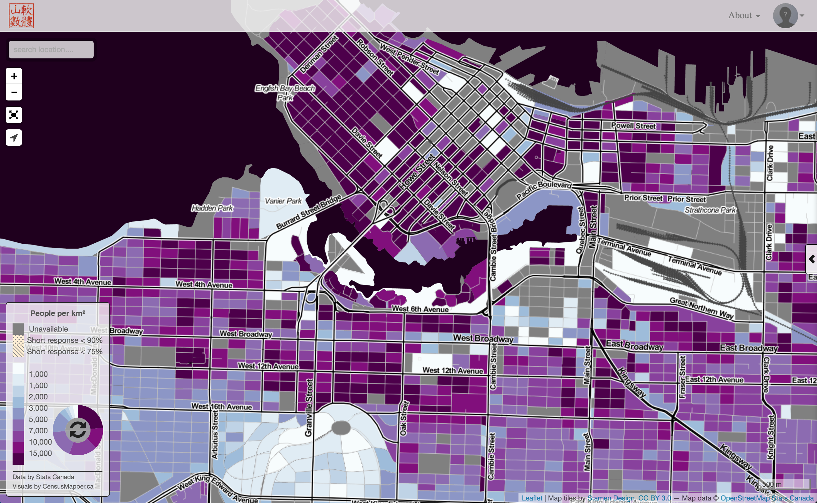
Just saw this excellent post looking at density around transit stations today and though I should pull out some numbers to go with the pretty visuals. And with CensusMapper’s new capabilities of populating custom geometries with census data estimates it’s super-easy to do.
Population density is only one measure of interest here, job density or amenities density would be others. But for now let’s focus on population, so how many people live near the rapid transit stations. To keep things simple we checked for a 400m and an 800m radius circle around the stations. At least roughly, if you need to know the details check the bottom.
To visualize this we simply map our concentric circles around the stations and use the population density as height. Click, touch or hover to get the exact values. And sorry again, only new computers will get a meaningful result. Most smart phones and tablets will have no problems. <iframe src=“/html/skytrain_tod_map.html” width=“80%” height=“500”, style=“margin:5px 10%;”> Full screen view
What immediately stands out is that for some stations inner orange circle is lower than the outer yellow circle. That means the 400m radius area is less dense than the 800m radius area. It’s as if there was an inverse-TOD development. That’s where local knowlege becomes important to see how exectly things are like around the stations. Maybe the station primarily servers jobs or amenities, which we did not map. This definitely deserves more scrutiny.
 Of course we can also view this on the CensusMapper population density map comes in handy, if we zoom in it breaks it down to the census block level. And CensusMapper will also function on your old computer if that’s what you are using.
Next steps
One clear drawback of the analysis is that it uses 2011 numbers, which are quite old by now. So it’s probably worthwhile to re-visit this once 2016 population numbers become available. In the meantime I should run the same analysis on the 2006 data to see how density around transit stations changed. Some other day.
###Details This section is only interesting for people who want to know how exactly the numbers were derived. Conveniently Dmitry had the station data handy, which I took and then threw out the duplicates data for each station platform.
Getting exact number of people in a given circle radius around a station would require a getting custom tabulation for Stats Canada. This is clearly overkill for the application we are looking at, and if we really wanted to be more precise we should probably start by using an isochrone, that is an area that is at a 10 minute walking distance from the station, instead of using a circle.
In the future we will bake the ability to compute isochrones right into CensusMapper. Right now CensusMapper estimates population data for arbitrary regions, including circular ones, by checking which census blocks intersect each circle and add up the populations. Actually, we have three differnt ways to do this
- by just taking all dissemination blocks that intersect
- by just taking all dissemination blocks with the majority of its area in the intersection with the region
- by scaling all properties of the dissemination block according to the proportion of its area in the overlap with our region.
Each has its own advantages and disadvantages, we felt that option 2 is best suited for our purposes.
So we end up with a slightly different areas from the circle, the area given by the census blocks we included, and we compute population densities based on that area. Since we visualize the circles instead of the union of the census blocks used the visualization is a little bit misleading, but there is some value in the simplicity of sticking with circles.
Since we are only interested in population data we are done. In the more general case, when we are interested in estimating other census variables, for example the average rent in the area, CensusMapper would now go through the census geographies and match up appropriate geographies with the census blocks to derive the appropriate estimates. The actual algorithm gets quite complex here. Extra weights, like the proportion of households that rent (and not own), come into play, as well as data quality estimates. And yes, if we did opt to use area overlap weights in the block level computation, we would base them on households instead of population. If I am vague here it’s because the algorithm is quite complex and not really fit for a blog post.
Reuse
Citation
@misc{tod.2016,
  author = {{von Bergmann}, Jens},
  title = {TOD},
  date = {2016-04-06},
  url = {https://doodles.mountainmath.ca/posts/2016-04-06-tod/},
  langid = {en}
}