Vancouver finally has a bikeshare system. And everyone is hoping it will succeed, despite the obstacles BC’s mandatory helmet law poses for the system. So we are eager to find out how things are going with Mobi.
To set the background, consider that Seattle’s Pronto is getting less than 1 ride per bike per day after half a year in operation. In comparison, bike shares that are considered ‘successful’ in North America get 3 to 5 rides per bike per day. Taipei’s system, which I am particularly fond of, gets over 11 rides per bike per day.
So how about Mobi? It barely started, and it’s not really fair to run the numbers right now. But we just couldn’t hold our curiosity back.
Data
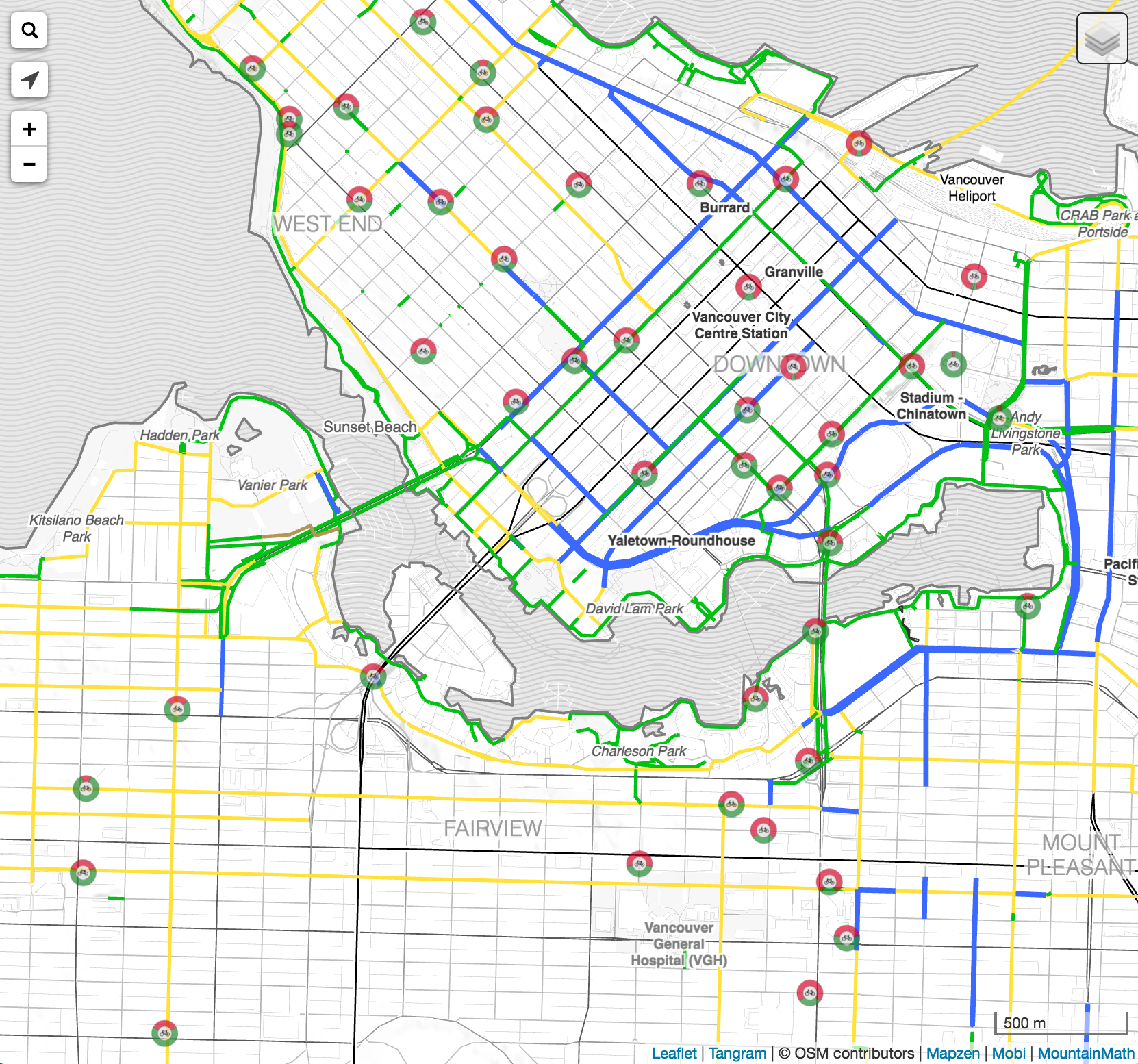
 First off, some caveats. Mobi does not have an official API for their system. In fact, they only provide a barely usable map of station statuses at the bottom of their landing page. So we decided to jump in and scrape their data to make our own map. In absence of better alternatives, the official Mobi smartphone app is still not released, the map has gotten quite popular. And in absence of an official Mobi API there are now others, like TransitApp, that are consuming our station data shadow API.
What that means in terms of data quality is that while we get fairly accurate station bike counts at about a 1-minute interval, there are some issues with using the data for rigorous analysis. If a bike gets checked in while another one gets checked out at about the same time there is a good chance that we will miss it. And we can’t distinguish rebalancing from a group of people checking out or dropping off a bunch of bikes at the same time. And we don’t have individual bike data to look at travel patterns, for example what popular trip patterns are. Moreover we currently don’t collect and store weather data, an important variable that should be included in any bike share analysis.
That pretty much rules out anything but high level analysis.
Station History
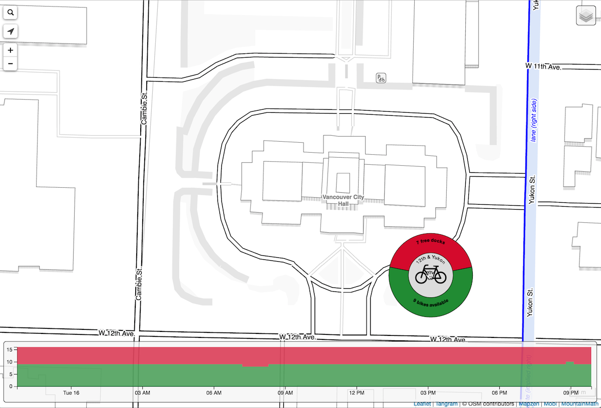
To get an initial idea we started to look at station history. We only started recording Saturday 13th. For the fun of it we added one day history to our Mobi bike station and bike infrastructure map. Drop me a line if you are interested in longer timeframes.
Taking a look at the daily overall usage patternsthings are pretty much as expected. Nice Gaussians for the weekend usage, and some commute spikes for the weekday usage. Squinting really hard one might want to make out a slight lunchtime boost, we will have to collect more data to confirm that.
Another thing we see is that usage seems to hit a low point around 4am, so that’s a good time to divide up the days when looking at daily usage. Adding up the rides we get around 1400 rides a day. At around 3am we detect 490 bikes in the stations, so that makes about 3 rides per bike per day. On average. That a pretty impressive number for a system that is just getting off the ground. And that’s while still in “members only” mode. The nice weather has helped, but there is no getting around the fact that Mobi is off to a great start!
Of course not every bike is getting 3 rides. Some get more, some get less. For example, a bike parked at the Ontario & Seawall station has been very popular, here is live data on the most recent days of usage. On the other hand, bikes at Yukon & 12th have been having a hard time to find riders. Both stations are at the current boundary of the system, it is hard to say what makes the difference. The particular location of the least used station is sure to get some people talking.
Mobi is undoubtedly carefully analyzing their station usage and incorporating that into their strategic planning how to expand their network. And hopefully publish a useful API for all the data geeks out there.
Reuse
Citation
@misc{mobi-a-first-look.2016,
  author = {{von Bergmann}, Jens},
  title = {Mobi -\/- a {First} {Look}},
  date = {2016-08-16},
  url = {https://doodles.mountainmath.ca/posts/2016-08-16-mobi-a-first-look/},
  langid = {en}
}