I have played with Mapzen’s Isochrone serivce in the past with a simple visualization of walksheds.
Recently Mazen updated the isochrone API to allow for a more fine-grained selection of exactly what transit services to include or exclude in transit routing, and they created an amazing mobility explorer based on that.
Partially motivated by chatting with two TransLink planners I decided to riff off of that and take a look at how well TransLink serves different parts of Vancouver. At different times of day. And how susceptible TransLink’s network is to Skytrain service disruptions.
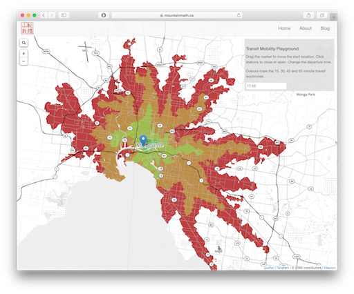
To do this I decided to allow users to drag a location pin around that sets the start location, allow to change the time of day, and call Mapzen’s API to compute transit isochrones to visualize what areas can be reached from the start location in 15, 30, 45 and 60 minutes.
To add some fun I made the Skytrain stations clickable, allowing the user to toggle the station status from open to closed, so users can explore how mobility options change if a station is closed for boarding and no Skytrains pass through any more. Essentially this cuts the transit network.
This does neglect bottlenecks that will emerge when alternative routes become overcrowded in the event of a skytrain failure, and it does not take into account countermeasures by TransLink to deploy parallel buses, but it nonetheless gives interesting conclusions about how crucial certain nodes are to the overall network.
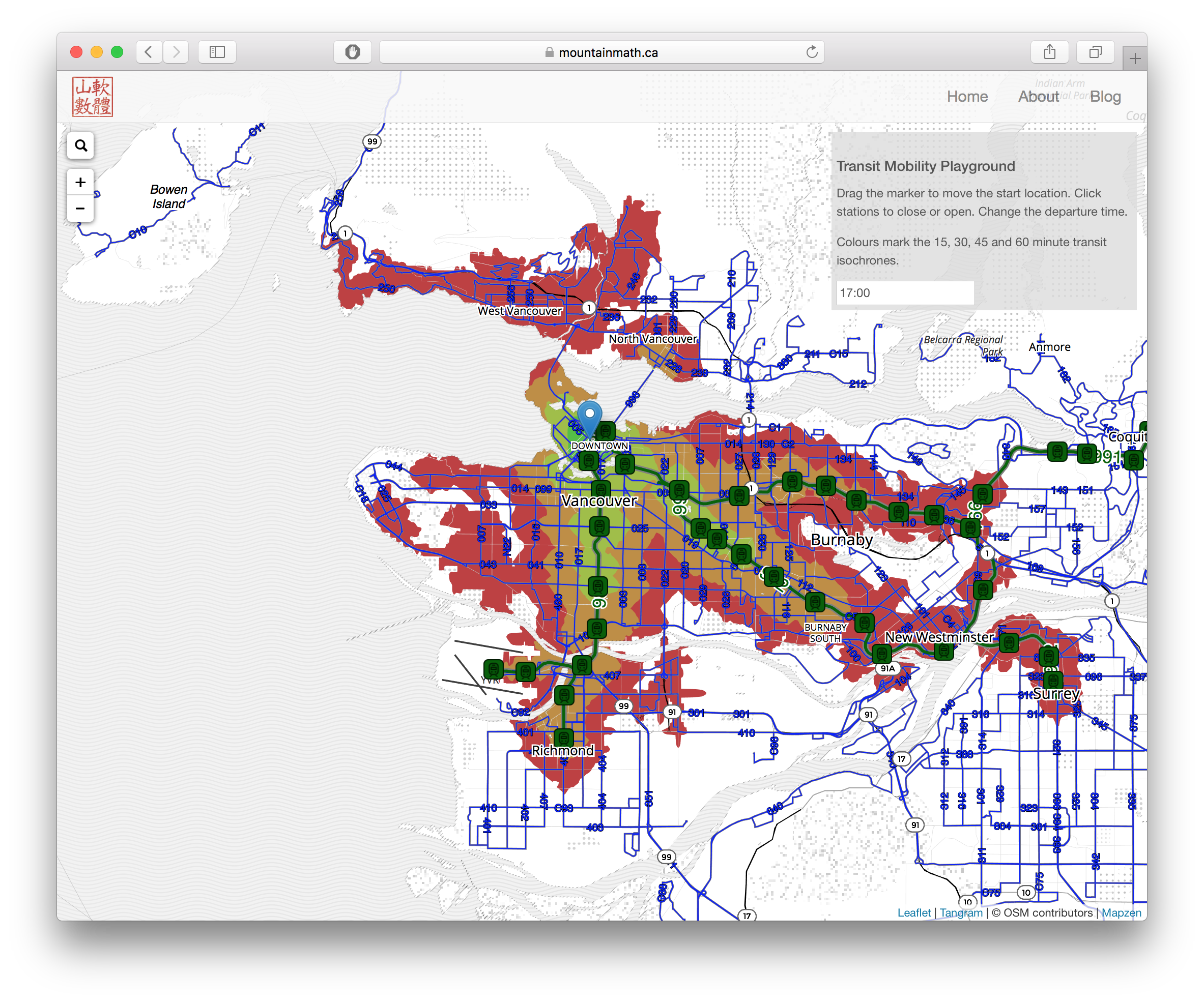 Do you feel that your area is not served well enough by transit? Or under served in the evenings? Or are you worried about what happens if the Skytrain breaks down somewhere? Just launch the Vancouver Transit Explorer and play around to see how transit serves your needs.
Don’t live in Vancouver and want to explore transit in your region? Not a problem. Use the search bar to jump to whatever city you are interested in and click on the map to move the start location there. Then drag it around to explore that region.
If transit services in your city are already part of the TransitLand feed registry that is. If not, this visualization won’t do you much good right now. If you are keen to use it to explore transit in your city, just help TransitLand add your local transit agency to their feed registry.
Details
I used settings that assume we have some happy walkers that are willing to walk quite a bit to get to and from transit, as well as walking between stations. It seemed to me that the visualization is already overloaded with options that I did not want to throw in another leaver.
The Mapzen Isochrone API also allows for routes or operators to be excluded from the calculations, so one can build more complex “what if” type simulations.
And the service does not include bike share, which really is another piece in the whole mobility puzzle that can significantly shorten travel time (or increase travel distance).
Issues and Caveats
Times after midnight may run into some issues, in some places, like e.g. Vancouver or Toronto, the early morning hour isochrones won’t work properly using this visualization. The technical reason seems to be that some GTFS used times past 24 hours, so 25:01 for one minute past 1AM the next day. And that breaks things somewhere. The good news is it’s just a matter of time for this to get fixed one way or another. But for now it’s broken. :-(
Also, the tools this is built on are quite fresh. So there might be some glitches and opportunities to improve. Exciting times when services like the isochrone API by Mapzen become publicly, and freely, available.
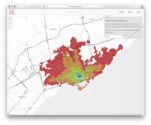
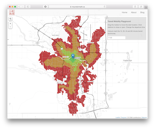
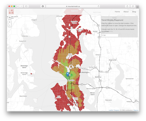
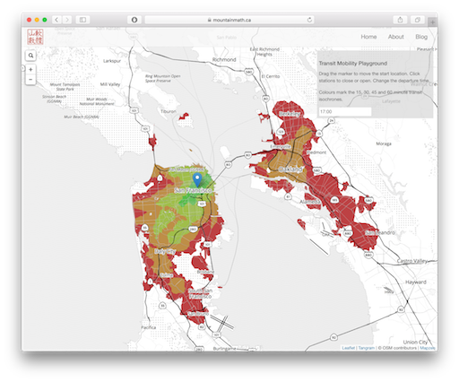
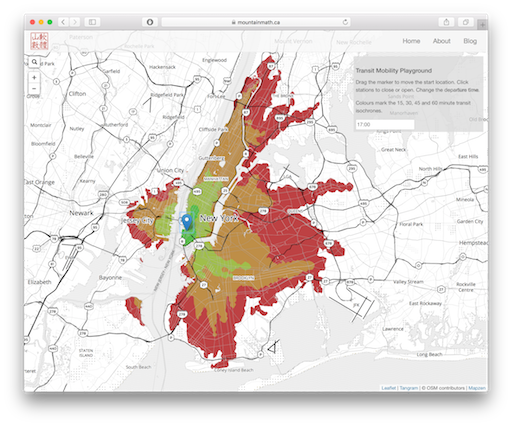
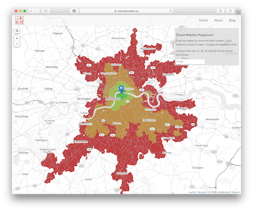
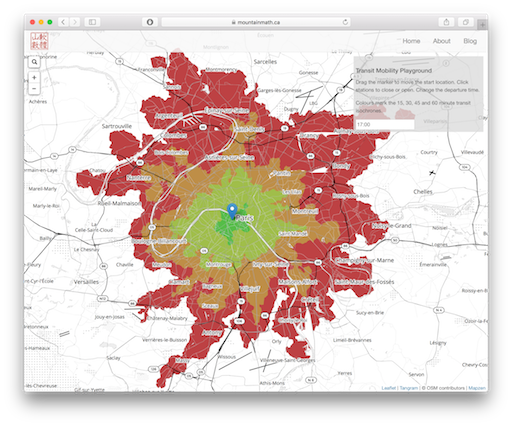
5pm transit sheds around the world

Reuse
Citation
@misc{transit-explorer.2017,
  author = {{von Bergmann}, Jens},
  title = {Transit {Explorer}},
  date = {2017-03-01},
  url = {https://doodles.mountainmath.ca/posts/2017-03-01-transit-explorer/},
  langid = {en}
}
