It’s great to have fresh census data to play with. Right now we only have three variables, population, dwellings and households. There is still lots of interesting information that can be extracted.
So we started exploring in our last post, things get really interesting when looking at change between censuses. But as we noted, there are several technical difficulties that need to be overcome.
So we at CensusMapper took that as and invitation to do what we love most: breaking down barriers.
The biggest difficulty in comparing censuses is that census geographies change over time to adapt to new demographic realities on the ground. Whenever that happens, there is no easy way to compare data across censuses.
Custom Tabulations
The best way to compare data across censuses is to pull a custom tabulation for data on a common geography, there are a couple of things to keep in mind though:
- It costs money (or at least time if part of a specific research project with access to a StatCan data centre),
- it takes time to complete a custom tabulation, and
- custom tabulations are typically not available at fine geographic levels.
For these reasons, comparing data across censuses is usually confined to select university research projects or well-resourced private interest. And to make matters worse, custom tabulations are rarely shared. I have asked university research groups if they were willing to share custom tabulations through CensusMapper, but got turned down every time so far. While the Tri-Agency Open Access Policy on Publications, postulates that research needs to be published in open access journals and the data also needs to be made available, in practice research groups often keep their data locked up long after publication.
But some public agencies do make their custom tabulations available, for example the City of Vancouver has custom tabulations for neighbourhood boundaries available on their open data catalogue.
Comparable Regions
But even without custom tabulations we can compare regions if they have not changed across censuses. For example, we can compare how the City of Vancouver or Metro Vancouver have change over time by tracing them through censuses, as their geography has not changed. Census regions are tracked through their unique region identifier, which allows people to establish timelines for regions. When doing so one quickly runs into issues with this approach though.
Just because a region has the same name and unique geographic identifier does not guarantee that the region has not changed. Simple examples of this are Census Metropolitan Areas that can change quite dramatically over time without this being reflected in the name or region identifier. For example, Ottawa, Montreal or Abbotsford were all expanded, some substantially) from the 2011 to the 2016 census.
For example, by just comparing Census Metropolitan Area data, Montreal’s population grew by 7.2% between 2011 and 2016. But a good chunk of that was simply due to the geographic region of the CMA being expanded, taking the 2016 expanded region as a base and including all people that lived in that region in 2011, including the ones that lived outside of the 2011 CMA of Montreal but that are now included in the 2016 CMA, the region’s population only grew by 4.2%.
On top of large changes like this, many smaller regions have undergone slight boundary adjustments while keeping their unique identifier, which move some people from one geographic region to another. And as one drills down into finer geographies one can easily find geocoding errors in the data, where people were moved from one region to another between censuses without any region adjustment taking place. These geocoding problems may persists in custom tabulations, but they are likely to even out as one moves to higher aggregation levels.
CensusMapper comparable regions
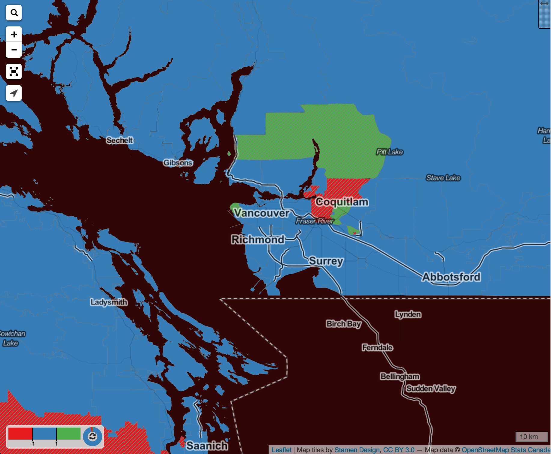
 At CensusMapper we decided that it would be in the general interest to be able to compare standard census variables across all aggregation levels. So we wrote some scripts to create a “least common denominator” tiling for all of Canada for all aggregation levels, ranging from Census Blocks to all of Canada. The idea is to keep regions that have not changed and, for regions that did change, join regions together in a way that the joins match again across censuses. While this sounds simple in principle, there are lots of issues and pitfalls along the way. Hopefully we have properly dealt with all of them now. We have done some testing, and there are still have 285 regions (36 CTs, 245 CSDs and 4 CMAs) where the adjusted and computed 2011 population counts don’t quite add up. For example, 348 people were moved between Coquitlam and Port Coquitlam in this fashion, most of it due to an adjustment between CTs 9330287.01 and 9330291.01 that is not due to a change in geographic boundary. In the example of Airdrie trading 705 people with Rocky view this is associated with a change of the census geography, but no change in name or geographic identifier. In most cases the adjustment is much smaller than this. Even more extreme than Airdrie is the case of CTs 5350512.00 and 5350511.01 in Mississauga that swapped 1074 people without any apparent boundary change.
We have a map that highlights all these difference at or above the CT zoom level, and in all maps we shade areas with adjusted population counts and we indicate the actual population adjustment on hover.
The Good, the Bad and the Ugly
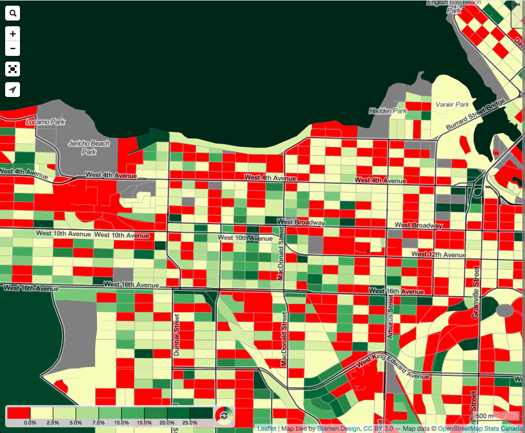
 So what does all of this buy us? For now, we get comprehensive maps comparing population, dwellings and households across the 2011 and 2016 censuses at all geographic levels, including Dissemination Blocks. As new census data rolls in, we will be able to compare data down to the Dissemination Area level. That’s pretty cool, we think.
What could be bad about this? Census data is far from perfect. And mapping differences tends to bring out the problems in Census Data. Incorrectly enumerated dwellings, households or population, geocoding issues, as well as changes in geographies.
And things start to get really ugly when the rest of the census data comes in where statistical rounding was applied. Even if everything was perfectly enumerated and geocoded, statistical rounding means that inevitably some areas will have census data that has been rounded up in one year and rounded down in the next. And taking differences will bring this out very strongly, especially at the Dissemination Area level. It is hard to overstate the effect of this, statistical rounding means that when mapping change at small aggregation levels we will map lots of statistical noise.
There is however still value in showing and working with differences of census variables at small aggregation levels, but the results are much harder to interpret. One very simple workflow that we use regularly is to generally use Census Tract level data, but zoom in to Dissemination Areas when we want more context for particular Census Tract values. Doing this, salted and peppered with a good dose of caution and ideally some ground truthing, we can greatly refine our insights in what is going on in that Census Tract.
For this reason we are decided to, at this point, keep fine grained data publicly available. We are aware that this will lead to some people misinterpreting census data, but this is already happening at any aggregation level and is generally not a sufficient argument to lock up data in our view. We may add more visual aids to warn the user of unreliable results, like adding pattern shading to results that could be dramatically effected by small difference errors due to statistical rounding or sampling/enumeration issues.
Maps
We opened up a number of maps on CensusMapper that explore changes between the 2011 and 2016 censuses down to the block level.
Reuse
Citation
@misc{comparing-censuses.2017,
  author = {{von Bergmann}, Jens},
  title = {Comparing {Censuses}},
  date = {2017-03-22},
  url = {https://doodles.mountainmath.ca/posts/2017-03-22-comparing-censuses/},
  langid = {en}
}