At CensusMapper we like building models based on census data. We now have a common tiling for 2011 and 2016 geographies that allows us to easily model changes over time. After building a model we often want to see how well the model performs. An easy way to do this is to simply map the difference of observations and model predictions.
Those maps are great and it is easy to understand what is mapped. But they are difficult to interpret properly. In many cases a better metric to map is how consistent the observations in each region are with the model. Which brings us to Bayesian surprise maps.
There is a great post making the rounds on the web, and when it recently showed up again in my Twitter feed I finally decided to get in on the fun.
The Problem
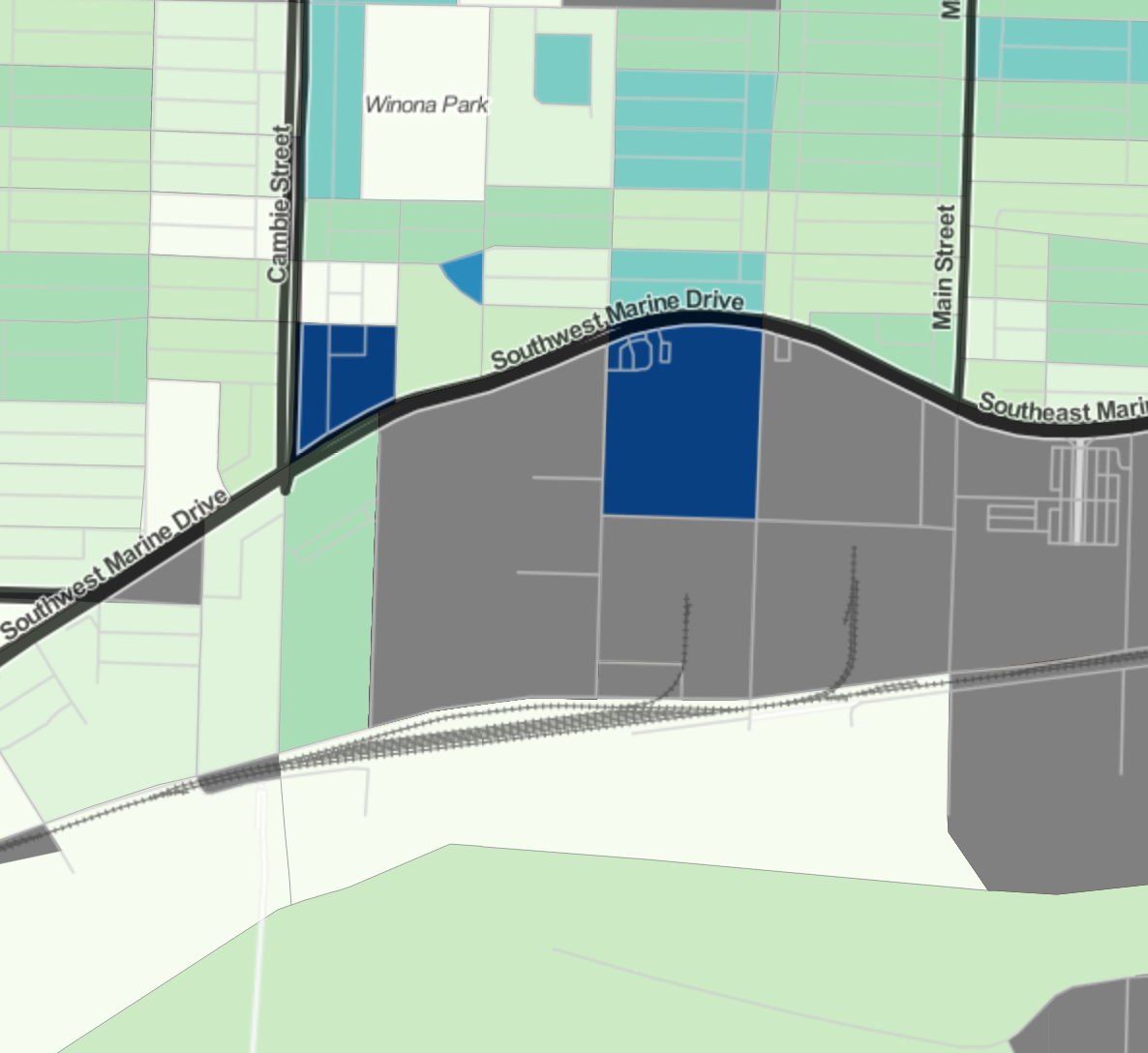
 To understand why surprise maps can be so useful, let’s look a a concrete example. Suppose we want to understand dwelling units that are not used as primary residences. (And incidentally it seems that everyone currently living in Vancouver or Toronto wants to do this.) To that end we can simply consult the map of these based on the 2016 census. As we try and understand better what is happening in each region and we zoom in more and more we start to run into issues. Consider this example looking at the Marine Gateway neighbourhood in Vancouver. We see two areas coloured in dark blue, indicating a high rate. The left is the site of the MC2 development that got completed just before the census and we discussed earlier in detail. The right one is a large area with exactly one private dwelling unit, which happens not to be a primary residence for anyone. If someone did use it as primary residence it would show up on the other extreme end of our colour spectrum. Either way, it does not really give much useful information, it is mostly a distraction that takes attention away from MC2 that has a more important story to tell.
More generally, areas with very low dwelling counts are much more likely to see high variations of rates of non-permanent residence buildings purely for statistical reasons. This results in a “checkerboard” pattern that is mostly due to statistical noise and hides meaningful variations in the data.
Surprise maps
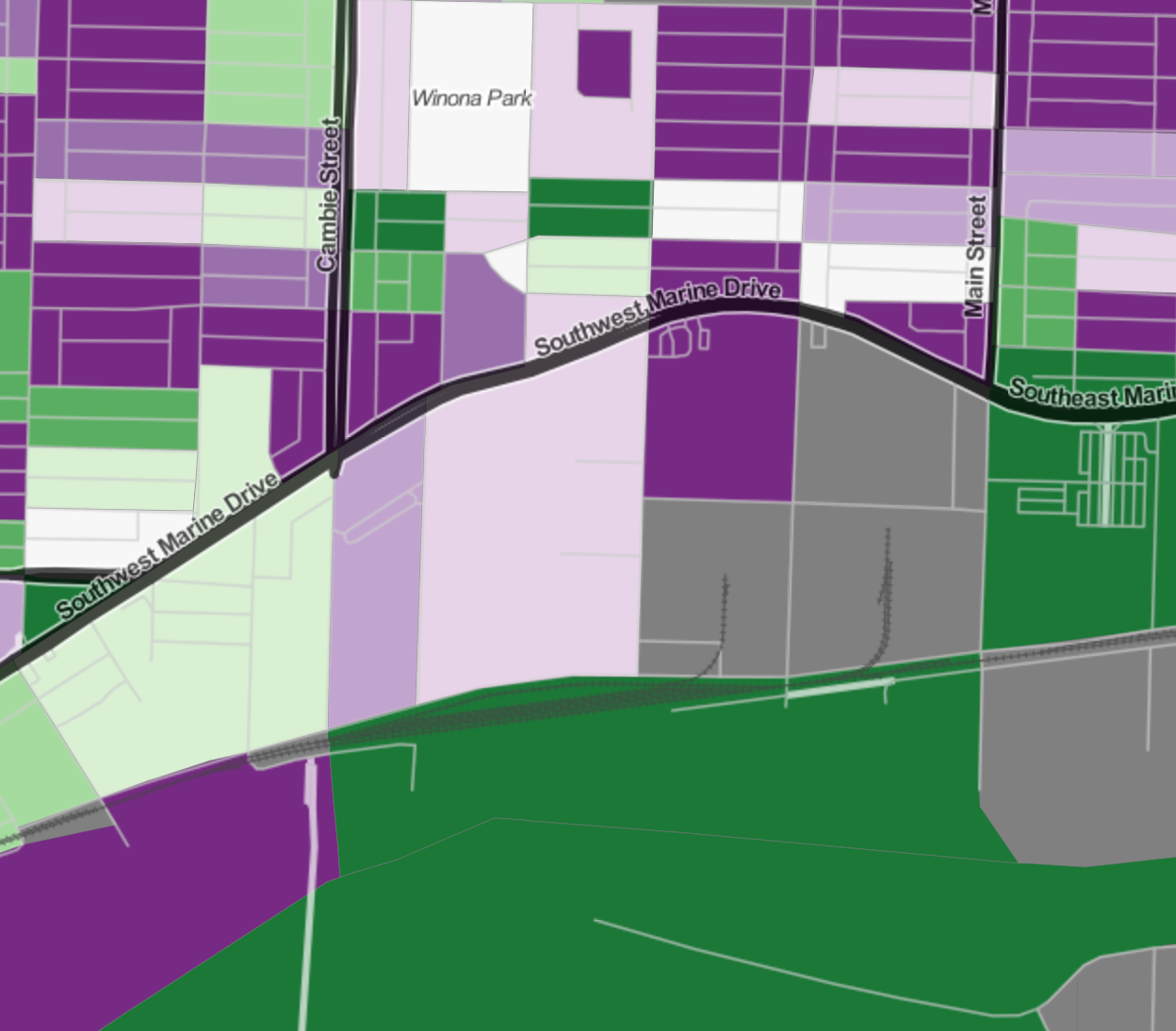
 That’s were surprise maps come in. As a first step, instead of colouring by the rate of non-primary residence dwellings, let’s colour by how this rate differs from our expectations. So we re-interpret our original map as mapping the difference from expectations where the expectation is that all dwellings are used as primary residences. Alternatively we can also take the regional average rate of non-primary residence dwellings and map the deviation from the average. Or we could build a more elaborate model using the 2011 rates and the Canada-wide average rates per net new dwelling unit.
Either way, what we are doing here is we make a guess what we think the rate of non-primary residence units should be in each area and we compare it with observations. The better our guess is, the stronger the “checkerboard” pattern will become as the residuals will be reduced to statistical noise. This as can easily be seen when comparing the more advanced model to the checkerboard observed using the “zero” model. In practice that means that we have to click into each region to see the number of dwelling units, as well as the rate, to understand how we want to interpret the result. Through this labour intensive process we will then weed out the area with just 1 dwelling unit and ignore it.
Surprise maps don’t map the actual difference of model and observation, they map how consistent the model is with the observation in each area. In our initial example of an area with only one dwelling unit in it, no matter if that unit is used as primary residence or not, this cannot be taken as strong evidence that our model is wrong. We should assign this a neutral colour. The MC2 development on the other hand contained 570 dwelling units in 2016, a large deviation from the model indicates that our model prediction might have some problems for that region.
In surprise maps, we colour each area by the amount of evidence observations in a that area gives against our model. To have good evidence against our model, observations should deviate from model prediction, and we should be able to exclude regular statistical noise as a cause for this.
For this example, we chose a mixture of the “base rate” and “de Moivre funnel” models described in this excellent paper where we essentially modify the de Moivre funnel model by allowing an arbitrary model to take the place of the average of our variable. We also keep track of the sign of the evidence we collect against our model, so whether our model underpredicted or overpredicted the rate of non-primary residence dwelling units.
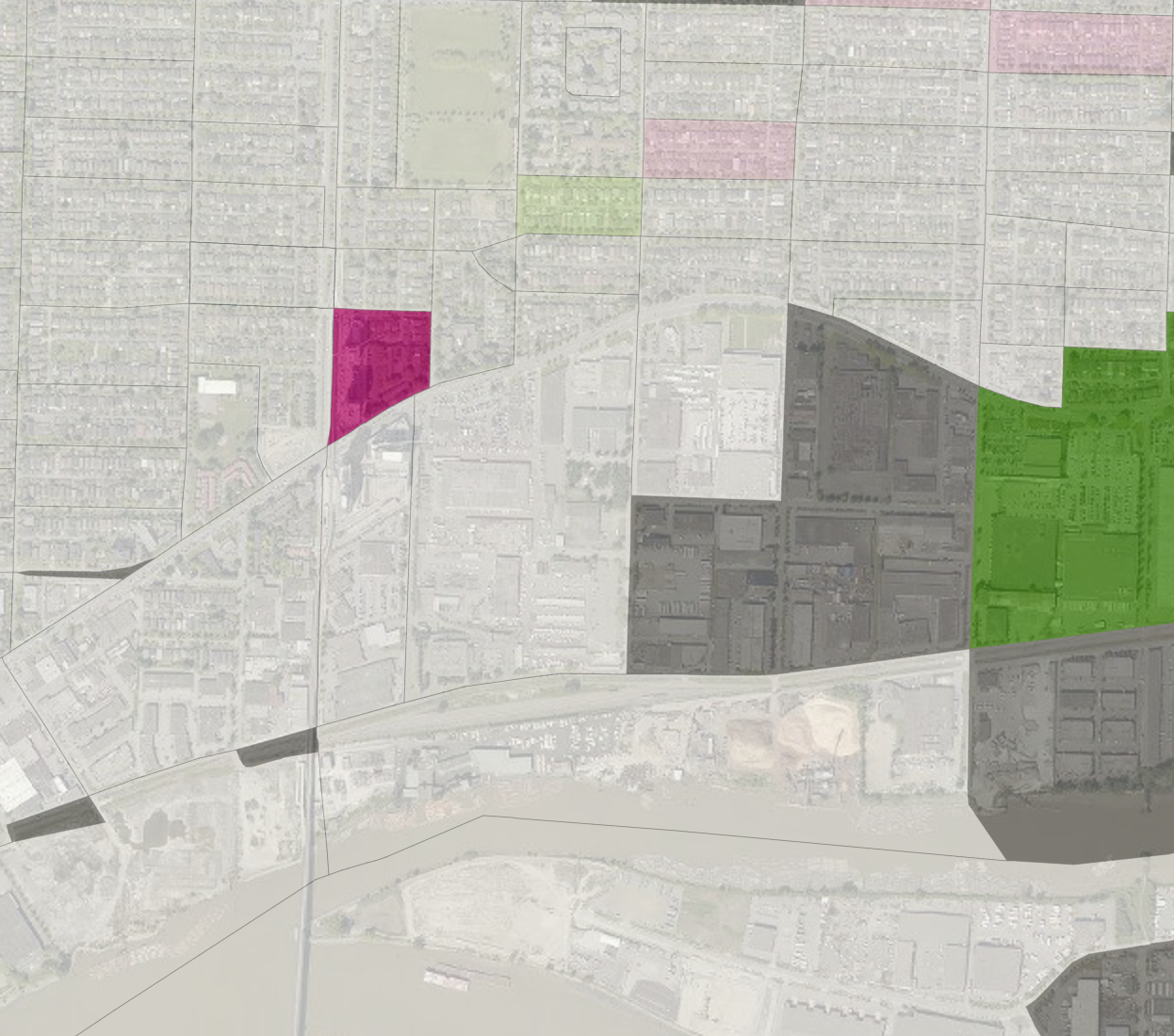
 The result is a map that makes it much easier to sport “surprising” areas, that is areas where observations provide good evidence that our model does not hold well there.
We can now go back to check the Marine Gateway area we looked at before, and we see that the only areas that contribute solid evidence against our model are the unexpectedly high rates at the MC2 development, as well as the unexpectedly low rates at the area to the east between Main and Frasier streets.
Surprise Maps in CensusMapper
 We baked these kind of surprise maps into CensusMapper, so now we can easily apply this to any other kind of observable.
The CensusMapper surprise maps that are implemented right now require as input a “model” , an “observation” a “base” variable (the number of dwelling units, averaged over the 2011 and 2016 censuses in our case) and a standard deviation of the difference between model and predictions. For now, that standard deviation will have to be entered manually for technical reasons. Moreover, other parameters like estimates of accuracy of census counts as well ask statistical rounding and other operations that may have been performed on the data, can be added in to account for the fact that the rate observed in the census is different from the actual rate. We added the ability to make the standard deviation region dependent, which allows us to account for estimates of the accuracy of the census data based on region dependent variables.
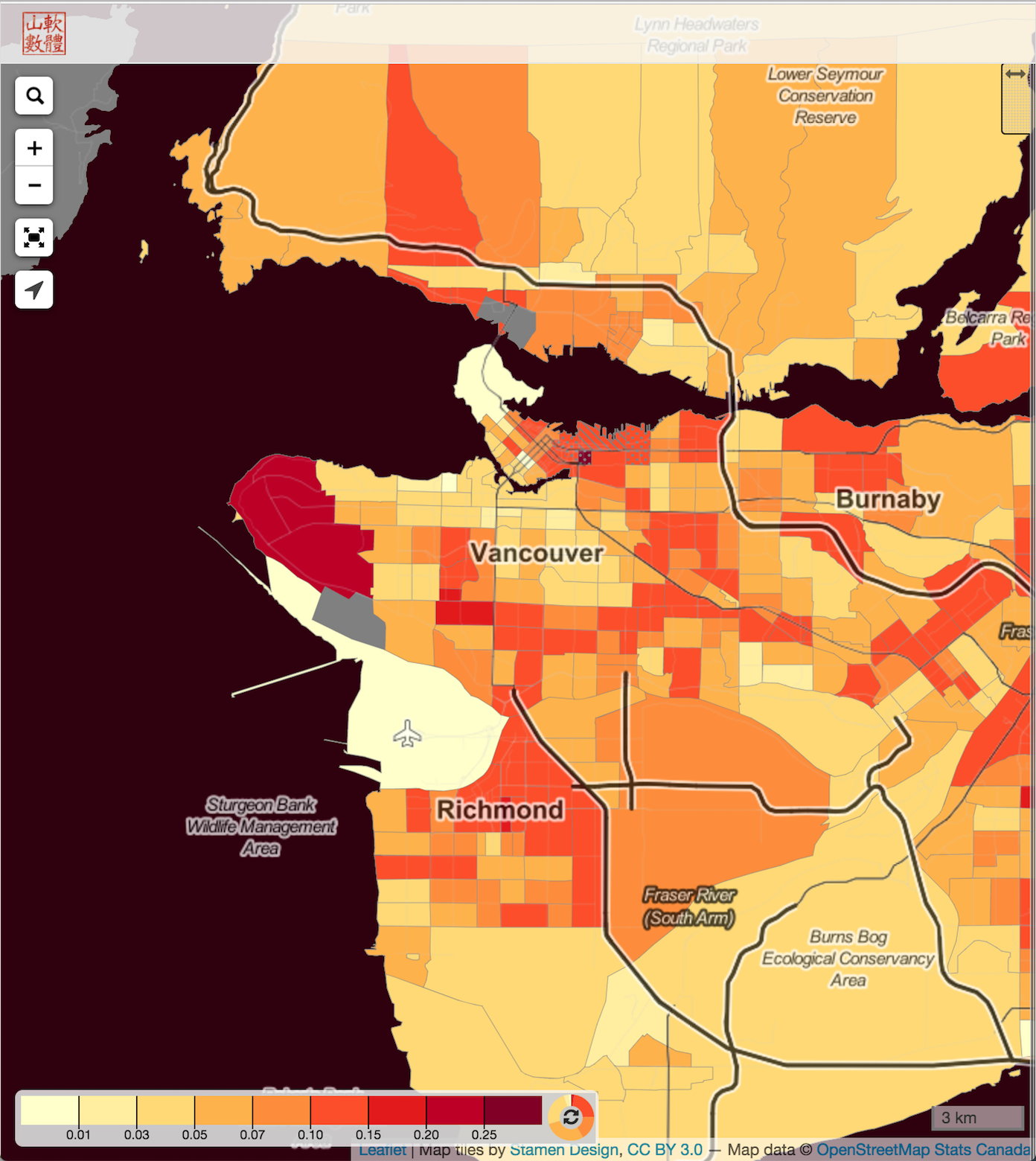
For a simple example what this might look like consider child poverty. We have mapped this variable in CensusMapper, but at times it can be hard to distill out the really important areas that have high child poverty rates as well as a high number of children overall. We have added a scatter plot of the rate vs the total number of children in poverty to the map story, so that the user can more easily determine how significant a high child poverty rate in each particular region is.
Reliability of the data can also be tainted by low NHS return rates, so CensusMapper maps automatically shade to regions that have particularly low NHS return rates (and similarly for the full census return rates) to give some indication of reliability, and we display the return rate on hover. But it is cumbersome to keep track of all this information.
Another way to deal with these issues is to make a child poverty surprise map. As model we can simply use the assumption that there are zero children in poverty in each area. We scale the standard deviation of the child poverty rate linearly by the return rate to weight down areas with low return rate. The result is a map that colours each region by the amount of evidence they provide against the model assumption of zero children in poverty.
This makes it easier to filter out regions that have a low number of children overall, where high rates of child poverty might just be a statistical fluke.
Where to go from here
Should all maps be surprise maps? No, there is value in just mapping straight up census variables, or mapping plain differences of observations from the model. But there are many good reasons why such maps should be complemented, or in some cases even replaced by, surprise maps.
Some kind of automation to aid the selection of appropriate standard deviation for the surprise model is needed before we can open this up to a wider user base. Or CensusMapper server has an R server running that ties directly into the database and communicates with the web server, so we need to build the appropriate scripts that can automate this task.
Another logical extension is to include proximity data into the Bayesian estimates. If one Census Tract provides good evidence against our model, but that evidence is distributed uniformly across Dissemination Areas within it, then our surprise map will show weaker evidence at the dissemination area level simply because each area has a smaller base population. But we could check if the deviation from the model is localized in just one Dissemination Area, or also present in neighbouring Dissemination Areas, and include that information in our estimates. This approach would also help with the problem if the evidence is concentrated in an area that is split between to Census Tracts and drowned out by outher data in these respective tracts. So it won’t show up at the Census Tract level because of the particular ways the boundaries were drawn (MAUP), and it will get diluted out at the Dissemination Area level because of low base population counts. Adding in proximity measures could recover this evidence at the Dissemination Area level.
There are lots of other interesting possibilities of using surprise maps while leveraging the dynamic nature of CensusMapper. One may allow for several models and let relative importance of the models self-adjust with the map view. The output would then be for each map view a linear combination of the models that provides the best fit for the current map view, as well as the evidence each region in the current map view provides against the model.
We will keep experimenting with surprise models and at some point open up some of it’s capabilities to a wider group of CensusMapper users.
Reuse
Citation
@misc{surprise.2017,
  author = {{von Bergmann}, Jens},
  title = {Surprise {Maps}},
  date = {2017-04-10},
  url = {https://doodles.mountainmath.ca/posts/2017-04-10-surprise/},
  langid = {en}
}
