Ever since that Bloomberg article whose claims nobody could reproduce, where the author refused to disclose what data was used, but that got recycled all across the local press there has been a hightened interest in migration patterns in Vancouver. Nathan Lauster took it upon himself to dig deeper and look if Vancouver’s lifeblood was really leaving, which he kept elaborating on as better data became available until the most recent iteration that compares Metro Vancouver to other Candian metropolitan areas as well as the City of Vancouver to other cities within Metro Vancouver using 2016 census data.
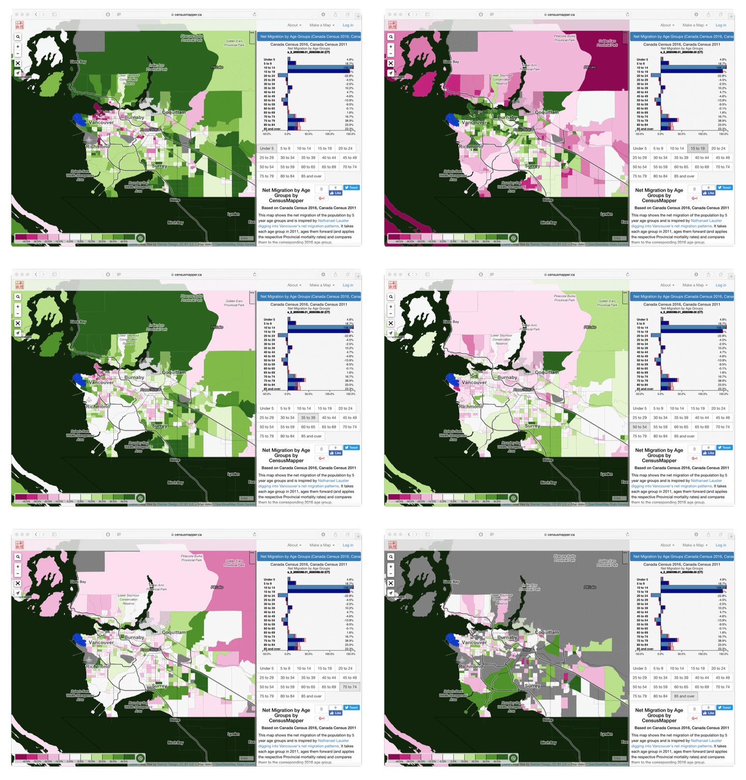 This is seriously good work and we thought it would be helpful to reproduce Lauster’s methods in CensusMapper. The result is a series of maps, one for each five-year age cohort, that visualized net migration of the cohort geographically, while hovering over a region reproduces Lauster’s net migration bar graph for that region.
With CensusMapper, we instantly get the ability to dig into areas to observe finer net migration patterns, and to pan across the country to compare different regions.
For Metro Vancouver, we can see how we have strong net in-migration in all younger cohorts, including children. And as Lauster observed, we see a net out-migration of 50 to 60 year olds.
For the City of Vancouver we see a net in-migration for 5 to 30 year olds, with basically all other age groups exhibiting net out-migration. This is echoed by Burnaby and New Westminster, and to a lesser extend Richmond. We can zoom in further to the Census Tract level to observe spacial patterns of net migration at the sub-municipal level. There we see that net migration of the under 5 cohort and the 20 to 24 cohort are almost exact mirror images. The strongest signal comes from the town centres of the region, that get flooded as the 20 to 24 year old cohort ages into the 25 to 29 year old cohort. As they form families and have kids, the flood reverses and as many children that under 5 that lived in these areas don’t live there any more when they advance to the 5 to 9 cohort.
Sadly we don’t have common tiles for other censuses that would allow for hassle-free comparisons to detect changes over time. (It’s a surprising amount of work to get those common tilings right.) But we can compare this pattern to other population centres in Canada, and this trend seems to hold true universally.
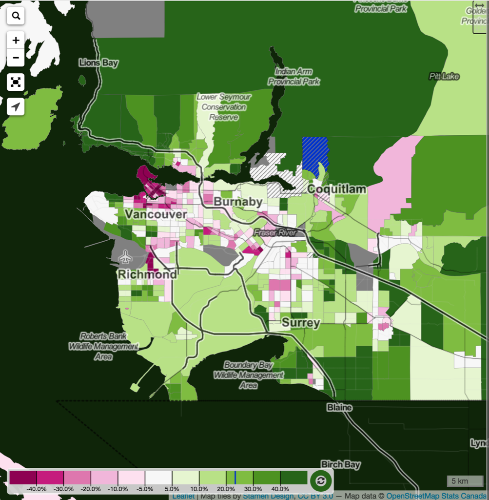
Vancouver
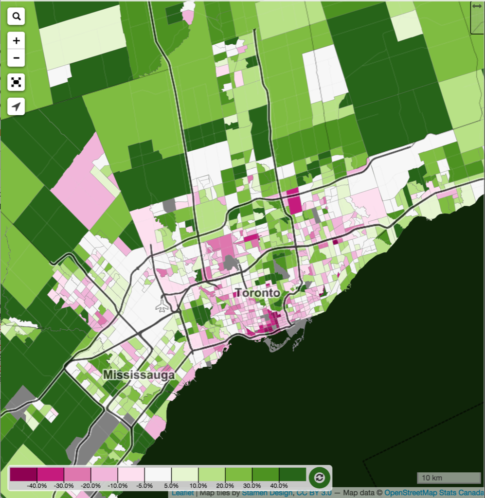
Toronto
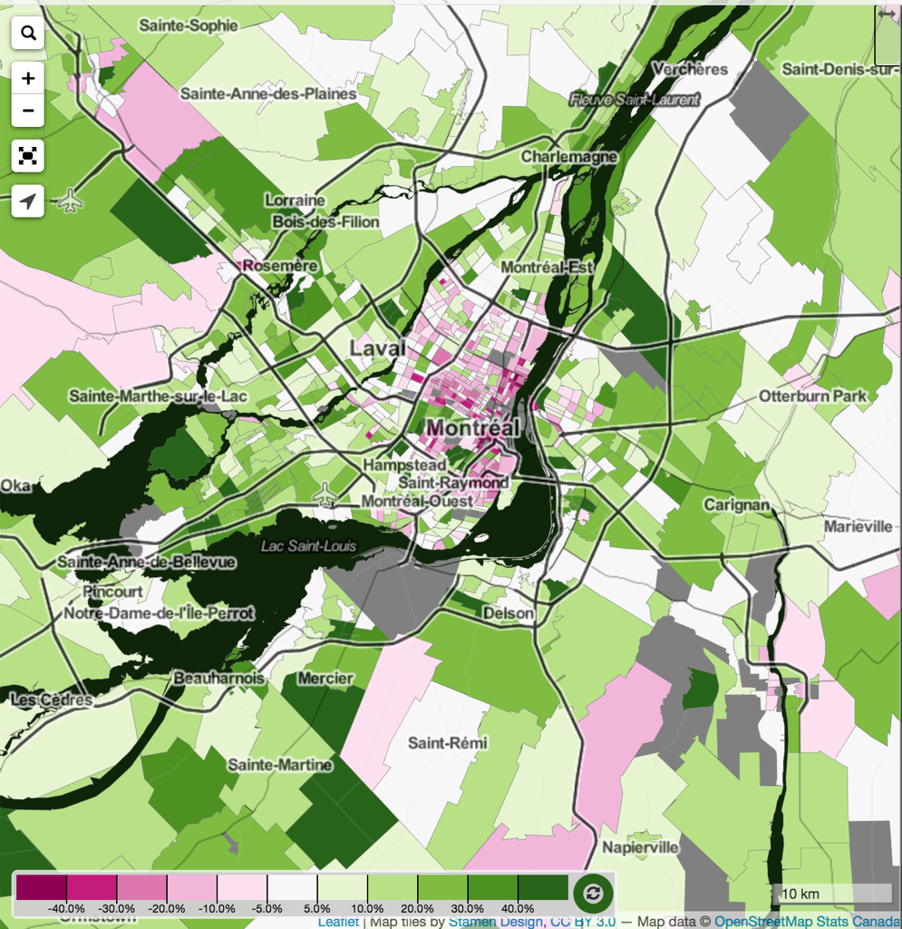
Montreal
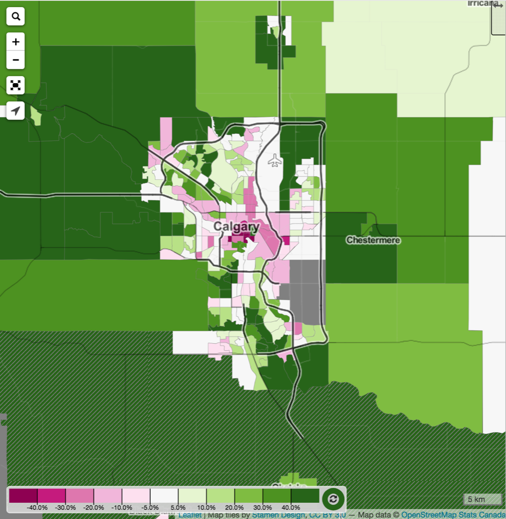
Calgary
Metro Vancouver as a region certainly looks quite healthy in terms of the net migration of it’s age groups. The migration patterns within the region also seem to be consistent with other population centres in Canada. These alone, at least at the qualitative level that we are mapping, does not seem to explain the prevalent feeling of millennials “fleeing” Vancouver. Maybe a more quantitative approach could dig up more. Or it could be that families moving away from the central regions is generally perceived as a “move up” in most cities, but in Vancouver it is viewed as “moving down”.
Technical Details
Common Geographies
The first (and biggest) problem is that the 2011 and 2016 census geographies don’t necessarily match up. But we solved that problem for the 2011 and 2016 censuses.
Easier said than done
The devil is of course always in the details, and as usual it is not until one has reproduced something until one can fully appreciate the work that went into the original piece. There were two main challenges for us to reproduce this within CensusMapper.
The basics
What is net migration? To compute the net migration for an age group, say the “under 5” (in 2011) age group, we want to compare them to an age group in 2016. To do that we need to “age them forward”. Children that were under 5 in 2011 were 5 to 9 years old in 2016. But some, in the case of the under 5 age group only a very small fraction, won’t have lived to 2016. So we need to subtract those out. More formally, we need to apply the apporpriate mortality rates as we age them forward. Then we compare the aged-forward group to the 5 to 9 year old cohort that the 2016 census counted, and we divide by the size of the original under 5 year old cohort (from 2011) to get the percentage net migration.
Mortality
This basic fact of life makes net migration really tricky to get right. Once we get into the older age groups, and thus higher mortality rates, the process is extremely sensitive to changes in the mortality rates. In CensusMapper we are using effective mortality rates of 5 year cohorts from CANSIM for Canada as a whole and the provinces and territories. A fair amount of massaging is needed to make sure this works properly, in particular it is important to interpolate the effective mortality rates as we age a cohort forward. And one should recognise that the mortality rates are based on the age at death, but that an age cohort in the census is, on average, already half way through a given year in their life.
Additionally, there is little reason to believe that there is no geographic variation in mortality rates within the provinces. To deal with that we decided to add an uncertainty band to the graph that allows for a 5% variation in mortality rates.
Uncertainty
The next issue is that census data underwent random rounding to an adjacent number that’s divisible by 5, which leads to an expected error of 1.6. (Actual rounding gives an expected error of 1.2.) When taking differences between censuses, that yields an expected error of 2.2. Additionally, we don’t know the actual number of people in each age group, just the one the census found. The “census undercount” can be quite sizable. Overall it is around 3%, but it varies by age group and geography.
To deal with this we add an error term of a mis-count of 5 people that also shows up in our error bars in the graph.
Fine geographies
CensusMapper is great for exploring all geographic levels. But that can lead to problems when our age cohorts become small in size. We divide by the size of the original 2011 age group cohort, and to avoid running into small denominator issues we cut our estimates off when there are fewer than 50 people in a cohort. Our error bars partially take care of this issue, but at 50 people our error bar already spans 10% points of net migration on either side of the computed value, showing values with even larger error bars is likely to do more harm than good.
Reuse
Citation
@misc{lifeblood.2017,
  author = {{von Bergmann}, Jens},
  title = {Lifeblood},
  date = {2017-05-16},
  url = {https://doodles.mountainmath.ca/posts/2017-05-16-lifeblood/},
  langid = {en}
}
