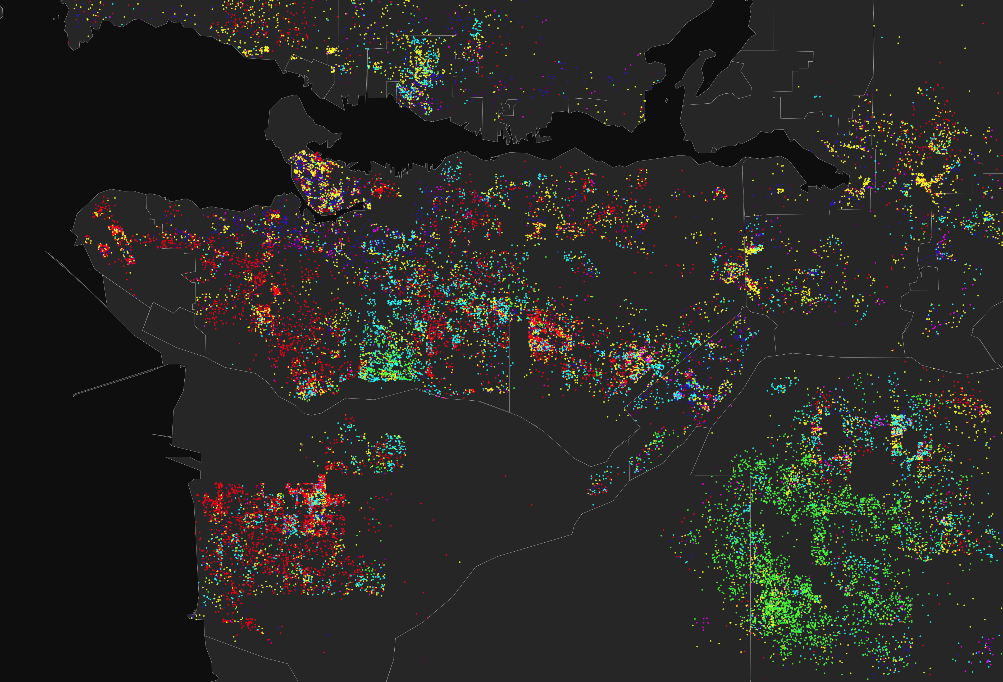
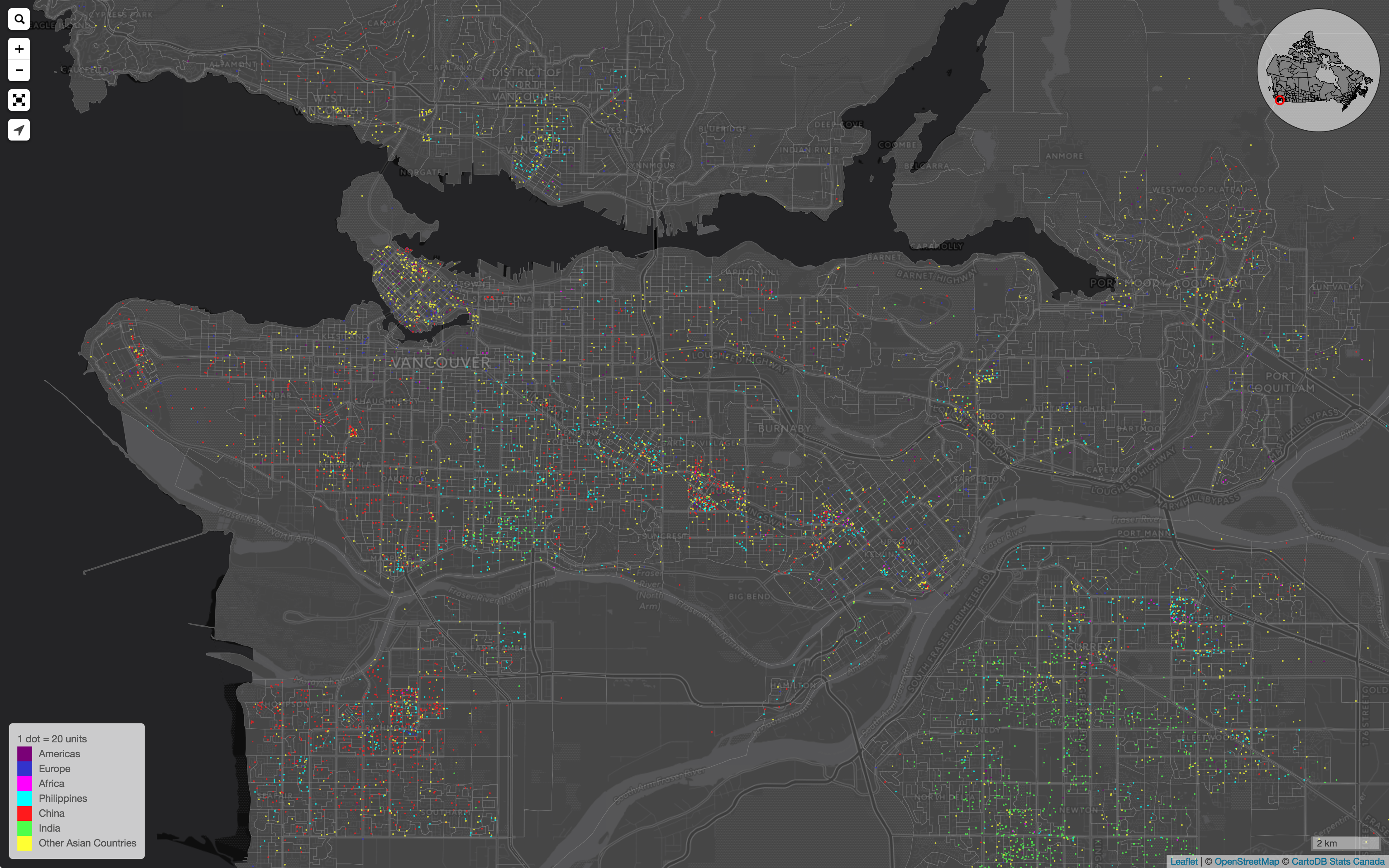
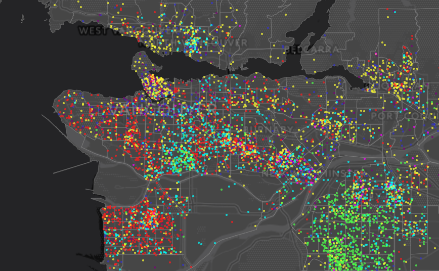
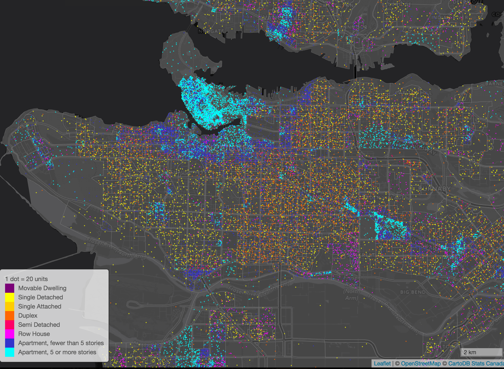
I started writing this blog post in December 2015, when CensusMapper quite a bit younger and I hacked together some basic dot-density maps. I never much liked the results and have been slowly improving and thinking about them. I am still not entirely happy with the current implementation, but it is slowly getting there. The final impulse to finsish this post was the work on cancensus, and R wrapper for the CensusMapper API my explorations in multi-category dot density maps in R, now tied up into the new dotdensity package.
One person at a time
 Dot-density maps look pretty cool. They have been flying around the itnernet lately, so we have been thinking about how to offer them in CensusMapper.
So what’s so great about dot-density maps? Essentially two things:
- They are very simple to interpret. One dot = one person is something everyone understands immediately.
- They can show several variables at once, for example mapping recent immigrants by region of origin like above or mapping ethnic segregation.
But once one looks closer there are lots of issues that need to be dealt with.
The devil is in the details
As simple as the the basic dot-density promise of one dot = one person is, it must fundamentally remain a lie for census maps. We simply don’t have the level of detail that the maps suggest. We don’t know the location of people with the accuracy depicted in the maps, and we certainly don’t know the categories that give the color with the accuracy suggested in the maps.
That’s the most serious drawback of dot-density maps, they often suggest a level of detail that simply isn’t there. Does that outweigh the advantages? For that it is useful to take a quick look at the alternative that we have been using at CensusMapper
Choropleth Maps
Choropleth maps are the staple of census maps. Every census region gets colored depending on a value of a census variable (or function derived from census variables). While this is also quite simple, in practive there are a number of problems with that:
Low population bias. Let’s look at an example to see how this works. Take a map of the percentage of children living in poverty. We immediately see where the percentage of child poverty is high. And child poverty is a problem. But what we don’t see is how many poor children live in each area. So while we see the relative magnitude, we don’t see the absolute magnitude of the problem. So for example the DA north-west of Broadway and Fir sports 66.7% of children living in poverty, but there are only 30 children in the area, and the expected error due to statistical rounding is 10%, let alone errors introduced by non-return bias or simple sampling error. The DA north-east of Arbutus and 33rd has a similar rate of 69.1%, but there are 345 children in that area. So when trying to understand child poverty in the west side of Vancouver one should focus on the latter not the former, but on the map they appear identical. Dot-density maps do a much better job at representing this properly as they would simply draw a dot for each child in poverty, contrasted by a dot for each child not in poverty as you can see here. Another way to deal with this issue is via a surprise map which we have explained in a previous post.
Choropleth maps are difficult to understand. If you read this far you probably have dealt with a fair share of maps and won’t appreciate how some people struggle understanding these. But the amount of time I have spent explaining to journalists what they see in the halloween map of trick or treat density is (torturous) testament of the difficulties people have with these kind of maps. I don’t think I would have gotten any questions if I had simply use the dot-density version instead. However, this only works for the trick-or-treat density map, not the trick-or-treat onslaught map.
One can only show one variable at a time. There are ways to stretch this a little, for example value by alpha maps are one way around this that tackle the population bias. Another way is the RGB maps CensusMapper has. But this does not exactly make it easier to interpret. Dot-density versions of this is certainly easier to interpret plus one is not limited by the three categories of the RGB maps. We can even combine the CensusMapper 3 color mixing with value-by-alpha to also show density.
Dot-Density Maps
One other big challenge with dot-density maps is that they are surprisingly hard to make. Right now we at CensusMapper just have the bare minimum in place to produce these kind of maps: A way to randomly place the required number of dots into each geographic region colored by the given categories. Just when I was about to try myself at dot-density maps I saw a helpful tweet telling me exactly what to pay attention to, so the implementation was quick and painless. – Well, not quite, I still had to deal with issues due to polygons clipped server side and the fact that census areas are often multi-polygons. And one needs to be careful to employ random rounding when scaling to more than one person per dot, standard rounding may introduce systematic errors.
CensusMapper Dot-Density Issues
 1. Clipping. There are still some minor issues due to clipping that can lead to the number of dots being off by a small proportion. I won’t bore you with the technical details, but the good news is that it can be worked out at the expense of adding some more custom code on the client. 2. Dynamic dot-value scaling. CensusMapper maps allow for zooming from country-level down to street level. The one dot = one person paradigm does not work very well on all scales. Visually as well as computationally. The smallest unit to draw is one pixel (or 1 quarter of a pixel on 2x retina displays), and at some point (at the latest when having to draw 33 million dots randomly within different regions in Canada) your browser performance will tank. To fix this we need to dynamically adjust the value of each dot. Instead of 1 dot = 1 person it will be 1 dot = 10 people at lower zoom levels. And at higher zoom levels at some point one dot will have to start to get larger to be more visible. Dynamically changing scales can be confusing though. As we zoom we keep the size of each dot relative to the map constant, but if we re-scale we change the size of each dot relative to the map scale to make it clearer to the user that wer are rescaling.
  3. Non-uniform distribution of population. The current code has the problem of placing the dots randomly in each census geography regardles of where people actually live. This goes back to the fundamental issues that dot-density maps suggest a level of precision that simply is not there. But it definitely is odd to see dots in the Pacific Spirit Park or camping out on Burnaby Mountain. The good news is that there is a partial fix to this. We have population counts at a finer census geometry: Census Blocks. And at the Census Block level we see that nobody lives in the Pacific Spirit Park, or on most of Burnaby Mountain. So to fix this we simply need to shift the way we decide what census geography to display. This is quite difficult to fix within the CensusMapper paradigm of highly dynamic maps where nothing is pre-computed. 4. Visual feedback on hover / select. For choropleth maps we highlight regions on hover so that the user knows what geographic area the variables in the legend and in the popup are for. This is something that is not too difficult to add, but we will have to wait for the next bigger CensusMapper map refresh.
Static dot-density maps
Statis maps is one way where the above issues don’t appear. And most importantly, we can fix issue 3. completely by taking the time to weight the placement of dots by census block level data. The new cancensus R package now makes it super easy to import cenusus data into R, and we wrote a dotdensity R package to implement common functions that deal with the usual pitfalls of multi-category dot-density maps. By moving from CensusMapper to R we trade the dynamic nature of CensusMapper for crisper images and improved processing and dot-placement. Often we aren’t interested in Canada-wide maps that are the staple of CensusMapper, but only want to focus on one particular region. Or maybe a couple of regions, and the cancensus and dotdensity packages still make it very easy to change the region and make the same map for a different geographic region. Or make changes to the variables we want to map. In particular in conjunction with the CensusMapper API helper that reduces the selection of geographies and variables to a couple of mouse clicks and let’s you copy and paste the R code to import the data through cancensus.
The dot-density package has two main functions that we use
dot_density.compute_dots takes care of converting geographic shapes with counts for each category into dots. This is fairly straight-forward, but we need to pay attention to two potential pitfalls.
- The order of the dots need to be randomized so we don’t draw all items of one particular category (colour) last, so that these end up on top and appear more prominent than others.
- When we scale so that 1 dot represents more than 1 unit in our category count, we need to employ statistical rounding, not just regular rounding, otherwise the overall count of the dots may not represent the overall averages. To see this, suppose we want to map German speakers, and we scale so that 1 dot corresponds to 50 German speakers. If German speakers are uniformly distributed in each area so that there are 20 German speakers in each area, regular rounding will produce a map without any German speakers at all. Statistical rounding will properly reflect the total number of German speakers, but they will be randomly placed in each area. Not ideal, we probably should adjust our scale. But better than random rounding. And adjusting the scale is not always an option, for example there might be one cluster of German speakers and a uniform distribution everywhere else.
The dot_density.compute_dots takes care of these issues under the hood. (And so does CensusMapper.)
dot_density.proportional_re_aggregate takes two nested geographies, for example census subdivisions and census tracts. It will compare counts across the geographic levels and adjust the lower-level geography counts with the more accurate higher-level data. If lower level geographic data has been suppressed due to quality or privacy concerns the overall counts at that aggregation level won’t accurately reflect the overall data. The dot_density.proportional_re_aggregate will re-distribute the missing counts proportionately among the lower level geographies, weighted appropriately.
The same function can also be used to weight the dots we want to draw by block level data, so this will produce maps that avoid placing dots in parks or other unpopulated areas, spacing them according to population density at the block level.
Examples
When the data is easily accessible and well-organized, it is incredibly easy to run analysis or visualize it. In CensusMapper, we can make dot-density maps within a matter of minutes, and with the cancensus and dotdensity packages it’s no different in R.
Hear are a couple of examples, first from CensusMapper with links to the live maps, and then from the vignettes embedded into the R package.
CensusMapper
R
Recent immigrants 
Cross-border race 
Reuse
Citation
@misc{dot-density.2017,
  author = {{von Bergmann}, Jens},
  title = {Dot-Density},
  date = {2017-08-24},
  url = {https://doodles.mountainmath.ca/posts/2017-08-24-dot-density/},
  langid = {en}
}

