NHS Income Data, a First Retrospective
There was much hand wringing when NHS income data got released. The change in methods were big, most notably the replacement of the mandatory long form census, that was administered to a random 1 in 5 sub sample, by the voluntary NHS that went out to approximately 1 in 3 households. The (design-weighted) response rate for the NHS was 77%, compared to 94% for the long form in 2006. And the rate of households that allowed a direct match with CRA records dropped from 82% to 73%. This lead to an overall drop in response rate for income data from around 80% in 2006 to around 60% in 2011.
Income data was never a true random subsample, but the voluntary NHS delivered a serious blow to data quality for this important time series.
But not all is lost. Stats Canada has some powerful methods to overcome some of these problems. 2011 still had the basic short form census, and that can be used to benchmark the NHS against. The short form tells us something about who returned the long form - and who did not. And Stats Canada has the ability to link households through time to learn more about biases in which households returned the census and which did not. And it had the ability to fold in other administrative data, like CRA tax returns and immigration data, to adjust aggregate data. And such post-processing was performed on the NHS income data. In fact, such post-processing is performed on all censuses. The following table shows how this has effected the released income numbers.
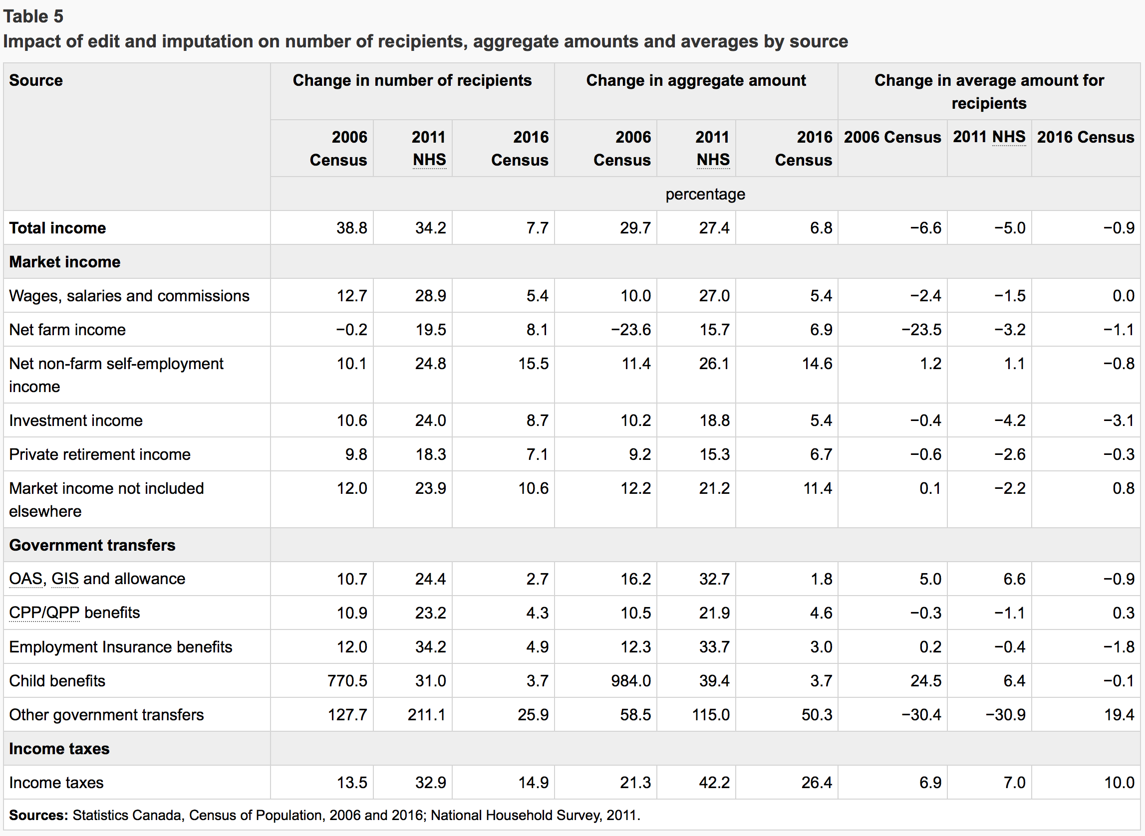
The question now is, how do the NHS income numbers after post-processing stack up?
Evaluating NHS Income Data
There are a variety of ways to assess the quality of the NHS income data. One it to compare it to T1 taxfiler data. That works reasonably well for individual incomes, although there are a number of caveats. The two are based on a slightly different pool of people and include slightly different types of income. The census only reports on people in private households, whereas the T1 data includes all taxfilers. And T1 data includes RRSP withdrawls but census data doesn’t.
Comparing data from different sources are tricky, but some of these can be mitigated by comparing the change over time, instead of comparing the two datasets for a fixed time. Several groups have carried out such analysis, StatCan included some overview results in their Income Reference Guide and several local groups carried out their own analyses, for example this one for Waterloo.
We will not go down this road in this post, mostly because CensusMapper does not have CT level CRA data (which requires a custom tabulation that is outside of the scope of our usual work, and researchers we contacted that have this data weren’t willing to share it for the greater public benefit).
The other part of the reason is that we wanted to try out a different kind of analysis.
Sandwiching the NHS
We will focus on median household incomes in Metro Vancouver and try and understand how NHS data fits in between the 2006 and 2016 censuses. There are some fundamental issues in our analysis that we will conveniently ignore. Most importantly, the geographic regions have changed between the censuses. So we can’t compare median incomes in all regions. In the 2016 data Stats Canada has stopped reporting average incomes, which makes it impossible to re-aggregate the data to a common tiling across censuses like we have done e.g. for our net migration map. At least without a custom tabulation. The redeeming quality of this is that the areas that change between censuses are generally the fasted growing ones, where we would also expect to see that the models we employ below would perform worse. Still, for these reasons, and because the limit on the time I can justify dedicating to this, this post is just an exploration, not a proper statistical analysis. And, at times, we will invoke the privilege of a blog post and rely on weasel words instead of making precise statistical statements.
Let’s first look at the median household incomes for all of Metro Vancouver. Here we can be reasonably confident that the numbers reported in all three census, including the 2011 NHS, are robust due to the large population base and the post-processing done by StatCan. We will use cancensus to load the data.
library(cancensus)
regions=list(CMA="59933") # 59933 for Metro Vancouver, 35535 for Metro Toronto, 48825 for Calgary, 24462 for Montreal, 505 for Ottawa
vector_list=list('CA06'="v_CA06_2000",'CA11'="v_CA11N_2562","CA16"="v_CA16_2397") # Median Household Total Income
inflation_list=list('CA06'=0.8465679,'CA11'=0.9220553,"CA16"=1) # Relative CPI to convert to constant 2015 dollars
label_function <- function(x){return(paste0("$",format(round(x/1000)),"k"))}
# uncomment this if running analysis on limat percentage instead
#vector_list=list('CA06'="v_CA06_1981",'CA11'="v_CA11N_2606","CA16"="v_CA16_2540") # LIMAT %
#inflation_list=list('CA06'=1,'CA11'=1,"CA16"=1) # don't adjust LIMAT data
#label_function <- function(x){return(paste0(x,"%"))}With a convenience function defined to load the data into a data frame we grab the overview data for Metro Vancouver.
overview_data <- get_income_data(names(regions))
overview_name <- paste0(sub(" \\(.+\\)$","",overview_data$`Region Name`)," ",names(regions))
income_dumbbell(overview_data, overview_name,y="name")
We see that the 2010 NHS income number (in blue) sits neatly between the 2005 (in red) and 2015 (in green). To be more precise, the adjusted median household income grew 5.3% between 2005 and 2010 and it grew 5.8% between 2010 and 2015. Another way to view this is to say that the 2010 NHS income number is situated at 46.6% up the adjusted income gain between 2005 and 2015.
Modelling 2010 Income Data for Sub-Regions
For this post we will use two naive approaches to model 2010 income numbers.
Model 1
Model 1 assumes that the sub-region income growth occurred uniformly at the metro level rate of 5.3%.
Model 2
Model 2 uses the hindsight of 2015 income data and assumes that changes in income over the time period between 2005 and 2015 were uniform in time in each sub-region, so that the 2010 actual income sat at 46.6% between the 2005 and 2015 numbers. We use this as our “best guess” model.
The rationale behind these models is that, to first approximation, change is generally gradual in time and uniform in space. We will formalize this a bit later.
2010 Income Data for Sub-Regions
We start off by looking at Metro Vancouver’s medium and large municipalities.
csd_data <- get_income_data("CSD") %>%
  mutate(income_estimate_1_2011= income_estimator_1_2011(income_adj_2006),
         income_estimate_2_2011=income_estimator_2_2011(income_adj_2006,income_adj_2016),
         `Model 1 Difference`=income_adj_2011/income_estimate_1_2011-1,
         `Model 2 Difference`=income_adj_2011/income_estimate_2_2011-1)
income_dumbbell(csd_data %>% filter(Households > 10000), paste0("Municipalities with at least 10,000 households in ",overview_name),y="name")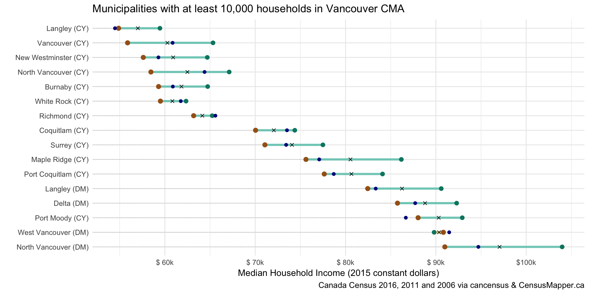
That looks pretty good, in most cases the 2010 data sits in the range between the 2005 and 2015 data where we would expect it to be, with a few exceptions (which should also be expected), but nothing out of the ordinary. Especially the larger cities seem to show a good match, with Richmond registering a drop from 2010 to 2015 that could be a reflection of to the increase in one-person households during that time.
Census Tracts
So let’s pull in the income data for Metro Vancouver’s census tracts and see how our expectation stacks up against the NHS numbers.
data <- get_income_data("CT") %>%
  mutate(income_estimate_1_2011= income_estimator_1_2011(income_adj_2006),
         income_estimate_2_2011=income_estimator_2_2011(income_adj_2006,income_adj_2016),
         `Model 1 Difference`=income_adj_2011/income_estimate_1_2011-1,
         `Model 2 Difference`=income_adj_2011/income_estimate_2_2011-1)
income_dumbbell(data, paste0("Census Tracts in ",overview_name))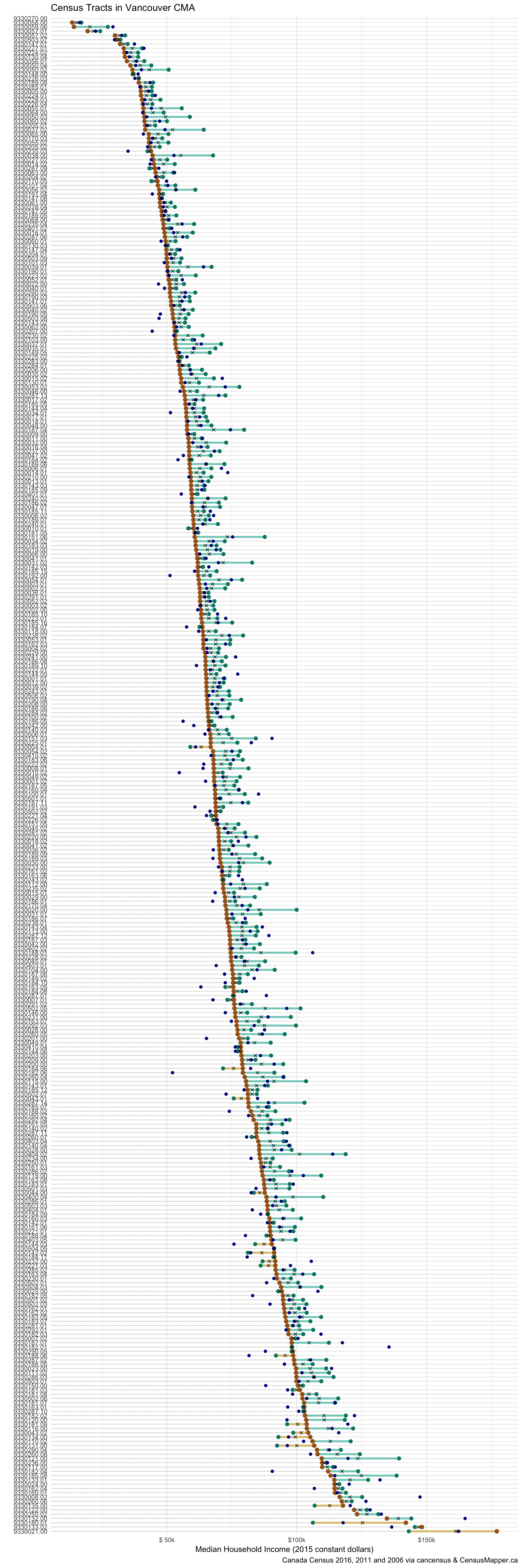
We see that in just over half of the tracts the 2010 NHS number lies within the range, but in 27.4% of the cases the NHS number is below the range and in 21.2% above. We would certainly expect it to lie outside the range in some cases, but not in so many. Over the 10 year time frame the income decreased in 11% of the tracts, over the two 5 year time frame it decreased by 29.1% and 22.9%. We would expect the 5 year data to be more volatile, but again not by that much.
Taking a look at the relative difference of our expectation and the NHS numbers we see that in general the deviation seems balanced,
ggplot(data %>% gather(key="Model", value="Relative Difference", c("Model 1 Difference","Model 2 Difference"))) +
  geom_density(aes(x=`Relative Difference`, color=Model)) +
  labs(title="Relative Difference of Estimates to NHS (CT level data)")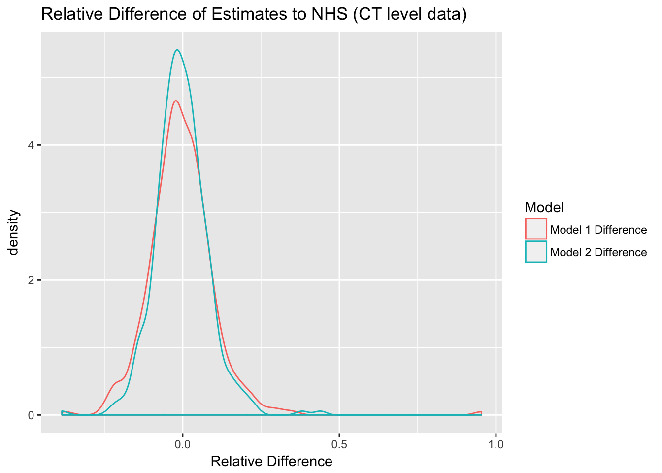
skewing slightly low. As should be the case, the NHS data is more consistent with our Model 2 assumptions than with Model 1.
Temporal Correlations
Testing the idea of temporal auto-correlation more formally, we would expect that the median incomes from adjacent censuses correlate higher than the the ones from the 10 year difference. The correlation coefficients are
| Comparison | CT Level Coefficient |
|---|---|
| 2005 to 2015 | 0.9444 |
| 2005 - 2010 NHS | 0.9425 |
| 2010 NHS - 2015 | 0.9449 |
| 2010 Model 1 - 2015 | 0.9444 |
What we see is that the 2010 NHS income numbers correlate better with the 2015 numbers than both the 2005 numbers and our Model 1, even though the correlation with 2005 numbers is quite poor. This redeems some of the quality concerns we observed earlier, and addresses some of the criticism initially leveraged against the NHS income numbers, namely that they appeared out of line with 2005 incomes.
The takeaway here is that the 2010 census tract income numbers add value over both, just having 2010 numbers and our naive model. But serious quality concerns remain.
Spatial Correlations
The next step is to check for biases in the NHS income data. One simply way to do this, without actually having to check for explicit biases, is to run a spatial auto-correlation of the relative difference of the NHS data to our “best guess” Model 2. If there is bias in the NHS data, it ought to show up in as spatial auto-correlation as pretty much any potential demographic variable linked to non return bias will have spatial auto-correlation.
As a first step, let’s visualize the spatial relationships between the relative difference of the NHS median incomes from our Model 2 expectation.
geos <- get_census(dataset = "CA16",
                   regions=regions,
                   level="CT",
                   geo_format = 'sf') %>%
  left_join(data, by="GeoUID") %>%
  mutate(bins=cut(`Model 2 Difference`,c(-Inf,seq(-0.25,0.25,0.1),Inf),c("Below -0.25","-0.25 to -0.15","-0.15 to -0.05","-0.05 to 0.05","0.05 to 0.15","0.15 to 0.25","Above 0.25")))
ggplot(geos) +
  geom_sf(aes(fill=bins)) +
  scale_fill_brewer("Relative Difference",palette = 'PiYG',na.value="grey80") +
  ggtitle("Difference of NSH from Expectation") +
  theme_void()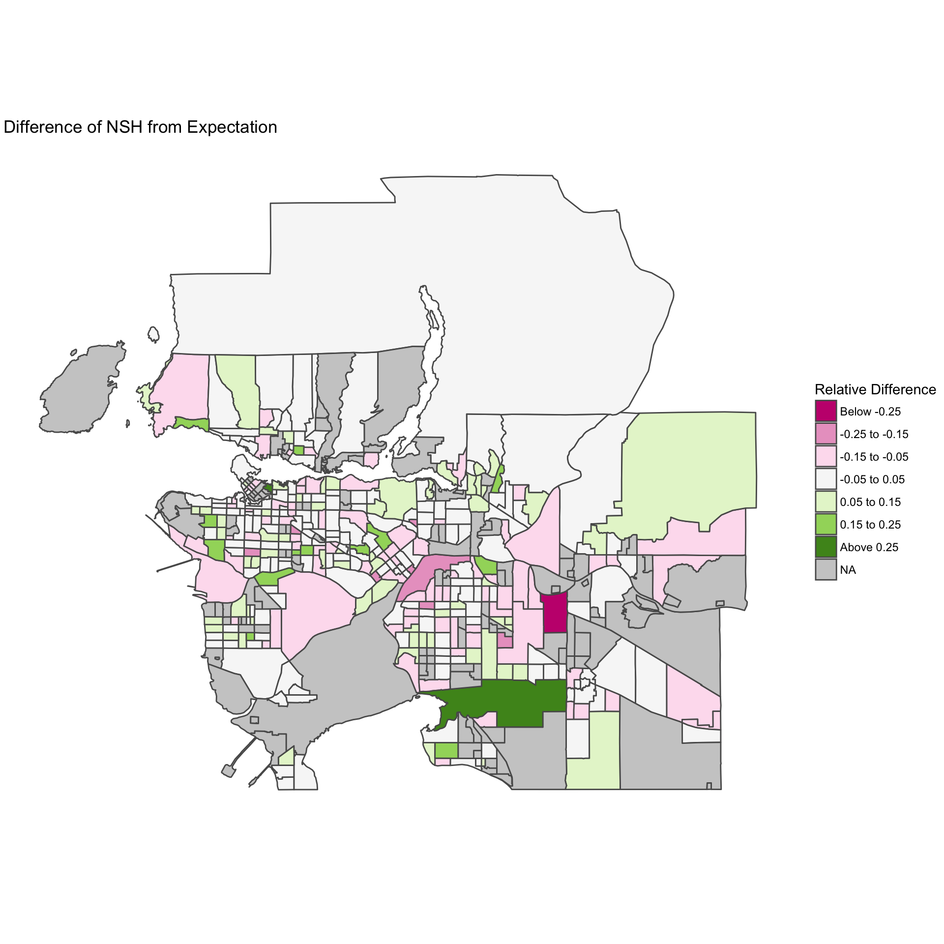
Testing formally for spatial auto-correlation
sp=as(geos %>% select("Model 2 Difference") %>% na.omit,"Spatial")
wr <- poly2nb(sp, row.names=sp$GeoUID, queen=TRUE, snap=0.005)
#plot(sp, col='gray', border='blue')
#plot(wr, coordinates(sp), col='red', lwd=0.5, add=TRUE)
ww <-  nb2listw(wr, style='B', zero.policy = TRUE)
moran.mc(sp$Model.2.Difference, ww, nsim=500, zero.policy = TRUE)
##
## Monte-Carlo simulation of Moran I
##
## data: sp$Model.2.Difference
## weights: ww
## number of simulations + 1: 501
##
## statistic = -0.00096903, observed rank = 293, p-value = 0.4152
## alternative hypothesis: greaterthe results are inconclusive. For visual confirmation, we plot the auto-correlation.
moran.plot(sp$Model.2.Difference, ww, zero.policy = TRUE)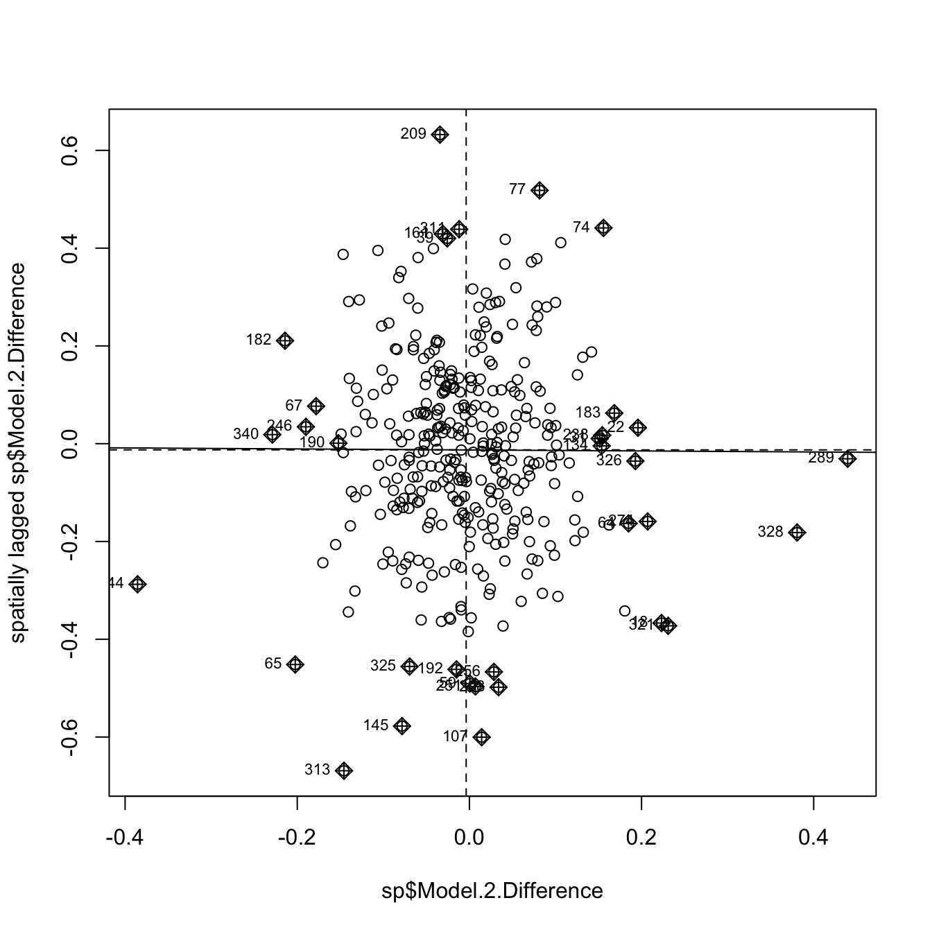
Let’s quickly re-run our tests at the Dissemination Area level. Dissemination Area level is prone to be much more noise than census tract level data, but also much more prone to bias. If the bias dominates we would expect to see stronger non-random spatial patterns, although they may be masked by random noise due to the smaller sample size for DAs.
data_da <- get_income_data("DA")
data_da <- data_da %>% mutate(
  income_estimate_1_2011 = income_estimator_1_2011(income_adj_2006),
  income_estimate_2_2011 = income_estimator_2_2011(income_adj_2006,income_adj_2016),
  `Model 1 Difference`=income_adj_2011/income_estimate_1_2011-1,
  `Model 2 Difference`=income_adj_2011/income_estimate_2_2011-1)
ggplot(data_da %>% gather(key="Model", value="Relative Difference", c("Model 1 Difference","Model 2 Difference"))) +
  geom_density(aes(x=`Relative Difference`, color=Model)) +
  labs(title="Relative Difference of Estimates to NHS (DA level data)")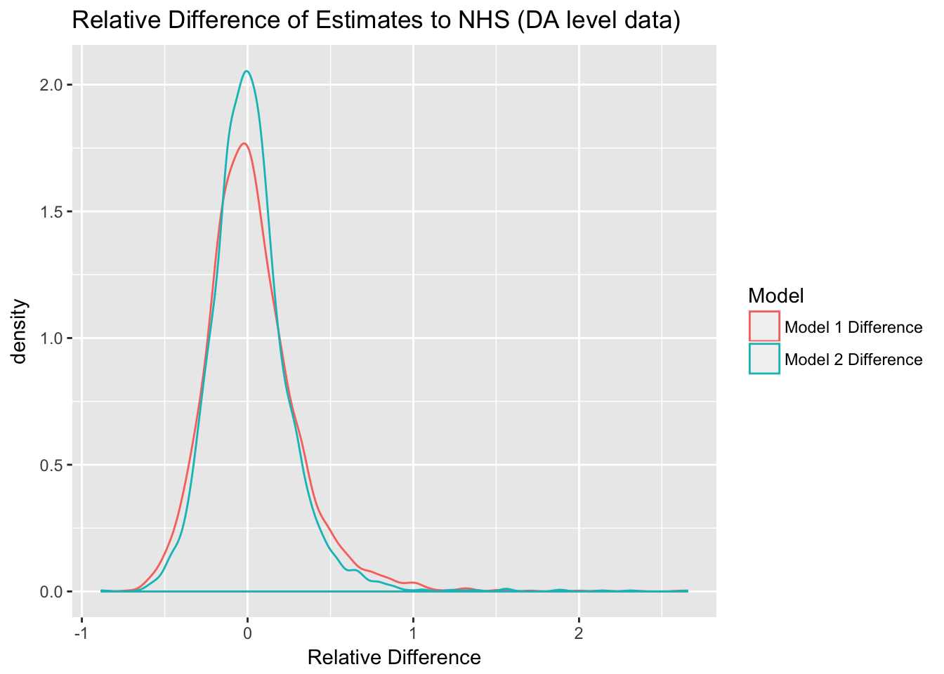
As expected, the DA level data is significantly more noisy. In 35.1% of the cases the NHS number is below the income range set by 2005 and 2015 numbers, and in 31.9% above.
We can again check the temporal correlation coefficients, they are
| Comparison | DA Level Coefficient |
|---|---|
| 2005 to 2015 | 0.7508 |
| 2005 - 2010 NHS | 0.6792 |
| 2010 NHS - 2015 | 0.804 |
| 2010 Model 1 - 2015 | 0.7508 |
and we again see that the 2010 NHS numbers correlate better with 2015 numbers than either 2005 number or our Model 1.
geos_da <- get_census(dataset = "CA16",
                   regions=regions,
                   level="DA",
                   geo_format = 'sf') %>%
  left_join(data_da, by="GeoUID")
Running the spatial autocorrelation at the DA level
sp_da=as(geos_da %>% select("Model 2 Difference") %>% na.omit,"Spatial")
wr <- poly2nb(sp_da, row.names=sp$GeoUID, queen=TRUE, snap=0.001)
#plot(sp, col='gray', border='blue')
#plot(wr, coordinates(sp_da), col='red', lwd=0.5, add=TRUE)
ww <-  nb2listw(wr, style='B', zero.policy = TRUE)
moran.mc(sp_da$Model.2.Difference, ww, nsim=500, zero.policy = TRUE)
##
## Monte-Carlo simulation of Moran I
##
## data: sp_da$Model.2.Difference
## weights: ww
## number of simulations + 1: 501
##
## statistic = 0.032273, observed rank = 501, p-value = 0.001996
## alternative hypothesis: greaterwe see that the spatial distribution of the relative difference exhibits weak clustering at the DA level, and it points to weak systematic biases in the data.
Other Metro Areas
It is prudent to check how these results compare to other regions in Canada. This simply involves changing the name of the region in the top code snippet. We will spare the details, they are easy enough to check by downloading the R notebook and running it. So we just report summary results.
Toronto yields similar results, with weak non-random variations also appearing at the CT level. Calgary does not show any significant non-random variation, only weakly significant dispersion at the CT level. Montreal shows weak clustering at the CT level that is eaten up by noise at the DA level. Ottawa displays weak dispersion at the CT level that also gets taken over by noise at the DA level.
Most importantly, in all cases do we see that the strongest correlation in our CT and DA level tables is the one between the 2010 NHS and the 2015 data.
Understanding the Biases
The census has a wealth of variables that we can use to explore this bias, and it is tempting to start to test against variables that have been identified as effecting the non-return rate of the NHS.
This is probably a good time to remind ourselves that the NHS income data is the result of post-processing by Stats Canada, so any investigation of that sort will only be able to discover the bias in these post-processed values.
Another obstacle is that we will have to investigate the relationships between census variables and biases in NHS income numbers at the aggregate level, which requires powerful statistical tools to make inferences about the relationship at the individual level that we are after.
We will leave this for another day and another post.
The Verdict
The bottom line is that the general caveats for NHS income data remain in place. At higher aggregation levels the NHS post-processing yielded fairly reliable results for standard statistics like medians. At finer levels like census tracts, the data becomes much more noisy and, in some regions, weakly biased.
Keeping some of the limitations of our analysis in mind, it does point toward some redeeming features of the NHS data. Even though it is quite noise and may exhibit weak biases, it has added a lot of value to analyses. And some of the early criticism, namely the large discrepancy from 2005 results, is partially redeemed by showing much better relation to the 2015 income data.
Improvements on this Analysis
There is plenty of rooms for improvement of this analysis. As usual, the entire analysis is embedded in this blog post and can be downloaded from GitHub. Feel free to fork, download, or file and issue or a pull request if you find errors or problems in the analysis. If you may wish to just reproduce the analysis for a different region, or a different variable, that you are interested in, just grab the code and make the appropriate changes.
Reuse
Citation
@misc{a-retrospective-look-at-nhs-income-data.2017,
  author = {{von Bergmann}, Jens},
  title = {A {Retrospective} {Look} at {NHS} {Income} {Data}},
  date = {2017-09-29},
  url = {https://doodles.mountainmath.ca/posts/2017-09-29-a-retrospective-look-at-nhs-income-data/},
  langid = {en}
}
