Recently there was some discussion at my son’s school about the hot lunch program, and who should pay for those who need a subsidy. Which made me curious how that works. Here is what I learned.
Student Vulnerability
Before we can talk about the VSB meal program, we need to talk about student vulnerability. VSB’s program concentrates its resource where the need is highest. Schools get ranked into tiers depending on the proportion of vulnerable students and categories and resources get attributed by tier. VSB uses the provincial Supplemental Security Income (SSI) data to determine the number and proportion of vulnerable students.
That is a reasonable approach, most importantly because it captures attributes of students actually attending the school as opposed to the properties of children in the catchment, some of which may attend other schools. It is not clear to me how well the match between SSI and VSB students is or can be done, this kind of record matching is bound to miss some case. VSB correlated that metric with other demographic and school level indicator to validate it. At the same time, demographics of vulnerable students can shift fairly fast in some schools, so VSB regularly checks the SSI numbers to ensure that resources keep getting to the schools most in need. As shifting resources from one school to another comes with a considerable amount of friction, VSB applies some multi-year smoothing on the data to avoid unnecessary shifts.
However, it seems that not considering child poverty numbers is a fairly glaring omission in the VSB analysis. VSB did check for households with income under $30,000, but that seems like a very poor proxy as it is not adjusted by family size, does not separate out income of families with children from others and the VSB analysis accordingly only found a weak correlation to SSI. With fresh 2015/2016 data available we now can fill this gap.
Child Poverty By Catchment
Let’s look at child poverty by school catchment. Using cancensus that ties into our CensusMapper API this is fairly straightforward, we have to assemble the regions that make up VSB and load in the data. Without going into too much details, the census has two separate low income measures, LIM-AT and LICO-AT. LICO-AT seems best suited for our needs. One problem is that only two age groups are available, Under 6 and Under 18. Under 6 has very little overlap with the elementary school population, whereas Under 18 is a little too broad and risks including those students which live outside their parents household but not in student housing in their own private household. But by looking at the range between these two numbers we should get a good enough proxy for child poverty of elementary school children without having to go to a custom tabulation.
library(cancensus)
rs=list(CT=c("9330069.01","9330069.02"), CSD=c("5915022","5915803"))
vs=c("v_CA16_25","v_CA16_2513","v_CA16_2558","v_CA16_2573","v_CA16_2516","v_CA16_2561")
data <- get_census(dataset='CA16', regions=rs, vectors=vs,
                   labels="short", geo_format='sf', level='DA') %>%
  rename(elementary_children = v_CA16_25,children = v_CA16_2513,
         poor_children = v_CA16_2558, poverty_rate = v_CA16_2573,
         young_children = v_CA16_2516, poor_young = v_CA16_2561) %>%
  mutate(poverty_rate=poverty_rate/100)

data %>% as.data.frame %>%
  select(children, elementary_children, poor_children) %>%
summarize_all(sum, na.rm=TRUE) %>% kable(format="html")| children | elementary_children | poor_children |
|---|---|---|
| 88525 | 23620 | 14895 |
Where are the poor children?
ggplot(data) + geom_sf(aes(fill = poverty_rate),size=0.1) +
  scale_fill_viridis_c(na.value="grey", option="magma", labels=percent) +
  labs(caption=caption1) +
  theme_void()
Matching with School Catchments
We need the geographies of the school catchments. The Vancouver Open Data Catalogue has these, but unfortunately they are at least three years out of date as we have noticed before. But this will do for our purposes, even though the catchments are wrong for UHill, the school my son is in and that triggered this post.
schools <- read_sf("schools/elementary_school_boundaries.shp") %>%
  st_transform(4326) %>% rename(school=NAME)

data <- populate_custom_regions(data,schools,"school")

summary <- data %>% as.data.frame %>% group_by(school) %>%
  select(school, children, poor_children) %>% summarise_all(sum, na.rm=TRUE) %>%
  mutate(rate=poor_children/children) %>% arrange(desc(rate))
Visual check on match
It’s a good idea to get visual feedback on how good our match of catchments with census areas is.
Overall, this shows that Dissemination Area level data is suitable to match school catchment areas. We can further improve this by going to down dissemination blocks and estimating the population of children and children in poverty by distributing the higher level Dissemination Area data proportionally by population counts. This will in some cases not be entirely accurate, but in aggregate this should improve the overall accuracy of our estimates. Our dotdensity R package has the functionality to do this built in.
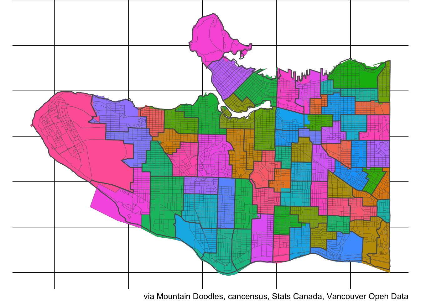
We see that the match is much improved, although this involved the minor assumption that children are uniformly distributed among the population in the overlap areas.
Poverty Rate by School Catchment
Next we check the child poverty levels at the 10 schools with the highest rates, splitting the children under 18 into the young children under 6 and the old children 6 to 17.
db_summary %>% arrange(desc(child_rate)) %>% top_n(10,child_rate) %>% kable(format='html')| school | children | poor_children | young_children | poor_young | child_rate | young_rate | old_children | poor_old | old_rate |
|---|---|---|---|---|---|---|---|---|---|
| Seymour Elem. | 484 | 227 | 175 | 55 | 0.4691614 | 0.3146944 | 309 | 172 | 0.5564137 |
| Strathcona Elem. | 895 | 370 | 305 | 110 | 0.4134495 | 0.3606557 | 590 | 260 | 0.4407454 |
| University Hill Elem. | 2676 | 945 | 876 | 255 | 0.3532244 | 0.2910357 | 1800 | 690 | 0.3834954 |
| Thunderbird Elem. | 784 | 220 | 202 | 60 | 0.2806506 | 0.2984886 | 582 | 160 | 0.2744483 |
| Jamieson Elem. | 1192 | 331 | 379 | 88 | 0.2773107 | 0.2332418 | 813 | 242 | 0.2978765 |
| Maple Grove Elem. | 1568 | 399 | 362 | 112 | 0.2546904 | 0.3086090 | 1207 | 288 | 0.2385331 |
| Osler Elem. | 885 | 224 | 231 | 58 | 0.2526800 | 0.2508624 | 654 | 166 | 0.2533210 |
| Britannia Elem. | 676 | 167 | 281 | 52 | 0.2471945 | 0.1850206 | 395 | 115 | 0.2913621 |
| Laurier Elem. | 1016 | 249 | 337 | 73 | 0.2450815 | 0.2168431 | 678 | 176 | 0.2591231 |
| Quilchena Elem. | 831 | 203 | 173 | 23 | 0.2447227 | 0.1301120 | 657 | 181 | 0.2749545 |
A more comprehensive look is the following graph, where we order the schools according to the average of the Under 6 and Under 18 poverty rates.
Generally, the Under 6 and Uner 18 poverty rates correlate quite well, which gives us confidence that the rates for the elementary school population in these groups will be quite similar. More formally, the correlation coefficient is 0.86 and we can view the outliers in this scatter plot.
We can also get a geographic overview over the Under 18 poverty rates by catchment.
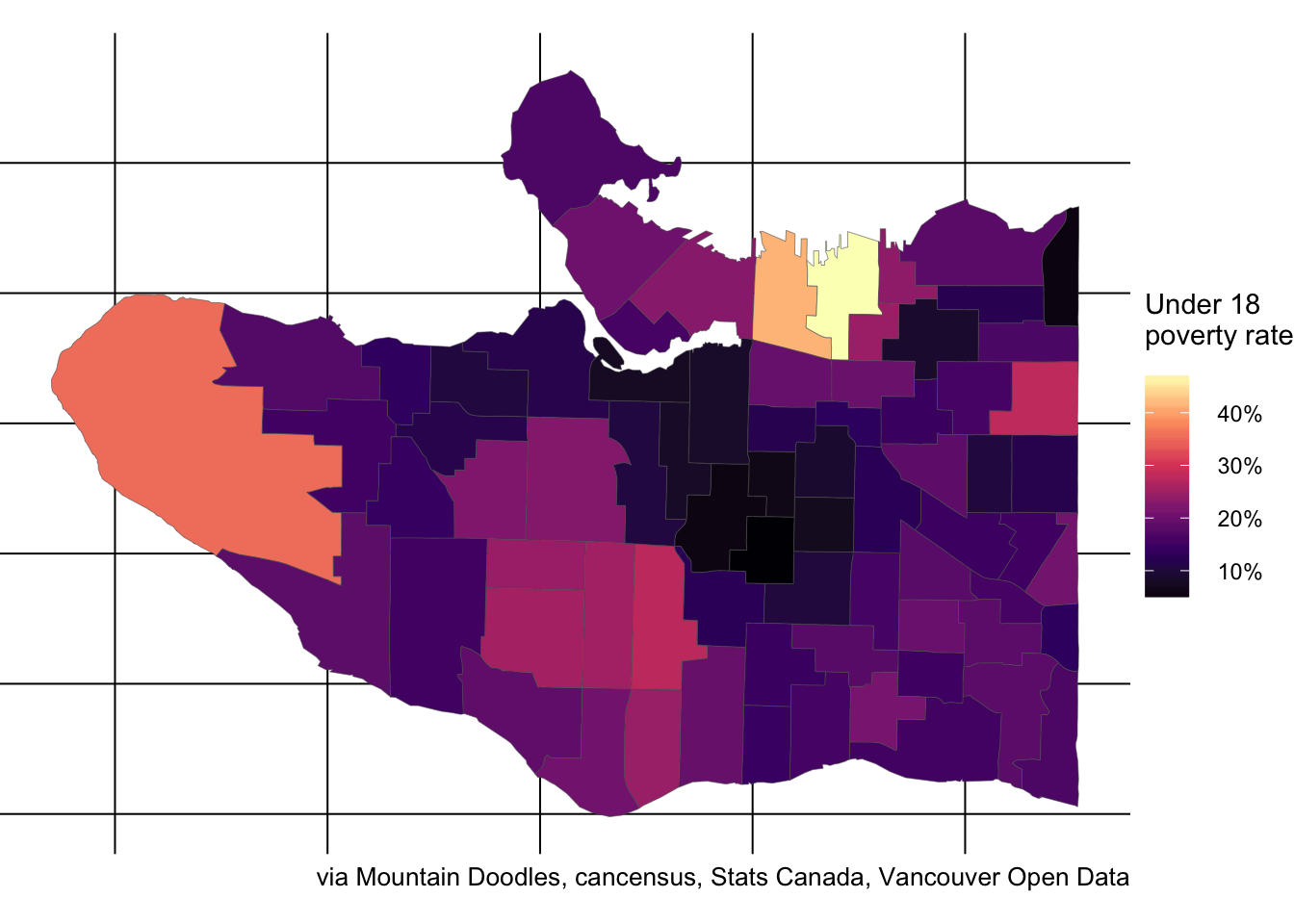
Or the Under 6 rate by catchment.
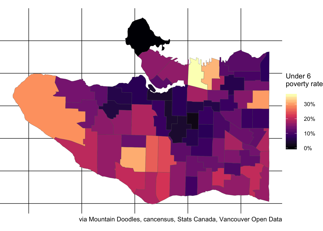
Comparing to SSI data
It’s a bit of a pain, but we can use tabula to scrape out the number of SSI students from the November 2015 report and adjust the names of the schools to match the ones from the open data catalogue we have been working with.
ssi <- readr::read_csv('../../static/data/tabula-C3 - Update on Elementary Meals Program - REVISED (November 15, 2015).csv')The match between the two data sources is not perfect, and my knowledge about VSB schools is not good enough to fill in the gaps. The geographic dataset is quite old and for example doesn’t distinguish between UHill Elementary and Norma Rose Point, so I pooled the SSI data for these. I also pools schools and their annexes, but there were still some schools left over without match.
Missing from the SSI data were International Village Elem., Stanley Park, and missing from the geographic school data were Tillicum Community Annex, Queen Victoria Annex, Collingwood Neighbourhood School, L’Ecole Bilingue Elementary, Garibaldi Annex, Lord Tennyson Elementary, Ecole Jules Quesnel Elementary, Tyee Elementary.
Some of the mismatch is due to the French Immersion schools that we don’t consider there. Maybe someone with more experience can point me to how to further reconcile these two datasets. (And hopefully the geographic dataset can be updated to reflect recent changes.) For the remaining bulk of the schools for which we can match the data we can try to understand the relationship between child poverty rates and SSI.
join_data <- left_join(db_summary,
                       ssi %>% group_by(school) %>%
                         summarize(ssi=sum(`Approximate #s of students`),enrolment=sum(enrolment)),
                       by="school") %>%
  filter(!is.na(child_rate),!is.na(ssi)) %>% mutate(ssi_rate=ssi/enrolment)
The correlation between the number of SSI students enrolled and either the number of children Under 18 or Under 6 in the catchment in poverty is surprisingly poor at 0.09 and 0.16.
We can go through the laborious work to hand-copy the enrolment numbers from the scanned PDF in Appendix K of this report to convert the number of SSI students into percentages (not counting international students). The correlations of the Under 18 and Under 6 rates with the SSI rates are 0.49 and 0.29 which are much stronger.
We are particularly interested in the outliers where the SSI rates and poverty rates don’t match. First up the stronger correlation with the Under 18 numbers.
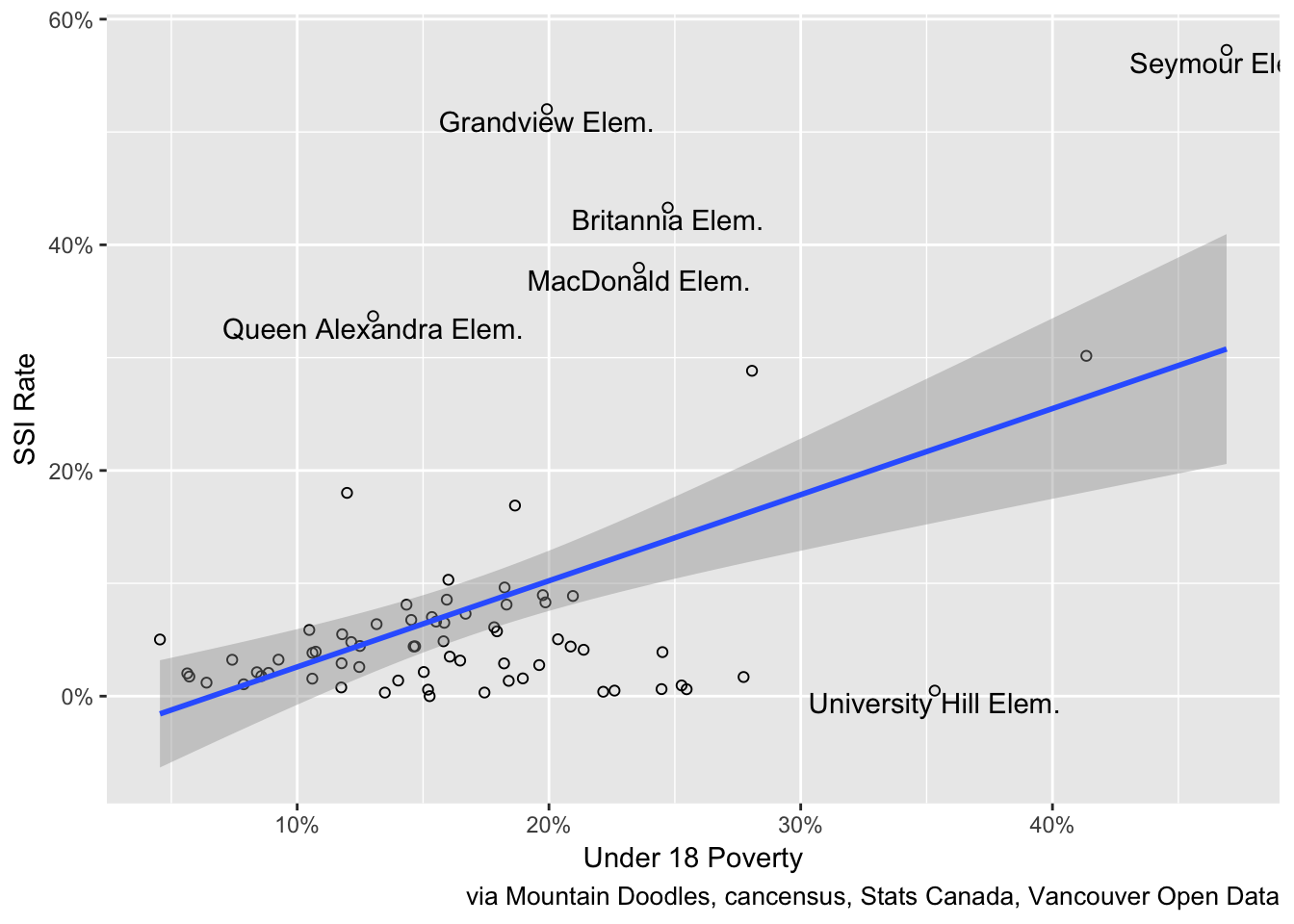
The Under 6 correlation shows a similar pattern, from which we again infer that the poverty rates for the 5 to 10 age group that we don’t have available from the standard census release data will likely show similar results . 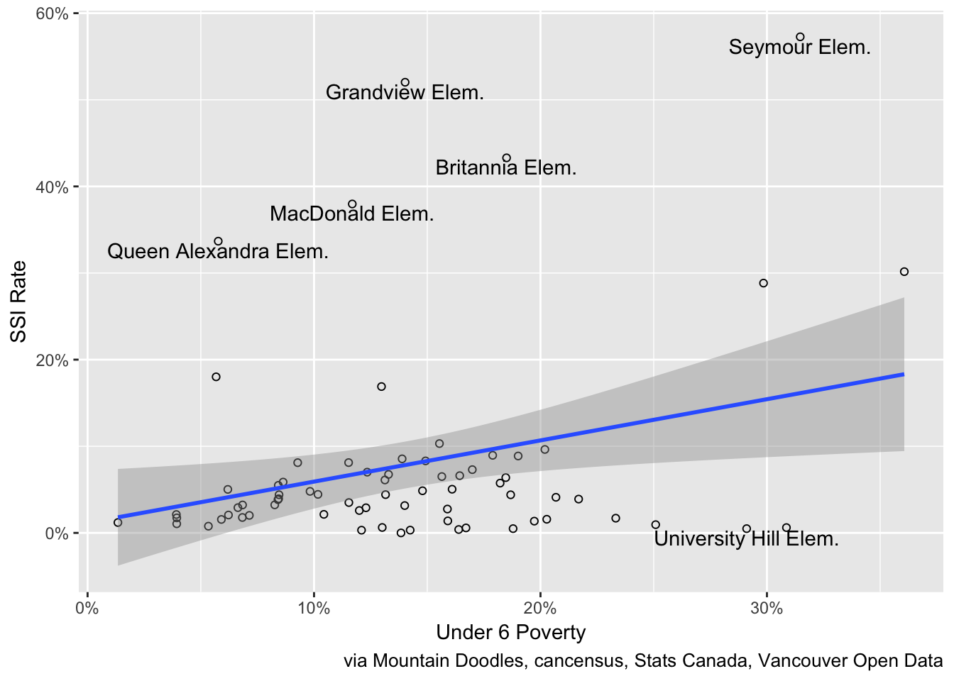
To get the best fit we can model the SSI rates on both the poverty rates for the Under 6 and the 6 to 17 populations, and graph the SSI rates against the model fit.
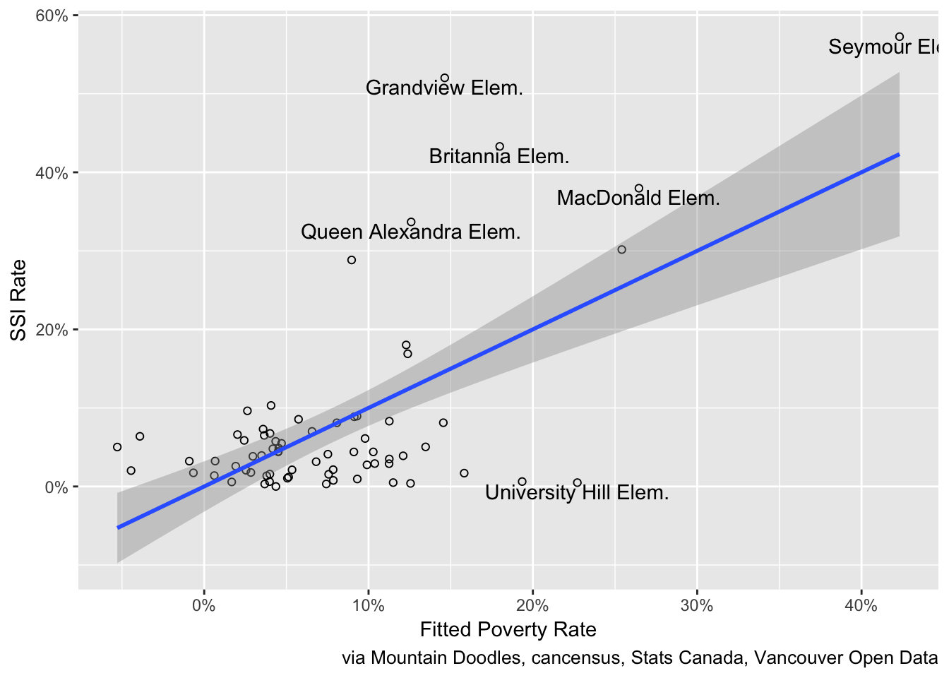
The correlation of the SSI rates with the model fit increases to 0.63, but the general pattern of the outliers remains.
To round things off, let’s map the SSI rate.
This nicely highlights the discrepancy from the poverty rates above.
Takeaway
What is remarkable is that the worst outliers are the same, no matter if using the Under 18, Under 6 or fitted model. This, together with the generally quite low correlations, suggests that the SSI data is missing some important aspects of poverty.
In particular, UHill Elementary and Maple Grove show high proportions of child poverty in their catchment that is not matched by SSI rates. At UHIll Elementary, this may be partially due to a large number of children with parents in subsidized graduate student housing that register with the highest child poverty rates, but may not qualify for SSI.
There are a number of possible explanations for this, to dig deeper one should add other demographic variables to reproduce the somewhat opaque analysis done by VSB. It’s fairly straightforward to adapt this analysis to include other census data using cancensus by downloading the R notebook that built this post and reproduces the analysis, and one can add school level data by updating the spreadsheet that was scraped and manually enriched with enrolment data.
Reuse
Citation
@misc{vsb-vulnerable-students.2017,
  author = {{von Bergmann}, Jens},
  title = {VSB {Vulnerable} {Students}},
  date = {2017-10-15},
  url = {https://doodles.mountainmath.ca/posts/2017-10-15-vsb-vulnerable-students/},
  langid = {en}
}