The neighbourhood level custom tab the City of Vancouver pulls for every census has arrived on the open data portal today. We have not worked much with that data because the 2011 dataset excluded the NHS, but it’s worth revisiting with the 2016 data now available. (Hopefully the 2011 NHS data will get retroactively added, it’s a bit of a shame that it’s missing and CoV return rates were quite reasonable.)
The neighbourhood level data adds to the generally available census data in two ways:
- It enables easy comparisons through time, since the neighbourhood geographies have been stable (whereas there have been changes to the census regions within the City of Vancouver between each of the censuses).
- It gives a finer breakup of the City into regions with recognizable names. That makes it easy to utilize the data for non-map based visualizations and analysis.
The Data
While a small dataset, getting it into working condition can be a bit of a pain.
- The data comes transposed from the usual format census data is delivered in and that is useful for analysis.
- The data comes in windows-1252 encoding instead of more universal formats like UTF.
- The data is formatted as text, with comma thousand separators that need to be stripped and converted to numeric format.
- Some of the region names are not consistent over time.
- Some inconsistencies in the row and column naming.
As quirky as this is, the issues aren’t that big and I wrote a quick import function a while back that works for all four available datasets (and only needed minimal tweaking for the 2016 data). And yes, the code is included in the blog post in case others want to save themselves some pain.
Before we get started we should explain another quirk/feature of the data. The City of Vancouver assumes various roles within Musqueam 2, e.g. policing and some public infrastructure. I am not entirely sure what the exact relationship is (and would appreciate some pointers to a good summary), but for our case at hand it means that Musqueam 2 is included in the Dunbar-Southlands neighbourhood (but not in the City of Vancouver total that’s also included in the datasets). So summing data over all neighbourhoods comes up with a larger total than taking the CoV numbers, the difference being the counts from Musqueam 2. Something to be aware of.
Children under 15
Let’s load in the data and search for the variables we are interested in. To start off, we will look at the population of children below the age of 15. Most of the work is locating the variables of interest. We have done a similar analysis before looking at finer age brackets but broader regions for the 2006, 2011 and 2016 censuses.
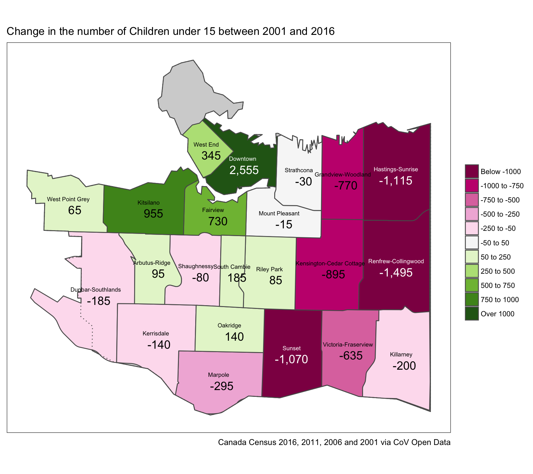
This gives a very vivid view of the changing landscape of children in the City, with only Downtown, Kitsilano, Fairview and the West End adding significant number of children and massive drops in the more eastern neighbourhoods.
To better understand the trend over time we can view the change in 5-year steps. 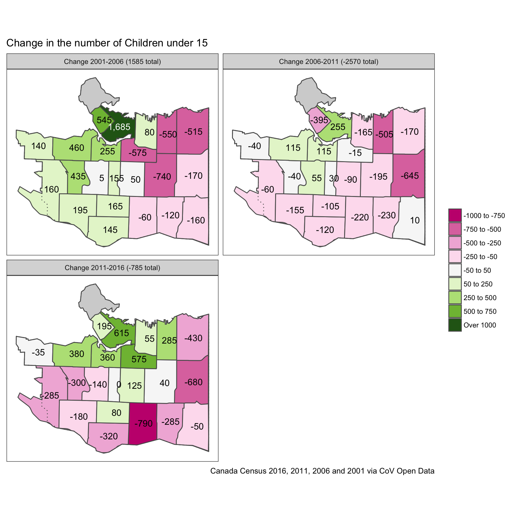
We see that between 2001 and 2006 the number of children in the neighbourhoods overall increased substantially, decreased dramatically between 2006-2011 and moderately decreased again 2011-2016. The general trend was that children were added in the central areas and dropped elsewhere.
Renters
Rates of renters by neighbourhoods has been in the news lately, so we can use the opportunity to refine some of the numbers and add temporal data to understand the development over time. For this we will have to skip 2011 since the City did not provide the NHS data at the neighbourhood level.
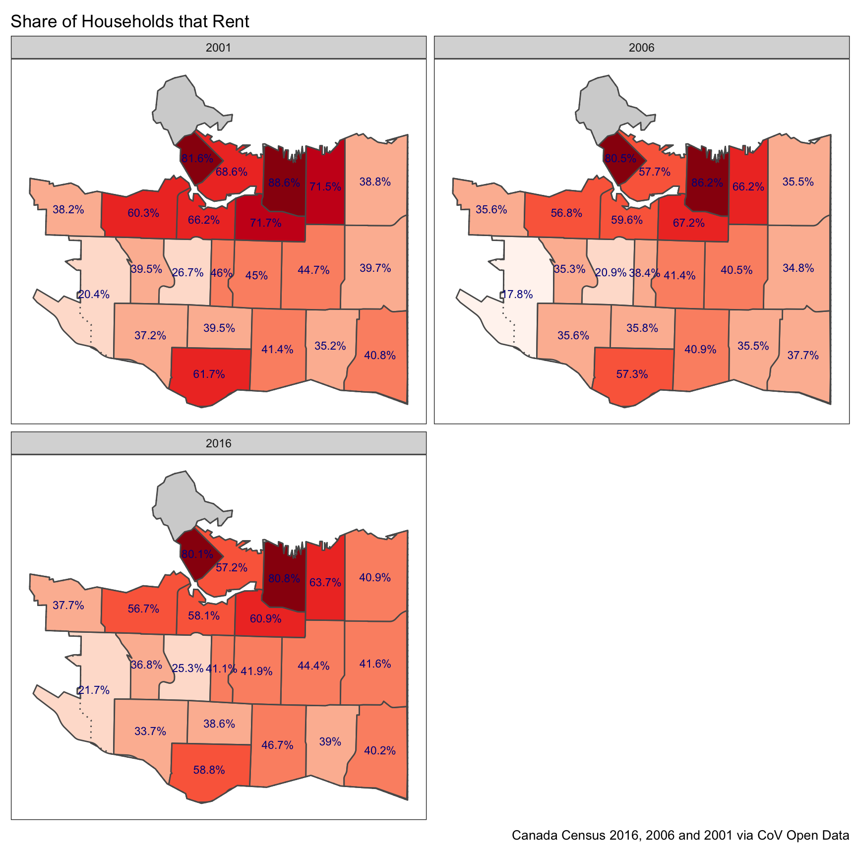
To better understand the trends over time we can graph the development. The red dots indicate the 2001 share, green the 2016 share with the 2006 share in black. Trend lines in red indicate a decreasing trend, the ones in green an increasing trend. 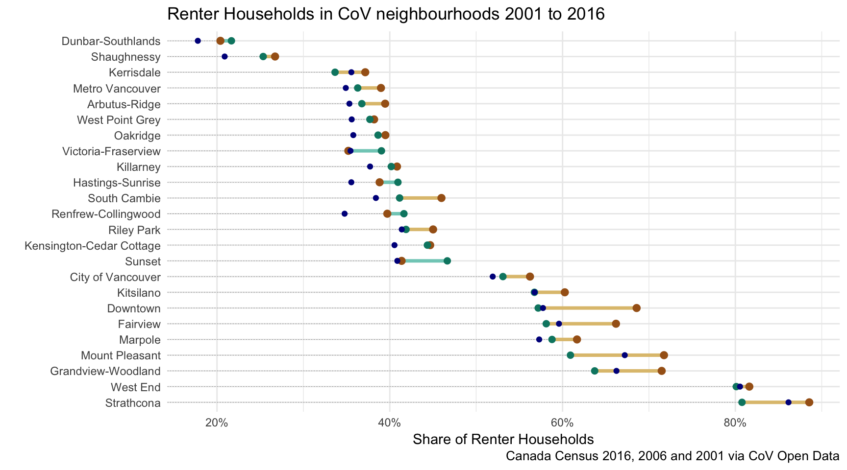
We can map the overall percentage change to get an idea of the geographic distribution of the change in share of renter households. 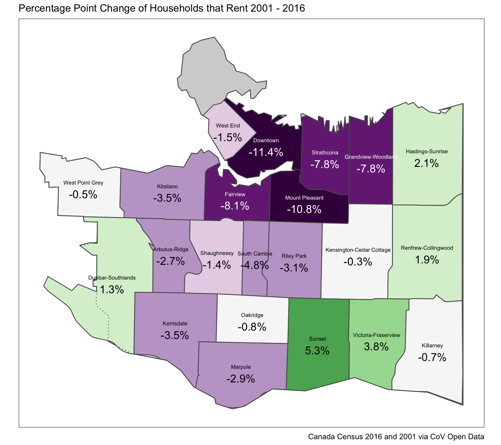
Lastly we can also look at the total change in renter households in each area. 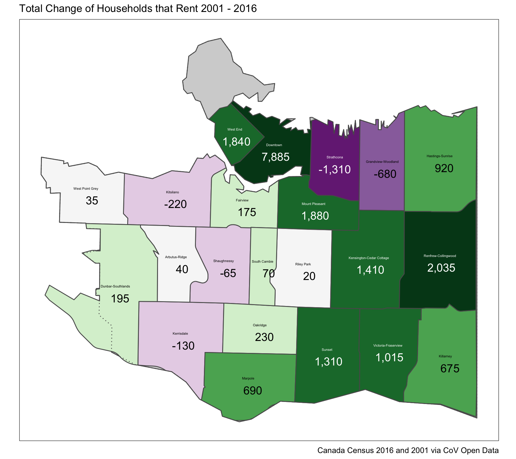
This shows a strong imbalance in which neighbourhoods have added renter households over this 15 year time period, with some neighbourhoods even losing renter households, in particular Strathcona (see update below) and Grandview Woodlands.
Update (Feb 9, 2018)
I was told that the drop in the number of rental households in some areas could have been contributed to by re-classification of housing from private to collective dwellings, in particular SROs and senior housing. According to the census dictionary SROs and senior homes should have generally been classified as collective dwellings, but that’s a judgement call. We have seen before that comparisons across time can be tricky as changes in definitions and enumeration methods can have large impacts. I have learned to appreciate all these little quirks in the census data and am grateful when people point me to any that I missed.
The City did not pull data on the number of collective dwellings, so we can’t directly test this. But we do have data on the number of people in collective dwellings and use that as a proxy.
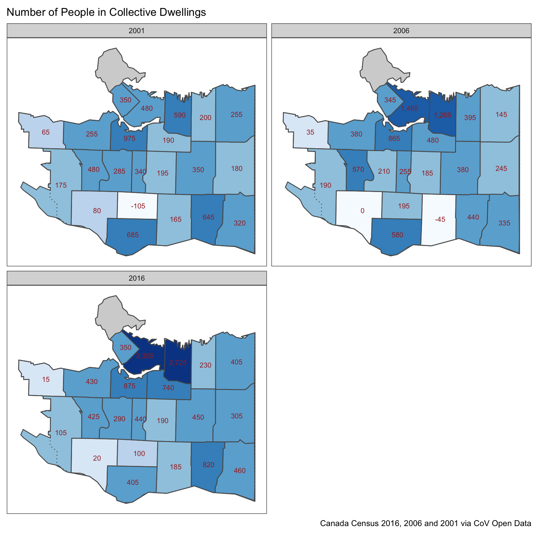
Looking at the total number of people in collective we immediately notice some data quirks in the 2001 and 2006 data. To assess the number of people in collective dwellings we took the total population in each area and subtracted the number of people in private dwellings. This procedure could yield small negative numbers in some cases due to random rounding, but the -105 and -45 we see in 2001 and 2006 should not be able to happen. So these estimates have some problems that we don’t fully understand and thus should be treated with caution.
Ignoring these issues we notice that indeed there was a sizable increase in the population in collective dwellings in downtown and Strathcona that could have confounded our change in renter households. To zoom in on that we map the change in people in collective dwellings, understanding that these estimates have some problems.
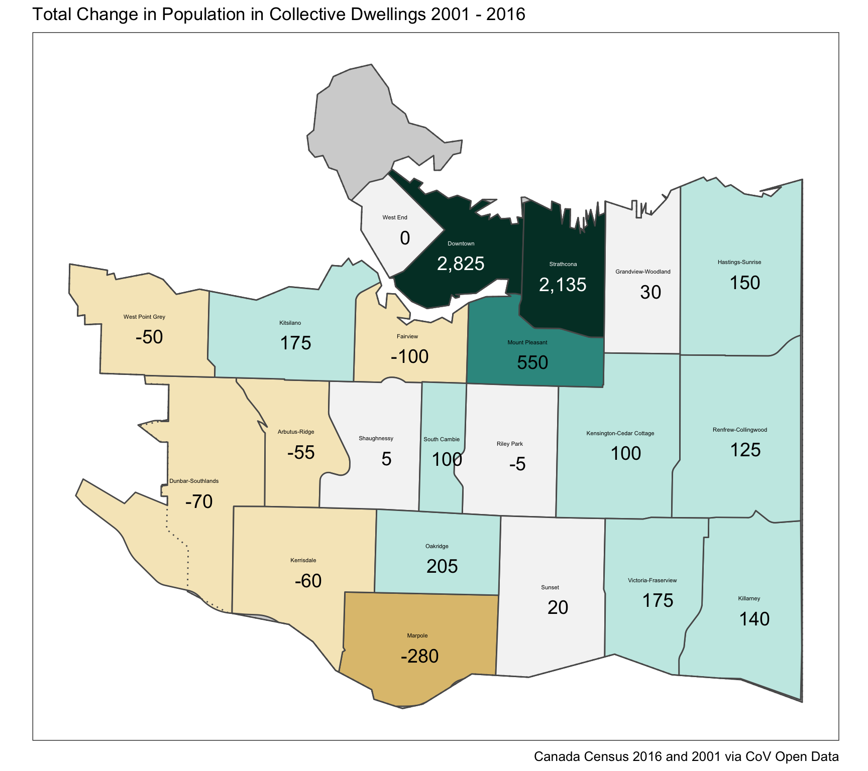
This map is counting people, comparing back to our map of the change in renter households above we notice that the drop in renter households in Strathcona could indeed be due to re-classification of private dwellings to collective dwellings.
As always, the code that made these graphs is available on GitHub. This should make it easy for others to jump in and map or analyse different aspects of the neighbourhood level data. Curious to see what interesting things other come up with.
Reuse
Citation
@misc{neighbourhood-level-census-data.2018,
  author = {{von Bergmann}, Jens},
  title = {Neighbourhood {Level} {Census} {Data}},
  date = {2018-02-08},
  url = {https://doodles.mountainmath.ca/posts/2018-02-08-neighbourhood-level-census-data/},
  langid = {en}
}