The other day I was catching a bus home later at night, which made me acutely aware that I should not take the frequent daytime transit in Vancouver for granted. On the ride home I decided to dig into this and grab some transit data. We have played with transit data before, but since this was going to be the second time it was high time for a quick R package to standardize our efforts and simplify things for the next time around. Or for anyone else interested in this. And I can’t think of a better way to use the time during a bus ride than writing an R package to access transit data!
It’s easy to write a quick package that gets the job done, but it took me a couple of days until I found some time to clean it up and write a short post, so here we go. This post is meant less to be informative about transit in Vancouver and more a mini-introduction of the R package in case others are interested in using this. It still has some pretty graphs and late-night bus riders might appreciate seeing why that bus they were waiting for never came.
As an example we are looking at transit service in the City of Vancouver. There are a number of ways to query transit data, we will specify a bounding box based on the geo polygon for Vancouver that we grabbed using our cancensus package.
Transit Routes
To start off we pull the route data for the City of Vancouver using the bounding box from our polygon
and plot it. 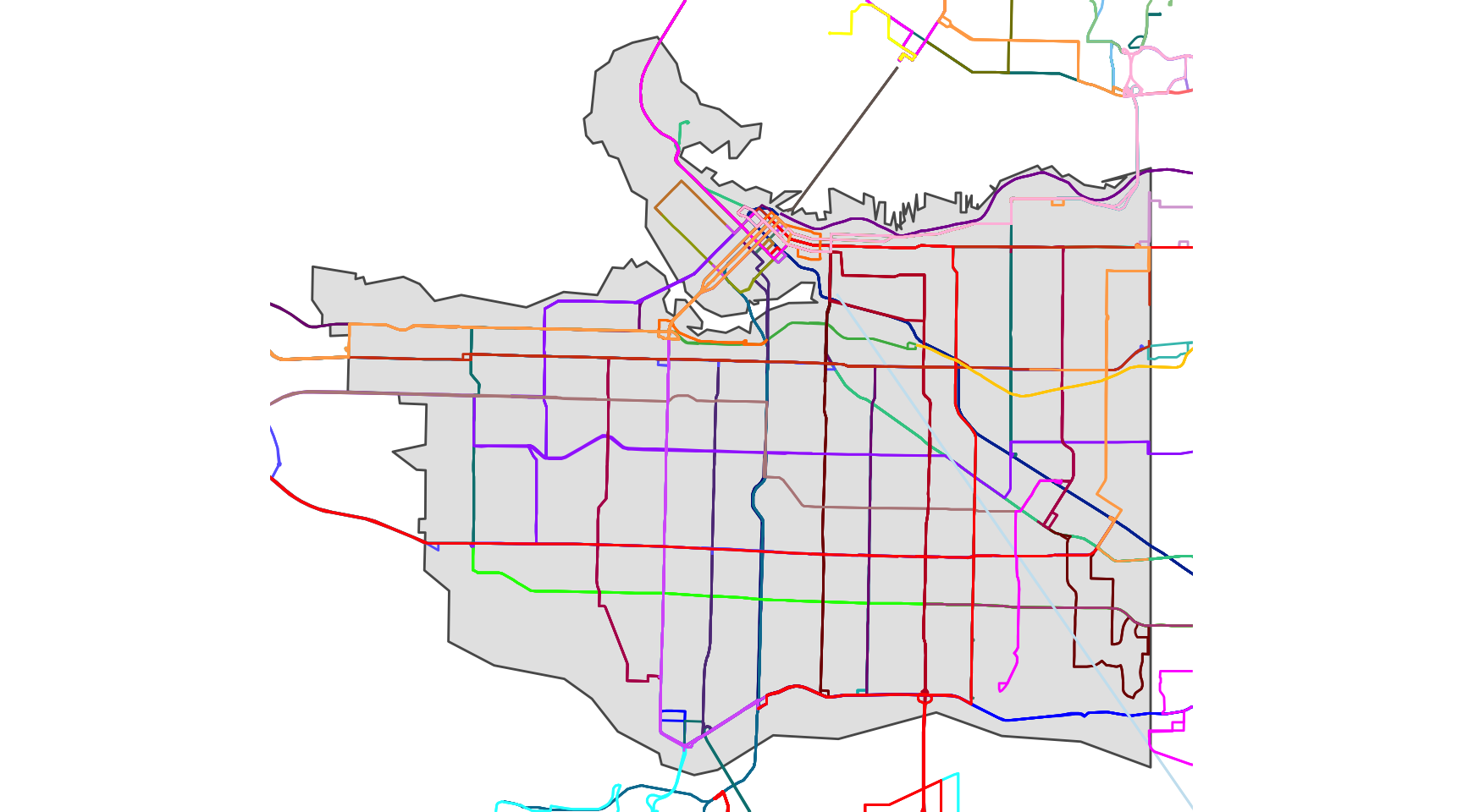
Transit Stops
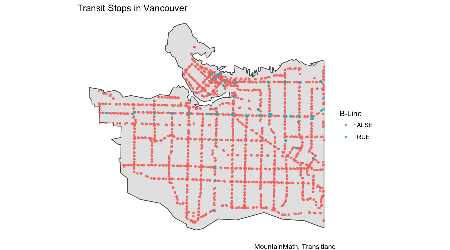
Next we query all transit stops in the bounding box and clip them to the City of Vancouver and identify the high frequency B-line and Skytrain stops and visualize all 1,956 of them.
Service Frequency
To assess service frequency we pull all departures between 9am and 10am on March 13th and plot the frequencies by stop. 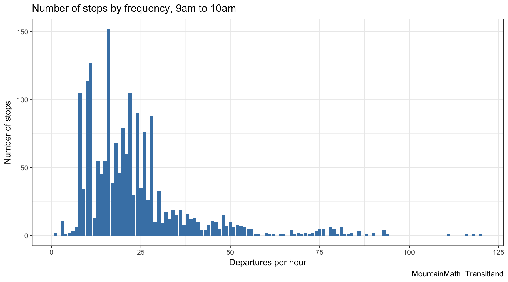 It’s kind of mind-boggling to think that in that hour transit services in Vancouver rack up 42,988 departures.
All on one map
We can join the frequency on the stations and get a geographic overview of transit frequency by stop, binning the frequency for easier readability. 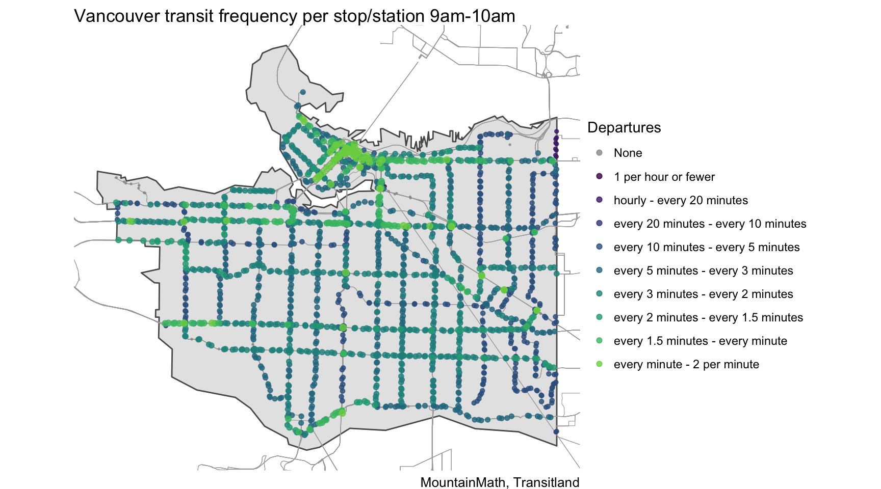
Compaing to evening service
To round up the example we want to compare this to transit departures midnight to 1am. 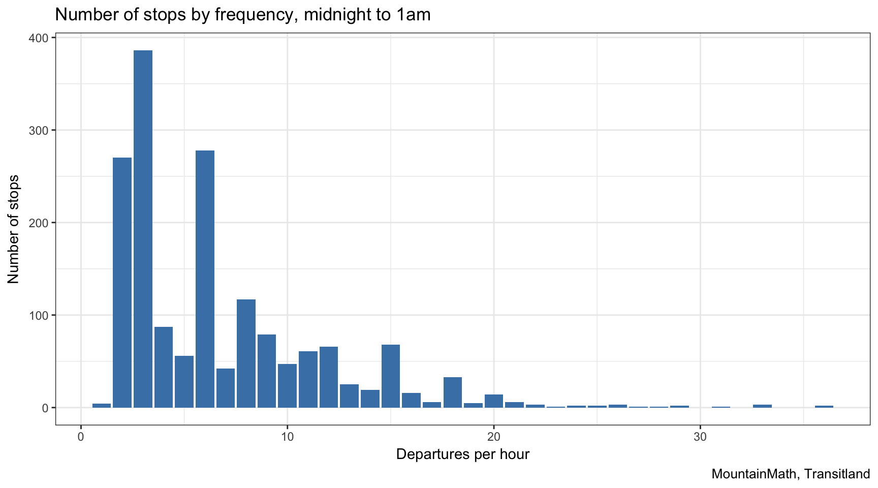
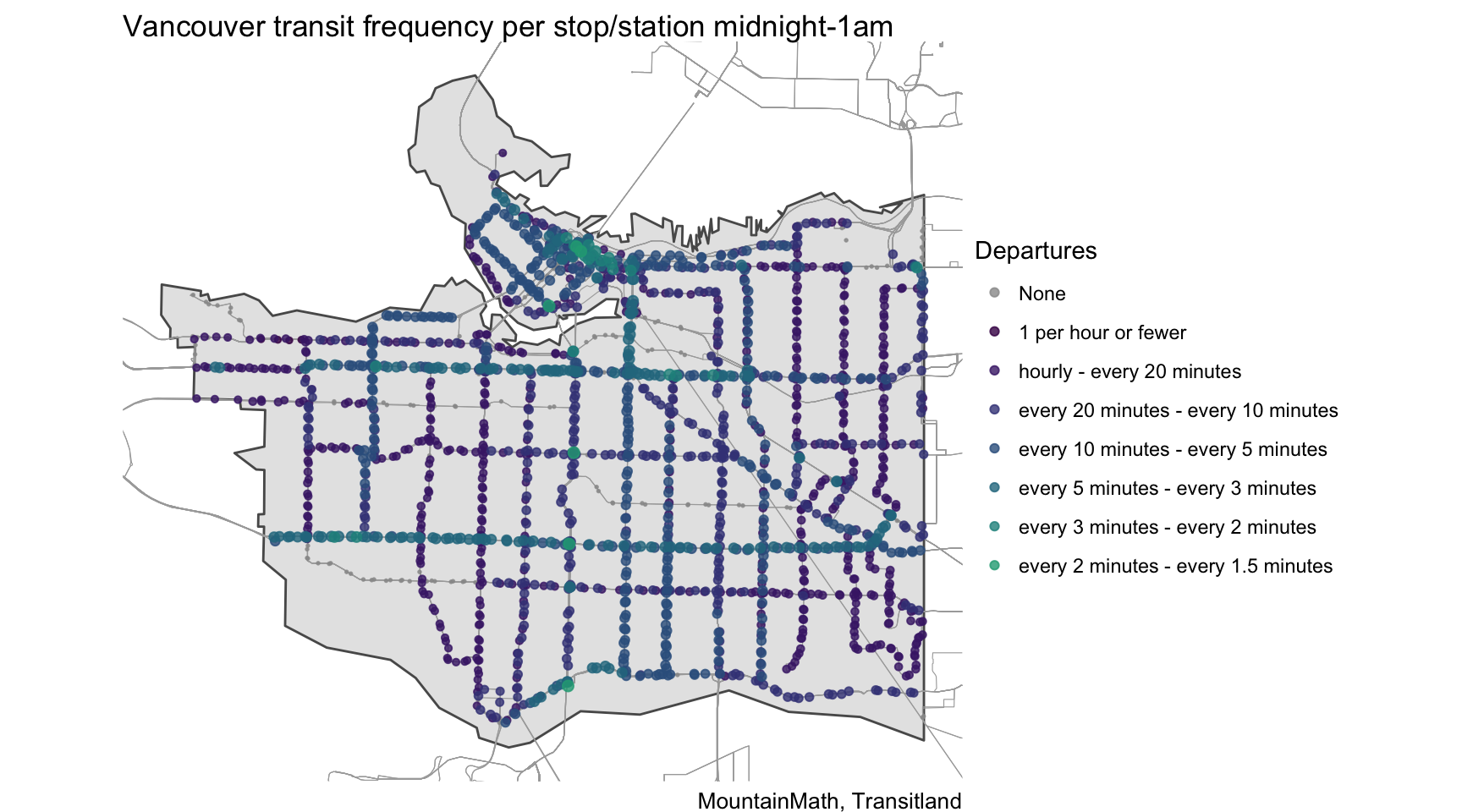
As expected, the frequency is significantly lower at night, but there are still 11,516 departures. We can again plot the geographic distribution, where we can observe that some local lines fade to grey with zero departures.
As always, the code that made this post is available on GitHub, go grab it if you want to reproduce the graphs, run some interesting stats with the data or re-run the analysis for a different region. Transitland has a pretty good repository of transit feeds from all over the world that are much more suitable for data analysis and visualization compared to the GTFS. And if the transit provider you are intersted in is not on the list you can always add it.
Reuse
Citation
@misc{transit-data.2018,
  author = {{von Bergmann}, Jens},
  title = {Transit {Data}},
  date = {2018-03-12},
  url = {https://doodles.mountainmath.ca/posts/2018-03-12-transit-data/},
  langid = {en}
}
