The City of Vancouver made individual ballot data available. So the vote choice on each individual ballot. It’s been out for a couple of days now, and I have been quietly hoping someone else would write something up. But I got too curious, so here is a super-fast write-up. We focus on mayor and council votes only. There were 21 candidates for mayor and 71 for council to choose from, and each voter was allowed to vote for (at most) one mayoral candidate and up to ten council candidates on their ballot.
Number of votes per ballot
There were 175,399 valid ballots by people eligible to vote for mayor and council. The first question we have is how people were using their votes. Did people make use of all their 11 possible votes for mayor and council candidates, or did the vote for fewer, either because there weren’t 11 they liked on the list (unlikely, given the large choice), or because they did not want to go through the troubles of evaluating all individual candidates and just went with one party only, or because they were ‘plumping’ their votes. Plumping refers to people voting for a few first-choice candidates and denying their second-choice candidates a vote in case they might narrowly overtake their first-choice candidates in the overall counts.
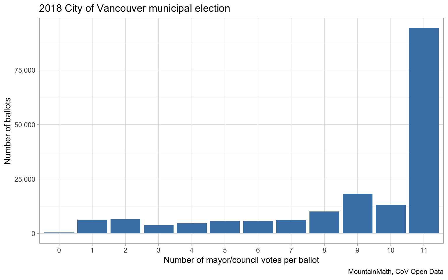
We see that a slight majority of people 53.8% made use of all their votes, the other ballots had fewer than 11 mayor and council votes. To take a better look into that we are showing the party makeup of all votes by number of total votes per ballot. With our strong showing of independent mayoral candidates we focus only on council votes for this.
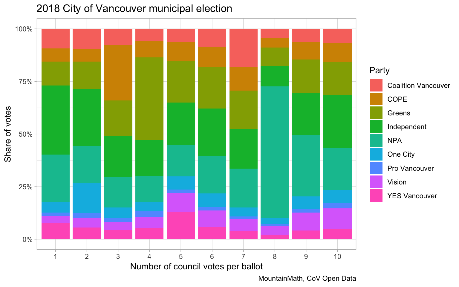
We see that the ballots with exactly 8 council votes are dominated by votes for the NPA – which incidentally ran 8 candidates.
Party votes
This brings us to the next section, where we investigate the role parties played in the election. The previous graph leads us to look into single party ballots, that is ballots where only a single party got votes.
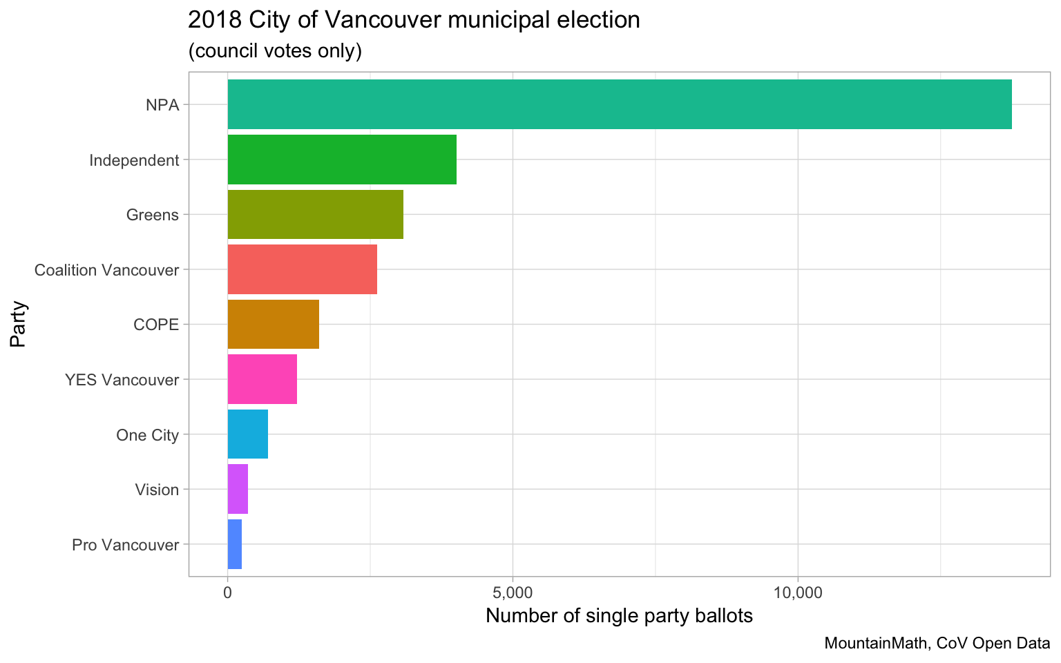
This shows that NPA lead in the number of single-party-only ballots, but with 8 candidates they also have the advantage of single-party-only ballots not “wasting” too many votes. Compared with e.g. One City, where single-party-votes “wastes” 8 votes as there were only two candidates. It’s interesting to see that quite a few ballots only had independent candidates.
We can widen the scope slightly to look at combination of parties.
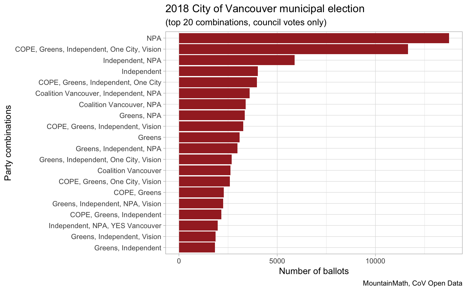
A more comprehensive view that also takes into account the number of votes each party got can be gotten by looking at correlations across all parties.
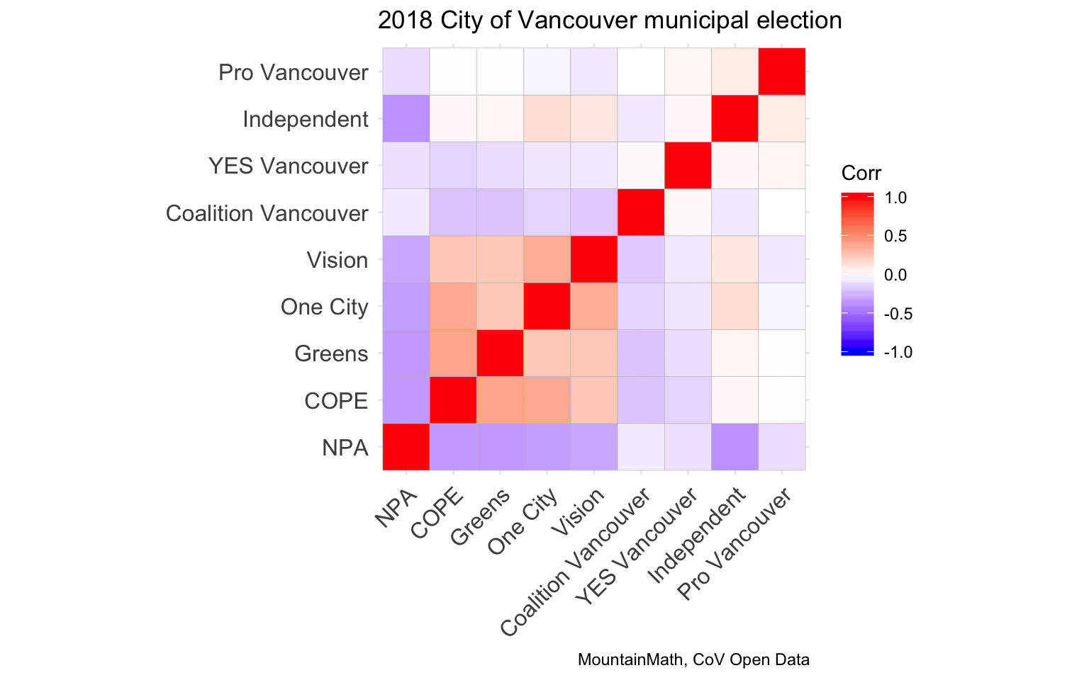
This shows that NPA votes anti-correlate with every other party, with Coalition Vancouver and YES Vancouver showing the lowest negative correlation. We also see a emergence of a weak voting block made up of COPE, Greens, One City and Vision. Coalition Vancouver also anti-correlates with all other parties, although having almost neutral correlation with Pro Vancouver and YES Vancouver. Independents show the highest correlation with One City.
The ordering of the parties in the plot was done by hierarchical clustering on the correlations, and it interesting how well it picks out adjacencies in the parties. Independents scatter a bit, showing some correlation with One City and (to a weaker extent) Vision, and also some weak correlation with Pro Vancouver and YES Vancouver.
Candidates
So parties matter, but people vote for candidates and not parties. And no party got all their candidates elected, so people did pick and choose among party candidates. Looking at the top 30 council candidates (by total votes) and top 5 mayoral candidates, we can correlate the votes on each ballot just like we did with the parties. Apologies to the candidates that got dropped off, the good news is that it only takes a one-line change in the code to change that in case someone wants to slice the data differently.
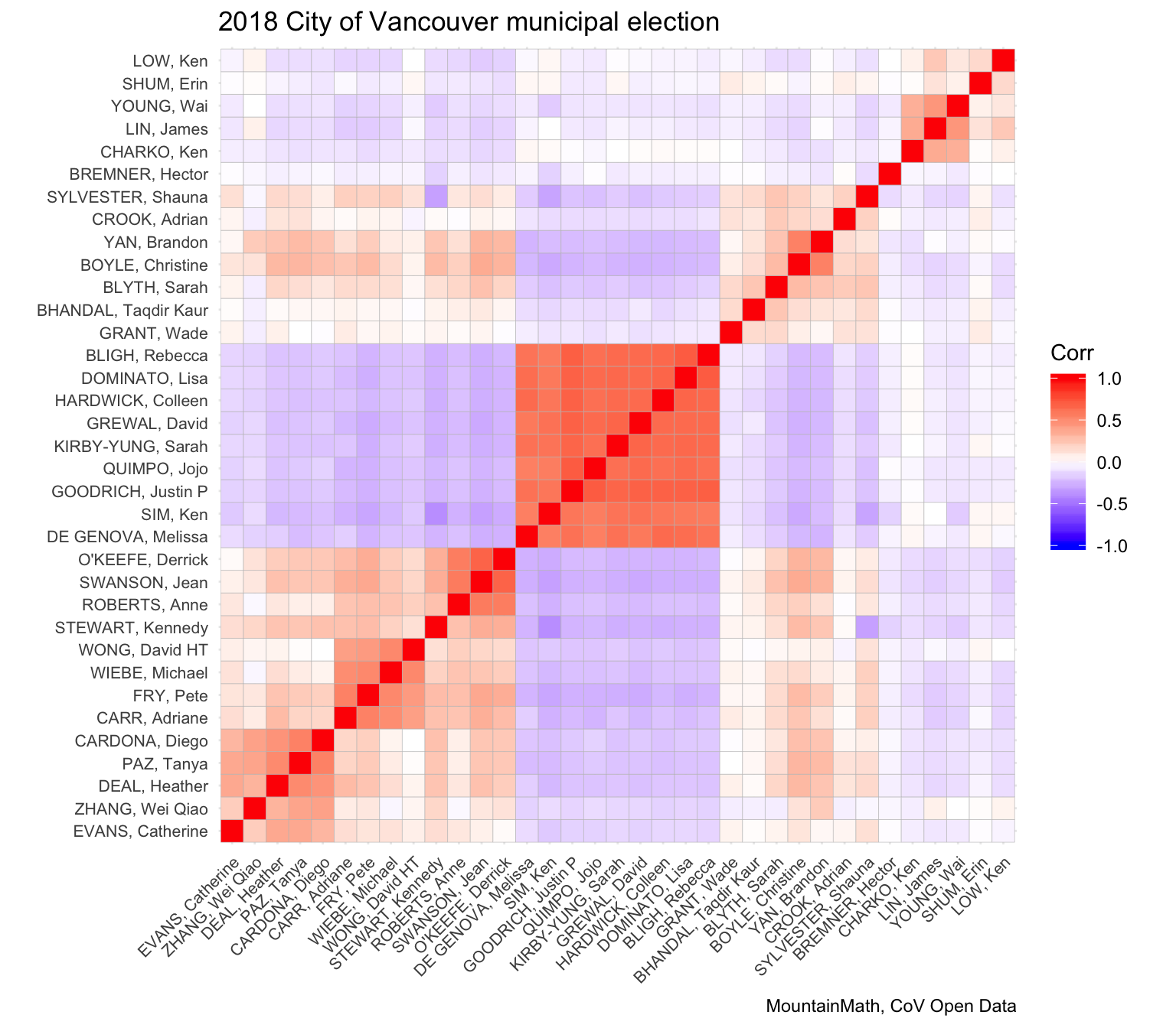
As to be expected, the hierarchical clustering again brings out the parties even though we did not use party affiliation to make this graph. The fact that there was only one vote for mayoral office shows in anti-correlations between all mayoral candidates. The clustering into parties is not perfect, and it is interesting to investigate differences within the party blocks, as well as between candidates that don’t follow party lines. Even though the clustering did not place One City next to the COPE-Greens-Vision block we can still see the strong correlation. Some independent candidates also show correlation with that block, in particular Sarah Blyth and Shauna Sylvester and to a weaker extent Adrian Crook, Taqdir Kaur Bhandal, and Wade Grant, who cluster close to One City, but also correlate with the COPE-Greens-Vision block. NPA anti-correlating with everyone else points to lots of full-slate votes with the few votes there are to spare spreading out. Erin Shum seems also correlates with these particular independent candidates, but also with the Coalition Vancouver block but not the COPE-Greens-Vision or One City block that these other independent candidates clustered around.
We can use the data to identify adjacencies of independent candidates with parties.
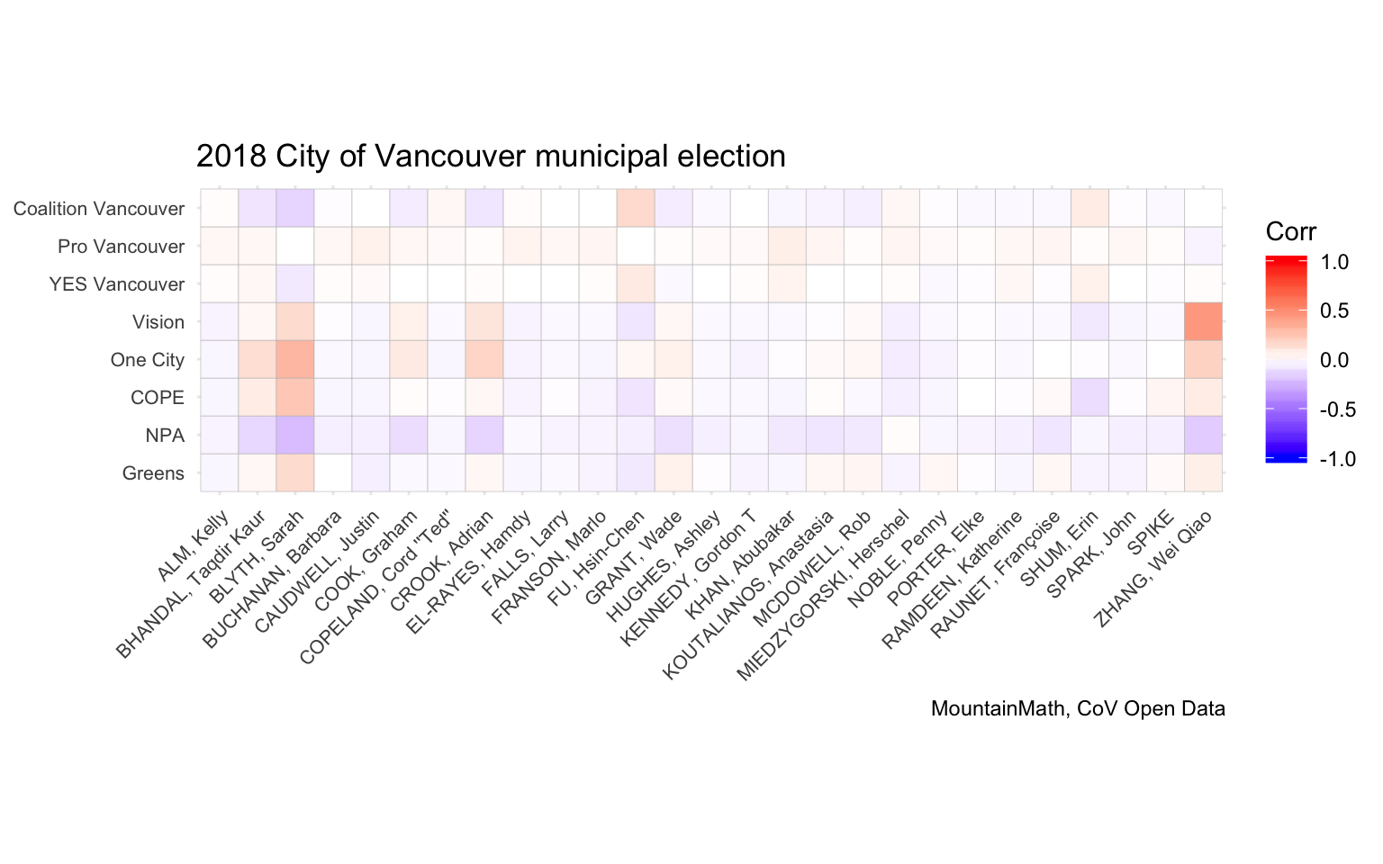
We see Wei Qiao Zhang standing out as Vision-aligned, which is to be expected as the ballot showed him as a Vision candidate, although Vision did disavow him shortly before election day. Sarah Blyth seems strongly adjacent to One City, as well as the other Liberal parties.
The new urban/preservationist scale
The Cambie Report introduced the urbanist/preservationist axis of Vancouver municipal politics, next to the usual Left/Right social-economic axis. It’s an interesting new way to look at things, Nathan has a good rundown. The Cambie Report crowd-sourced the scoring of the parties and major independent mayoral candidates and relased the data. That makes it easy for us to use this for analysis.
Unfortunately, we don’t have data for the independent candidates, which means that there is a lot of missing data in the analysis in this section Moreover, candidates within each party may also scatter a bit around the average party position, which we won’t be able to pick up on. Maybe someone will collect scores for the independent candidates and even individualize party scores.
This means we are filtering the voting data down to only the ones that the Cambie Report has scored, that is party candidates as well as the two major independent mayoral candidates, Shauna Sylvester and Kennedy Stewart. Fortunately this covers all people on council right now, so it is maybe not as bad as it seems.
While we now have scores for each individual candidate, it is not clear how to aggregate up the votes on a ballot to assign scores to each ballot. We will fill this with some heuristics:
- Votes for mayoral candidates carry double weight, votes for unscored mayoral candidates are discarded.
- Scores for party-affiliated council candidates are added up and scaled up as if there were 10 votes.
In total this scheme gives the sum of 12 scores if the ballot also had a vote for a scored mayoral candidate or 10 otherwise, so we normalize the result by dividing by 12 or 10. Alternative ways would be to count the absence of votes with a negative weight, but it is not clear how much sense that makes as we can’t distinguish e.g. a candidate that just missed the first 10 that fit on a ballot or if the candidate got left off a ballot because the voter had a strong aversion.
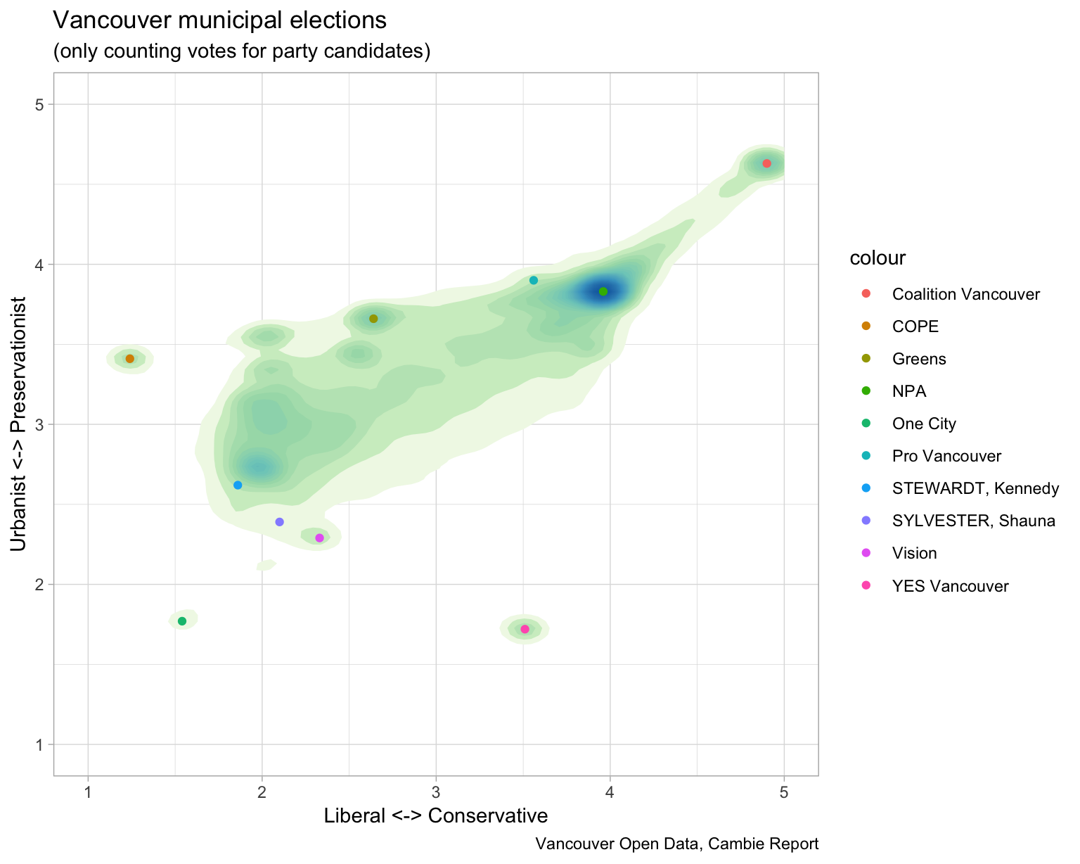
Using the methods we chose it does not appear that there is a strong urbanist cluster visible in the data. Partially that is due to the urbanist vote spanning across several parties that also strongly correlate with preservationist parties. And looking at recent council votes, it does not seem that councils vote in block on these issues. Taking the Broadway subway extension vote, squarely an “urbanist” issue, the (only) COPE councillor together with one NPA councillors voted against, whereas all three Green councillors voted in favour - a move that was at least partially attributed to Greens recognizing the shifting makup of their base. It will take more time to observe if the crowd-sourced scores still hold after the election, and if having just one score for e.g. NPA candidates is appropriate.
Given our methods we still have a fairly high correlation of urbanist/preservationist and Liberal/Conservative scores of ballots (coefficient of 0.68) as is also evident from the graph.
Next steps
There are plenty of ways to refine this. One can look into Park Board votes or ballot questions, or analyse data by voting place or voting type (general voting, advanced voting, mail, …). Refining the Cambie Report scores would certainly be interesting. For those interested in expanding on the analysis, or folding in new data, or looking at some of the lower-ranking candidates that got dropped off the list, the code is available on GitHub as usual.
Update
Chad Skelton did a really nice interactive looking at the votes. He used a different metric to show adjacency, for each pair of candidates A and B he computed what share of candidates that voted for A also voted for B. That’s a much more interpretable metric than my correlations, and may be better at picking up what’s going on with candidates that did not get that many votes. Overall, we don’t expect much different results, but it is worth exploring how these metrics differ.
Let’s first compute the vote matrix based on likelihood. Just to keep things simple, we cut down by the
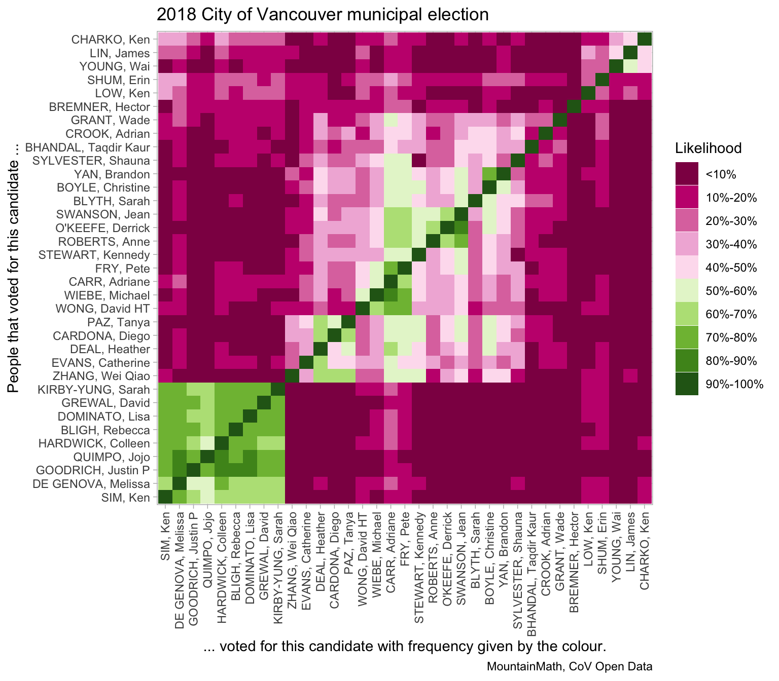
The matrix looks quite similar to the correlation matrix, with the advantage that it’s not symmetric and the asymmetry reveals more information. For example, people that got a high number of votes tend to have greener columns than rows.
The order of candidates is slightly different from our correlation plot, that’s due to us using hierarchical clustering on the likelihoods in this case. The result of the clustering is interesting in itself, the hierarchical clustering gives us information about the voters’ opinion on adjacencies of candidates. To conclude the post, we will give more details on the clusterings. And this time around, we will show the data for all candidates.
First up, clustering based on the likelihoods.
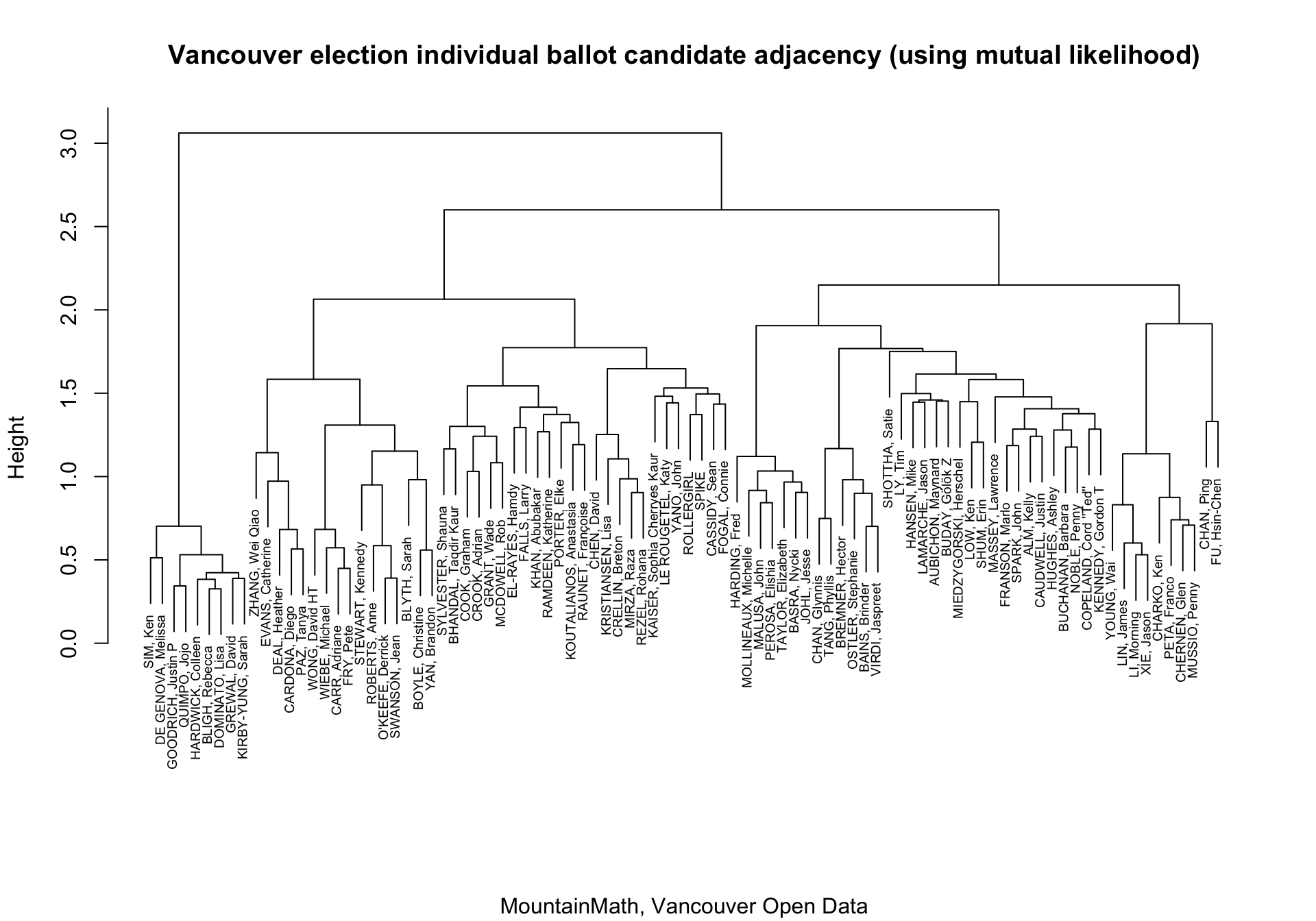
The “height” gives us information about the separation between different groups. NPA did best at distinguishing itself from the other candidates, as is evident by all candidates coming together at low height. As discussed earlier, this is favoured by the NPA running 8 council candidates plus one mayoral candidate, so people voting for the full slate have little opportunity to establish other adjacencies.
We can compare this to clustering based on correlations.
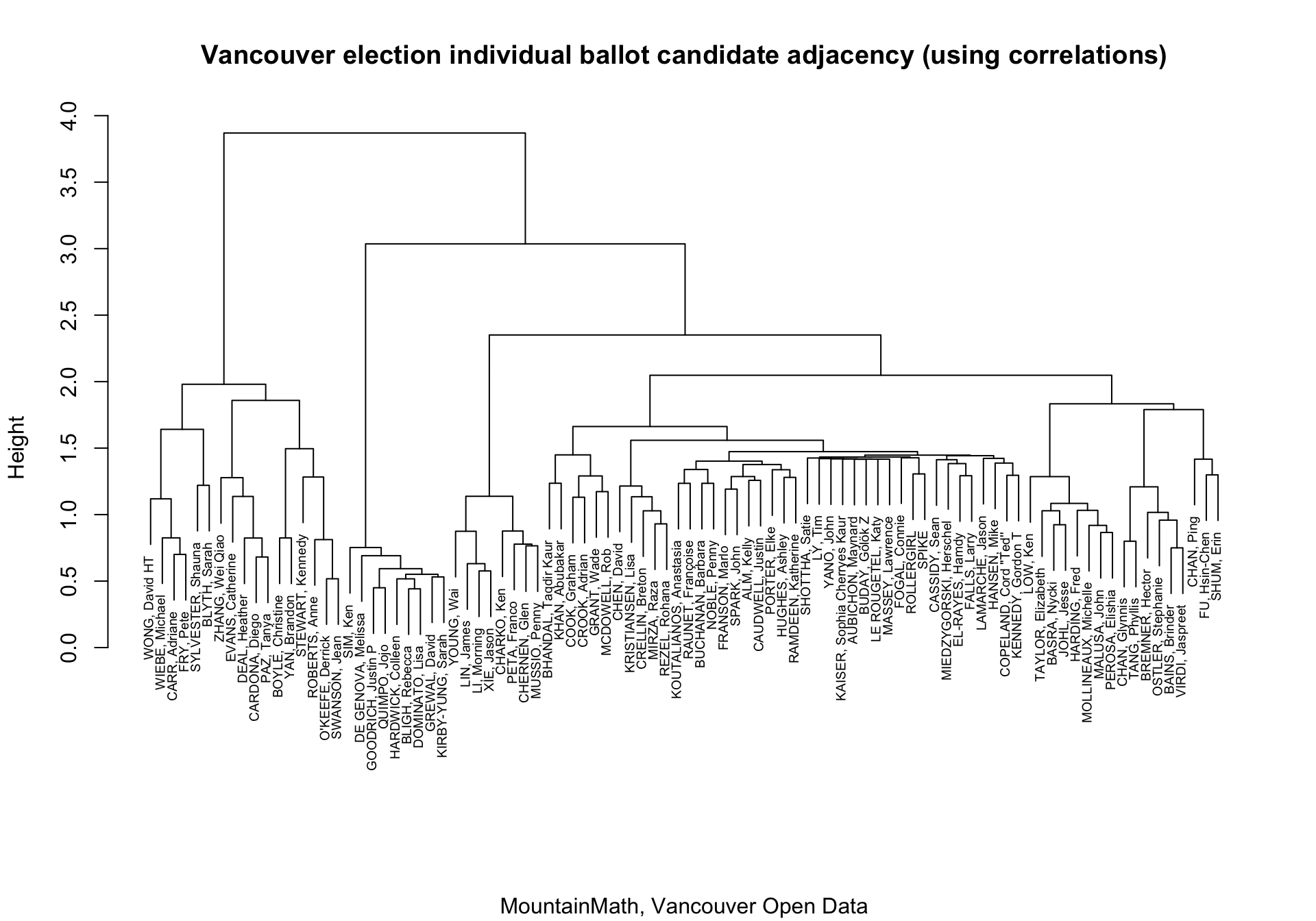
The picture is quite similar, with again NPA coming together out at very low height. The order of the branches, so which side is on the left and which is on the right, is not very important, it’s the branching points that matter. This graph places Sarah Blyth adjacent to Shauna Sylvester and then the Greens, whereas the likelihood based graph places Sarah Blyth next to One City, and then Kennedy Stewarts and COPE.
It would be interesting to explore these subtleties further.
Reuse
Citation
@misc{vancouver-election-individual-ballots.2019,
  author = {{von Bergmann}, Jens},
  title = {Vancouver Election Individual Ballots},
  date = {2019-02-04},
  url = {https://doodles.mountainmath.ca/posts/2019-02-04-vancouver-election-individual-ballots/},
  langid = {en}
}