Two days ago I gave an example using the new (to CensusMapper) 2001 census data to mix with 2006 data on a common geography based on dissemination areas. A question came up if this works for several censuses, not just for two. Yes, the TongFen package was built with exactly that in mind. Time for a quick demo.
For this we will look at the households spending between 30% and 100% of income on housing in the City of Toronto. To grab the relevant variables we query all available CensusMapper datasets and query each for all census variables with the term “30%” in the description and grab all “parent” and “child” variables (wrt the CensusMapper variable hierarchies) for good measure.
all_vectors <- list_census_datasets()$dataset %>%
  lapply(function(ds) search_census_vectors(" 30%",ds) %>%
           bind_rows(child_census_vectors(.),parent_census_vectors(.))) %>%
  bind_rows %>%
  unique

regions <- search_census_regions("^Toronto$","CA01") %>% filter(level=="CSD") %>% as_census_region_list()
To start off, we take a look at the summary statistics for the City of Toronto. No TongFen needed here, the geography has not changed since 2001.
total_data <- get_census("CA16",regions=regions,vectors = all_vectors$vector,labels = 'short') %>%
  compute_sc %>%
  gather(key="Year",value="Share",seq(2001,2016,5) %>% as.character)

ggplot(total_data,aes(x=Year,y=Share)) +
  geom_bar(stat="identity",fill="brown") +
  bar_theme +
  labs(title="City of Toronto share of households spending 30% to 100% of income on shelter")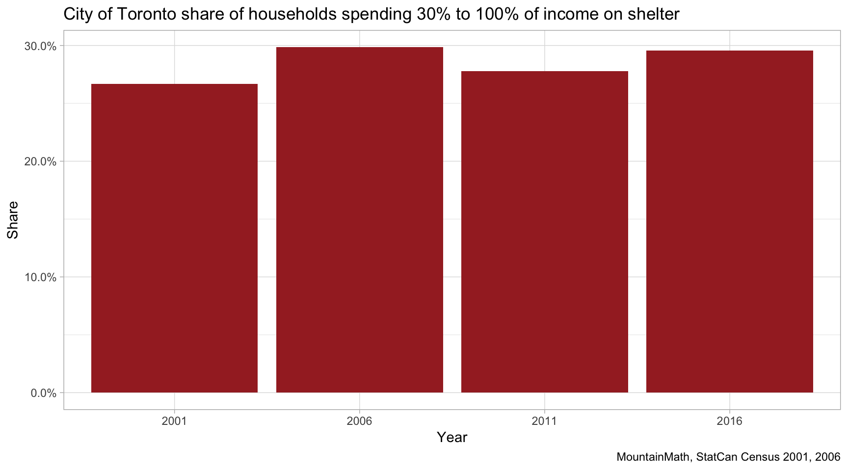
The high-level numbers suggest a slight worsening, that is an increasing share of shelter-cost burdened households. If we are interested in a finer breakdown of the geographic distribution, we need to TongFen the data to CTs or DAs.
CT level data
To get CT level data for all four censues on a common tiling we just need to make the appropriate call, tongfen will take care of the rest.
data_ct <- get_tongfen_census_ct(regions=regions,vectors = all_vectors$vector,geo_format = 'sf') With the data at hand, we can easily take a look at the geographic distribution. Here we have encapsulated the computation of the shares in the compute_shares function call, details are in the code.
plot_data <- data_ct %>%
  compute_shares

ggplot(plot_data) +
  geom_sf(aes(fill=share_d),size=0.1) +
  facet_wrap("Year") +
  share_theme +
  labs(title="Spending 30% to 100% of income on shelter")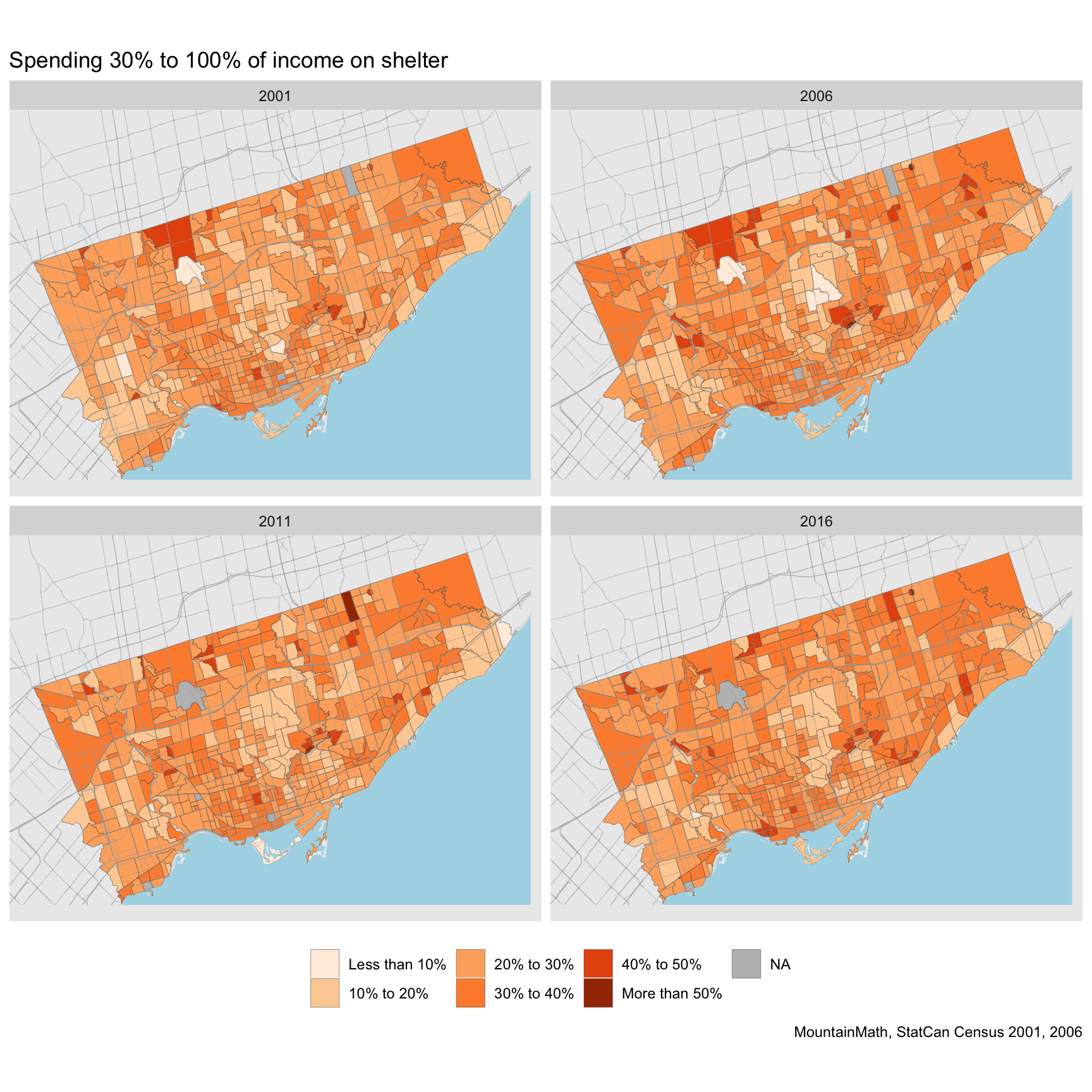
This gives us a good overview over where shelter-cost burdened households were located in Toronto in each year. We can also see some changes over time, but to really understand the changes it is easier to plot them directly.
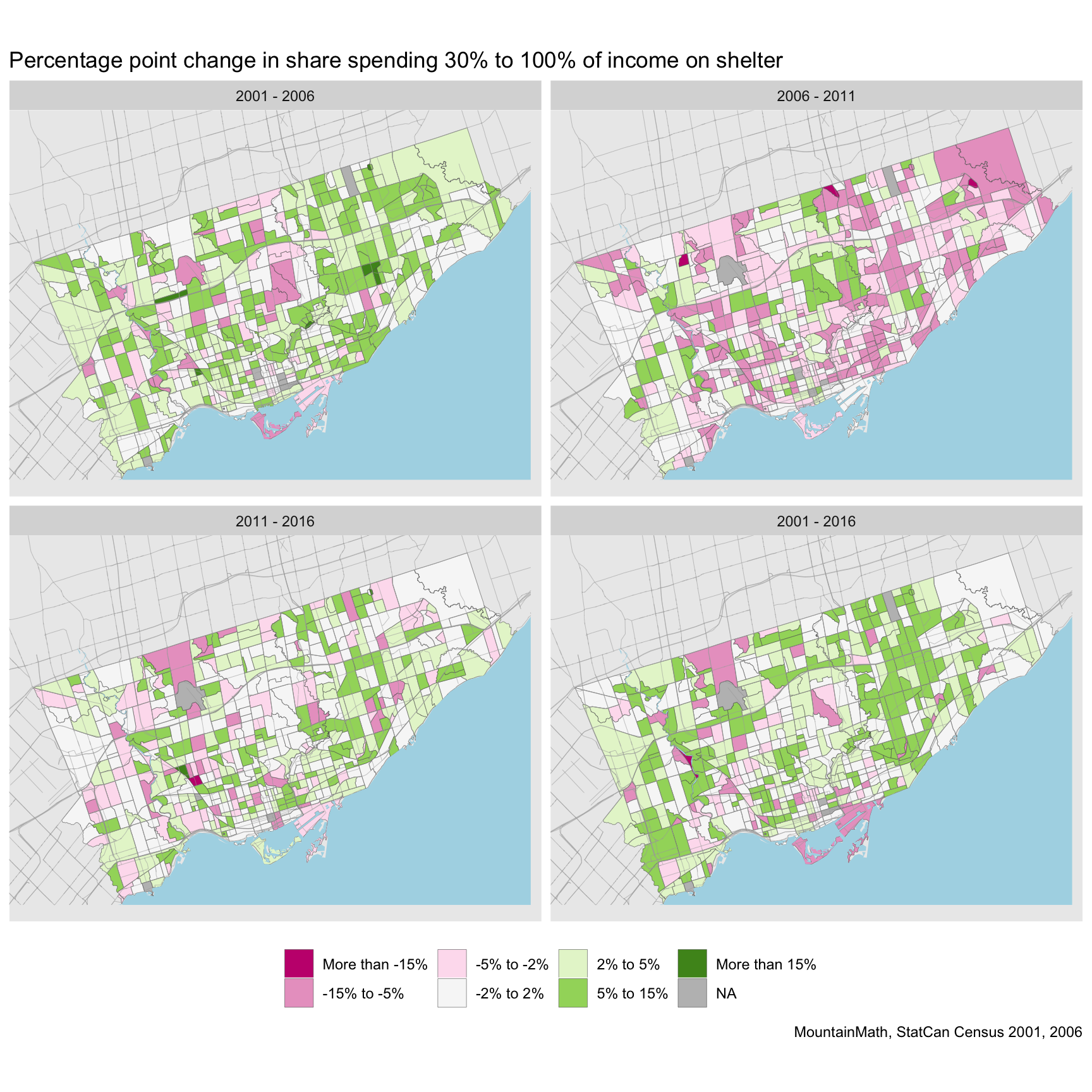
There is significant variation on how the shares changed during those years. Part of that volatility is possibly an indication that households cluster around the 30% cutoff and thus can easily slide across that line. Another issue is data quality for the 2011 NHS, one should probably view changes involving 2011 data with a bit of caution. We have observed before that while CT level income estimates were better than their reputation, this did not translate to good individual level income to shelter cost estimates. Imputation of aggregate income numbers using CRA taxfiler data is reasonably easy, but imputation of individual level incomes to join with shelter cost data is hard. The long-term 2001 to 2016 estimate in the bottom right is probably the one that should receive most of the attention.
DA level data
If we want even finer resolution we can take this down to dissemination area level. Here we pass an optional “transform” function to transform the initial census data before the TongFen process. This allows us to convert NA values for areas without households or population to zeros, eliminating areas for which we can’t report data just because they contain subareas without population.
data_da <- get_tongfen_census_da(regions=regions,vectors = all_vectors$vector,
                                 geo_format = 'sf',na.rm=FALSE,
                                 census_data_transform=census_transform)

plot_data <- data_da %>%
  compute_shares

ggplot(plot_data) +
  geom_sf(aes(fill=share_d),size=0.01) +
  share_theme +
  facet_wrap("Year") +
  labs(title="Spending 30% to 100% of income on shelter")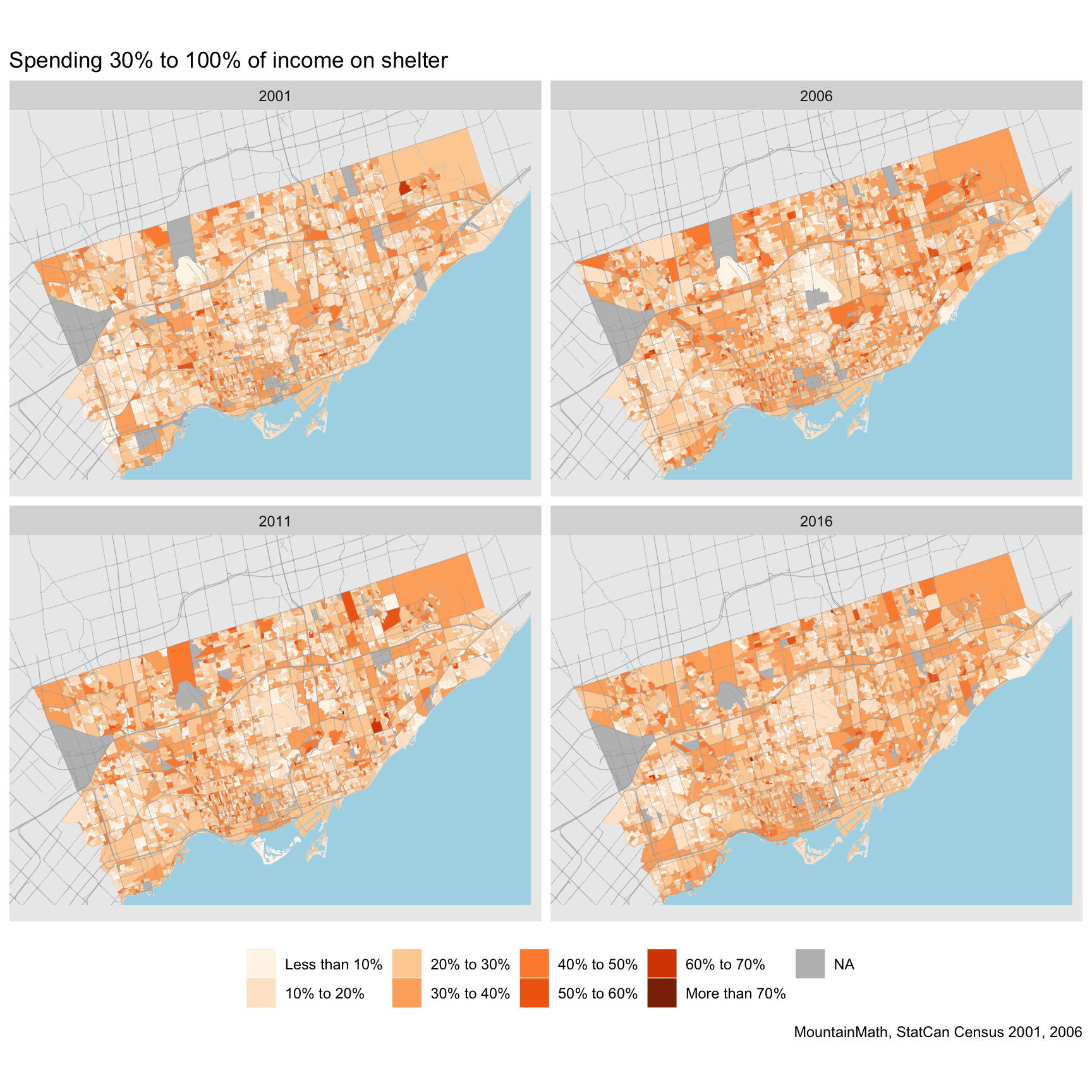
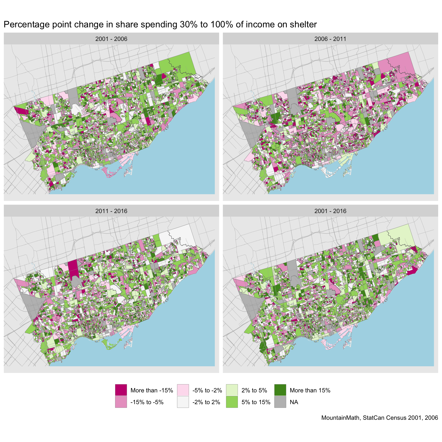
And of course, we can also compute the changes at the DA level.
Uncertainty
However, here we start to run into problems. Changes across small geographic areas are prone to errors. Statistical rounding and biases in the census data really start to matter for some of the areas. In the past we have dealt with this using “Surprise maps” that make a model assumption, for example “no change in share of shelter-cost burdened households”, and colour regions based on their (signed) statistical evidence against our model assumption. Areas with low household counts would provide little statistical evidence against our model assumption, similar to areas with little change but higher numbers.
But it can also be instructional to separate these two factors with a bivariate scale, where we fade out the colours as we lose confidence in our estimates.
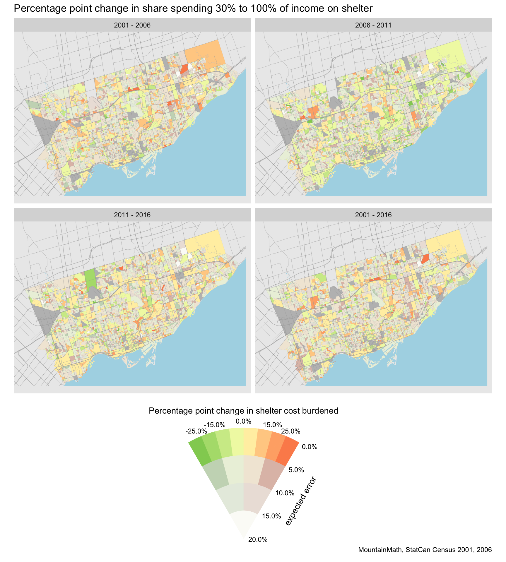
The expected error is the expected percentage point error of the estimate due to statistical rounding. One can refine this by e.g. folding in non-return rates to estimate the uncertainty due to this, and one can tune the colour scale to the specific purpose of the map.
Summary
In summary, with TongFen it’s straight forward to compare census data at the CT or DA level across the four censuses 2001 through 2016 that we have made available via CensusMapper. Especially at the DA level we need to be mindful of limitations to census data as quirks in the data start to distort our results.
As usual, the full code for this post is available on GitHub for those interested in replicating or adapt this for their own purposes.
Reuse
Citation
@misc{multi-census-tongfen.2019,
  author = {{von Bergmann}, Jens},
  title = {Multi-Census {Tongfen}},
  date = {2019-06-04},
  url = {https://doodles.mountainmath.ca/posts/2019-06-04-multi-census-tongfen/},
  langid = {en}
}
