Canadian census data is freely available, alas not in a very convenient format for older data. Census data back to 1991 are available from Statistics Canada with an open data licence, digital geographic data is only available back to 2001. Older census data is available in digital format via paid subscription services from private entities with restrictive licences. But all data is available for free as open data in paper format.
Stuart Smith took it upon himself to go to the library and digitize (i.e. type into a spreadsheet) old census data all the way back to 1941. And he used the reference maps to trace back the areas to tongfen to modern census boundaries. Which it totally awesome. And Stuart has been making neighbourhood timelines using that data to great effect.
We decided to team up and take another look at the data to understand population growth in the City of Vancouver, as well as Musqueam 2 and the UBC/UEL/UNA area.
When computing density there are always some choices to be made. Ideally we like to work with net density, that is only counting area taken up by residential lots. That works well for point-in-time density calculations like we did recently, but raises new questions when looking at time series because the designation of lots as residential changes over time. So we would either have to use changing geographies over time, or use some kind of union geography to aggregate residential land use over time. For this we decided to go a simpler route and just take out parks, but leave industrial and commercial land uses included. None of the effects the population growth in an area, but it does effect the population density.
With these caveats in mind, let’s take a look at an animated population density in Vancouver between 1941 and 2016.
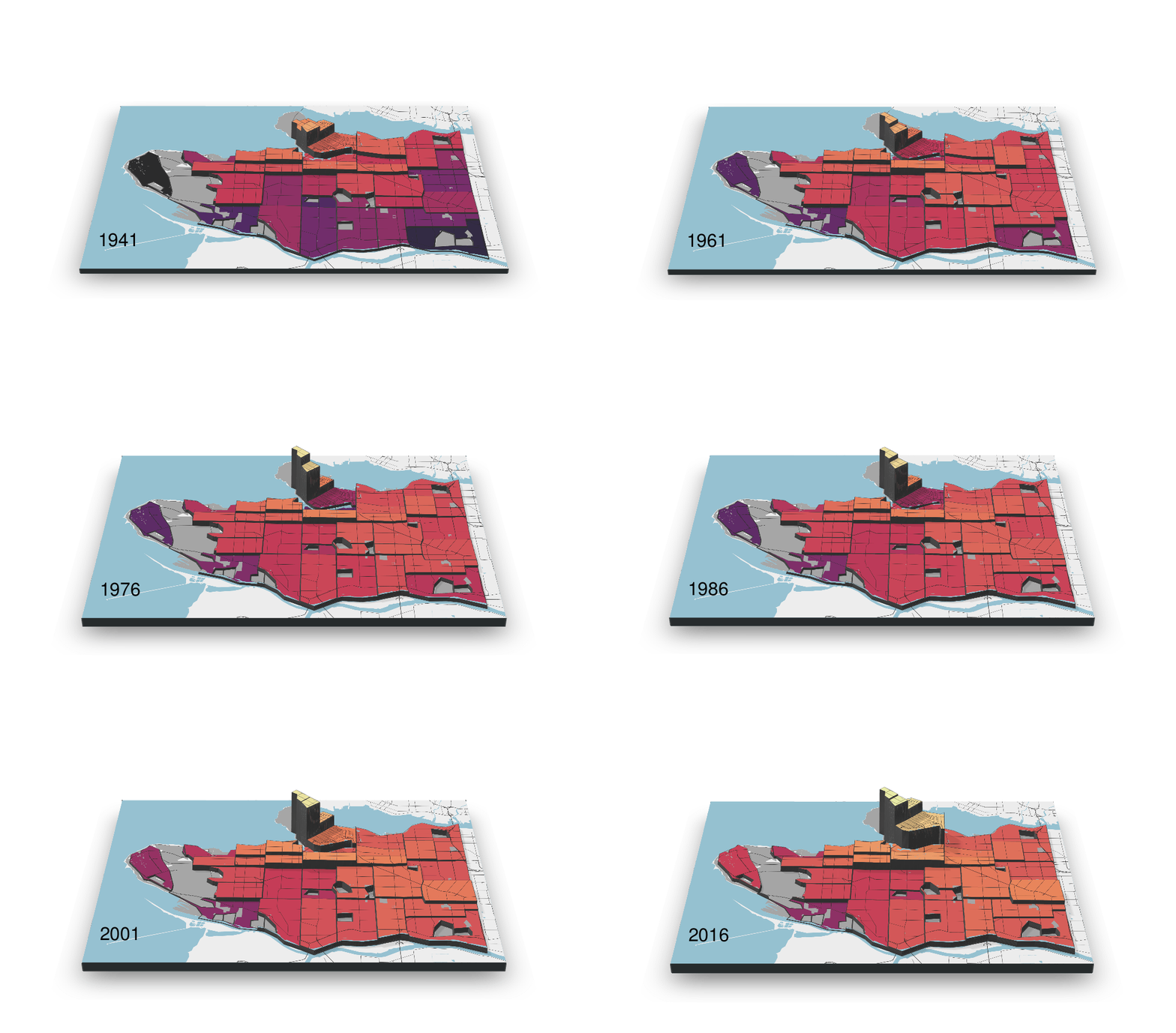
This gives an overview of where Vancouver has added population – and where it hasn’t. We want to take a more systematic look at how this played out in the different areas.
Classifying growth and density patterns
Looking at the changes in population density, we wanted to dive a little deeper and cluster neighbourhoods by how they grew. Trying not to pre-impose our ideas we settled on simple unsupervised k-means clustering. We did play a little bit with the number of clusters, 6 seemed like a good number to get some nuance but still keep things simple. As variables we used growth between the first and last years in our series, and current density. We applied a log scale and normalized both before clustering.
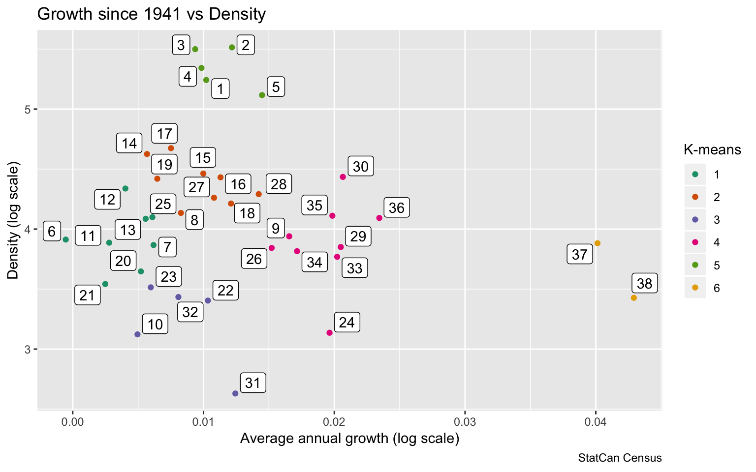
The scatter plot shows that there us a large variation in the data, ranging from population decline for Area 6 that is part of our low-growth cluster, to tremendous growth for our high-growth cluster comprised of Areas 37 and 38 where population grew by a factor of 20.
Generally the clustering makes intuitive sense, although there are some edge cases. The labels correspond to the 1941 census tract boundaries, we kept them as labels for the neighbourhoods. There is a reference map further down.
We could have also used a more complex model to look at the whole time series for the clustering, but results were not much different and the simple clustering seemed to make sense when looking at the time series.
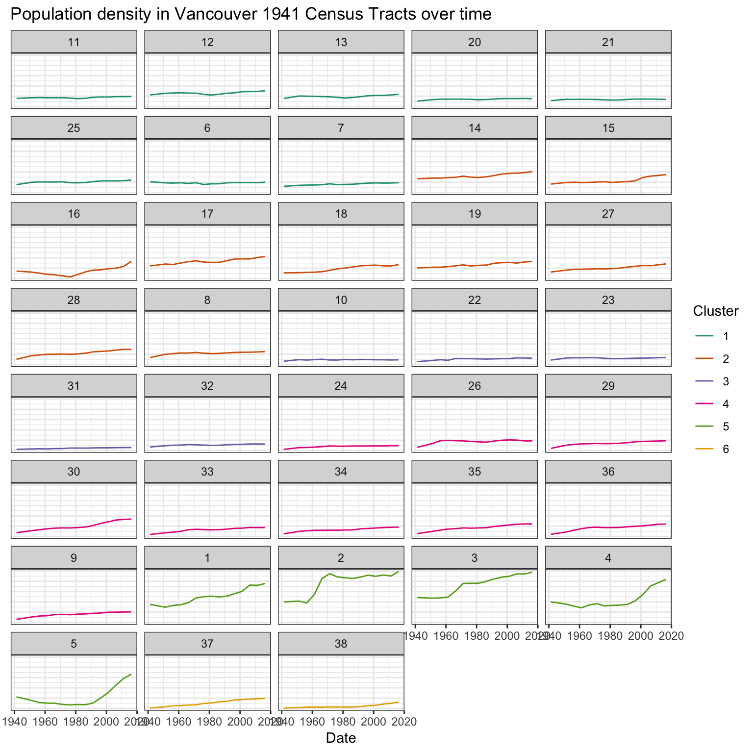
We can take these time series and condense them into our six growth and density archetypes.
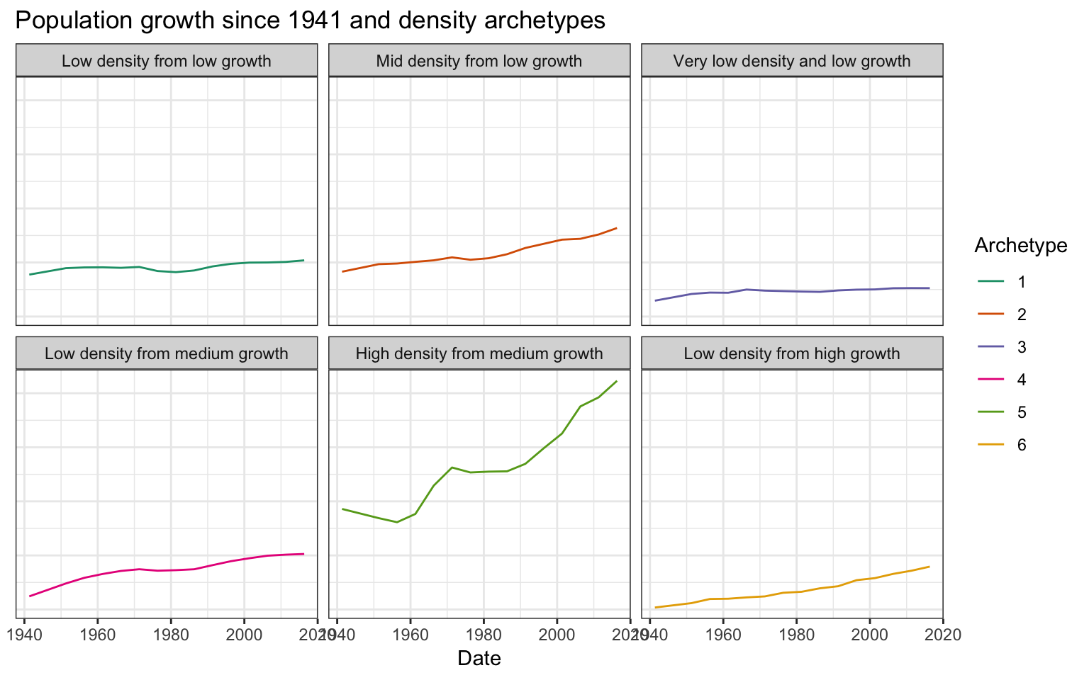
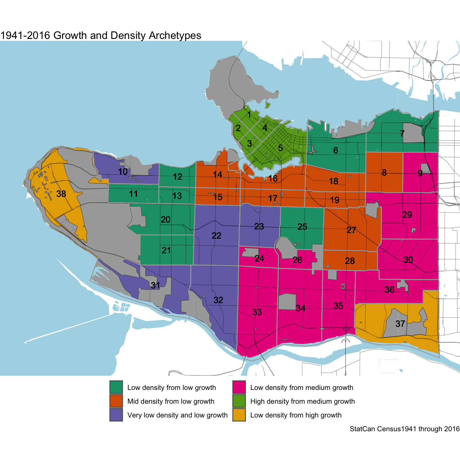
Referring back to the time series for the neighbourhoods, we can examine some of the ones that did not quite fit their archetype model. Neighbourhood 16, containing Fairview and South False Creek, hit a low in 1976 before growing quite strong. So overall the growth was only low when using 1941 as the starting point, but it would qualify as medium growth when starting from 1976.
Similarly, area 5 saw a decline until 1986, but Yaletown lead to strong population growth.
Area 2 in the West End took off between the 1956 and 1961 censuses and reached a peak in 1971 that was only eclipsed in the last census, something we also see to some extent in Area 3.
Area 30 is highest density area of the purple “medium density from medium growth” category, with Joyce-Collingwood marking it’s imprint even though it is located within a very confined part of that area.
The “low density and very low growth” areas stand out as being geographically disconnected, but thus is the fate of these parts of Dunbar, West Point Grey and Strathcona.
More recent history
Memory is short, and not many Vancouverites have 1941 as a comparison in mind. While is great to take the long view on this topic, we also wanted to complement by just looking at the more recent history and using 1976 as a start year, roughly the half-way mark in our time series.
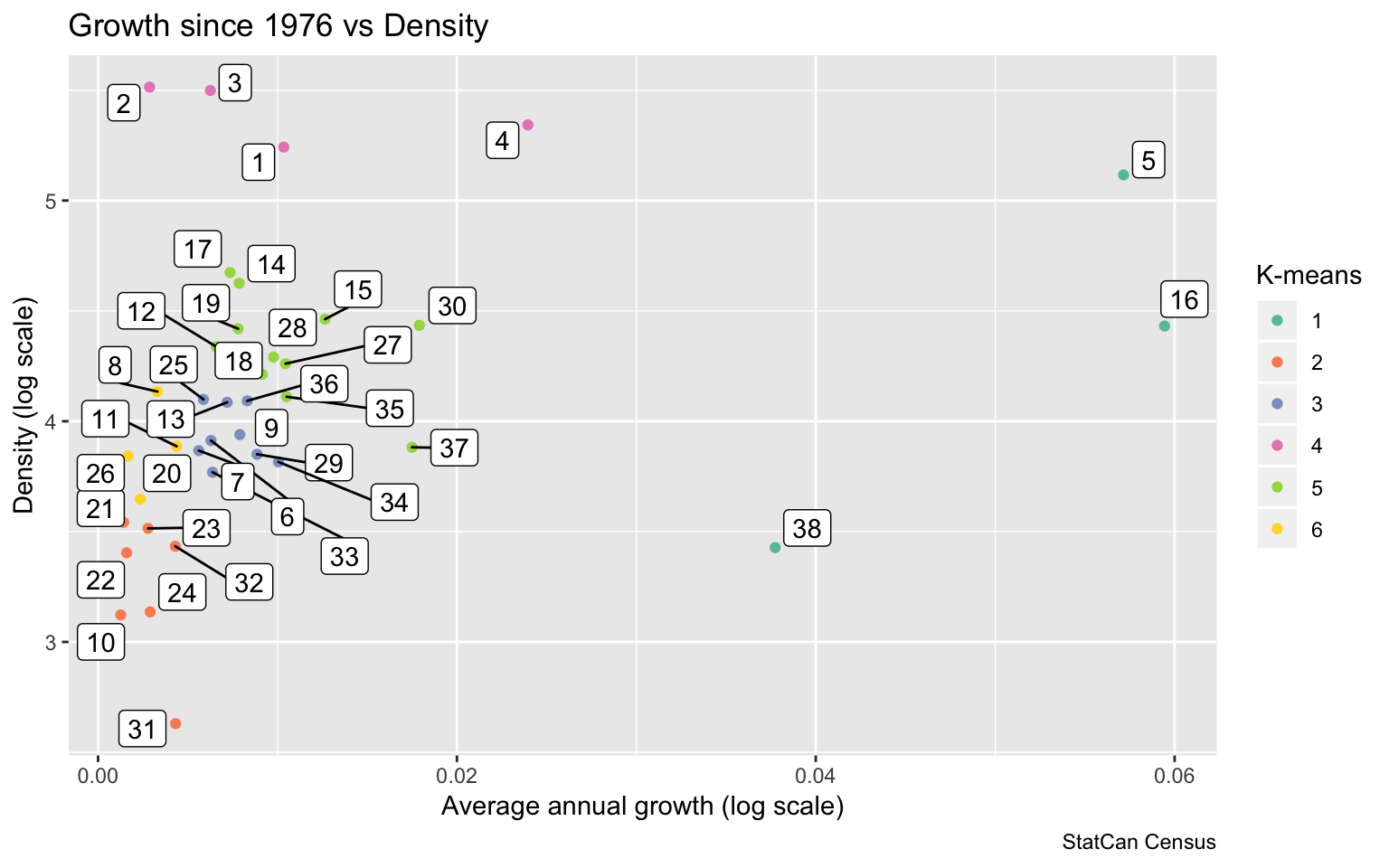
Here the picture is quite different. Area 37 dropped back into a lower growth cluster, while Areas 5 and 16 joined 38 in the high-growth cluster.
We can take these time series and condense them into our six growth and density archetypes.
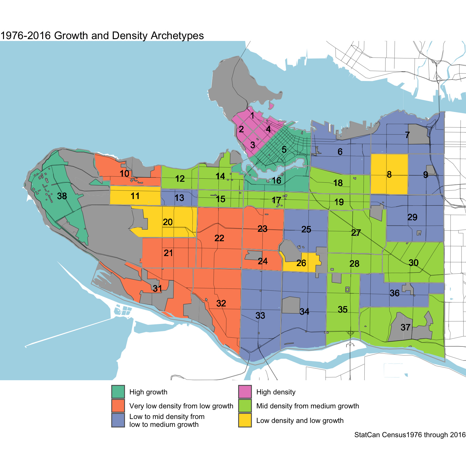
Using a more recent time frame paints a somewhat different pictures, albeit one that most are more familiar with.
Finer geographies
There is a tradeoff between the length of the timeline and how coarse our geographies are. 1976 is somewhat of an inflection point in terms of geographies, so it’s worthwhile to use this as a starting point for taking anther look using finer geographies.
This gives us more sub-regions to classify, but we can just run it though our established machine.
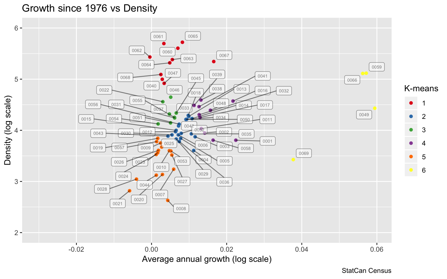
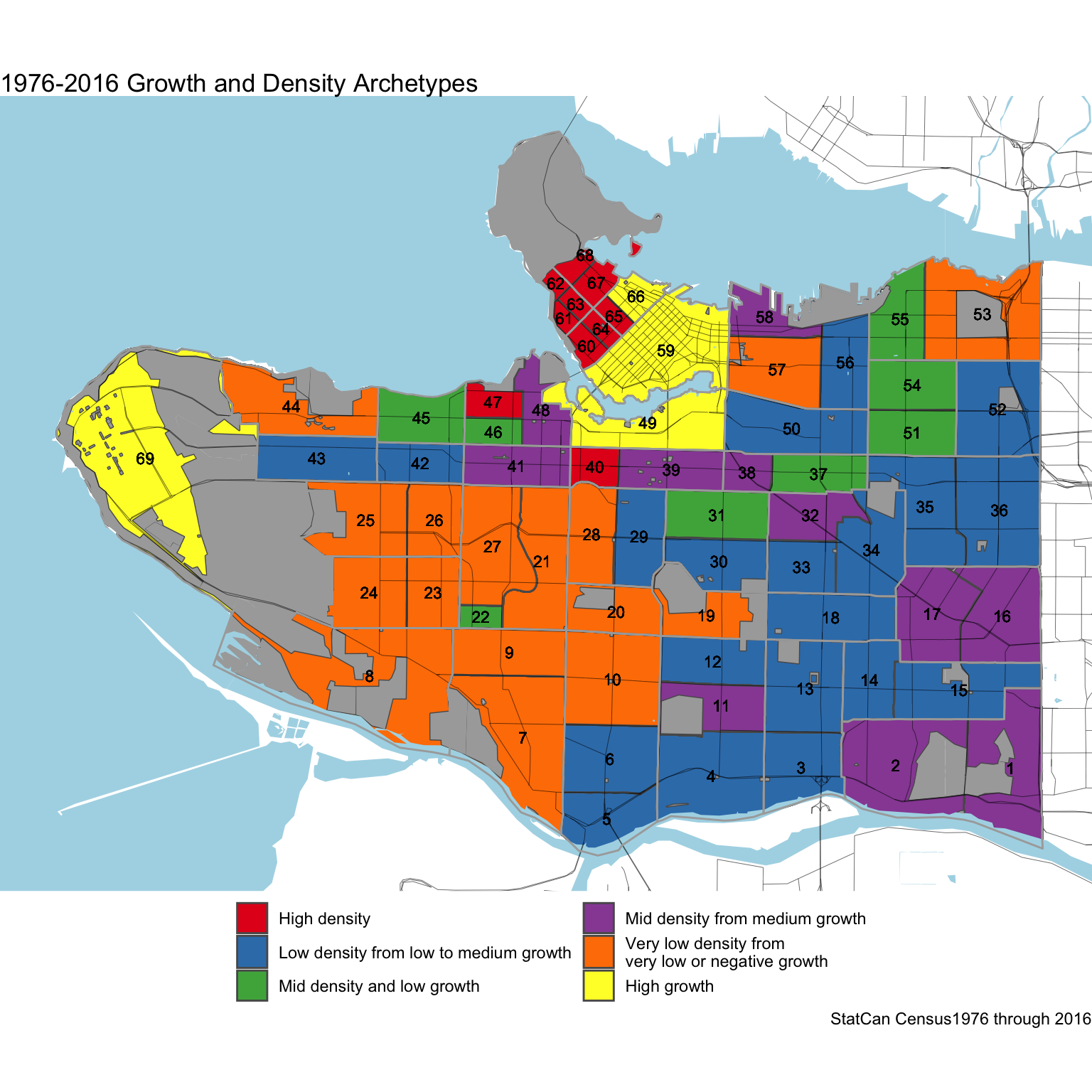
The slightly refined geographies add a little bit more detail, for example the mid-density centre of Kerrisdale pops out. Generally it paints a similar picture to the more coarser geography used above.
Implications
This highlights how unevenly growth has been distributed in Vancouver. This pattern is not caused by people’s preferences, it is almost entirely shaped by policy that dictate which areas should accommodate growth, and which ones should not. One modest exception is the proliferation of informal dwellings in form of secondary suites that has lead so some growth and was only fairly recently legalized.
We don’t know how growth would have evolved without the imposing rigid zoning that does not just regulate nuisances by e.g. separating residential from industrial areas, but imposes very low density on the majority of city land designated for residential use. But we do understand how cities generally function. Cities exist because the proximity of people, jobs and amenities create synergies. And this leads to residential density genreally decaying exponentially with distance from the central business district and amenities. In Vancouver we notice the imbalance between the densities at the centre to densities only 4km out.
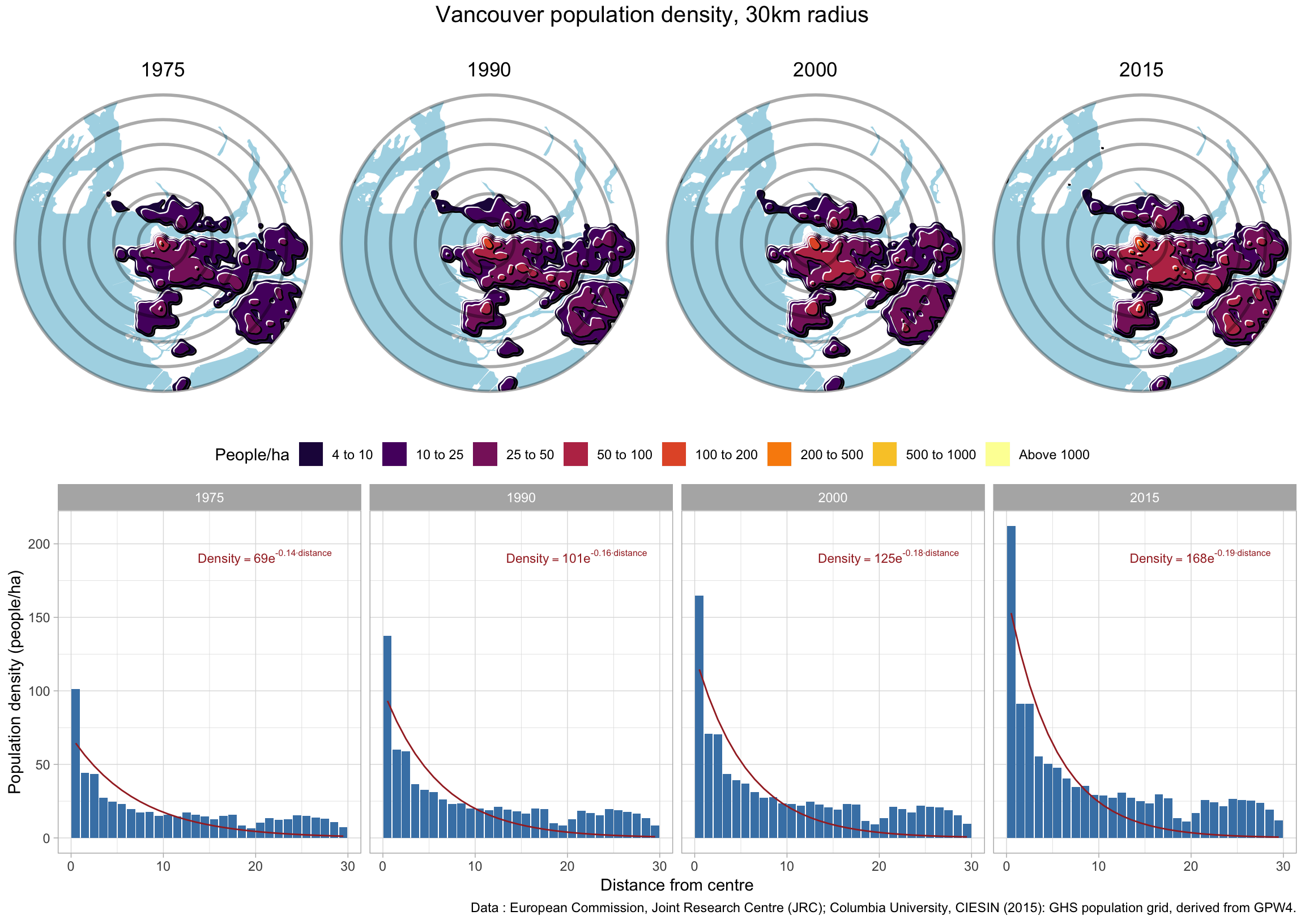
The strong differential also builds up very visibly in the 3D animated map near the top, and is indicative of a massive planning failure that forces artificially low density in large swaths of the city while squeezing growth into small central areas as well as areas far outside of the City of Vancouver in other parts of Metro Vancouver. The consequence is a loss of social welfare, forcing people into longer commutes and into lower-amenity areas.
The data
Stuart made the transcribed census data available, you can download it here. Or grab the code to the post and play with the data that way.
Reuse
Citation
@misc{vancouver-population-density-over-time.2019,
  author = {Smith, Stuart and {von Bergmann}, Jens},
  title = {Vancouver Population Density over Time},
  date = {2019-06-09},
  url = {https://doodles.mountainmath.ca/posts/2019-06-09-vancouver-population-density-over-time/},
  langid = {en}
}