After our recent posts on multi-census comparisons I was pointed to a semi-custom tabulation for census timelines back to 1971 for Vancouver and Toronto. That’s data for the 1971, 1981, 1986, 1991, 1996, 2001, 2006 and 2011 censuses on a common 2016 DA geography for the two CMAs. This is really cool, not just that it eliminates the need to tongfen the geographies, but in particular because Statistics Canada does not even haven publicly available geographic boundary files for censuses before 2001.
It also ties in nicely with recent work we did with Stuart Smith that took hand-transcribed census data all the way back to 1941 and looked at population change on a common geography. This data does not go back quite as far, but it comes on a much finer geography.
The data
The data comes in the much hated (by us at least) Beyond 20/20 format, which requires manual work to get it into a form where we can run our scripts. It comes in separate files for Toronto and Vancouver, and separate files for each year, and some years are yet again broken down into separate files (in two different ways). Which makes it quite annoying to assemble the data.
If that was not enough trouble, the spelling of the variable names is not consistent across the different extracts, so it requires manual adjustments. Moreover, there are some multi-row variable names that need special attention during the import. And while this is thoroughly annoying, this is unfortunately expected and quite the norm for custom tabulations from Statistics Canada.
The data only comes at DA and CMA level, so we had to aggregate up the data for the intermediate census geographies of CTs and CSDs to fit into the CensusMapper geographic hierarchy and allow for rapid analysis at different geographic levels. There are several problems with this though. Some variables, like medians, can’t be aggregated up. And other variables, like averages or percentages, need metadata in order to aggregate them up properly. CensusMapper added this metadata for the 2001 through 2016 censuses, but we have not added it for this custom tabulation. It’s a lot of manual work and we could not justify dedicating the required resources to this. Lastly, some data is suppressed at the DA level, and it will be missing from higher level aggregate counts too.
Unfortunately the data is constrained to Vancouver and Toronto CMA, it would be amazing to have this data available nation wide. I see an opportunity for Statistics Canada to provide a consistent semi-custom tabulations for all of Canada, including for higher aggregation levels.
To make it easier for us to work with the data we have imported it into CensusMapper. As we haven’t yet added the metadata that would enable us to make it available for the general public to map, but that’s something that we are hoping to find the resources to do in the future.
One usual caveat with the data is that geocoding is hard, and we should expect some issues where StatCan incorrectly, and inconsistently, geocoded dwelling across the censuses. Geocoding errors will show up as one region suddenly losing population, while an adjacent region is gaining. This won’t happen often, but there are a lot of DAs in Metro Vancouver and it is bound to happen at times.
Population change
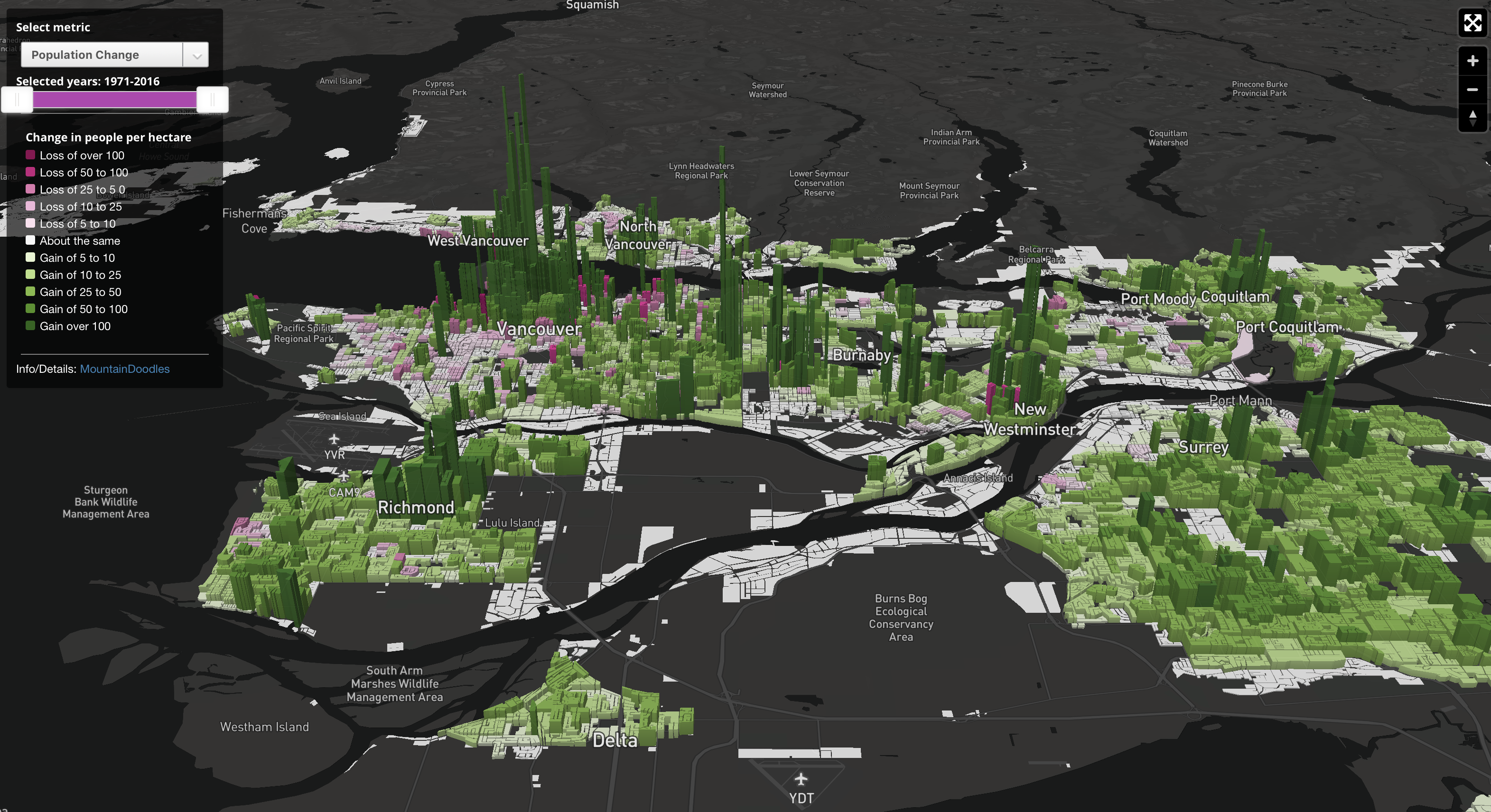
For today we will just look at the most basic variable: Population. And map how it changed over time. People can view this data on CensusMapper. But flat 2D maps have difficulty to show the extent to which the population change across regions differs.
Relative population change, that is percent increase in population, is also a challenging concept when dealing with regions that did not have any population in 1971. A better way to slice the data is to look at change in population density. Which introduces a problem when comparing one geography to another. Some regions contain large parks, others just housing (and some road space). The park space will weight down increases in population density compared to the area without parks.
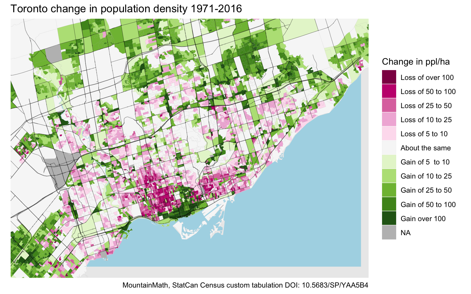
It still gives a decent overview over how a region changed. Here is a map of population change around the City of Toronto 1971 to 2016.

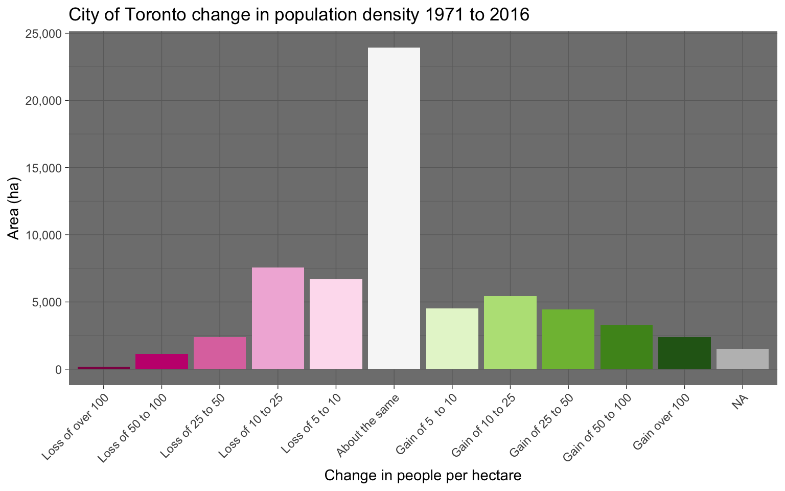
It’s quite striking how unequal the growth has been distributed throughout the region. We aggregate the areas in each of our growth bins for just the City of Toronto to quantify this.

Land use
The solution to the problem of some areas containing large non-residential land uses is of course to cut the regions down to residential lots, so switch from gross density to net density like we have done in our project with Denis Agar looking at population, dwelling and renter density in the frequent transit network. For Vancouver we can use the Metro Vancouver Land Use Data. For this map, we are keeping the industrial and commercial land use areas, as well as the areas marked as undeveloped or unclassified, as the land use data is a bit dated now and does not account for some of the recent residential growth in some of these areas.
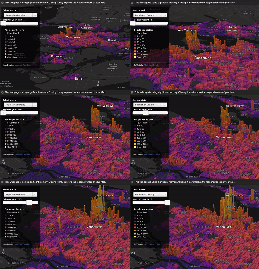
This data is best explored in an interactive map, which we won’t embed here because it loads a large dataset and should probably not be explored on mobile. It’s totally worth it to take the time and play with this on a desktop though.
Explore interactive population change map
Here we allow to view the population density for each year, and we have the option to view the change in population density for any two years.
Upshot
Population change is the obvious point to start the explorations of this rich custom tabulations. I am glad to have found it and am looking forward to exploring it more. And hoping that others will jump onto the bandwagon and use this to understand how Vancouver and Toronto have changed since 1971. As usual, the code for this post is available on GitHub for those that are looking for some pointers how to use this data.
Reuse
Citation
@misc{census-custom-timelines.2019,
  author = {{von Bergmann}, Jens},
  title = {Census Custom Timelines},
  date = {2019-06-15},
  url = {https://doodles.mountainmath.ca/posts/2019-06-15-census-custom-timelines/},
  langid = {en}
}

