(Joint with Nathan Lauster and cross-posted at HomeFreeSociology)
In our previous post on COVID mortality in context, we tried to place COVID deaths, as recorded so far this year, in the context of expected deaths from previous years. There have been a lot more developments since that post. And unfortunately a lot more deaths too.
Here we’re providing an update to our previous post, but also expanding on that post by talking a bit more about new mortality analyses and the progression of outbreaks in terms of expected deaths on a weekly basis. First, an update! We previously placed COVID deaths in the context of expected deaths at the national level, starting after the 20th death was recorded. What does that look like now?
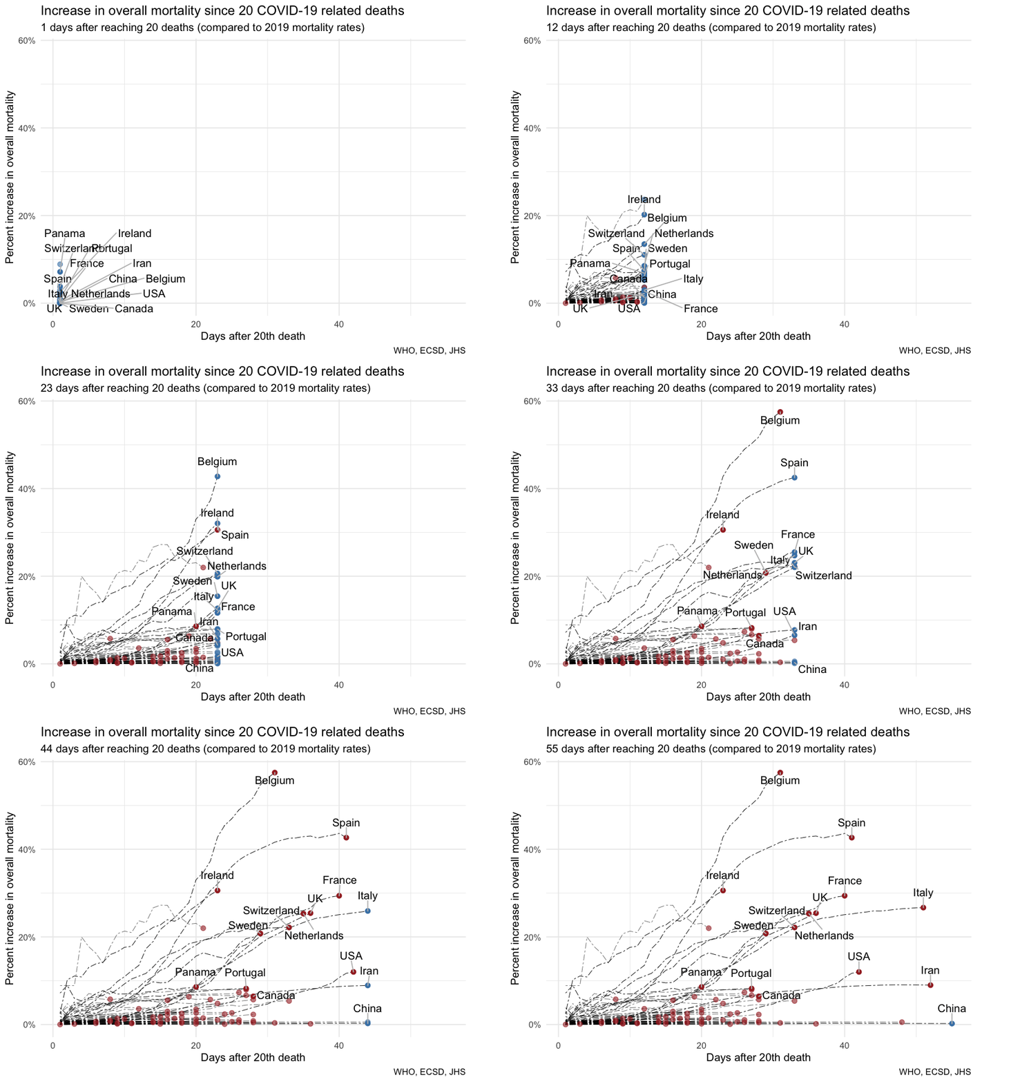
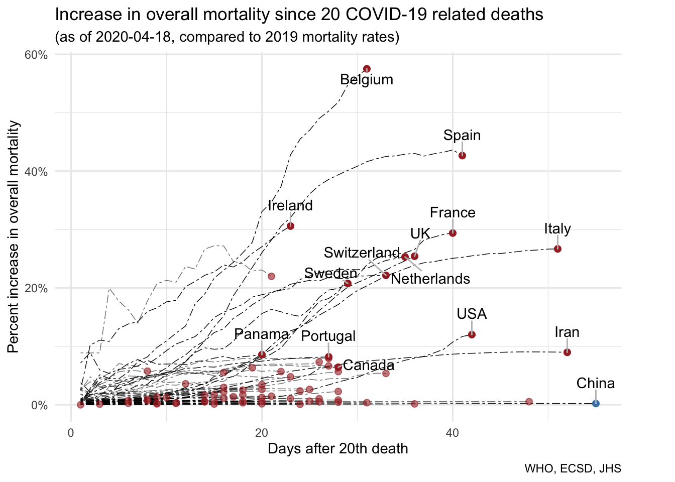 As visible in the mortality data, Belgium has moved to the forefront of the COVID outbreak in Europe in terms of COVID deaths relative to expected deaths from years prior. Ireland, the UK, and the US appear to continue to climb. By contrast, Spain and Italy, early centres of the outbreak in Europe, have largely levelled off. Though the USA “leads” in deaths from COVID-19, this doesn’t (yet) show up in the relationship between COVID deaths and expected deaths because the USA is enormous, with a lot of expected deaths every year, and the outbreaks of COVID deaths have been heavily concentrated in a few locales so far. Even so, as the NYTimes suggests, COVID is now arguably the leading cause of death in the USA, ahead of heart disease and cancer.
Overall, and as mentioned previously, there’s still a lot we don’t know in these comparisons. For instance, we don’t know if we’re actually counting all of the deaths due to COVID. Lots of people don’t get tested, and cause of death is always tricky to determine in the best of times, let alone with an overloaded medical system and coroners’ offices. As a result, revisions to the data can add dramatically to the death toll, as happened recently in New York City. In addition to good COVID death data, we’d also like updated data on mortality overall. We’ve seen recent – and very preliminary – data out of NYC and scattered other locales suggesting that all-cause mortality has risen dramatically in places with severe COVID outbreaks.
Where we have it, we can put updated all-cause mortality in conjunction with COVID mortality and expected mortality all together. Putting this on a weekly basis really provides a sense of the progression of outbreaks and how overloaded they leave medical systems in terms of the normal deaths they have to deal with. Given some of the data from NYC, here’s roughly what that looks like.
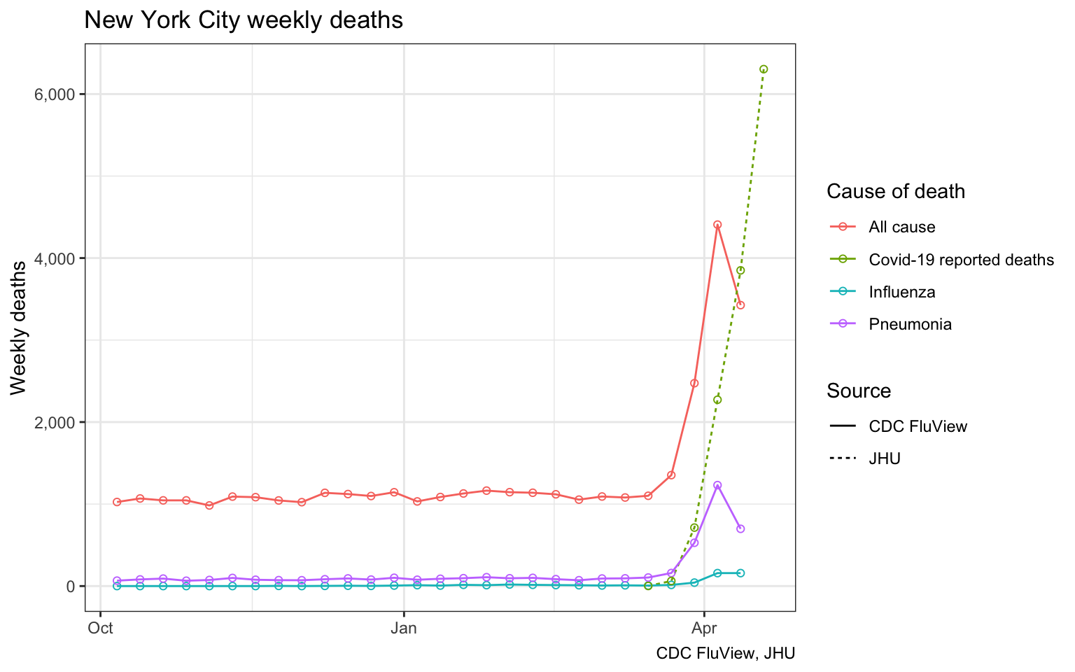
We notice a downturn in deaths as recorded by the CDC FluView for the last week they report data (the week ending on 2020-04-12). This is not a REAL downturn. Rather it illustrates the reporting lag for data on deaths. It can take several weeks for the numbers to fill in and stabilize. We added the reported Covid-19 related deaths as assembled by the JHU for reference. JHU data was aggregated up the week ending 2020-04-19, so it’s nominally a week ahead of the FluView data. However, these deaths are coded by date reported, unlike the CDC data that is coded by date of death, which causes the JHU data to lead a bit. Even accounting for a possible time shift in JHU data, it appears that JHU data does not account for the full increase in all-case mortality, hinting at likely under-reporting of Covid-19 deaths in the JHU data.
Unfortunately we still don’t have updated all-cause mortality on the country level. As suggested by the lag in NYC data, it takes awhile to compile in the best of times (here’s a look at efforts to gather some of the European data). So here we’ll provide a replication of our previous analysis, but breaking out COVID deaths against expected deaths on a weekly basis for countries instead of across the entire length of the outbreak.
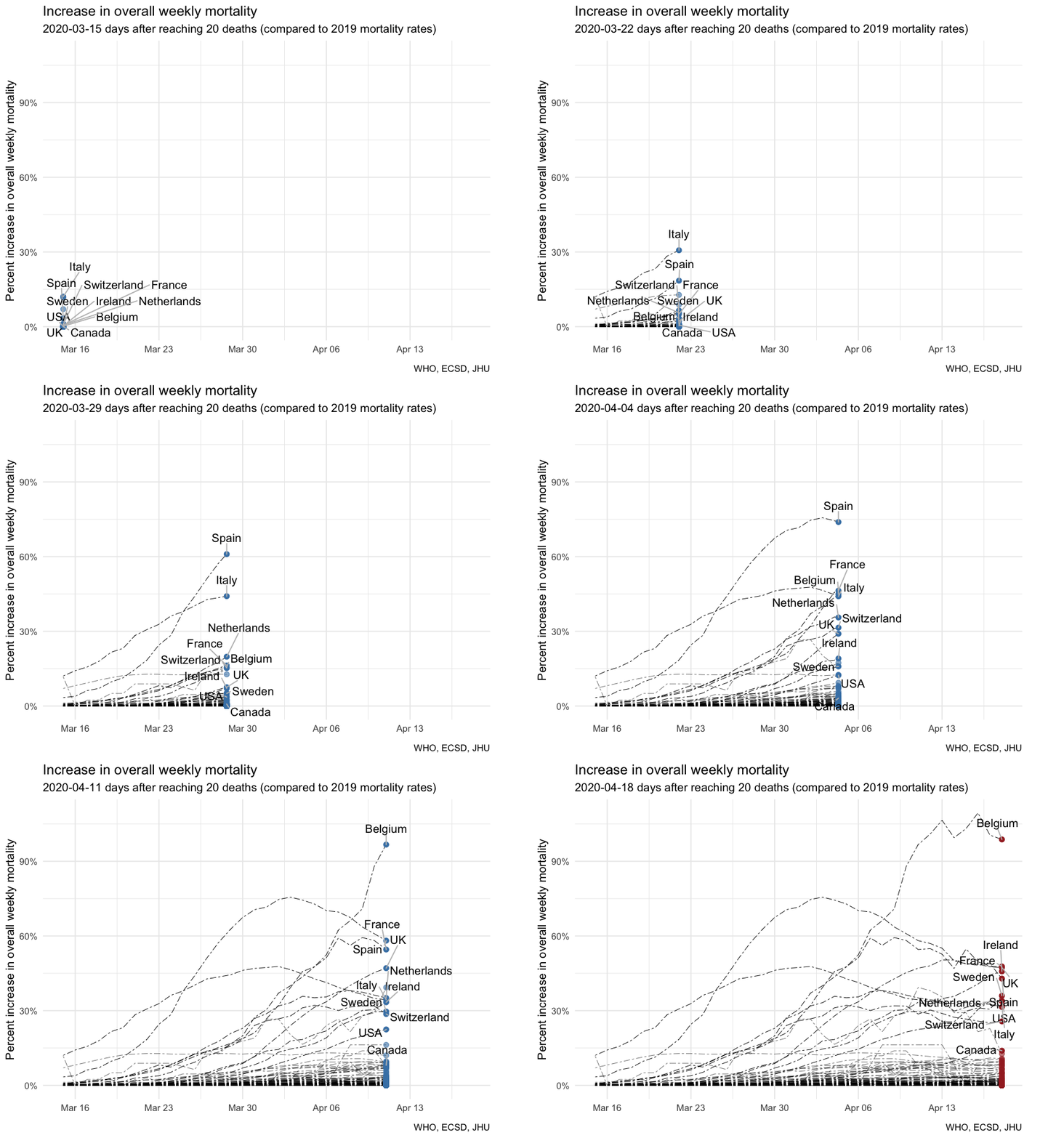
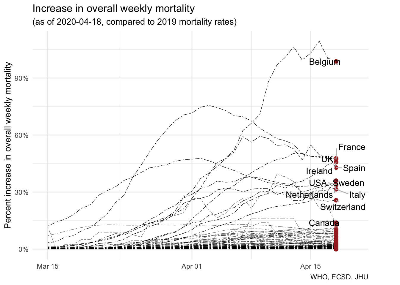
Overall, weekly COVID deaths as a percentage of expected deaths looks broadly similar to our earlier figure, which charted the rise in COVID deaths as a percentage of expected deaths since outbreak deaths began. But there are a few significant differences. The weekly chart better highlights the evolving overload on hospitals and health systems, as well as coroners’ offices, and this is reflected in the y-axis, demonstrating that COVID deaths in Belgium have more than doubled the expected deaths in the last week for which we have data. The weekly chart also more quickly identifies declines in the relative impact of COVID deaths in places where the worst of the outbreak has passed, like Spain, Italy, and France. It will take a long time for the expected death toll to diminish the impact of the overall death toll of COVID in our figures at the top of the post. But on a weekly basis, we can already see the toll of COVID receding in many places.
As we’ve noted previously, it will still take a long time to sort out the overall effects of COVID on mortality. Why? Well, we’re still nowhere near done with the outbreak, and we can expect deaths to continue until we have a vaccine and have reached some level of “herd immunity.” But we’ll also be sorting through the mortality data for years to come. Also important: the toll at national levels, while helpful in assessing cross-national differences, masks the impact at local levels where outbreaks often occur. So it is that the estimate from Belgium, where most recent weekly COVID deaths appear to have more than doubled expected mortality, is dwarfed by the estimate from New York City, where the most recent weekly COVID deaths appear to be more than six times the expected (pre-COVID) mortality.
As usual, the code for the post is available on GitHub in case anyone wants to refine or adapt it for their own purposes.
Reuse
Citation
@misc{covid-deaths-in-context-by-weeks.2020,
  author = {{von Bergmann}, Jens and Lauster, Nathan},
  title = {COVID Deaths in Context by Weeks},
  date = {2020-04-19},
  url = {https://doodles.mountainmath.ca/posts/2020-04-19-covid-deaths-in-context-by-weeks/},
  langid = {en}
}
