We have written about the situation of covid-19 data in Canada previously, and the need for good data is becoming more pressing as we are poised to slowly open up some of our restrictions and need to closely monitor how the spread of COVID-19 is responding.
A key number to watch is the effective reproduction rate, the average number of people an infected person passes on the virus ($R_0$). Our collective social distancing has led to the effective reproduction rate to drop below 1, so the spread of the virus is receding. But social distancing also has adverse effects. For some it is merely an inconvenience, for others it has meant serious hardship.
Now that case numbers have come down in some parts of Canada we are starting to consider loosening some of the social distancing restrictions. The key is to find the right balance of undoing restrictions that cause the most serious hardships, while at the same time keeping the effective reproduction rate at or below 1. If the reproduction rate creeps up above 1 we will find ourselves in a cycle where we have to again tighten social distancing recommendations to beat the case number back down.
Next to social distancing there is another method to suppress the effective reproduction rate: Rigorous contact tracing. Rigorous contact tracing means that whenever we confirm a new COVID-19 case, we determine all “close contacts” during the time they may have been infectious and quarantine all “close contacts” for about two weeks. If we are fast enough in detecting cases and tracing contacts, the contacts won’t be infectious before they are quarantined and we stop the growth of the infection. To be practical, contact tracing requires a low case number to start with, and British Columbia’s new case numbers are definitely low enough now for rigorous contact tracing to be effective. But life is messy and contact tracing will be leaky, but it will help reduce the spread and push the effective reproduction rate down.
Estimating the effective reproduction rate
There are a number of great open analysis packages that can be used for modelling COVID-19 data. But modelling accuracy will suffer as data quality declines. Before we can model we need to talk about dates related to the cases. There are several dates that are important for this.
- Date of infection
- Date of onset of symptoms
- Date of testing
- Date test result is reported to Health Authority
- Date test result is reported to the public
For modelling, the date of infection is the most important one. But it’s also the one that we have the least information on. In some cases we will be able to pinpoint the exact time of infection, in many others we won’t. Onset of symptoms is a bit easier to get, although it will be missing at least for asymptomatic cases. Assuming our testing protocol is set up to find any, in which case we generally substitute the date of testing in for this. The distribution of time between infection and onset of symptoms is fairly well understood by now. It will introduce some noise in our modelling, but we can manage that well in our modelling.
The case reporting dates are secondary for modelling. They have value because they relate to important contextual information like changes in testing protocol, and help understand reporting lag. Yet they are the most ubiquitously used dates because more data with more relevant dates often isn’t available.
On top of that, we need to distinguish different kinds of exposure to COVID-19. If someone gets infected elsewhere and travels to a different region, gets symptomatic and the case gets confirmed, that person should only count as a source of infection, but not as a newly infected case. Having information on the type of exposure will make the model more robust.
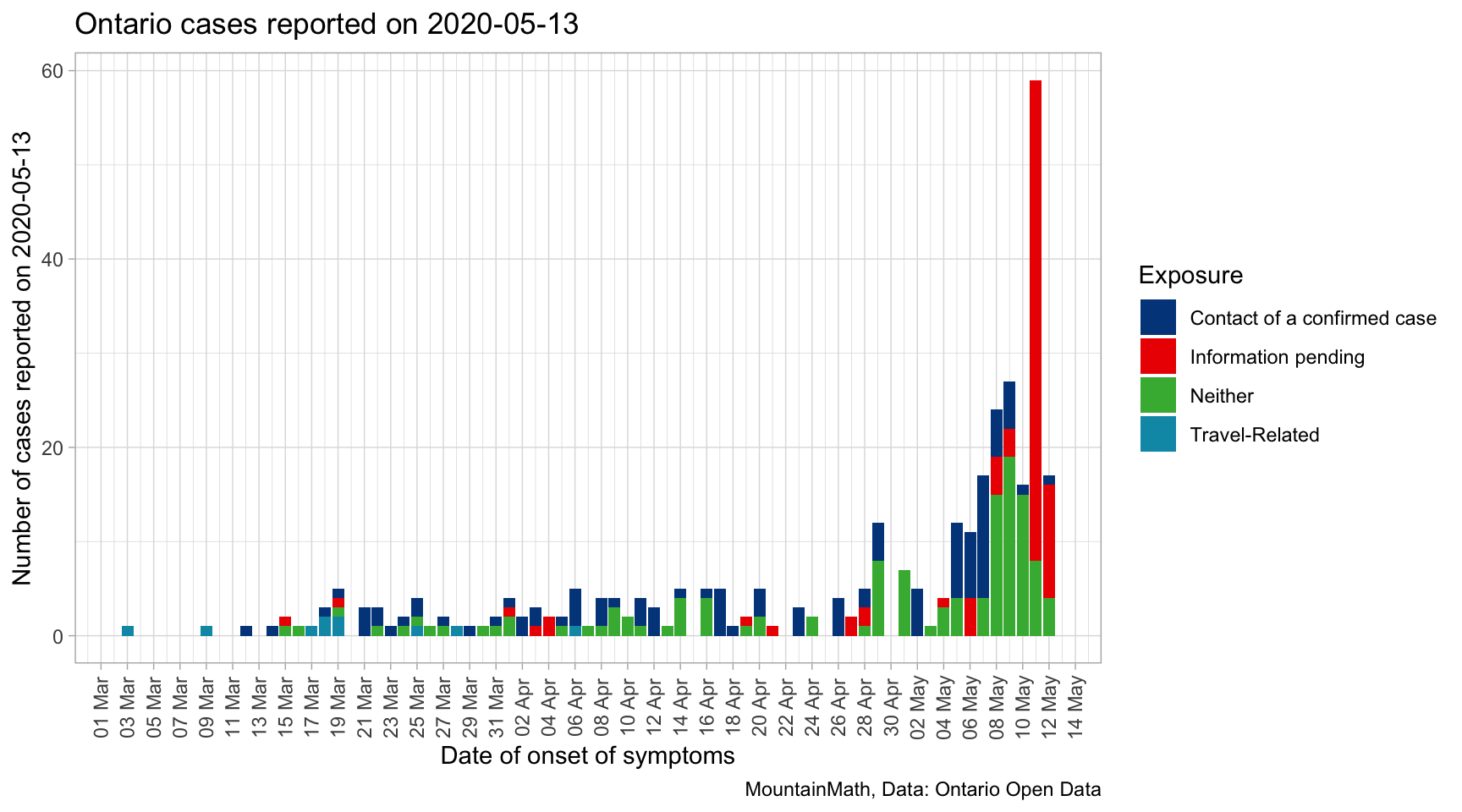
To start off, let’s take a look at the data by exposure and date of onset of symptoms for the cases that Ontario reported on yesterday.

This highlights one of the key problems when modelling effective reproduction rates, we are reporting on cases now while symptoms started a month ago. Thus the modelled effective reproduction rate for the time one or two weeks ago will change when new case data gets released that had an onset of symptoms during that time period.
The good news is that the bulk of cases publicly reported on May 13th comes in within the previous 8 or 9 days, modelled effective reproduction rates are likely quite stable before that. Understanding the distribution of these lags between symptom onset dates and reporting dates can help us make guesses about the how the overall distribution of cases by onset date is likely to change in the coming days, and sampling from that distribution can inform robust confidence intervals for bringing the modelling up to just a couple of days prior to the reporting date.
Unfortunately that requires some extra work, Ontario does not publish a clean dataset with the required dates. At this point, linking the reporting date with onset of symptoms date requires to cache all successive data releases. For the above graph, we took the difference of released data on two consecutive days (delaying the publication of this post by one day). Hopefully Ontario will release a clean dataset in the future to support modelling instead of asking researchers to do the extra work of caching historical release data.
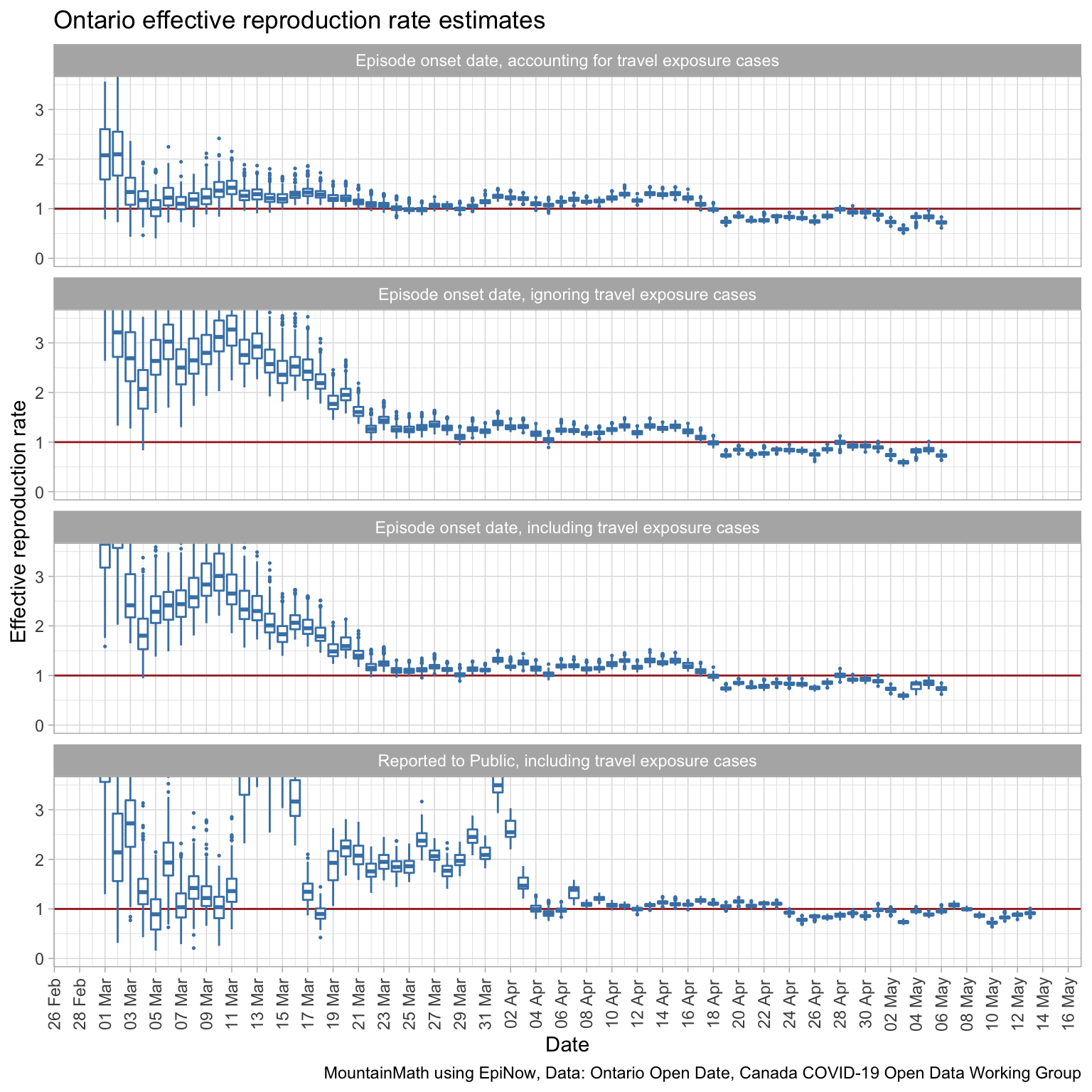
Understanding how these days relate begs the question how modelling the effective reproduction rate depends on the type of dates we use for modelling, and also how accounting for travel exposure affects the modelling. For this purpose, we count Travel-related exposure as imported cases and all others as local transmissions. For modelling, we are using the EpiNow package that we found to be quite good.
Before we dive into modelling, we need to understand the value of contextual information that goes beyond just case counts. What we are really interested in is the spread of the virus, case counts is just a proxy for that. But generally we only discover and confirm a fraction of actual COVID-19 cases. If that fraction stays constant over time, then the effective reproduction rate based on case counts will mirror the effective reproduction rate of all cases, discovered and confirmed or not. But the fraction of confirmed cases will change over time, in particular when we change our testing protocol. Incorporating this into the model goes beyond the scope of this post, but this is something to keep in mind when interpreting the model results.

We see that model fit is best when using the episode onset date and accounting for travel exposure. Travel exposure mattered more in the beginning period and less later on when local transmissions started to dominate. We cut off the effective reproduction rate for graphs based on the onset of symptoms date for the most recent 8 days where we lack confidence in the accuracy due to reporting lag as explained above.
To understand the effect of social distancing measures, recall that Ontario ordered schools closures on March 12th, Canada announced international travel restrictions March 16, and Ontario started shutting down on March 17th. We do see a drop in the reproduction rate starting around March 18th when using the symptom onset date, which is consistent with our general understanding of the distribution of the incubation period centred around 4 to 5 days. What is interesting is that the modelled effective reproduction rate was already quite low at the beginning of March, suggesting that many already adapted their behaviour before the officially announced social distancing measures. (The higher modelled effective reproduction rate on the first couple of days is a product of the Bayesian prior of a reproduction rate of 2.6 used to kickstart the model.)
The bump in the modelled effective reproduction rate at the end of March could be people infected by infected travellers returning from March 16-20 break.
It seems starting around April 12th the social distancing measures in Ontario finally became effective enough to push the effective reproduction rate below 1.
When comparing to the last graph that is based on reporting date we notice about a 6-day lag, which is consistent with our understanding of the distribution of onset date by reporting date.
We should be careful not to over-interpret the data without also taking other contextual information into account, in particular when and how testing protocol changed.
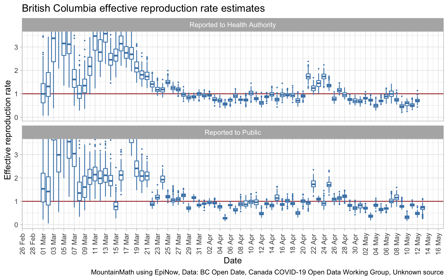
We can also run the same model on BC data, although unfortunately BC does not make onset of symptoms data available in digital form.

These two graphs are of the same type as the last Ontario graph, they are based on the date of public release, not the date of the onset of symptoms. We see larger uncertainties which is driven by the overall lower case numbers. No complaints about that! Using the date of when the case was reported to the Health Authority gives a slightly better fit than using dates when cases were reported to the public, which is as expected.
Social distancing measures got introduced in BC starting March 12th and became successively more stringent in the week following. It is hard to see where exactly that is reflected in the data by reporting date, taking hints from the Ontario data this may be the cause of the drop in effective reproduction rate by reporting date starting around March 25th. The temporary increase April 21th through 25th is likely due to the change in testing protocol introduced at that time. (Changes in testing protocol tie in nicely with reporting date.)
Especially given the larger uncertainties due to lower overall case counts, it would be great if we had data by onset of symptoms date easily available. Having better data will drive down model uncertainty as we have seen in the Ontario data. Alas, BC only publishes this data in image form in their Situation Reports, and it’s too much work to scrape it all out for the purpose of this post.
Lag
The lag in reporting is a real impediment in getting robust timely estimates for how we are doing. As things stand, we are looking at roughly a 10-day lag from change in behaviour (due to change in social distancing measures) and the result showing up in our estimates. If we open up and cases start to climb again, we will have two generations of COVID-19 spread before we see the results and can re-adjust.
We can’t do anything about the lag from infection to onset of symptoms, but there is little reason for the delay between onset of symptoms to reporting to be 6 days. If we are serious about getting timely actionable data, we need to set up processes that people with symptoms can get tested (and isolated) fast with fast reporting. This lag should get cut down so that we aren’t flying in the dark for such a long period.
What data do we need
The bottom line for this post is that we need better data. The minimal dataset that can give us decent estimates has: * date of onset of symptoms * type of exposure (travel vs local) * Health Region geographic granularity * date of reporting * number of cases for each combination of the other variables
The date of reporting is not essential for the model, but it gives an indication of how to impute cases with a recent onset date that we still haven’t discovered and thus help drive down the lag. This is important as we want to reduce the lag of our modelled effective reproduction rate as much as possible.
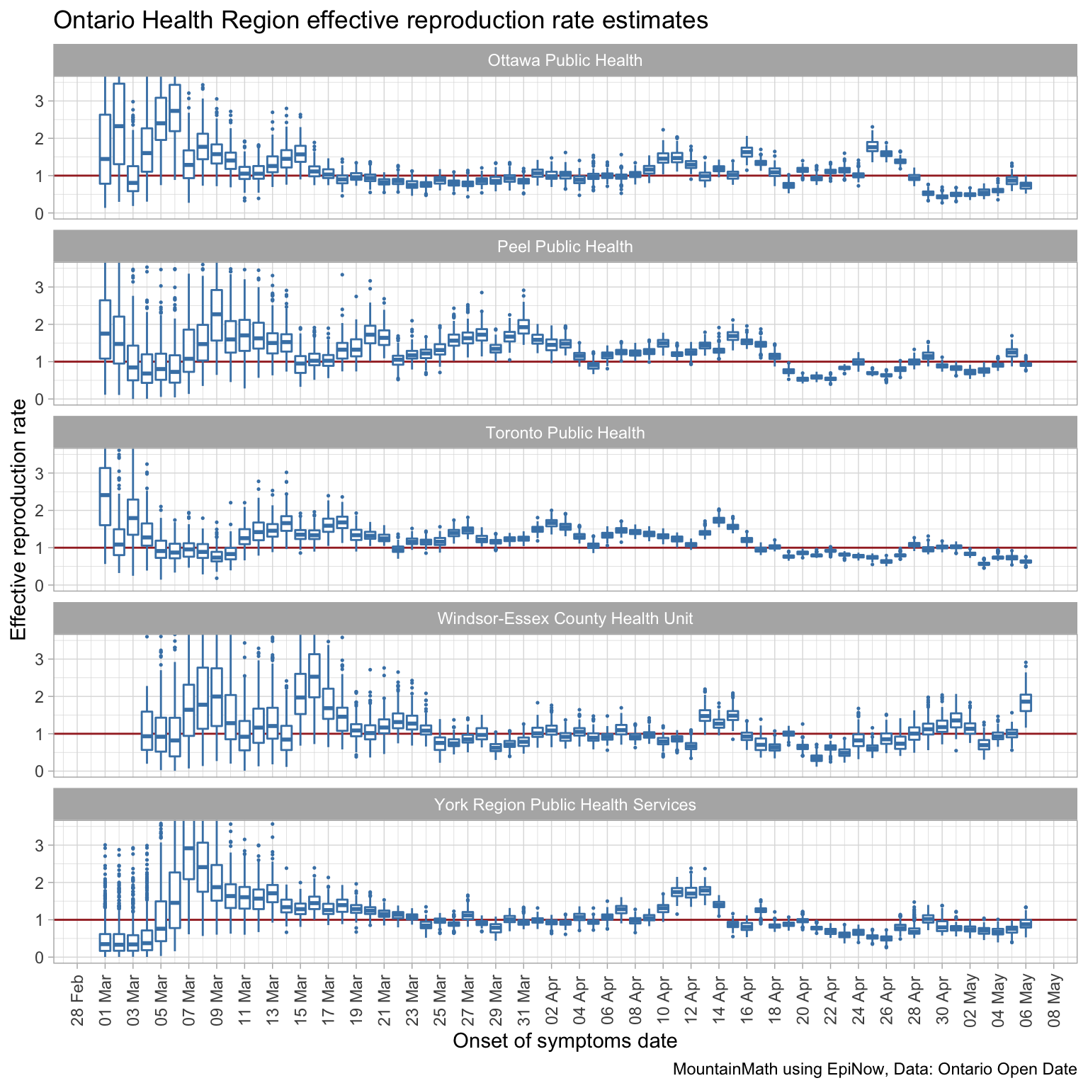
And we need this data for smaller geographies. Having it for Health Regions, like Ontario does, is important because the spread is mostly local, especially with current travel restrictions in place. British Columbia unfortunately does not publish data by Health Region, but only by much coarser Health Authority geography. Data for finer geographic regions will allow a more tailored approach to loosening social distancing restrictions, for example Germany has tied the degree of loosening of social distancing measures to local case growth rates. Here are the effective reproduction rate estimates by onset of symptoms date and accounting for travel exposure for the 5 most affected health regions in Ontario.

Ontario publishes this data on their open data portal, although the case report date needs to be obtained by caching daily data and taking differences (as we did for the first graph in this post). BC publishes that data in their daily Situation Reports, but for some reason they don’t make this data publicly available in tabular form. They do make it available to researchers after signing an NDA. Typically one only goes through the trouble of involving an NDA if the data can’t be released publicly over privacy concerns, but that clearly isn’t the case as the data is already released in the Situation Reports, albeit in an inconvenient form.
NDAs are necessary in some cases, but they amount to tall barriers to research progress. It takes time and effort to put an NDA into place, researchers need to spend time to take extra measures to safeguard the data, and most importantly, research gets siloed as data can’t be shared across research groups, imposing a significant drag on collaboration and research progress.
British Columbia, and other provinces that have not done so, need to release the data in digital form. Ideally the data for all regions across Canada is structured and disseminated in a uniform way to avoid replication of analysis and facilitate a coordinated response. Unnecessarily suppressing data used in decision making goes against one of the fundamental tenants of transparent governing. Whenever possible, analysis that informs public policy decisions should be based on open data and open analysis.
As usual, the code for this post is available on GitHub for anyone to reproduce the post, play with the data, or even better, improve on the modelling.
Reuse
Citation
@misc{covid-19-data-in-canada-effective-reproduction-rates.2020,
  author = {{von Bergmann}, Jens},
  title = {COVID-19 Data in {Canada,} Effective Reproduction Rates},
  date = {2020-05-13},
  url = {https://doodles.mountainmath.ca/posts/2020-05-13-covid-19-data-in-canada-effective-reproduction-rates/},
  langid = {en}
}
