What do we know about COVID-19 testing in BC? That’s a surprisingly tricky question, so I decided to do a quick post on this.
Why do we test?
The main use of testing is diagnostic and to break transmission chains. If we suspect a person has COVID-19 that person will go into self-isolation and seek a test. If the test confirms the suspicion, we contact trace the COVID-positive person and ask close contacts to self-isolate to break transmission chains.
As an aside, the timelines of COVID are such that the traditional contact tracing approach described above captures a maximum of about one third of all onward infections and having researchers call for alternative appropaches to traditional contact tracing like borad asymptomatic testing or employing other approaches like tracing contacts of contacts to get ahead of transmissions.
Test metrics
A natural question is how well our testing is doing in supporting the breaking of transmission chains. There are some obvious metrics to measure the effectiveness of our TTI transmission chain, for example keeping track of what share of confirmed cases were already in self-isolation at the time they (likely) became infectious. Unfortunately we aren’t reporting on metrics like this, and I strongly suspect we aren’t even keeping track of this.
But there are some secondary metrics that we are keeping track of. The number of tests we are doing, as well as the positivity rate, so the share of tests that come back positive. The positivity rate tells us if we are testing broadly enough. If the positivity rate gets too high, which people often peg at above 3%, we likely aren’t testing broadly enough to capture all infections and we are starting to miss a lot of cases and the chance the break their transmission chains. In the words of the BCCDC
This metric [positivity rate] can be used to understand if a jurisdiction is doing sufficient testing relative to the size of its epidemic to catch enough cases to maintain epidemic control. The higher the test positivity, the greater the likelihood that many cases are being missed and there is widespread community transmission, making it more difficult to limit the spread of the virus.
Generally we try to scale up the number of tests to keep up with the pace of the transmissions, but viral growth is exponential and real world resources generally can’t keep up with that growth. Which leads to rising positivity rates as we increasingly focus our testing on the most likely cases.
How many tests are we doing in BC and what’s our positivity rate?
The answer to this seems simple, the BCCDC dashboard has data on daily tests, testing turn-around time and positivity rates.
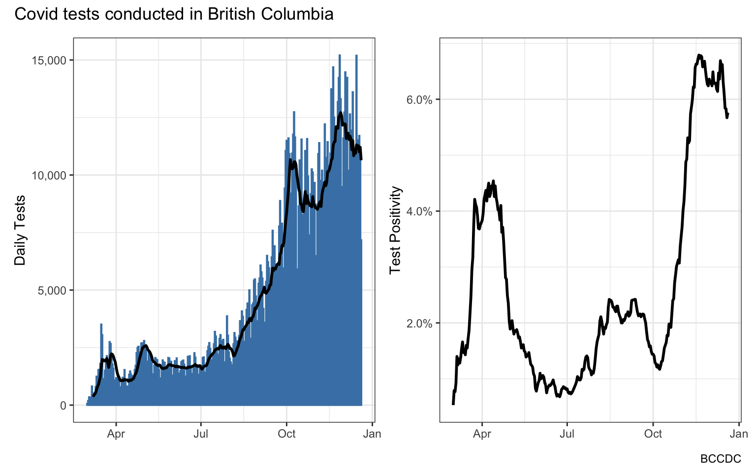
But here is the rub. This data does not mean what one would naively expect it to mean, at least if “we” means the public that’s doing the testing to diagnose COVID and break transmission chains.
To understand what’s going on we need to take a step back. There essentially are two distinct ways we are testing in BC, as the weekly Situation Reports explain:
In BC, laboratory-based surveillance captures mostly symptom-based diagnostic testing conducted under the Medical Service Plan (MSP) funding scheme, as well as any non-MSP funded screening tests.
To understand why this matters we keep reading:
Screening tests have a lower likelihood of testing SARS-CoV-2 positive (i.e. percent positivity) than symptom-based diagnostic testing; therefore, including screening specimens will tend to lower the overall percent positivity indicator and the impact of that will be greater when more screening specimens are included.
To put it simply, in BC we have our regular publicly funded diagnostic testing, based on guidelines given by the BCCDC, that aim to break transmission chains. On the other hand we also have privately funded “screening tests”, most notably those employed by the film industry that regularly tests people detect COVID cases before they can spread and keep their workplaces, where social distancing is not always possible, safe.
Both types of tests are great, but private testing is orthogonal to our containment effort, which is what the general public and the BCCDC is focused on. After all, the BCCDC is reporting the number of tests and the positivity rate because it “can be used to understand if a jurisdiction is doing sufficient testing relative to the size of its epidemic to catch enough cases to maintain epidemic control”. The relevant metrics are the number of public tests and the positivity rate of public tests.
The dashboard however gives and answer to a question nobody asked: “What are the combined number of private and public tests and what is the blended positivity rate”. If reported separately, this would give us important insight. How is our public testing performing, and what’s the positivity rate of private screening tests – probably the best metric we (in theory) have right now to understand true prevalence in the population. Blending both together as the dashboard does gives us a hard to interpret blend.
Our PHO got asked about if private tests are included several times, including on October 15th, where the PHO explained that they do monitor what positivity rates look like when just using public testing and that those positivity rates “remain low”. At the time the overall positivity rate for that week from the Dashboard was around 2%, and the one for just public testing was close to 3%. On November 27 the BCCDC finally started to report public testing separately in the weekly Situation Reports. The information is only weekly aggregates, number of tests needs to be back-calculated from the testing rate, and the information only available in image form requiring manual scraping to get the data. The BCCDC has on several occasions refused to provide the data underlying their graphs for the (bizarre) stated reason that the inconvenience of the manual scraping is an essential safeguard of patient privacy.
Confused yet? You aren’t the only one, things are about to get worse. Apparently the BCCDC is also confused by their own data.
BC COVID-19 Epidemiology App
It’s generally a good idea to consume your own data, which the BCCDC did on their new shiny COVID-19 Epidemiology App. There we can see how BC’s testing rate and positivity rate compares to that of other provinces. BCCDC used the testing data from PHAC for this, except for BC. For BC the BCCDC swapped out the PHAC data and spliced in their own data. But not just the data on public testing, but the BCCDC inflated their testing numbers and depressed their positivity rate by adding in private tests. Just for BC. Which defies the whole purpose of making a comparison.
How misleading a comparison does the BCCDC COVID-19 Epidemiology App make. That’s easy to see by doing a side-by-side plot using the Dashboard data, which the BCCDC used for BC, vs the PHAC data for BC, which the BCCDC used as comparison for the other provinces.
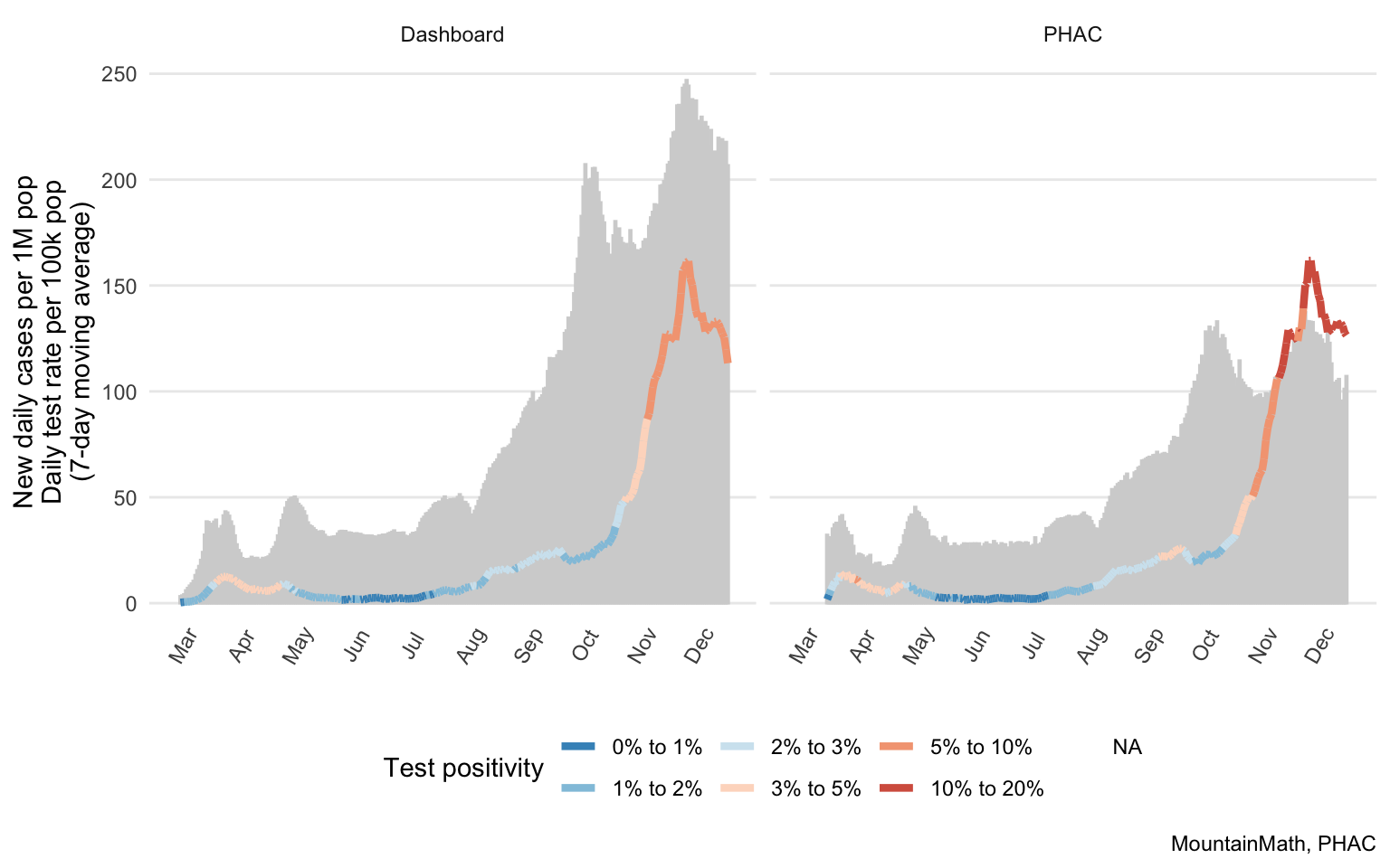
I am not a fan of this visual, I find it hard to read. So a quick explanation is in order. The grey bar-graph in the background shows the new daily tests (or number of people tested) per 100k population, the line graph shows the number new daily cases per 1M population and the colour of the line graph is given by the test positivity rate.
In the two graphs case numbers are (almost) the same, with the only difference given by BC not reporting this data on weekends (which we smoothed out). But the testing rate and the positivity rate are very different.
This brings out another issue with the BCCDC COVID-19 Epidemiology App comparison. For BC data is shows number of daily tests, for the other provinces using PHAC data it shows the number of people tested. Similarly, the positivity rate from BC data is number of positive tests by number of tests, whereas the positivity from PHAC data is calculated as number of confirmed cases by number of people tested. It’s never a good idea to compare metrics that have different units.
For completeness we can quickly plot what the proper comparison with all the provinces looks like.
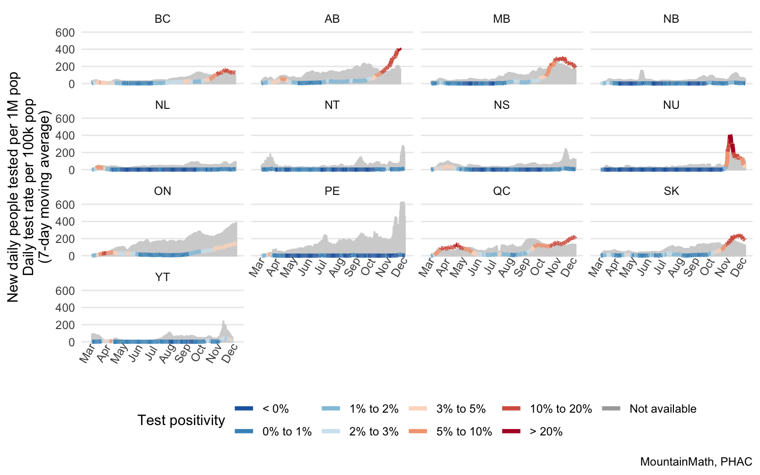
Unlike on the BCCDC graph, we now see that BC’s testing rate rate compares unfavourably with many provinces. It’s hard to directly compare the positivity rate off the graph, but we can just plot it separately.
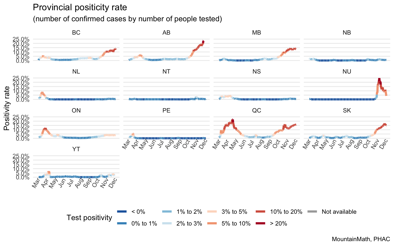
Alberta is in a league of it’s own, but BC, MB, QC and SK also have dangerously elevated levels. Nunavut shot up during their recent outbreak, but thankfully seems to be getting things under control again. One should note here that the positivity rate shown here, as estimated from PHAC data, is given by number of cases divided by number of (unique) people tested.
The BCCDC should fix their graphics to insure their comparisons aren’t misleading.
BC’s real number of tests and positivity rate
As we have seen, one issue that comes with using PHAC data is that PHAC reports on number of people tested, not the number of tests done. In general the number of people tested, and the positivity rate that’s calculated via cases by number of people tested are the better metrics, but counting the number of tests, so double-counting people when they got multiple tests, is often easier to do.
The BCCDC only reports on the number of tests and the positivity rate calculated as positive tests by number of total tests, and after a lot of pressure we now have weekly averages in the Situation Reports. Time for my 11yo to scrape out the data – in exchange for fancy ice cream.
Scraping the data gives us the opportunity to get a better reading on the number of public and private tests done in BC. This is an inexact science, scraping the data out of images will come with small errors, despite the 11yo’s best efforts. And there are no graphs that show the total number of public tests, just the test rates, so we need to divide by the population to untangle this.
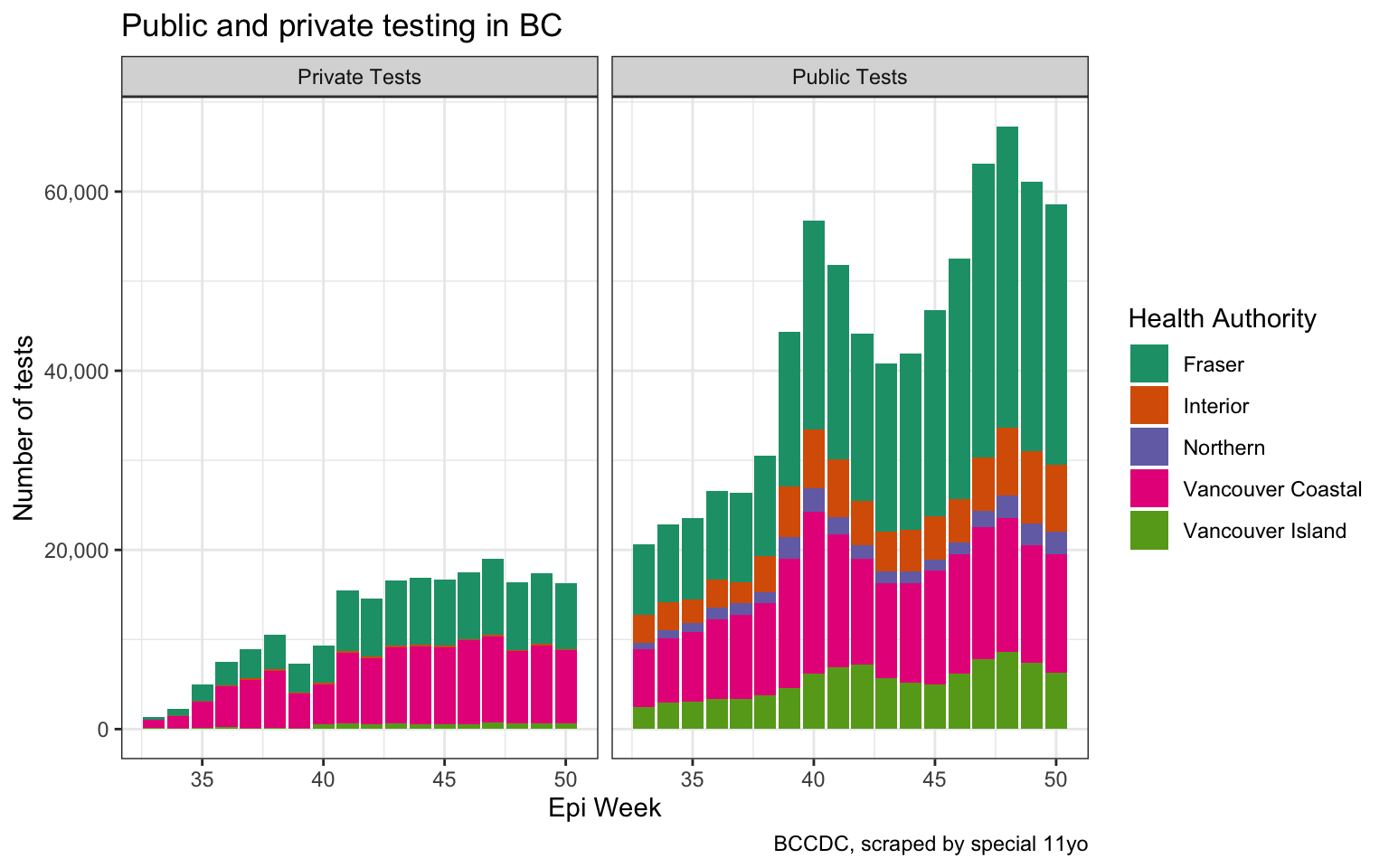
We see that private testing ramped up over time and now takes up almost 20k tests a week, compared to around 60k tests done via public testing. This allows us to also look at the ratio of private tests out of all tests, which helps us better understand how this impacts the positivity rate of the blended data over time.
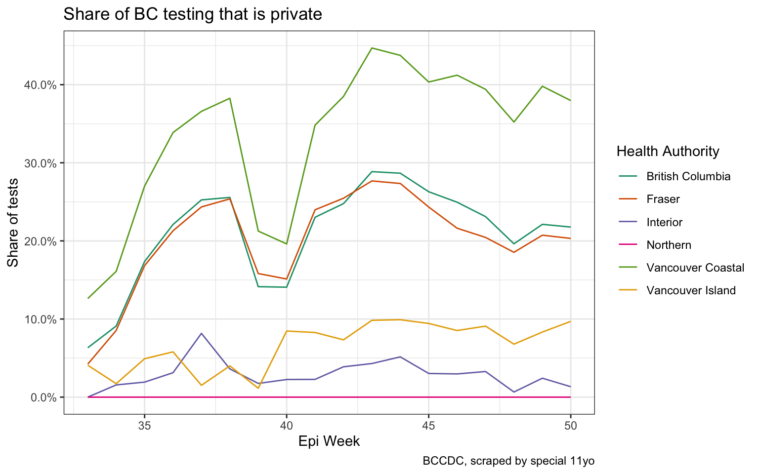
BC’s overall share of private testing has been between 20% and 30% starting epi week 42, so mid October. Vancouver Coastal’s share of private testing has been significantly higher, Vancouver Island, Interior and Northern’s share has been significantly lower.
Positivity rates
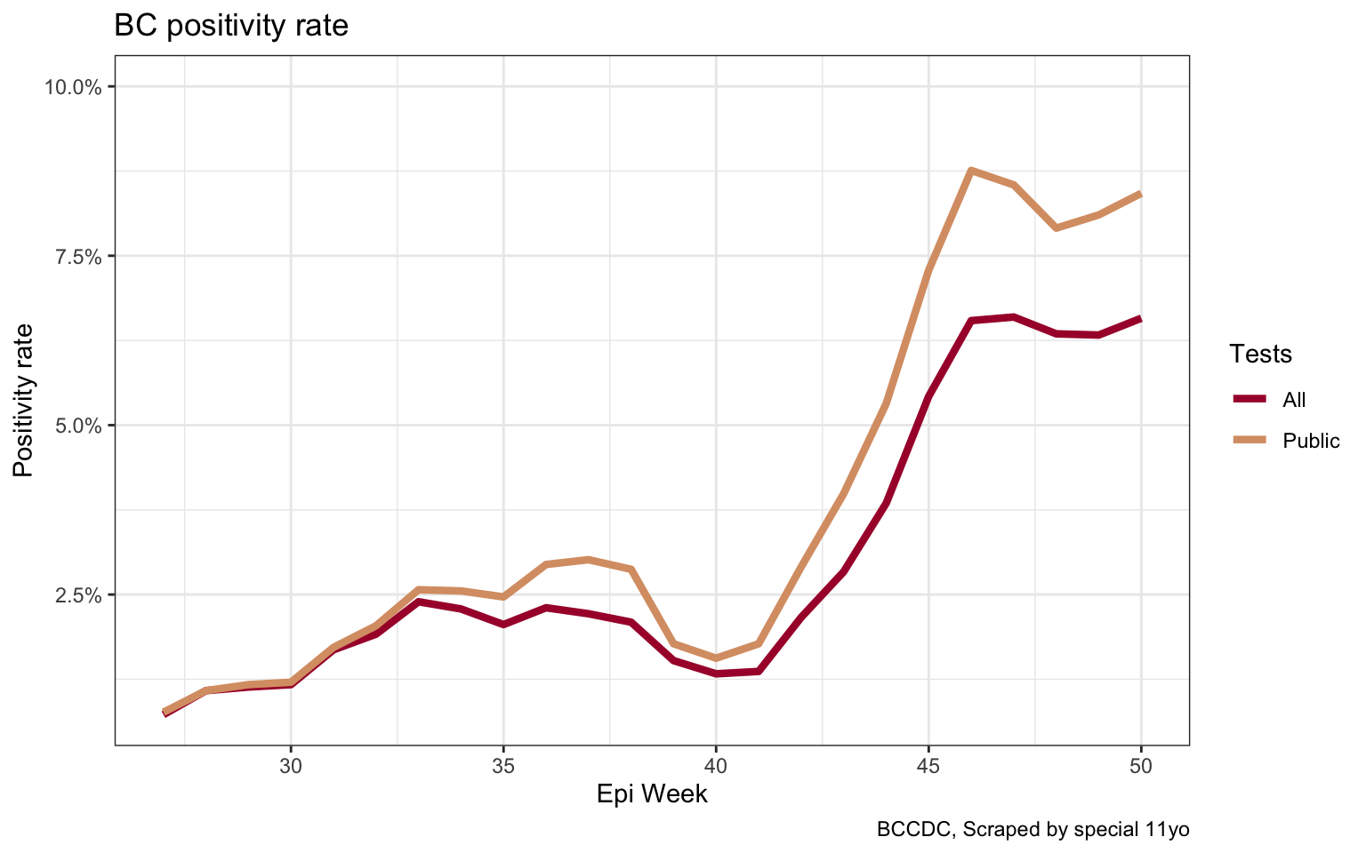
Which brings us to the next step, looking at positivity rates. Private routine testing has very low positivity rates, they will be roughly at the levels of population prevalence of COVID-19. (Maybe slightly higher because of occasional false positives.) This means that the more private testing we are doing the lower the overall blended positivity rate that the BCCDC still reports on their dashboard will be.
The Situation Reports have the weekly positivity rates, and there we can read off BC’s real positivity rate for public testing. Although the graph they provide is awfully cramped and hard to get a clear idea, but nothing a little ice-cream fuelled scraping can’t fix.
We can take this down to the Health Region level and compare the real public positivity rate to the one generally reported by the BCCDC on the dashboard. Again, the graph in the Situation Report is not very useful for this, so we scraped and reshaped the data.
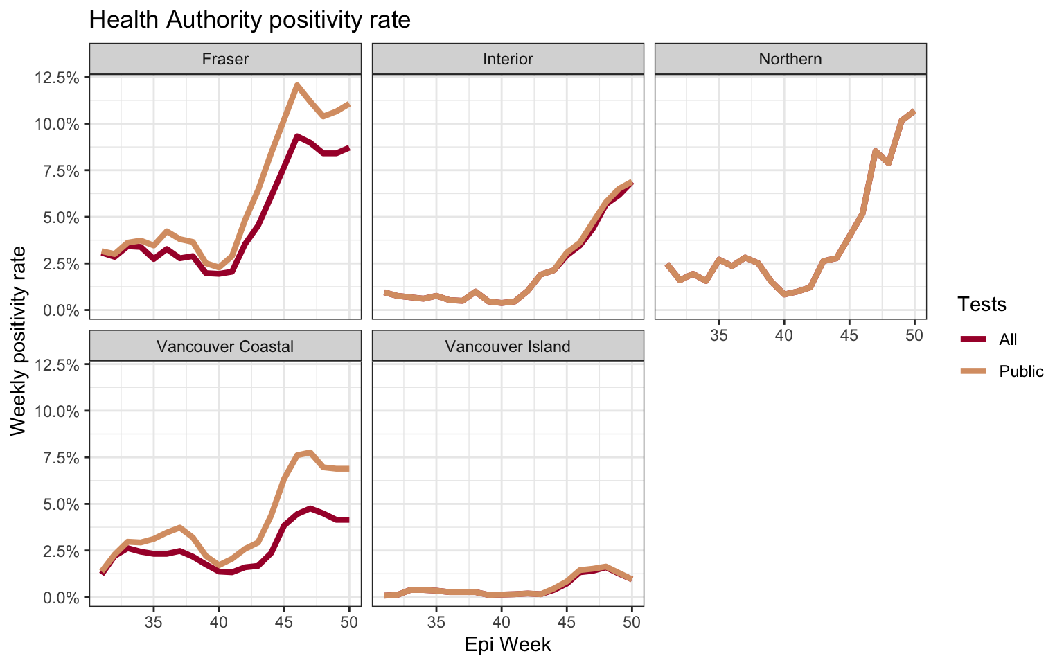 Of note is that the positivity rate of public testing does not always move in sync with the blended positivity rate that includes private testing. Which should make us extra careful when trying to discern trends of the public testing positivity rate that we are principally interested in from trends in the overall blended rate that the BCCDC reports. This graph also answers the question by Tyler Olson if any other Health Region hit the (7-day average) 10% positivity mark before Northern did very recently. Just looking at the dashboard data we might be inclined to say that no Health Region got over 10%. But we are of course interested in public testing positivity rate, and that has been above 10% in Fraser for several weeks.
Upshot
The upshot of this post is simple: Report relevant metrics. Don’t report metrics that are likely going to mislead people because they are convoluted and hard to interpret because they don’t address the relevant questions.
When the metrics you report are so confusing that your own team misuses them in very misleading BCCDC graphics, it’s maybe time to stop reporting the blended private/public positivity rate altogether and just report the two separately.
Testing matters, and testing data matters. Almost a year into the pandemic, and BC main dashboard and public data download is still reporting largely uninterpretable testing data. The only useful testing data we are getting is weekly aggregates that have to be manually scraped out of images.
If you are interested in the data, it’s embedded in the code for this post. That was the easiest way to grab it form the image-scraping tool my 11yo used.
Reuse
Citation
@misc{covid-testing-data-in-bc.2020,
  author = {{von Bergmann}, Jens},
  title = {Covid Testing Data in {BC}},
  date = {2020-12-21},
  url = {https://doodles.mountainmath.ca/posts/2020-12-21-covid-testing-data-in-bc/},
  langid = {en}
}
