The recent dismissal of PHAC modelling by the head of the BCCDC, coupled with some reactions we have seen on Twitter, have led us realize how hard it is for most people to understand exponential growth. Part of the fault lies with most modellers generally assume too much math literacy in others. In particular, we assume that public health officials or relevant policy makers can understand the models. Even though we have seen time and time again that this assumption is very tenuous. But more importantly, their inability to understand the models will not help them derive at the desirable responses and will not be able to explain to the general public.
So how can we explain those models better? I don’t have a good answer, but I have some ideas which I want to try out in this post.
How did we get to where we are?
A good starting point is to look back in time and understand how we got to our current state. Here is the graph I like to show for this, it does some mild cleaning of daily counts to extract a trend line.
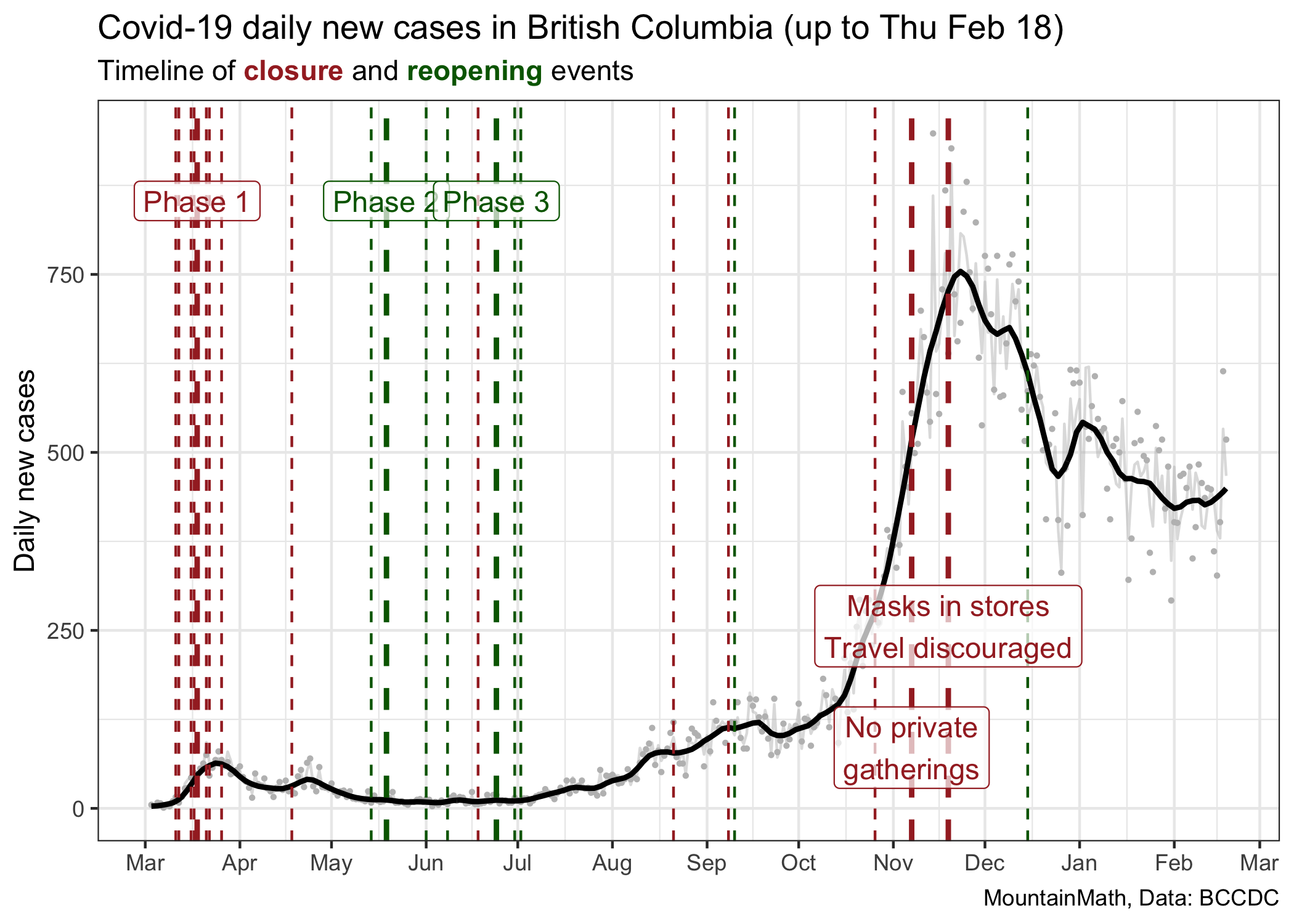
This graph shows major and minor changes in public health measures, coloured by whether they loosen (green) or tighten (red) restrictions. Because of the lag between transmissions and cases getting reported, the graph is showing cases by the date the lab result came back, there will be a lag between a change in public health measures and when we see the effect in the case counts. We should expect that lag to be somewhere between 7 and 14 days.
This graph does a good job at showing the dramatic rise in cases in November, but it does not explain well how we got there. Our mind tends to interpret graphs like this as linear. We see a slope that is steepening and we want to say that COVID is spreading faster. But that’s not true. The growth rate of COVID, sometimes expressed in terms of the reproduction number R, has been fairly constant since the beginning of July, only taking an intermittent dip in September.
To visualize this we can go to a (semi-) log plot.
In the beginning period our testing wasn’t very good, so it does not make much sense to look at case counts before May, when changes in cases were also heavily impacted by changes in testing and not just changes in transmissions.
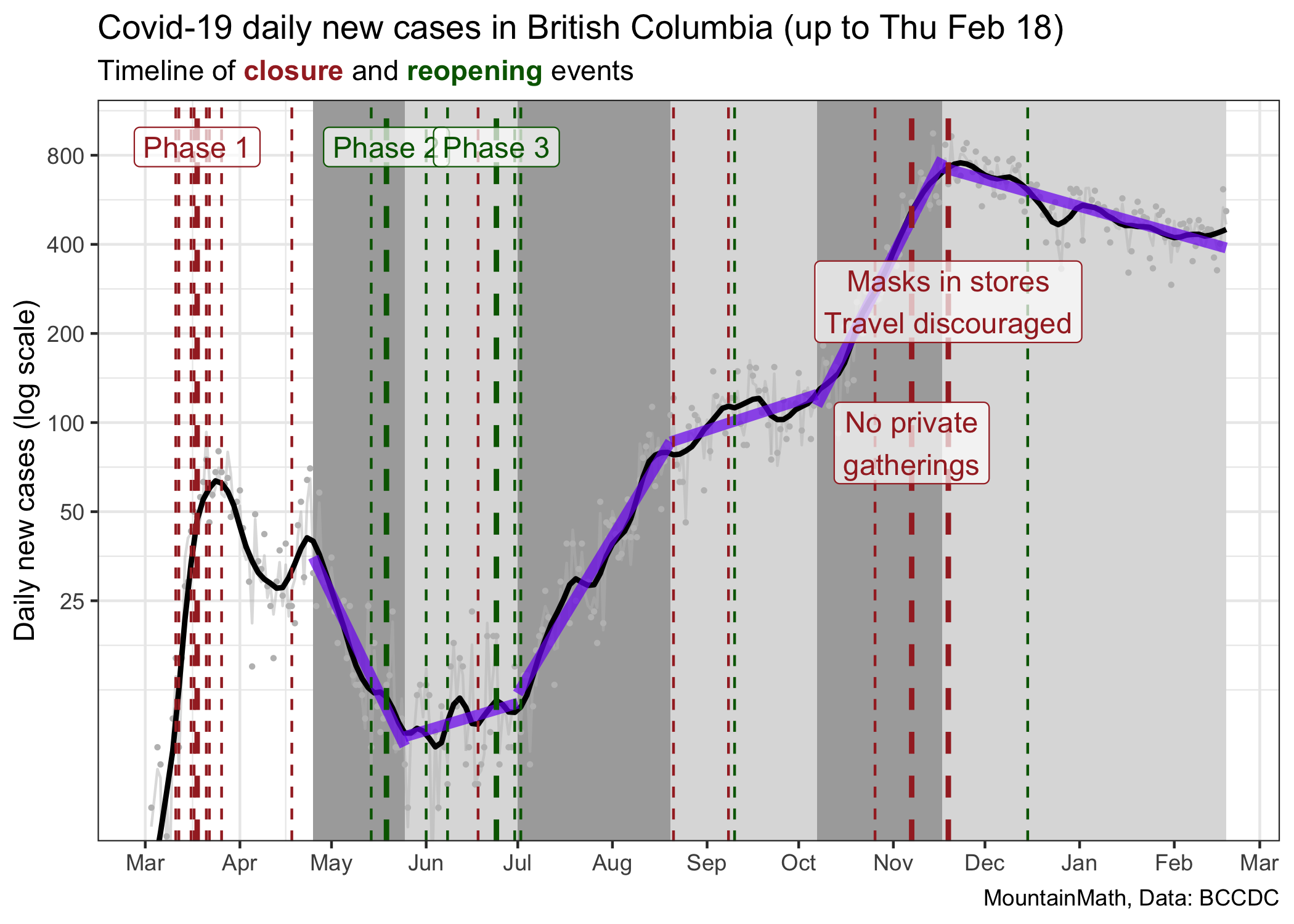
In this graph we have segmented the time since the end of March into 6 phases where we have seen fairly constant growth (or decline) of cases, and we draw the corresponding thick purple lines that fit these stages well. The way we divide things up into phases of constant growth is a bit ad-hoc. We could have chosen slightly different change times, but results are similar. The cause why growth rates flattened in September is not clear for me, the other changes line up well with major policy interventions. The slopes of these lines are the fitted growth rates during these time intervals.
| Start | End | Growth rate | R |
|---|---|---|---|
| 2020-04-25 | 2020-05-25 | -4.9% | 0.73 |
| 2020-05-25 | 2020-07-01 | 0.7% | 1.05 |
| 2020-07-01 | 2020-08-20 | 3.9% | 1.29 |
| 2020-08-20 | 2020-10-07 | 0.8% | 1.05 |
| 2020-10-07 | 2020-11-17 | 4.7% | 1.36 |
| 2020-11-17 | 2021-02-18 | -0.7% | 0.96 |
We also added estimates of the effective reproduction number (the average number of transmissions each case causes) using the assumption that the generation interval is \(\tau=6.5\) days, that is \(R=e^{r\cdot \tau}\) in our simple exponential growth model. We prefer to work with growth rates as this is the intrinsic quantity that captures viral growth. The reproduction number has an intuitive interpretation but is model dependent, so will vary depending on the type of model used to describe the growth. For example, a more realistic model using a distribution of generation intervals will end up with reproduction numbers that are scaled closer to 1.
An interesting exercise is to take the same graph with the fitted lines and show this on a linear scale.
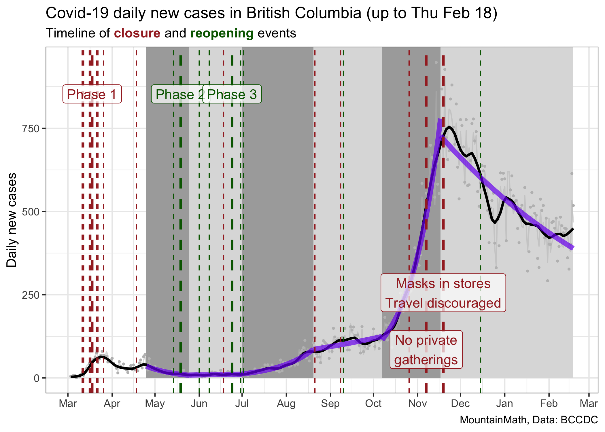
When looking at it this way we might be misled to think that the July/August growth rate was much less than the October/November growth rate, when in reality they were similar. We might think that our current rate of decline is greater than the one we saw at the end of the spring wave in May, when in fact the current decline is much softer. Both of these graphs have value, but they speak to different aspects of the pandemic.
As an aside, the basic observation that our pandemic is very well described by periods of constant growth can be leveraged to create predictions. Unless we change our public heath measures, cases will likely follow the same growth rate.
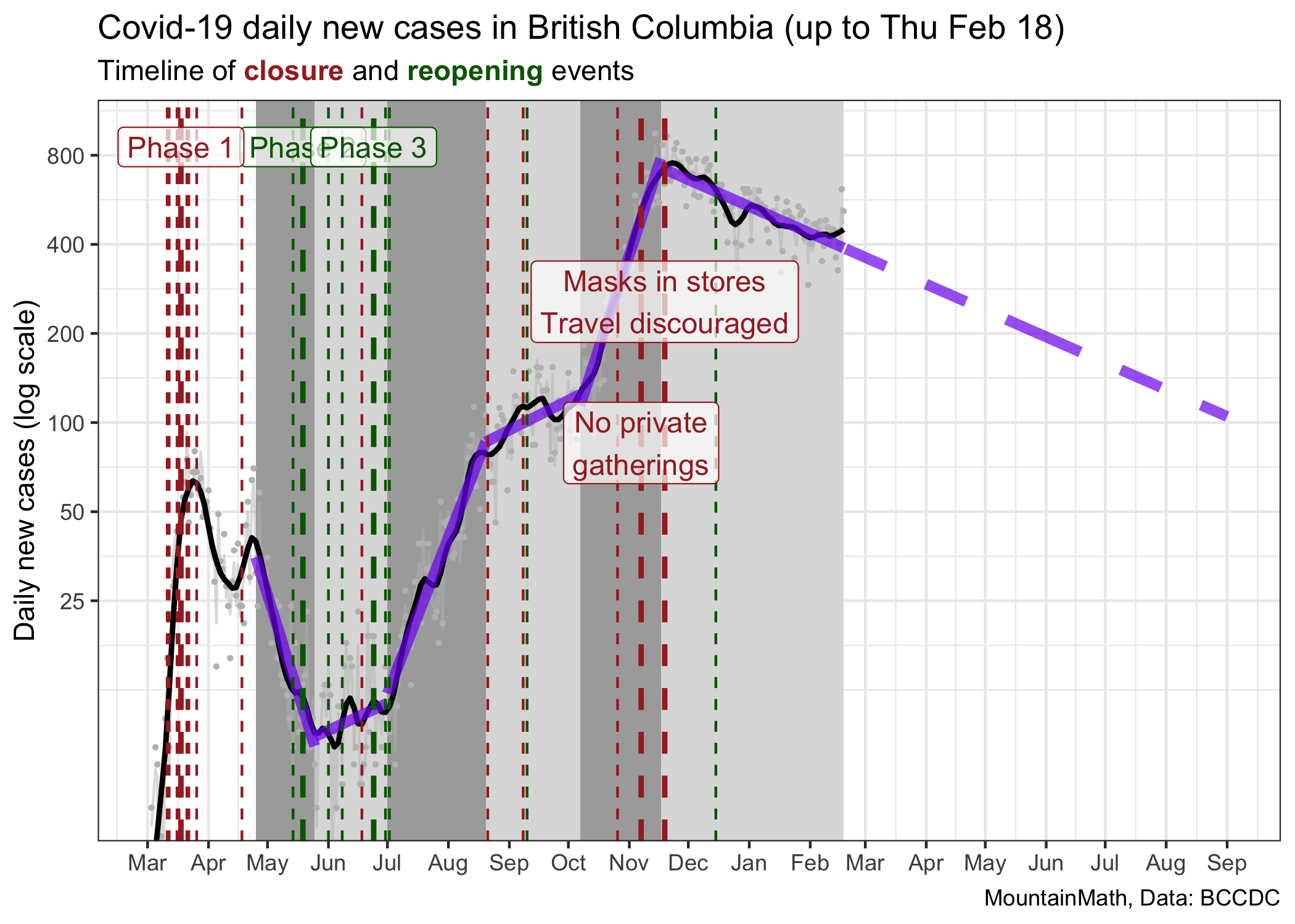
The current trajectory suggests that we will reach 100 cases around September 1st. However, projecting things out this far is probably not useful for several reasons. This assumes constant growth, meaning no changes in policy nor voluntary changes in behaviour over this time frame. However, we generally would expect a weakening of compliance with public health measures over time, and thus a flattening of the decline. At the same time, vaccinations are ramping up slowly, and as the share of the vaccinated population increases we will start to see impacts on transmissions. In fact, we are already seeing impacts on the 90+ and 80-89 year old age groups, their rates of cases have decreased dramatically over the past month.
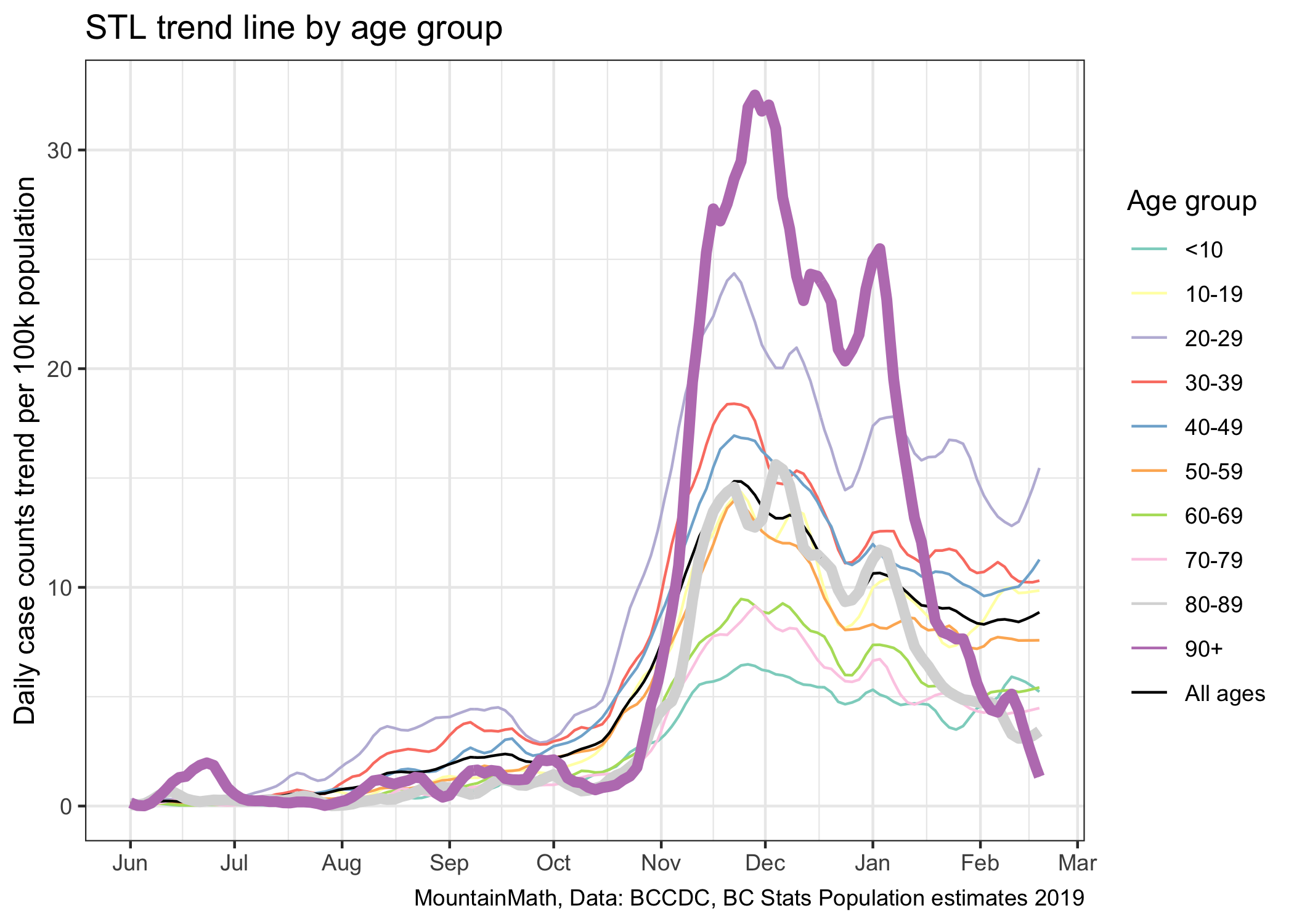
While vaccinations are good news, in the short term they won’t do much to overall case growth. While we can see the decline in older age groups when splitting them out, there is no discernible effect visible in overall case numbers. It will take a much higher rate of vaccinations to make a clear dint in the above graph.
This shows how fitting exponential curves to case growth runs into limits. It does a good job of explaining high-level behaviour of the virus, which is what we are after here. Better models will refine this and tease out higher level effects. Vaccinations is one of them, waning adherence to public health measures may be another.
And now, we have a third effect that we are watching out for. Variants of Concern, or VOCs. Mutations of our original strain of increased fitness. Either because they are more easily transmissible like B.1.1.7, or because they escape some immunity like is believed to be the case for B.1.351. Both of these strains are now in circulation in BC, and they break our simplistic exponential model in more serious ways than pandemic fatigue or vaccinations do.
Variants of Concern
We focus on B.1.1.7, the variant first observed in the U.K. because we have very good data on it’s fitness advantage. While there are some uncertainties, it is generally believed to have an advantage that grants it a 1.5 times higher reproduction number. We need to translate this into how that affects our exponential growth rate, which is surprisingly tricky to do for reasons that go beyond the scope of this post. As mentioned above, the reproduction number \(R\) is model-dependent, and using the naive estimate of \(r=\ln(R)/\tau\), where \(\tau\) is the mean generation interval, will under-estimate the growth rate. Fortunately, Dean Karlen recently estimated the daily growth rate advantage of B.1.1.7 in the UK directly from the data, and it comes out to be somewhere between 0.08 and 0.1. Based on this, we assume a (continuous) growth rate advantage of 0.086 for this post, which roughly corresponds to a daily growth rate of 0.09 in the middle of Dean’s range.
Going to our table above, that means that under current conditions in BC the B.1.1.7 strain has a growth rate of 0.079. That is higher than what we have seen this fall for regular COVID when we had looser restrictions. (Remember the the time when you could still have small gatherings with friends?) The difference in growth rates between regular COVID and VOC, in particular B.1.1.7, is so large that we can’t model this by fitting exponential growth any more. We need to treat this as two separate pandemics that occur concurrently. With regular COVID acting as a smoke screen for the more dangerous VOC.
To gather some intuition we take our current BC growth rate and level of regular COVID and seed a small B.1.1.7 VOC with initially 5 cases. Is this a good initial guess? We don’t know, but it’s something to go with and sharpen our intuition.
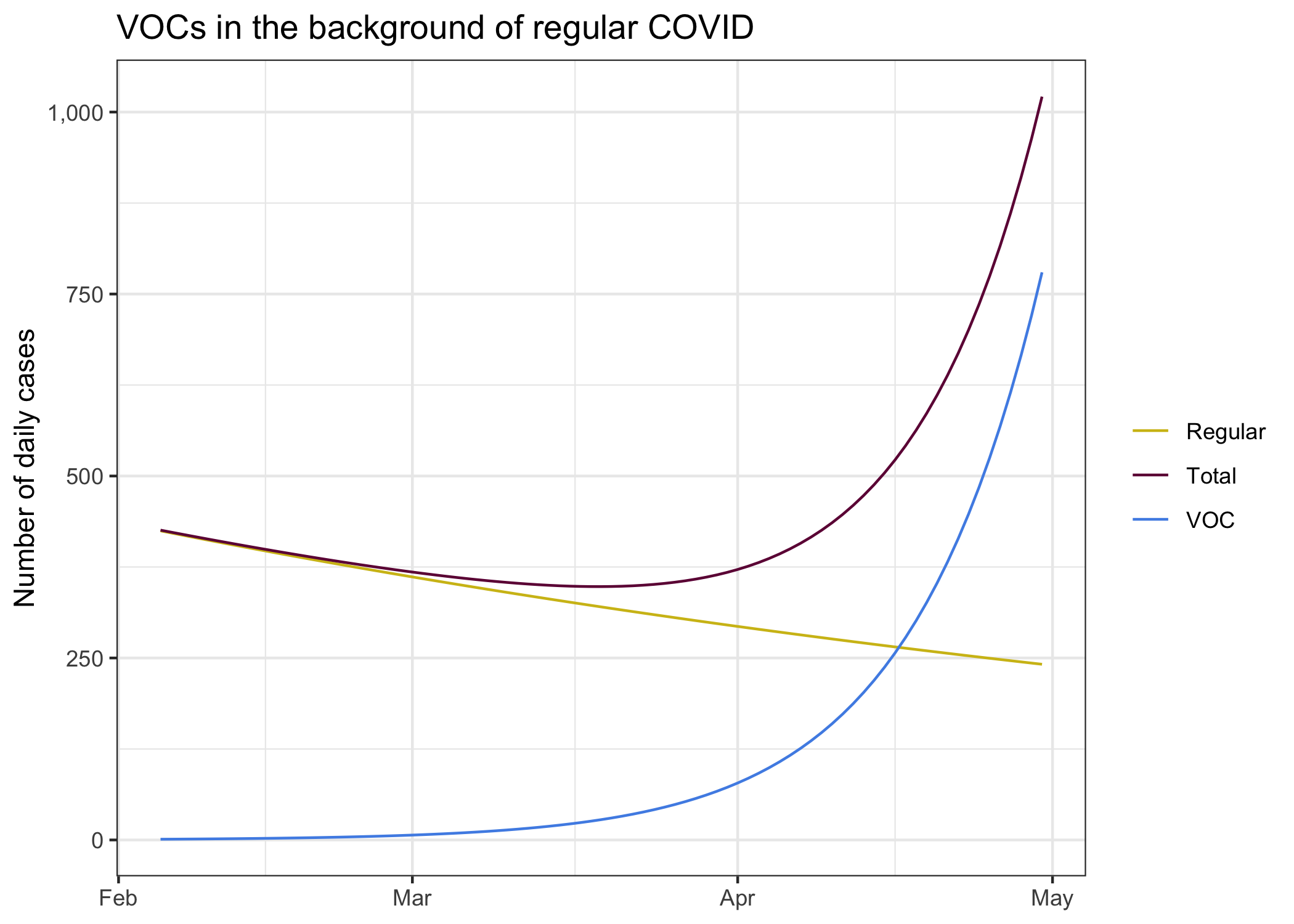
We see the decline of regular COVID in our current environment, it’s exactly the “predicted” curve from above that we get from fitting and exponential decline to case development since the end of November. It’s what we expect to see if everything stays the same. In this environment we seeded a B.1.1.7 variant at a level of 5 daily cases two weeks ago.
Combining these two different pandemics we get the total number of cases we observe. The B.1.1.7 cases remain hidden in the background of regular COVID cases for quite a while, only in April is the upward trend of the combined cases.
To better understand why this is best thought of as two different pandemics, let’s take a look at this using our log scale.
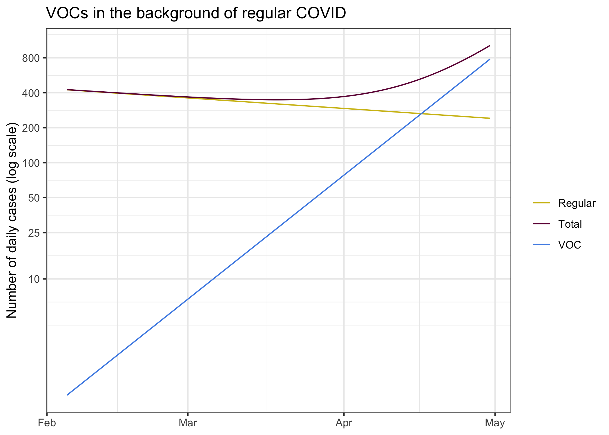
On each own, regular COVID and B.1.1.7 cases look like lines on the log plot. This is of course by design, that’s the fundamental process of the virus and we modelled it that way. The sum of the two however does not follow this pattern. This might seem overly theoretical, but this also has played out in England.
Features to deal with things like this are built into more complicated models. Not just models that incorporate new variants, in general models have differnet compartments where they vary the transmission rates between age groups, groups of people with different levels of adherence to public health orders (or groups exceeding public health expectations), with complex interactions between these groups. And some models go even further and vary these parameters at the individual person level, like the models we have used before to look at the effect of differnt interventions at schools.
However, projecting things this far out is mostly a theoretical exercise, we will almost certainly see a strong public health reaction at some point down the road.
How about vaccines?
When projecting out into April we may have to start taking vaccination progress into consideration. In theory it is fairly straightforward to do this within the framework of our simplified exponential growth model, if we were vaccinating randomly we can simply model vaccination by reducing the growth rate by \(\ln(1-s_i)/\tau\), where \(s_i\) is the share of the population that’s immune and \(\tau\) is the generation interval. Here immunity means that they won’t pass on the virus. We know the mRNA vaccines are around 95% effective in preventing severe outcomes, and there are some indication that they will also prevent transmission. This gets further complicated because we don’t really know how good the immunity, especially for transmission, is after only getting one shot.
To ballpark the rough effect of vaccines we can ask what percentage of the population needs to be vaccinated so that B.1.1.7 growth rate would be zero (or R for B.1.1.7 would be 1), assuming we don’t have any public health measures and vaccines are 100% effective at blocking transmissions. That’s just given by \(1-\frac1R\) which comes out to 40%. We are quite far from that, even during the given long time window. Moreover, our vaccine schedule is going down by age, which will have a net effect on transmissions that is worse than vaccinating randomly. How to optimize the vaccination rollout to also reduce transmissions, indirectly reducing severe outcomes by reducing spread, is an interesting and ongoing topic of research.
The problem of projecting from low numbers
There is one more point to talk about. The whole exponential growth approximation works well when case numbers are high. But when case numbers are low, as we have right now for B.1.1.7, things get complicated. COVID is highly over-dispersed, and we should assume the something similar is true for B.1.1.7. What that means in practice is that most people don’t pass on the virus, but a few pass it on to many to make up for it.
In practice, this means that having occasional cases does not mean B.1.1.7 will become established. There is a decent chance it will die out. But the more introductions we have, the more likely one of them will kick-start into a superspreader event and take hold for good. We have just seen this in Newfoundland and Labrador, where they are trying really hard to beat that outbreak back into the ground. But Newfoundland and Labrador have the advantage that they have almost no regular COVID, so they go hard against any COVID they see. We don’t have that luxury, we can’t go and automatically trace all contacts of contacts to beat down a new strain, our background COVID means we simply don’t have the resources for this.
What does this mean for our curves? It means that our initial 5 cases could die back down to zero. Or jump up to 40 within a couple of days. This kind of low likelihood but large effect situation is hard to handle. Should we assume we may have already 40 daily cases established right now? In that case, our curve looks a lot scarier. It’s probably more likely we have 5 to 10 at this point, but what should we plan for? The worst case scenario? The best case scenario? It depends on our risk tolerance. The other problem is that we don’t have inter-provincial quarantine and we don’t have good international travel quarantine, we have already seen how leaky it was with the first B.1.1.7 cases we saw in the news. That means we will have continuous seeding of VOC, and more chances for them to take off.
To model this properly we would need much better information. Unfortunately the BCCDC does not share much useful information to inform that. We only get cumulative counts of VAC. No sample collection dates, so we don’t know where on our timeline we should place them. We don’t have denominators, how many cases got sequences or what the flow of cases through N501Y screening looks like, so we don’t know how representative the ones we found are. The newest cases that have been announces are from episode onset week 5, so they are two weeks old now. Today there have been some school related B.1.1.7 exposures announced, one of them looks quite recent whereas the other ones are quite old. Data from WGS lags quite a bit, and we don’t get data on N501Y screening in BC at all. Ontario published daily updates on both. In short, it’s a mess in BC and we have next to no useful information how we should seed the model.
For good measure, let’s look what scenarios look like where we assume 3 through 10 daily cases (on average) as of two weeks ago (the rough lag that we seem to have for detecting variants). This also gives an indication what would happen if we had an early superspreader event to significantly boost VOCs. We would have to go to more advanced models to better model the probability band of outcomes that incorporate the overdispersed nature of COVID, for now looking at different choices of how to see B.1.1.7 cases will have to do as a rough proxy of potential outcomes.
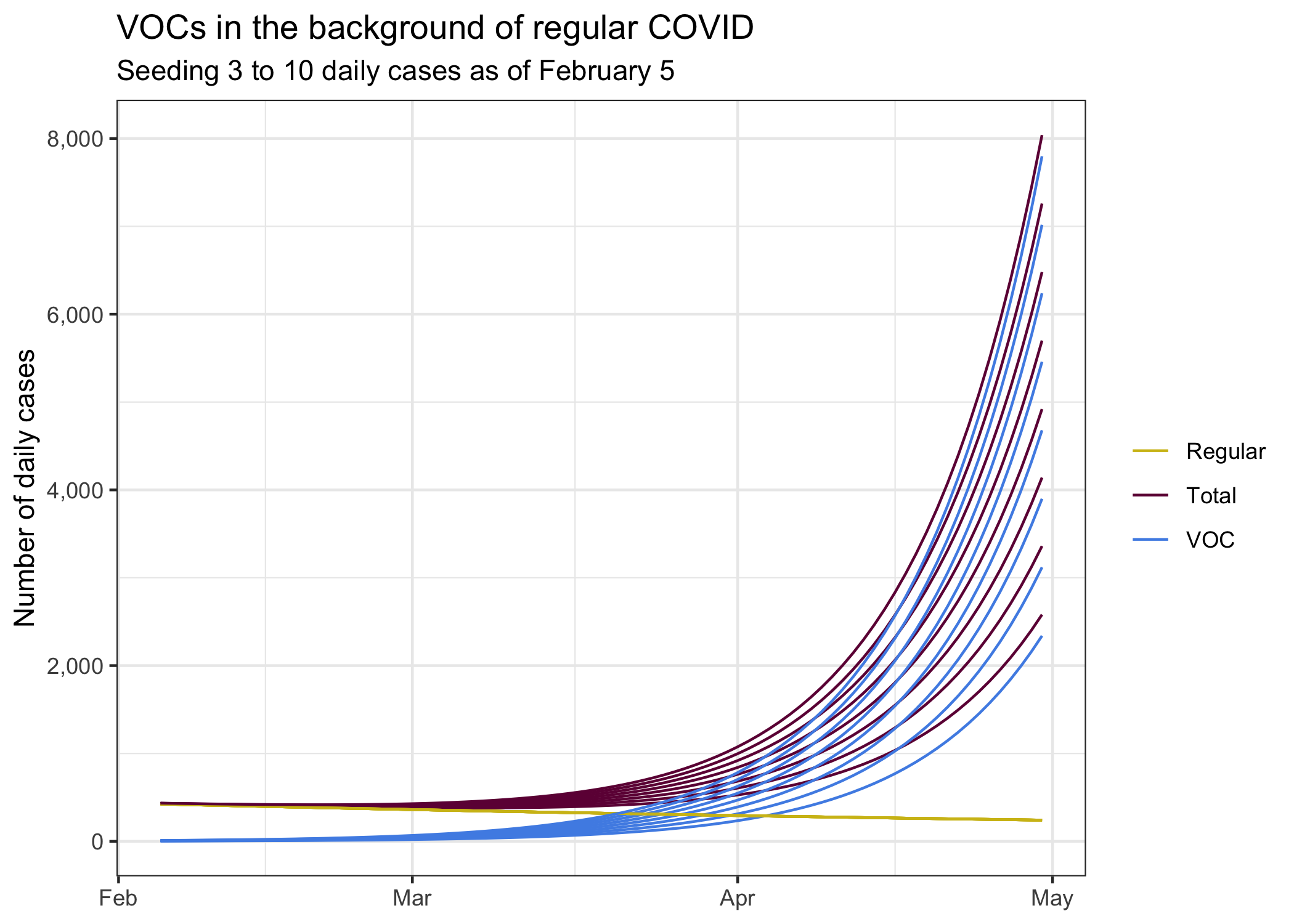
Of course there are a lot of other uncertainties. There are some indications that our current growth rate might not be negative any more. It’s too early to say for sure, but the tail end of our case trend diverges from our model fit. If we assume we are currently at \(R=1\), then our growth estimates would look quite a bit worse.
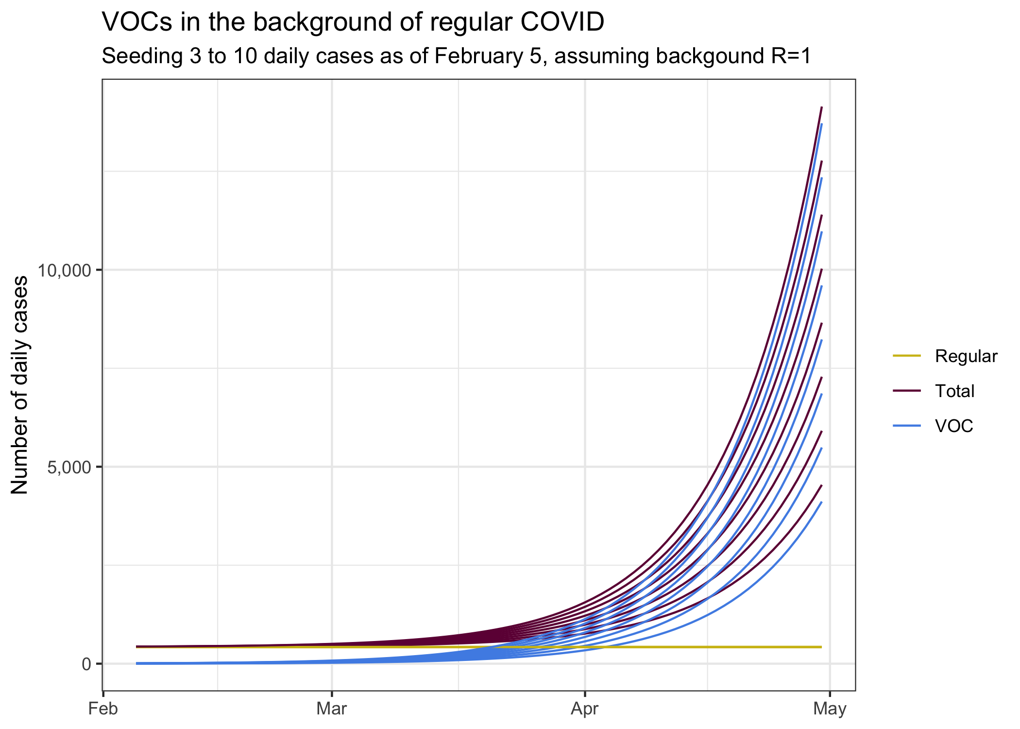
If we think that we currently are in a growth regimen, then things would be worse again. On the other hand, without larger changes in public health measures, the changes in growth are mostly due to people slipping in their compliance, which may well reverse as variants of concern become established.
The difference in the last two graphs reminds us that growth rates really matter. And how dialling down the growth rate even a little can have large effects two months down the road.
Bottom line
The big takeaway from this post is our pandemic is well described by sustained periods of constant exponential growth, with changes in growth rate usually initiated by changes in public health measures. The post also demonstrates that we should treat the emergence of new variants as a new pandemic that forms a “hidden wave” obscured by our regular COVID. Our background COVID makes it impossible to pinpoint new variants in a timely fashion, so we can’t effectively fight the new variants without fighting all COVID.
The model we used, simple exponential growth, loses some of the detail that more advanced models bring to this. On the upside it’s easy to understand and it (hopefully) brings a clearer understanding to what drives these more advanced models.
The last point is these models make it clear that we will have to intervene to reduce the growth of the new variants. Current public health measures simply aren’t anywhere near enough to contain it. The question is when to intervene. Waiting until new variants become established will require much stronger interventions later. We have seen how easy it was for the virus to grow in the fall, and how hard it is now to reverse some of this.
Reuse
Citation
@misc{on-covid-and-exponential-growth.2021,
  author = {{von Bergmann}, Jens},
  title = {On {COVID} and Exponential Growth},
  date = {2021-02-21},
  url = {https://doodles.mountainmath.ca/posts/2021-02-21-on-covid-and-exponential-growth/},
  langid = {en}
}