(Joint with Nathan Lauster and cross-posted at HomeFreeSociology)
It can be really useful to count things, but sometimes numbers end up causing confusion and misunderstanding rather than helping. Often this has to do with how the number is presented and attached to claims. Other times it has to do with problematic procedures used to obtain the number. Here we want to explore these problems more in detail concerning a claim that “Canada lost 322,000 affordable homes” between 2011 and 2016. This stat is generally made in reference to “private” rentals, and is contrasted to the number of non-market units built between 2011 and 2016, pegged at 60k units.
At its best, the claim has been used to advocate for more non-profit housing. This is a great thing to advocate for, and something we support. At its worst, the claim has been made to look like a popular NIMBY talking point: that development of new housing, including non-profit, is directly resulting in the loss of older more affordable housing stock, resulting in worse overall affordability. While this can occur in specific cases (especially when we only allow new apartment buildings to be developed on top of old apartment buildings), as a general claim it’s wrong and misleading on multiple levels. So let’s walk through where the number is coming from and how it’s being presented.
The headline number is based on an estimation by Steve Pomeroy:
The erosion of “naturally occurring affordable housing” (NOAH) units is the most serious threat to Canada’s supply of affordable housing. Between 2011 and 2016 the number of private rental units affordable to households earning less than $30,000 per year (rents below $750) declined by 322,600 units — a trend that appears to be continuing.
We will temporarily set aside the problematic term “naturally occurring affordable housing,” except to link to this critical history of the term and note that left to nature, housing invariably decays (something that can also be observed in parts of Vancouver where zoning bylaws force unproductive land use). Let’s dive into the number. In the report referenced, this stat is only broadly sourced to the 2016 Census and 2011 NHS with no indication how it was estimated. But this document outlines one way that does line up with the headline number. It takes a data table from the 2016 census that enumerates non-subsidized rental households paying below $750 in rent and utilities, and a data table from the 2011 NHS with slightly different cutoffs where the $750 cutoff was estimated by linear interpolation between the rent cutoffs in the table.
Using linear interpolation assumes that shelter costs are uniformly distributed in the $600-$800 range, which is tenuous at best. Shelter costs will skew high within this band, which would under-estimate the “loss”. At the same time one has to ask why nominal shelter cost levels should be used for this instead of adjusting for inflation or income growth.
Setting these questions aside, a quick cross-check with this method shows a net loss of 322,700 households in non-subsidized rental housing paying $750 or less on rent and utilities, matching the number cited in the research report (assuming the report truncated instead of rounded to the nearest 100). We will assume that this is how the number was constructed, as the estimated difference between 2011 to 2016 in households not living in subsidized housing or receiving rent subsidies paying at most $750 in rent and utilities. (If one were to adjust for inflation, using $701 as the starting rents in 2011, then the loss would amount to 103,000 households, adjusting in the other direction using $802 in 2016 this method comes out with a gain of 654,100 units, which is absurd and highlights the issue of using linear interpolation, in this case to estimate households below the $802 cutoff in the $750-$1000 band.)
Now with the newest 2021 census data, we don’t need to interpolate using standard tables and can read off that between 2016 and 2021 another 230,500 fewer non-subsidized renter households were paying less than $750 in rent and utilities. So we can extend the claim forward. We can also push the claim back to 1996, although at the cost of grouping subsidized and non-subsidized rental housing and losing households with zero income in 2006 and earlier, to see a longer timeline of the number of units renting below $750.
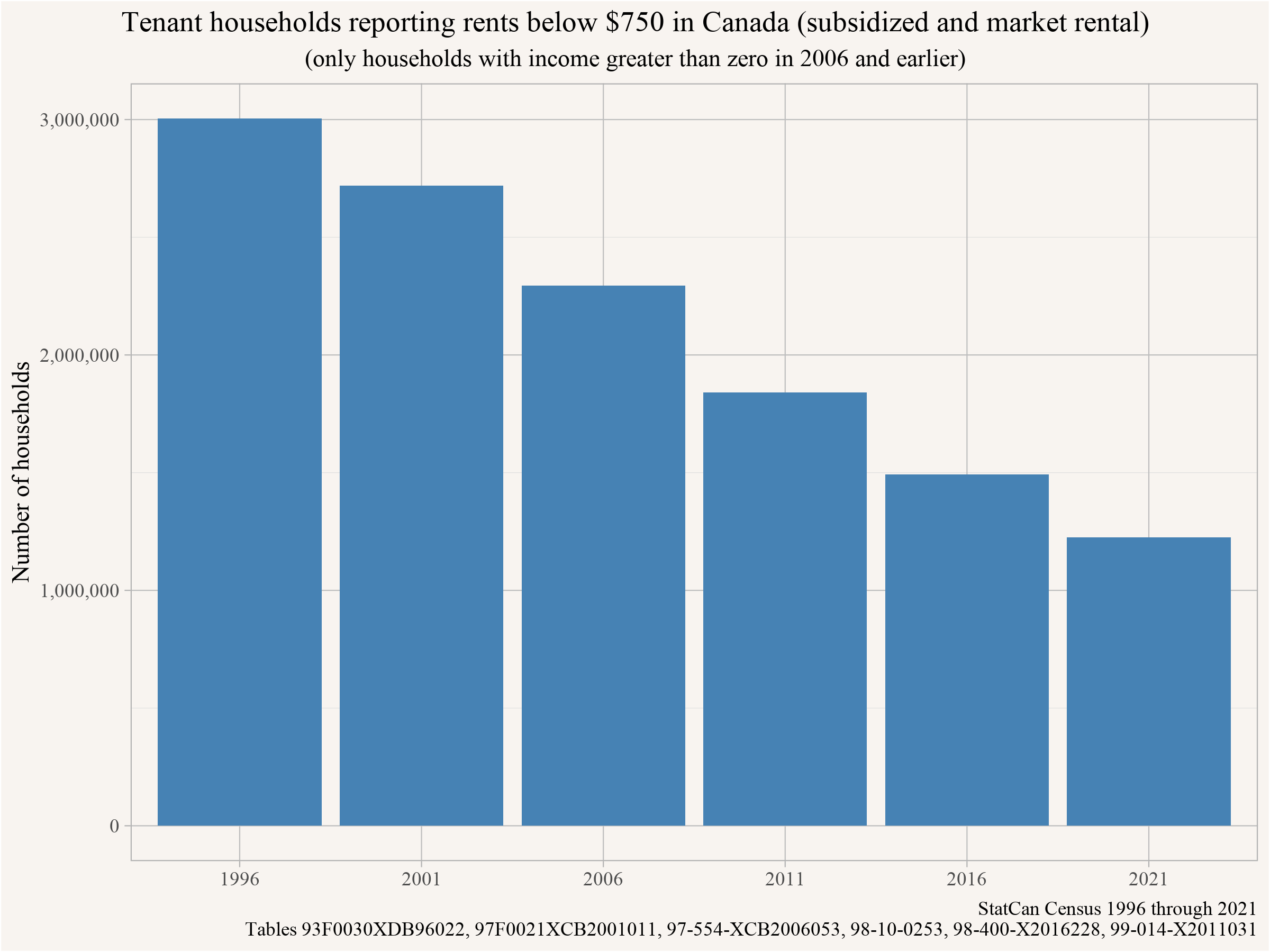
In short, the number of tenant households in subsidized or market rental & paying rents below $750 has been declining for quite some time now.
How should we interpret this 320k statistic?
The research note that introduced this loss of “322,600 units” interprets it in the following way:
These losses are driven chiefly by the financialization of rental housing – an asset class attracting investment from both large capital funds, as well as smaller investors, both seeking to capitalize on dramatically rising rents). A further contributor is the intensification and redevelopment of sites with older low-moderate rent properties.
Unfortunately no argument is made to fully define or support these claims. And they’re pretty big claims involving a variety of potential processes and lots of room for confusion. Perhaps the biggest generator of confusion is that rents in Canada are generally not tied to units. Instead they’re mostly tied to rental contracts between landlords and tenant households. Here these rents are reported by tenant households. Rental contracts can provide stability and protect tenants from rent increases - especially in places like BC that have rent control. But they disappear when tenants move, resulting in turnover for units and new contracts offered to new tenants. And tenants move a lot.
Overall, the decline in households reporting rents below $750 generally doesn’t reflect a loss of units, but rather turnover in rental contracts. Labeling our number properly as tied to tenancies, as we attempt to do above, may help ward off a lot of confusion. When tenants move out, landlords tend to set new rents for their units. In a remarkably predictable dynamic, these rents go up when vacancy rates are low, and go down when vacancy rates are high. Landlords setting higher rents on units that have turned over in conditions of scarcity probably explains most of the decline in rental contracts paying below $750 in rent. You could term this process “financialization” if you want to, but it’s not clear how it helps explain the underlying dynamic. “Filtering” is likely a better name for the process, reflecting how units tend to “filter down,” becoming cheaper as they age in places where housing is abundant, but can instead “filter up,” becoming more expensive, in places where housing is scarce.
But let’s get back to the number.
Affordability
The stated motivation for this statistic is to understand “naturally occurring affordable housing”, and the $750 shelter cost threshold was chosen because this level is “affordable to households earning less than $30,000 per year.” This relies on the standard affordability criterion of spending no more than 30% of total income on shelter costs. The change in the number of households paying less than $750 on rent and utilities is one side of the affordability equation, the change in the humber of households earning less than $30k is the other. We could reasonably improve housing affordability either by working to keep rents low or by providing better income supports to people. So far we’ve only looked at rents, so let’s take a peek at households below $30,000 in income. In 2016 there were 128,500 fewer households in this income band than in 2011 living in non-subsidized housing. And by 2021 there were another 363,600 fewer households in that income range.
Again, if we look at all renter households, including those in subsidized housing, we can extend that timeframe back to 1996 (again dropping households with zero income in 2006 or earlier) and tally up how many households had income below $30k in the year preceding each census year.
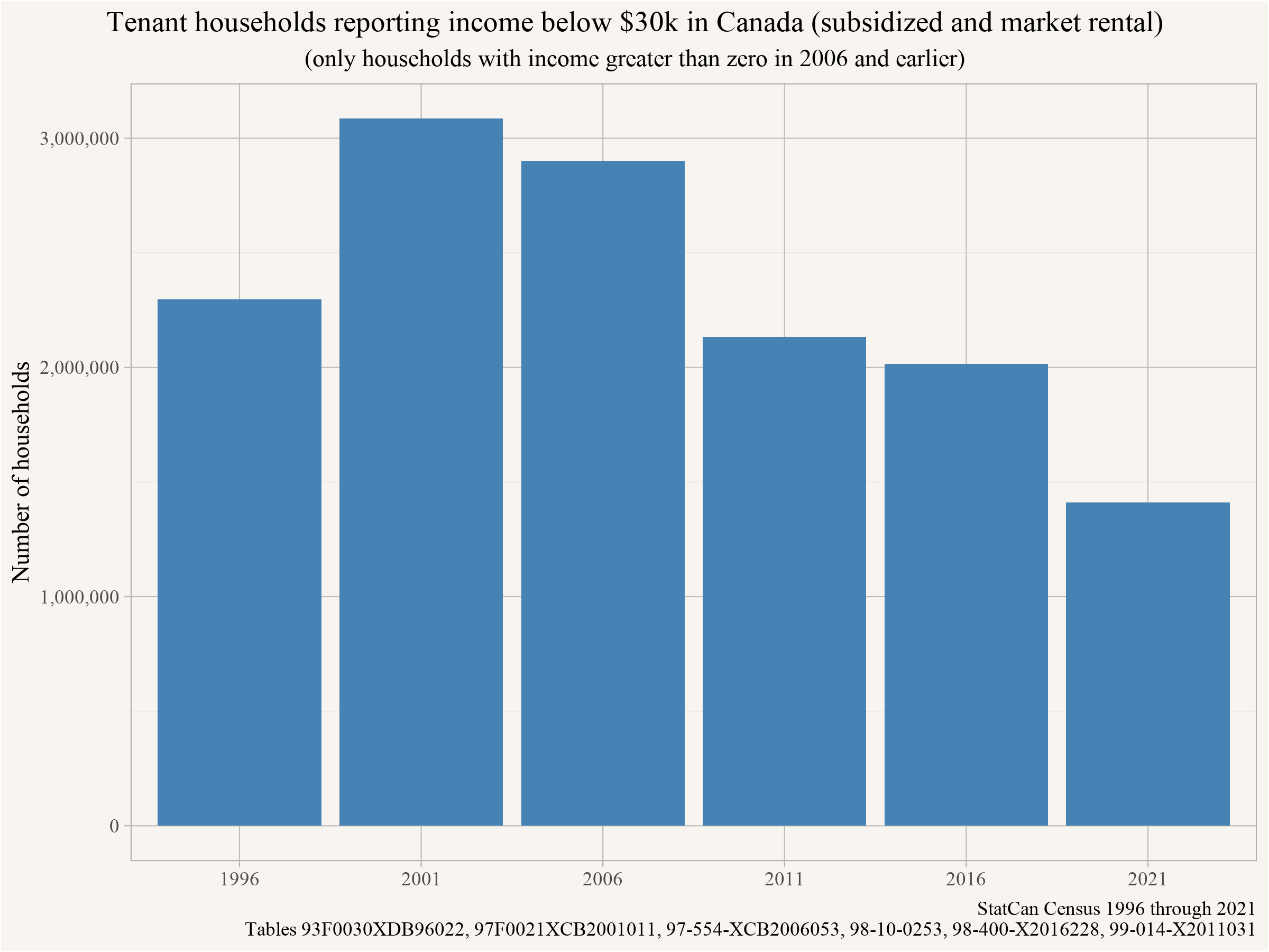
The bump between 1996 and 2001 likely reflects simple household growth through a time period when $30,000 was still a decent income, but it could also result in part from a methods change in how households and incomes were counted. Regardless, since 2001 there’s been a strong decline in tenant households reporting less than $30,000 in income. It doesn’t fully match the more steady decline in rents less than $750, and may also be complicated by recent pandemic-related income supports, which together with methods changes make income harder to track than rents, but we can see real change. In other words, the decline in households paying low rents (<$750) roughly tracked the decline in households with low incomes (<$30,000). Nevertheless, there remain more of the latter than the former, suggesting real rent burdens.
Rather than examining changing rents and incomes in isolation, another approach is to look directly at rent burdens, i.e. what proportion of income is going toward rent for households with income below $30,000. Here we’ll only look at those in non-subsidized housing. We’ll also keep in mind that there’s an important lag between reporting of incomes (mostly drawn from tax records for the year prior to the Census) and rents (estimated as contemporaneous with the Census). As a result, some situations where it looks like people are paying a very high proportion of their incomes on rent may arise simply because they just graduated or moved to Canada and started a new job (with income not yet recorded) at the same time as they moved into a new place (where we get their new rent). We’ll come back to this point. But for now, keeping this caveat in mind, let’s take a look at the data!
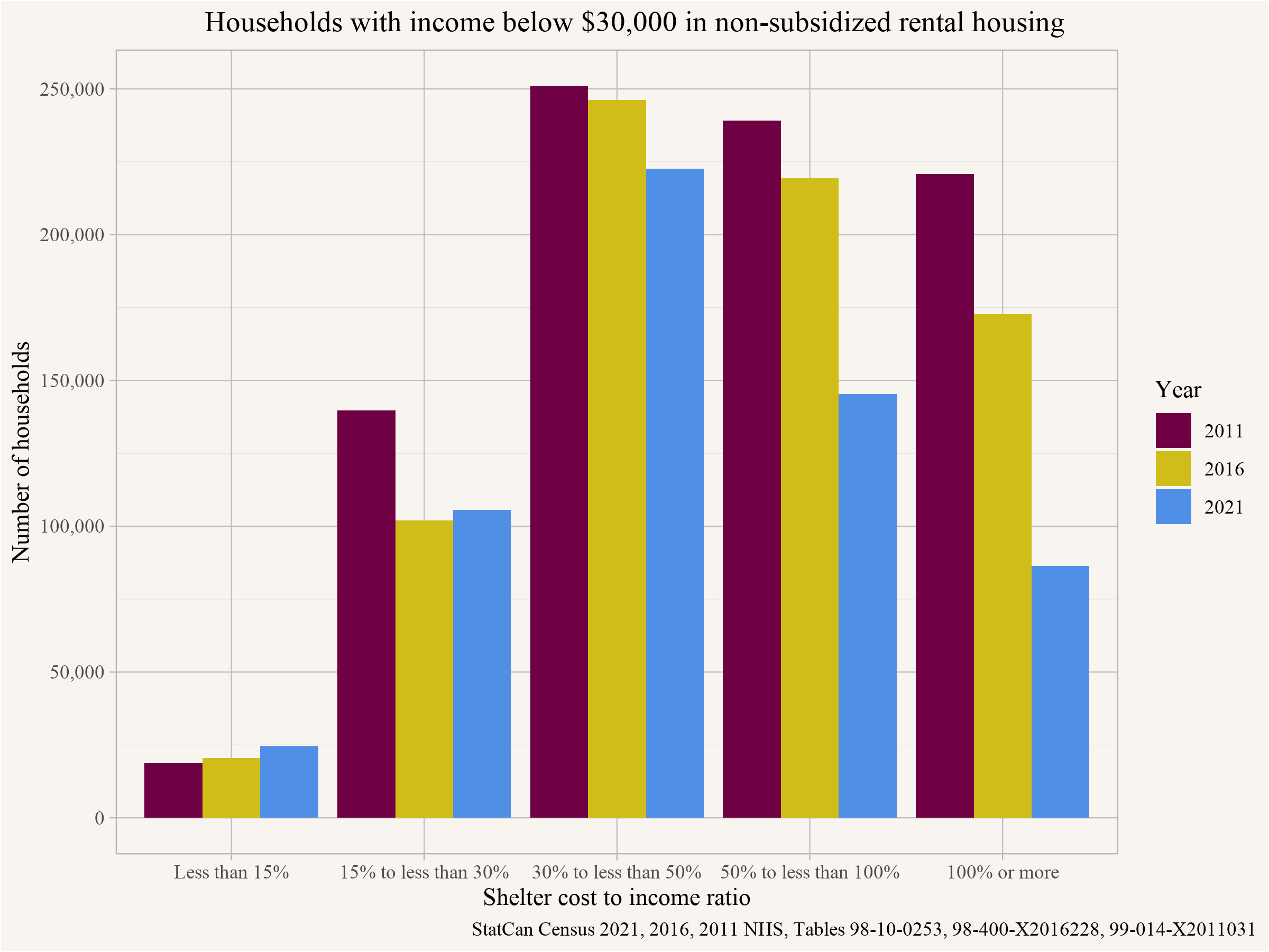
Overall, the most common situation for low-income households without subsidies is to be paying 30%-50% of incomes on rent. This doesn’t leave a lot of room for other expenses. On the bright side, we can see the decline in unsubsidized households with incomes below $30k, and we can also see that the low-income households remaining in 2021 are less and less likely to be paying more than half their income in rent, continuing a pattern of decline observable since 2011. So from that perspective, that’s an improvement. But we shouldn’t overstate it. Overall, looked at distributionally, little has changed concerning the rent burden for those households making under $30,000.
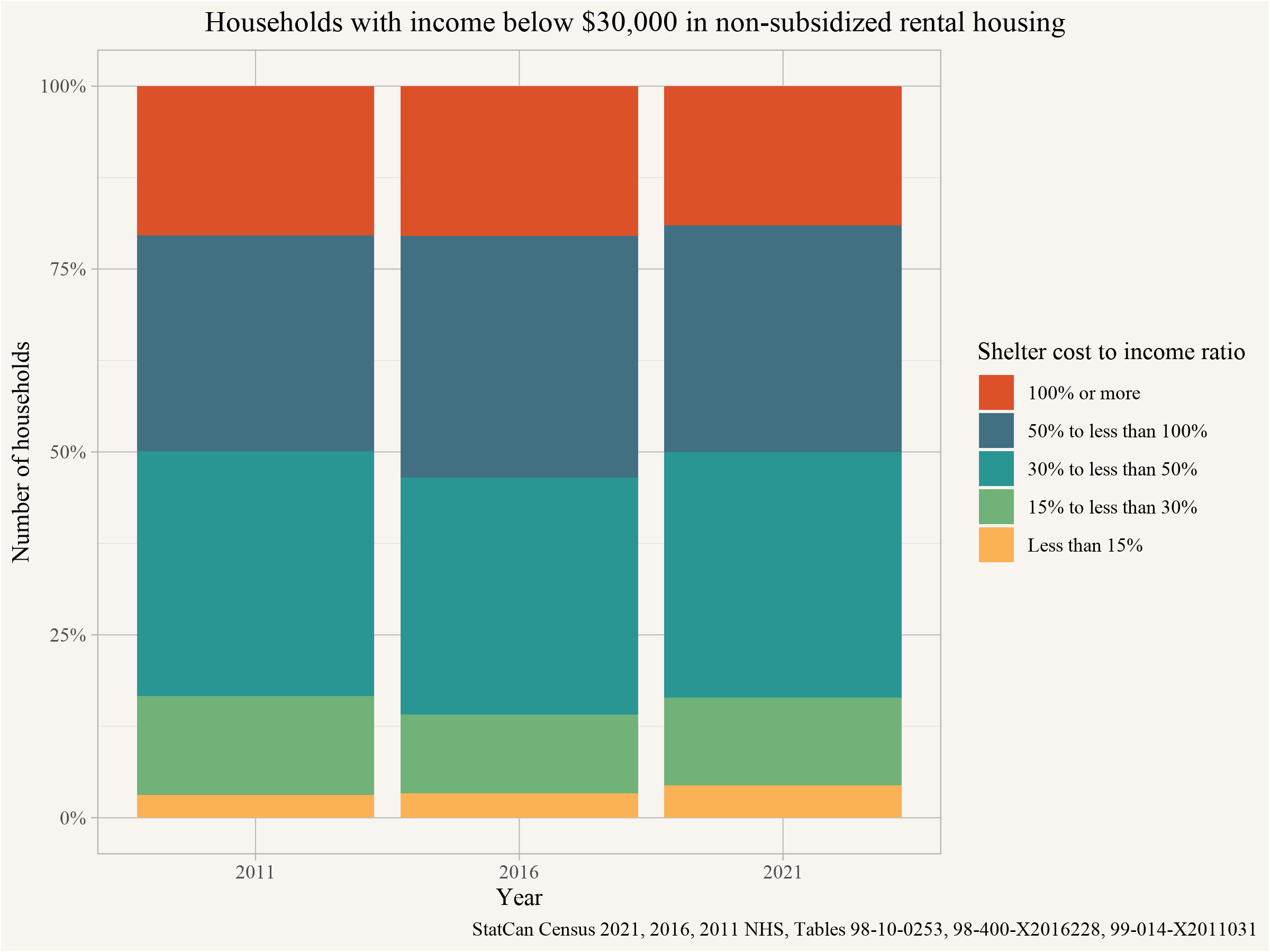
The relative lack of movement in this metric fits pretty well with the observable decline in both the number of households paying less than $750 in rent and the number of households making less than $30,000 in annual income. We’d like to see more improvement, but it’s not clear that things are getting noticeably worse.
The Geography of Cheap Rent
Let’s take a look at the geography of cheap rent. Where are the tenant households with shelter cost below $750, and where are we seeing the most losses of these kinds of rental contracts? We can pull this data from the cross tabulation we have used above. To reduce clutter we will break out the 20 biggest Metro Areas (CMAs) in Canada, and lump everything else together.
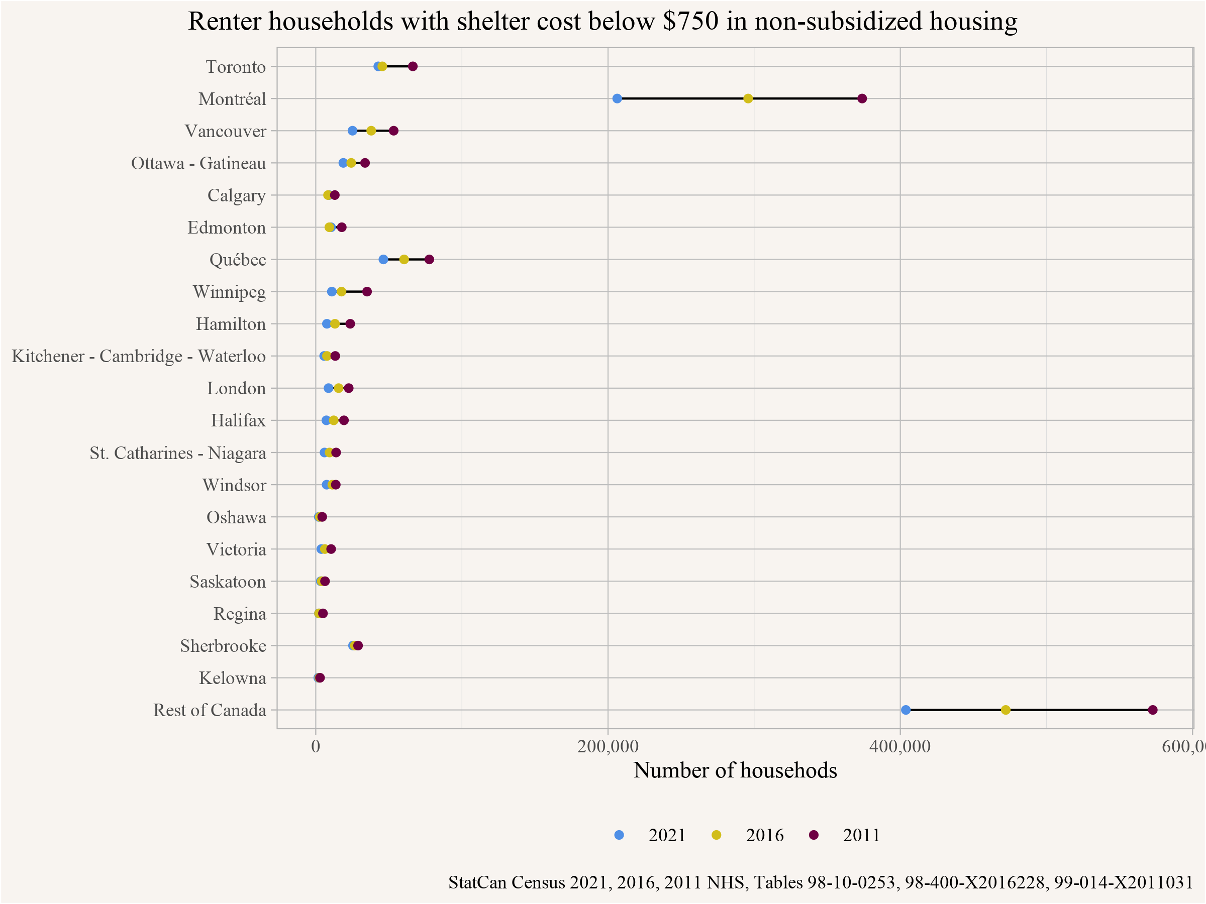
We see that cheap rent is most common outside of Metropolitan Canada (as represented by the top 20 CMAs), though Montréal also still retains a lot of tenant households paying less than $750 in rent. Correspondingly, Montréal and more rural parts of Canada are also where we’ve seen the biggest recent declines in low-rent households. Strange, then, that the focus on reporting about these losses often shifts to Vancouver or Toronto, where there are very few such rental contracts remaining. This speaks to a broader problem with the potential for any headline number for Canada to mislead insofar as it combines data from very different housing markets across the country.
We can look at this more directly by showing the loss of renter households with shelter cost less that $750 in each region and inter-census period.
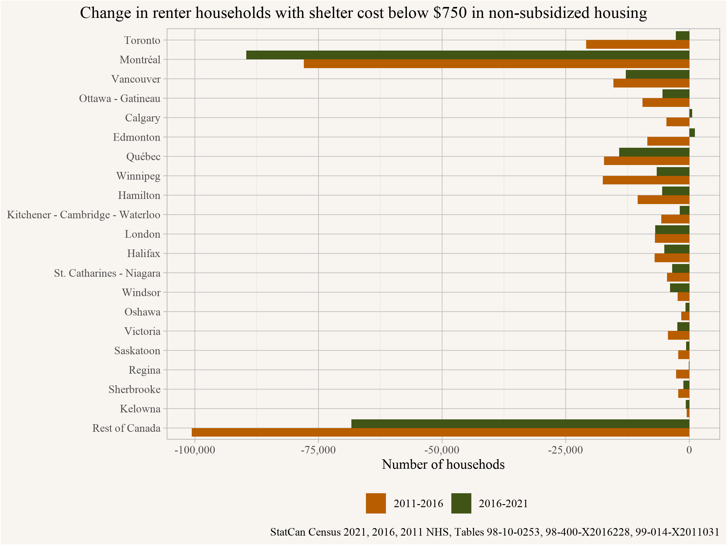
This again highlights that most of the losses were in Montréal and regions outside of the main metro areas. The number of households with shelter cost below $750 in Calgary and Edmonton increasing 2016-2021 shows that this isn’t necessarily a one-way street. Units renting below $750 at any given point in time aren’t separate from the rest of the housing market, and their asking rents can go up or down depending upon what’s going on elsewhere in the market.
Further exploration into Low Rent
Let’s dig a little deeper, drawing upon public use micro file (PUMF) data. Unfortunately this hasn’t been released yet for the 2021 Census, so we’ll only be able to look at 2011 and 2016 data, coming from the long-form NHS and Census samples. For 2016, these samples come in both individual and hierarchical form (including complete households), and we’ll include both here for reference. Using PUMF data adds uncertainty due to lower sample size, but adds much greater flexibility. First let’s look at a simple distribution of what rents those paying less than $750 a month are paying for each sample.
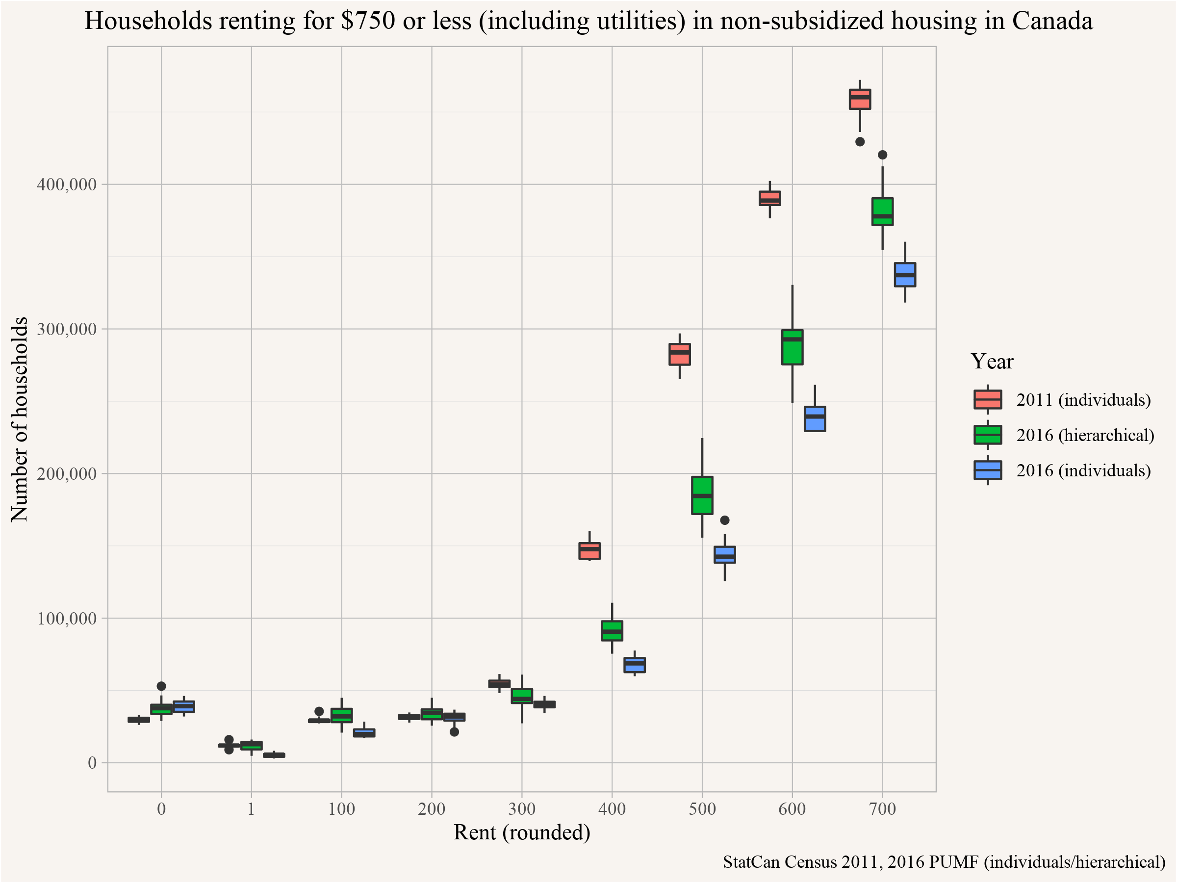
We can see that most rents are (perhaps not surprisingly) at the upper end of the distribution, with $700 a month being the most common. This suggests that there’s nothing intrinsically separating market housing renting under $750 from the rest of the housing market. There’s nothing “natural” about its affordability except that its on the low end of the overall distribution of rents. As the overall distribution shifts rightward, its affordable tail at the left end gets smaller and smaller.
Other noticeable issues include the difference in results when using the individuals vs the hierarchical PUMF data, with only minimal overlap in the confidence intervals. This is a good reminder of the inherent difficulties when working with PUMF data. Another interesting observation is that renters renting below $300 have increased 2011-2016. These are likely non-arms length rentals, which we’ve yet to discuss another issue complicating analysis. Not all of these “market rentals” actually represent market processes.
Let’s use our flexibility to break down tenancies with rents below $750 by age of primary household maintainer.
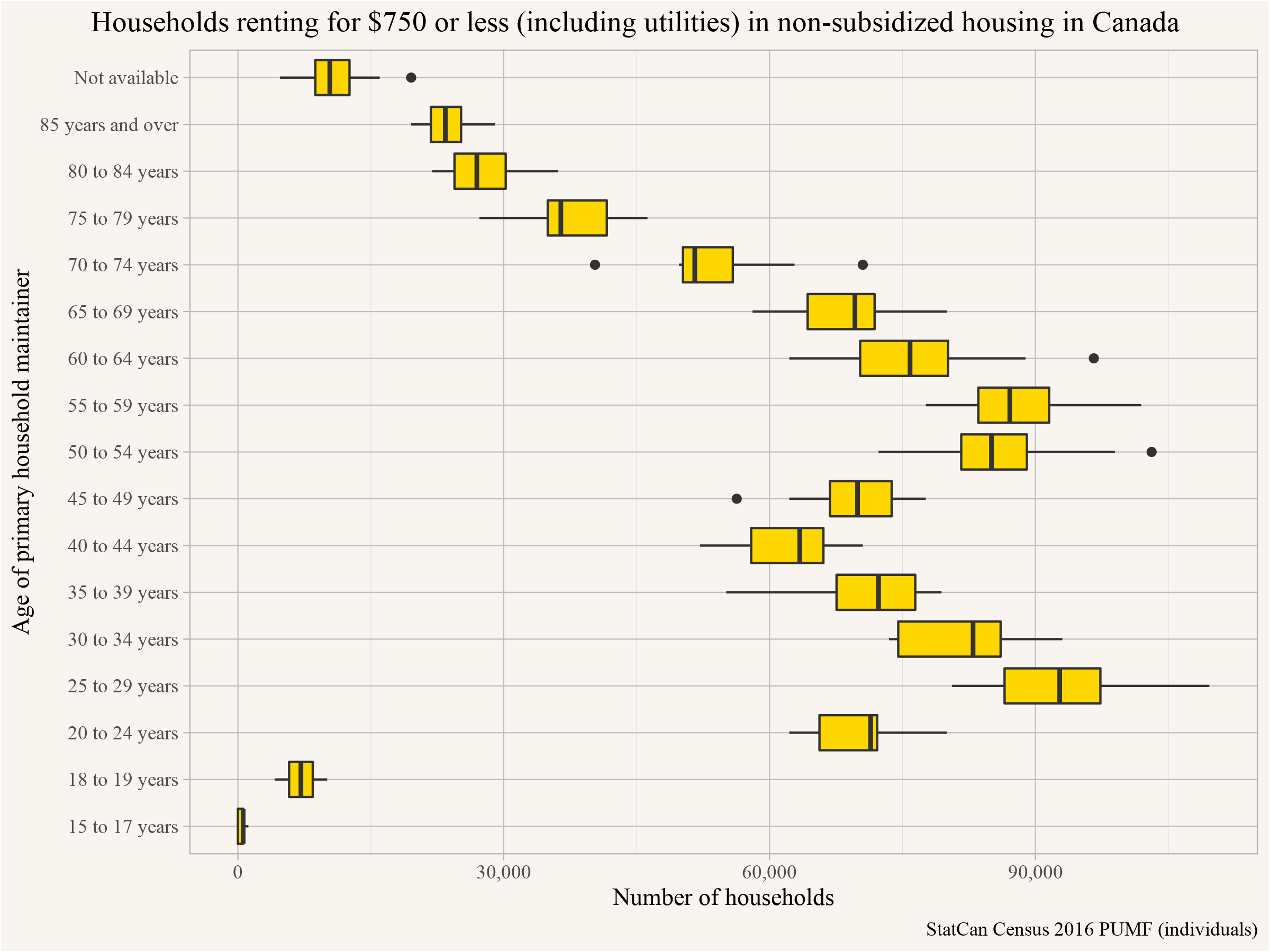
The zigzag (or double hump) pattern here is fascinating, with concentrations in both the early Millennial (born 1986-1991) and late Boomer (born 1956-1966). This may reflect simple demographics (these were larger cohorts than the intervening Gen Xers), but may also be picking up on other patterns, with variation in both quality and geographic distribution of low rent tenancies by age (keeping in mind that most of these renters are in more rural parts of Canada and bigger metros in Quebec). We’ll circle back to look at these patterns in a moment, but first let’s take a look at what was renting for less than $750 in 2016 by number of bedrooms.
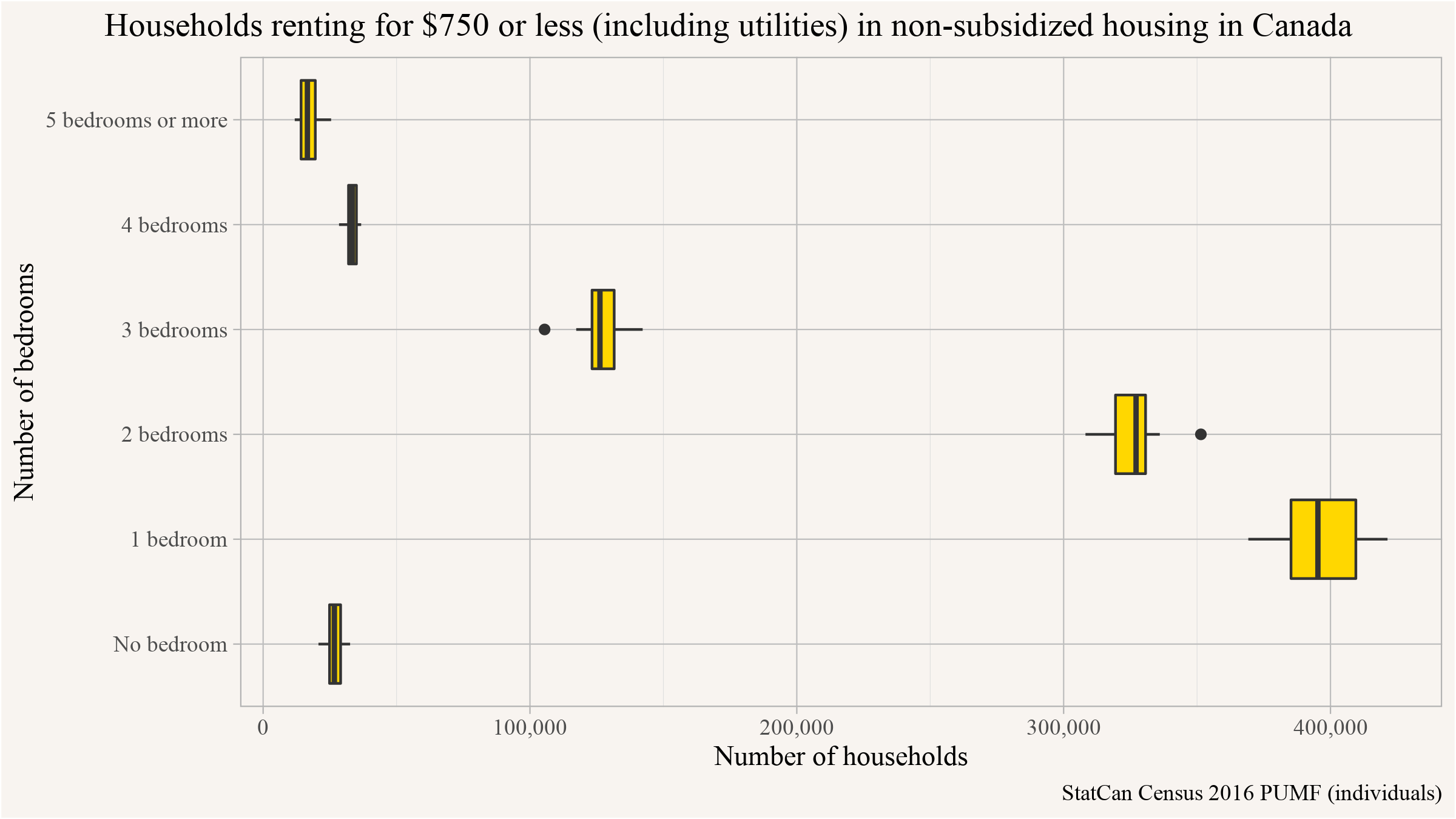
No surprise, mostly 1BR and 2BR dwellings. We can also look at the type of dwelling households paying less than $750 in rent tend to live in.
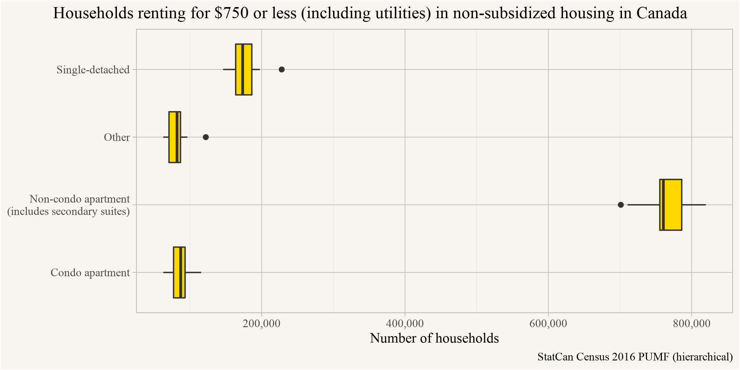
The vast majority of low rent situations seem to involve non-condo apartments, representing both purpose-built rental buildings and secondary suites in homes. Once again, it’s worth keeping in mind that these are mostly showing up in Quebec and more rural parts of Canada.
Checking by period of construction of the building we see that most of these households live in buildings constructed between 1946 and 1980 or 1990.
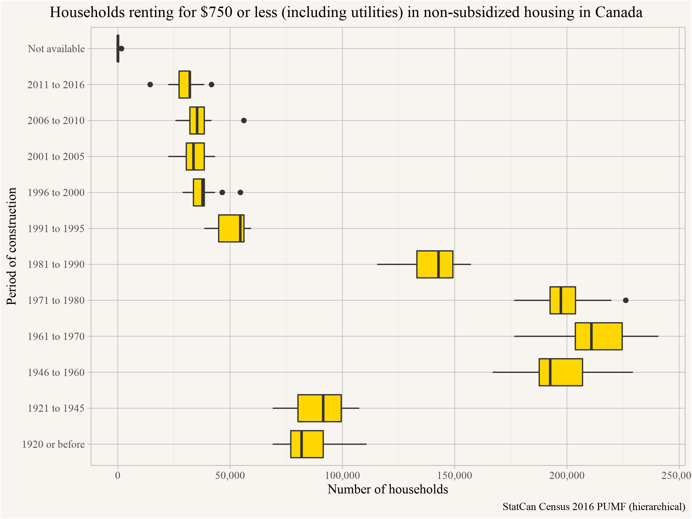
Most low rent situations involve older buildings. But this age distribution also generally fits the age-distribution of our purpose-built rental stock in Canada, largely constructed during a mid-Twentieth Century build-out prior to the rise of the condominium (where we see far fewer being rented out at below $750). Aging stock is also more likely to be in poor condition, drawing a clear connection between rents and quality of housing. A fair amount of preventive maintenance is needed to keep old buildings habitable, and the more they fall into disrepair, the cheaper their rents tend to go relative to surrounding alternatives. There’s nothing “natural” about keeping older housing inhabitable.
Time Lag Bias in Shelter Cost to Income Ratios
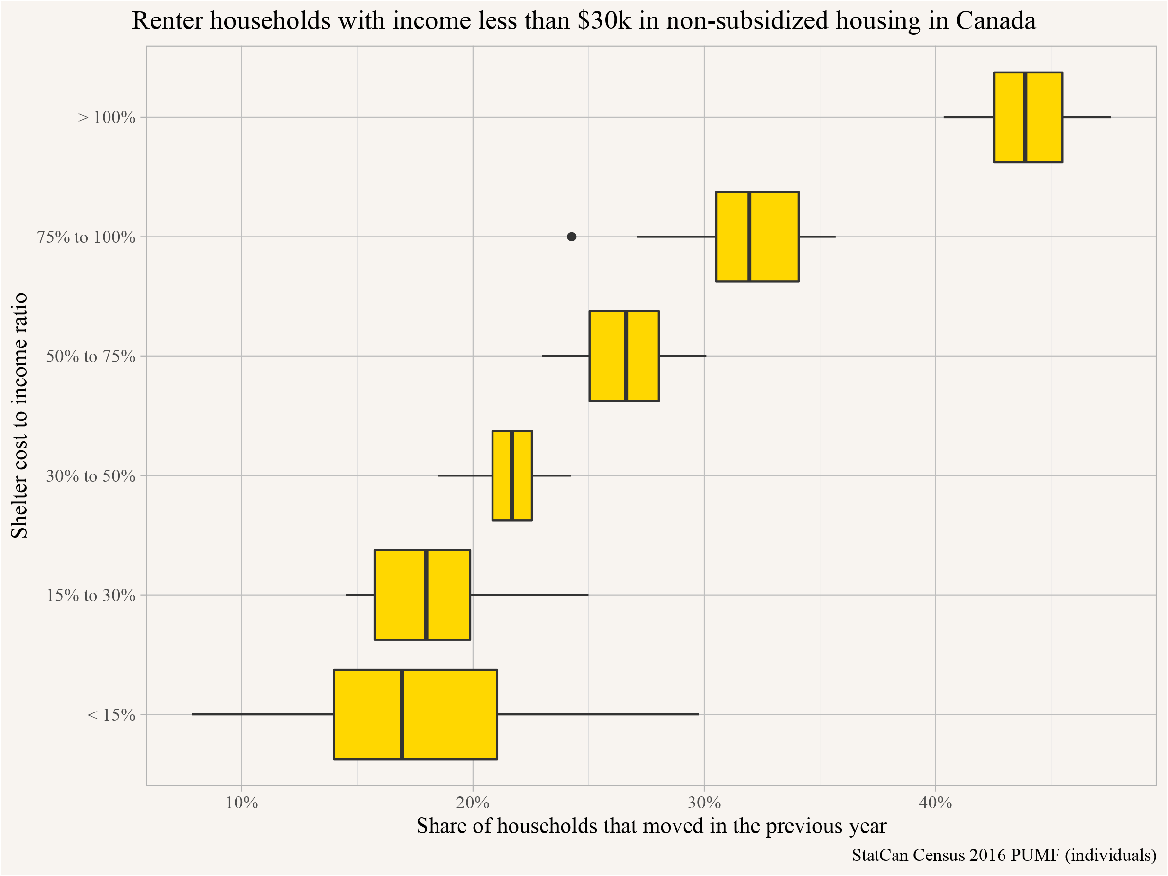
Let’s exploit the flexibility of our microdata to return to our exploration of those on the other side of the low rent affordability issue: households with incomes below $30k. As we noted before, some of the particularly high ratios, where it seems like tenants are paying extraordinary portions of their incomes on rents, may be accounted for by time lags between reporting incomes and rents. This can especially be an issue for recent immigrants and new graduates who might have landed both a good job and new apartment prior to the census, but lack income records from the year prior to the census. We can help account for this by pulling out recent movers (those moving in the last year). What do their shelter cost to income ratios look like if we actually separate non-movers from recent movers?
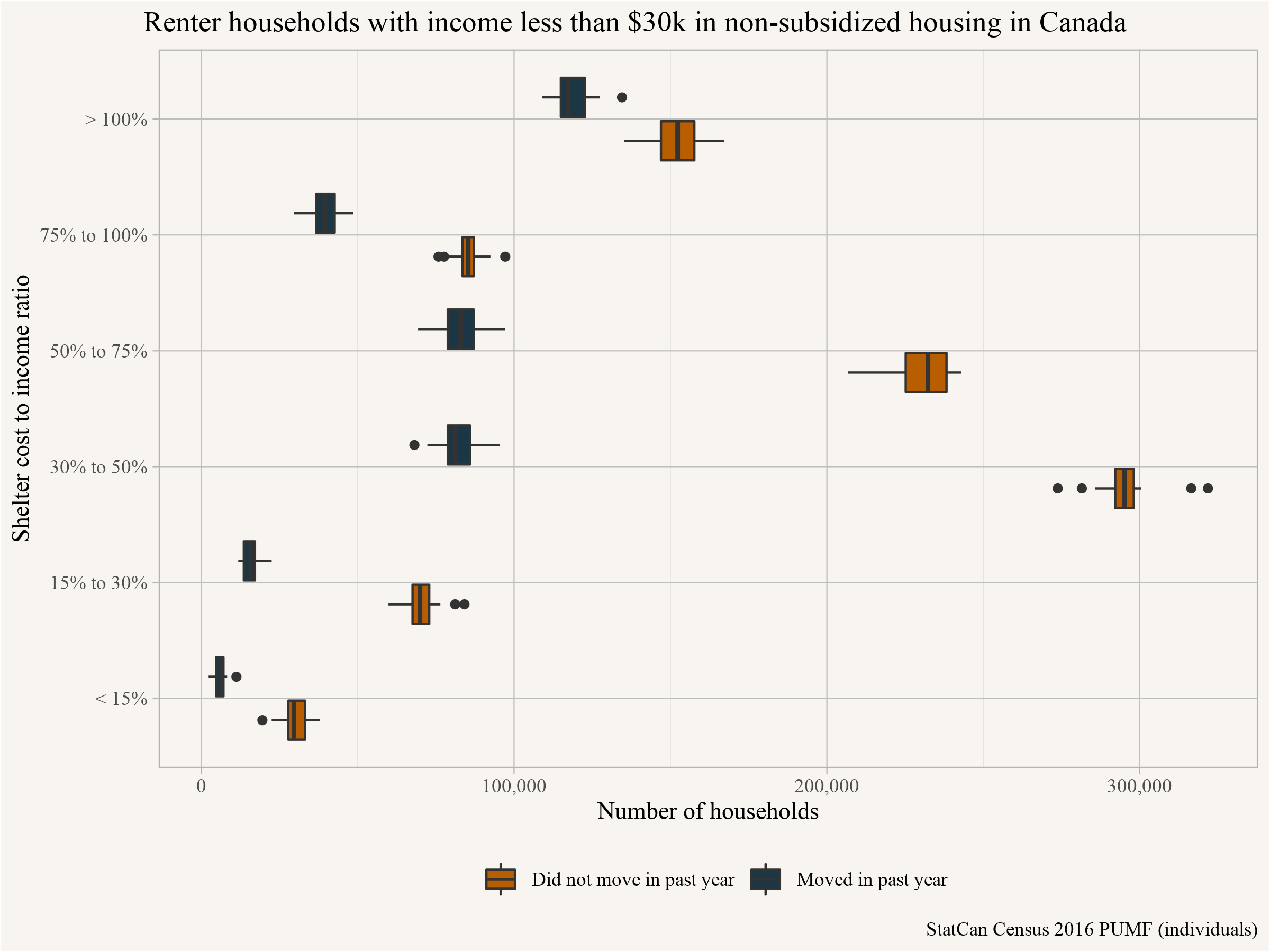
We can see that when we separate them out, non-movers in the past year with low household incomes (<$30,000) reported for the year prior are mostly concentrated in the range of those paying between 30% to 50% of their income on rent. By contrast, the highest category for movers with low incomes is those paying 100% or more of their income on rent. This likely reflects the lag effect, where movers current incomes (at least within Canada) are likely much higher when they fill out Census forms about their rents, than in the year prior, when the Census attempts to assign their income.
Computing the ratio of households that moved in the past year for each shelter cost to income band makes this relationship even more clear. The time lag between reported incomes and reported rents likely produces a real upward bias in shelter cost to income ratios. We can partly account for this bias by separating out mobility, but it’s imperfect, and analysts drawing upon this metric - including for the construction of Core Housing Needs measures! - should really keep this bias in mind.
Rents in the Primary Rental Market
Let’s draw in one more source of data to keep triangulating our exploration of low rents. In particular, let’s look at the primary rental market. This gets surveyed annually by CMHC through their Rental Market Survey (RMS) and looking at rent bands by quartile gives some indication how this market has changed. Deeper access to CMHC data could answer the question how rent has changed in individual buildings, and how many of these have gotten torn down or received deep renovations. But publicly available data can give a broad overview.
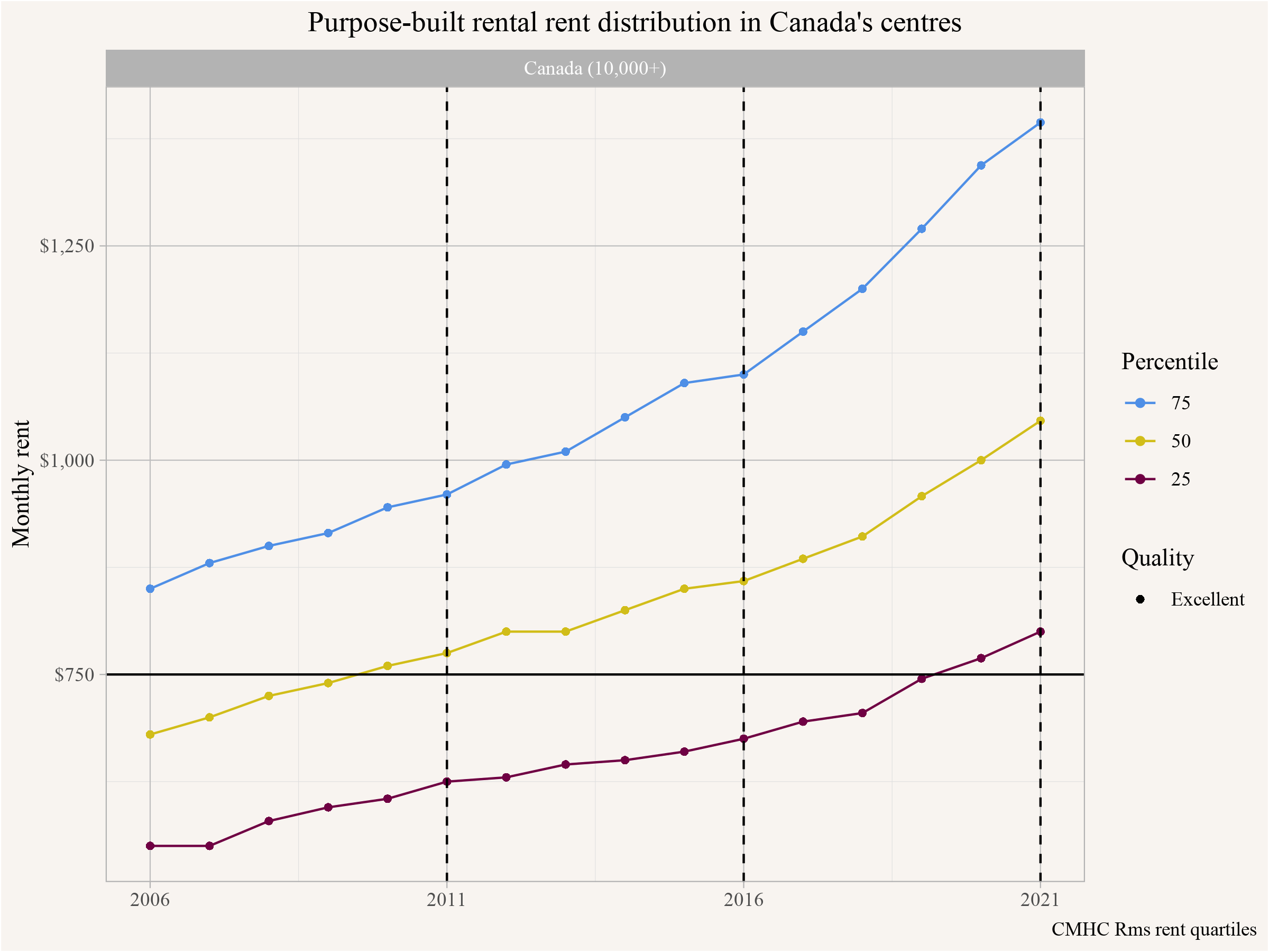
Our broadest overview of the primary rental market shows that the percentile bands of rent levels have continuously increased between 2006 and 2021. If we assume that the rents are evenly distributed between these 25th and 50th percentile we can estimate what share of the rental stock rented below $750 in 2011 and 2016, and folding in data on the total stock of purpose built rental housing we can estimate the loss of such units.
This method gives a rough estimate of 125,500 fewer primary market rental units in 2016 renting below $750 compared to 2011. This is based on rent, which may include some utilities, but generally not all of them, so it’s a slightly different estimate than what we used above.
In the purpose-built market the RMS estimated a total of around 842,864 units renting below $750 in 2011, compared to the census estimate of 1,408,306 households with shelter cost below $750 in 2011. As we noted those two aren’t directly comparable because the RMS rent does not include all utilities, but also because the RMS coverage has gaps outside of census metropolitan areas. But it’s probably fair to say that somewhere between half to maybe 60% of all households with shelter cost below $750 were renting in the primary market. Adding to that that some of the households with shelter cost below $750 were in non-arms length rentals, understanding what happened in the primary market can probably provide good context.
As noted above, housing markets are decidedly regional, so it might be useful to see how this pans out across different metropolitan areas.
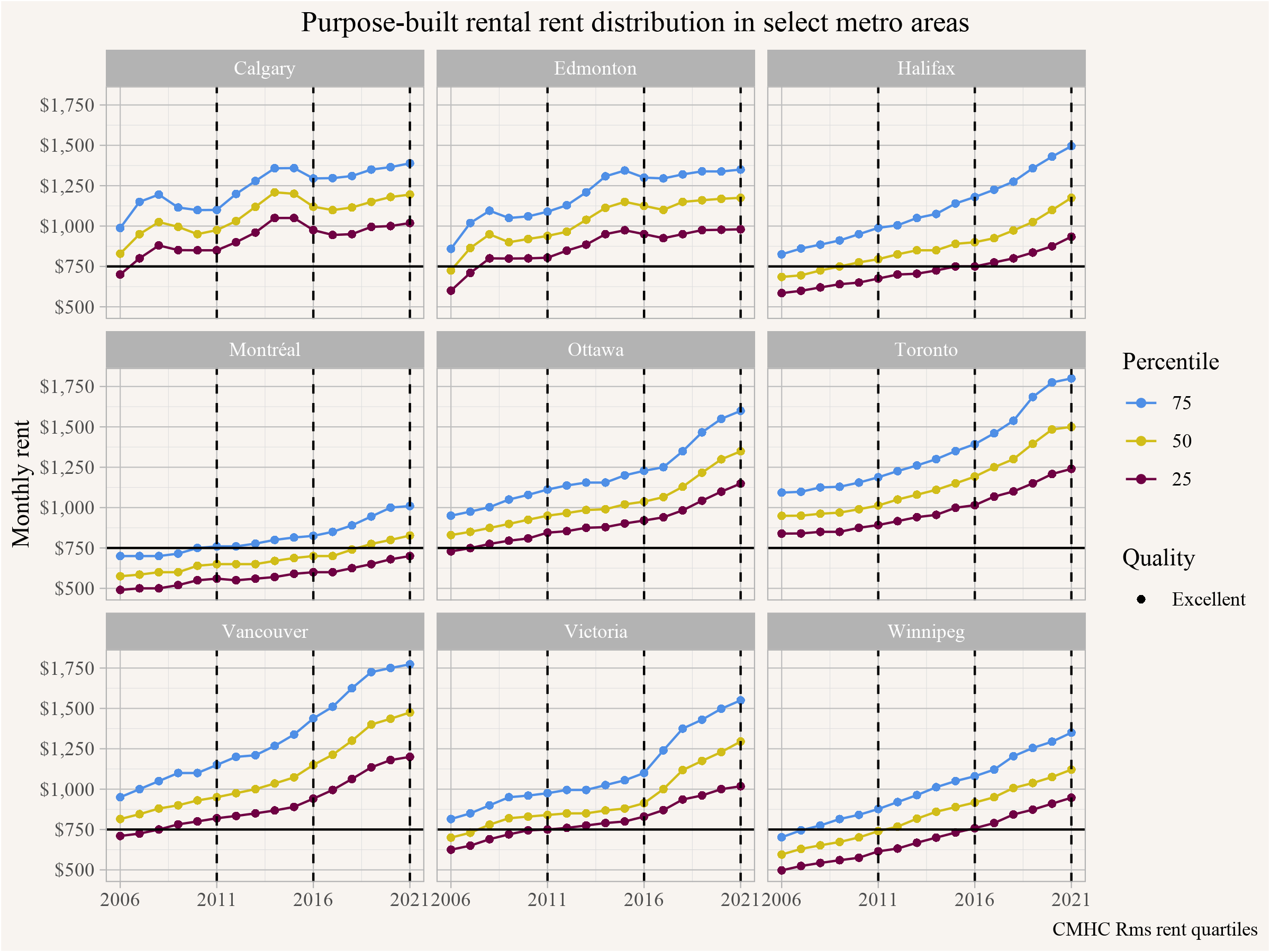
Matching our census-based analysis, the RMS data shows that Montréal has a high share of purpose-built rental units renting below $750 both in 2011 and 2016, whereas e.g. Toronto doesn’t. We can also see that in Winnipeg and Halifax about half of the units were renting below $750 in 2011, dropping to 25% in 2016 and likely very few left by 2021, whereas in Montréal about 75% of units were renting below $750 in 2011, with still a little over 50% renting below that cutoff in 2016 and over a quarter in 2021.
But how should one interpret this? That’s where things get tricky. RMS data alone does not answer why there are fewer units below this rent cutoff over the years. Or across metro areas. There are many different processes at play, from the location and state of repair/quality of rental units to the bedroom mix and size of units, and overall market conditions with scarcity disrupting filtering processes. But there’s no “natural” cut-off between apartments renting below $750 and the rest of the rental market. Instead, we can see that different price points in the distribution of rental contracts tend to move up and down together. In other words, we don’t see strong segmentation of the rental market, and instead see evidence of upward and downward filtering at work. So where there’s high demand, halting the addition of new apartments will place increased price pressure on old apartments, shifting their rents further upward.
Analyzing this in more detail unfortunately goes beyond the scope of this post, but we do want to quickly highlight how bedroom mix and change in overall purpose-built rental units vary across metro areas.
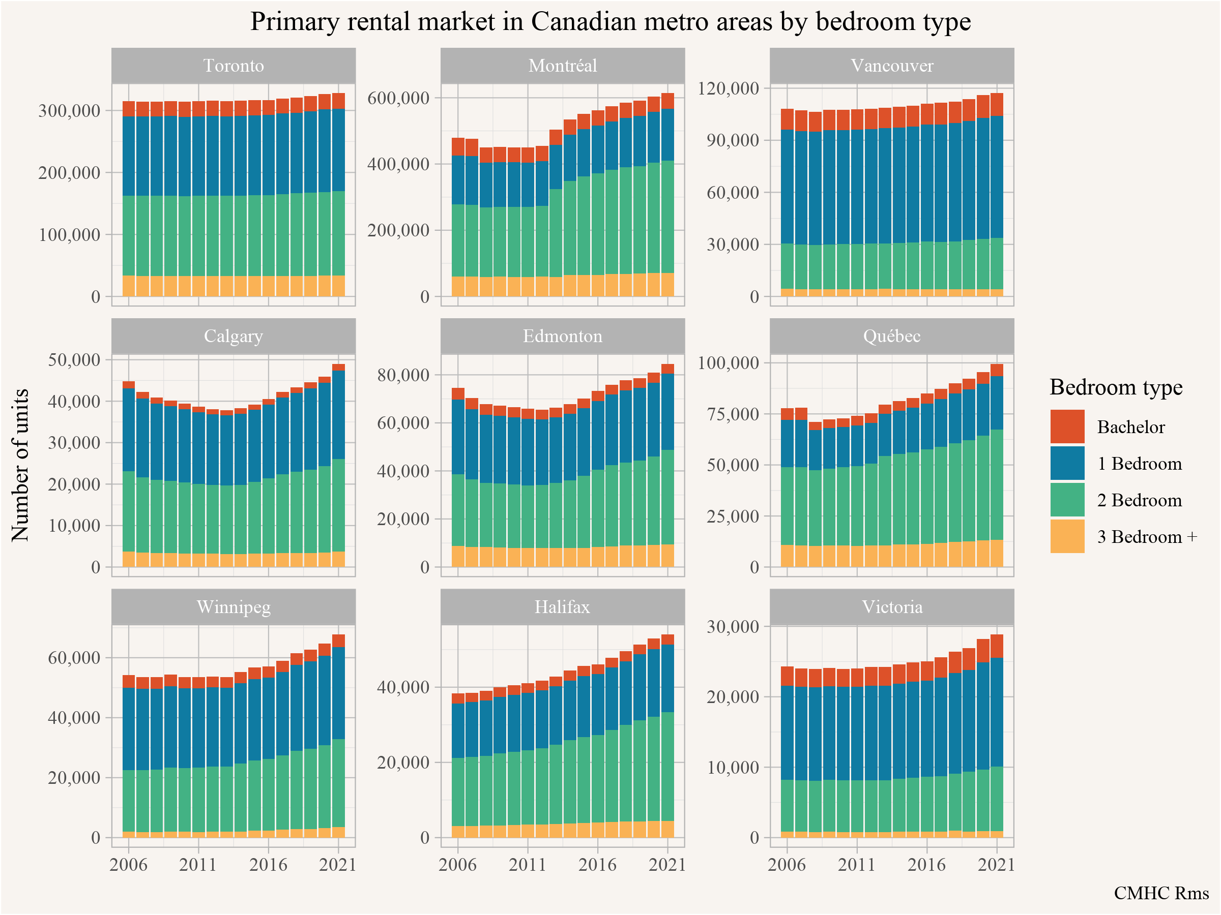
Montreal and Québec have a relatively high share of of 2 and 3 bedroom units, which makes their high share of units renting below $750 even more impressive. They also have a high share of overall purpose-built rental units in their CMAs, and they have been adding on that over the years. Toronto and Vancouver, on the other hand, have been relatively flat in their overall stock of purpose-built rental units due to a mixture of modest additions and some loss due to conversion and demolitions.
To round this off we can narrow down to look specifically at the rent distribution of 2-bedroom purpose-built rental units across metro regions.
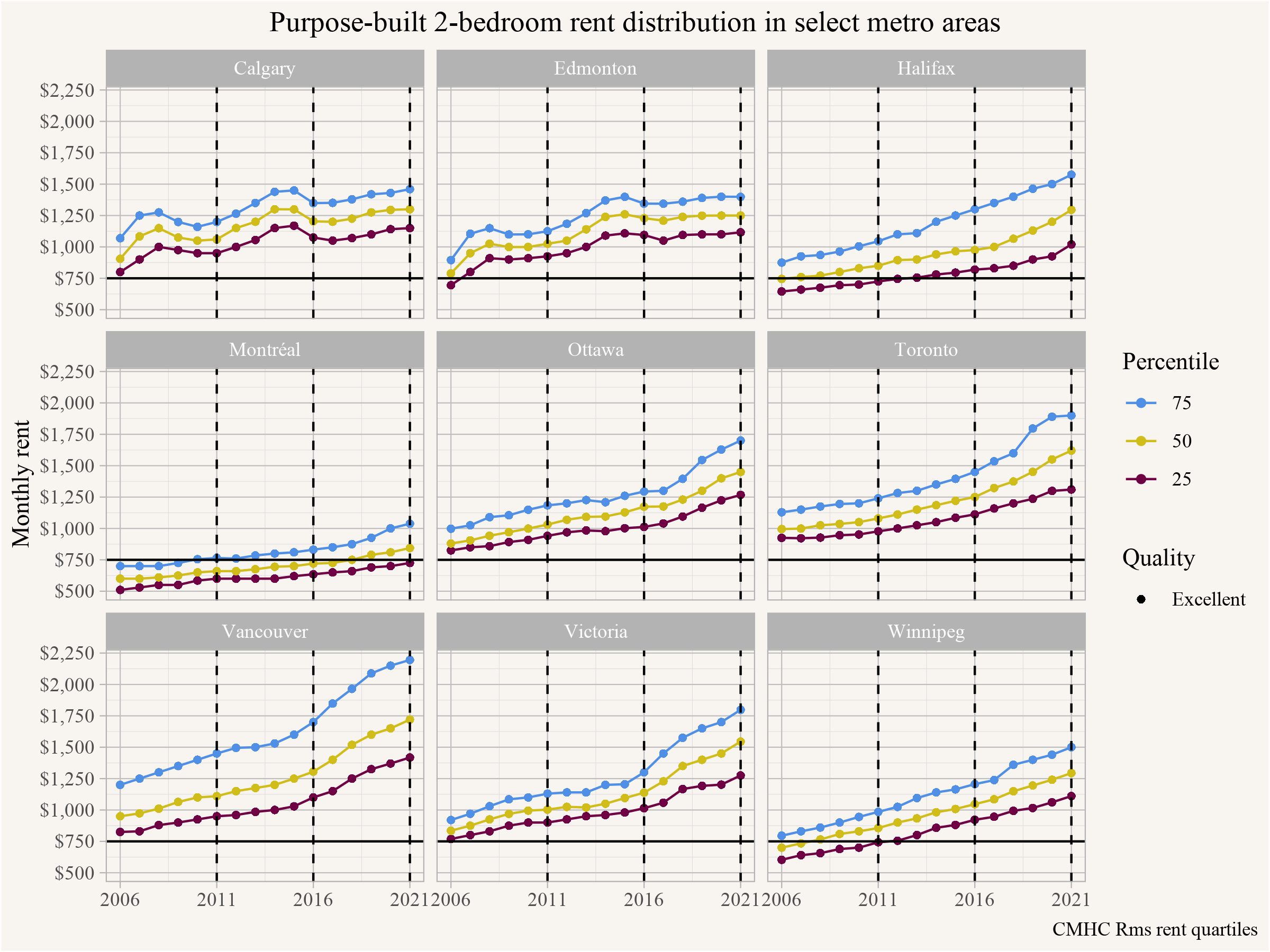
Only Montréal has a good share of their 2-bedroom purpose-built rental units renting below $750, with a little over 25% of them still renting below that cutoff in 2021. In Toronto and Vancouver 2-bedroom apartments renting below $750 have been exceedingly rare since at least 2006.
Takeaway
What happens in the cheaper portions of the housing market is really important, demonstrating where the greatest risk of homelessness lies, and where the greatest need for non-market housing can be found. The headline number of 322,000 “lost units” renting below $750 calls useful attention to this portion of the housing market, but unfortunately it’s often misleading on multiple levels. To review just a few of the ways it can mislead:
- The statistic is mostly about changes in contracts between tenants and landlords, specifying rents below $750, and is not generally otherwise tied to units of housing
- The statistic refers to shelter cost of households, rather than referring directly to rents.
- The $750 figure is nominal dollars, not adjusted for inflation or for growth in incomes.
- Without consideration of incomes, the stat says little about change in affordability.
- Interpretations frequently advanced to explain the “loss” don’t hold up, there is no indication that this losses in rental contracts below $750 are driven by REITs or by demolitions of old rental buildings.
The much more immediate interpretation is that scarcity is driving up rents, leading to older units filtering up. This leads to the opposite implications of common NIMBY talking points that old housing is “naturally” affordable. It’s only affordable if enough new housing is built to soak up demand that would otherwise draw up the lower portions of the housing market into higher overall rents.
Additionally, using nominal rents is not very useful. We could adjust for inflation to (crudely) account for increased costs to build and operate rental buildings. Or adjust for income growth to account for people’s ability to pay. Instead of focusing on rent or shelter costs we should probably focus on affordability, as measured by shelter cost to income ratios. When looking at the impacts of “financialization” and/or REITs on the rental market we need to do better to support our arguments with data. (We will discuss this more in a separate post.)
Non of this negates the dire need we have for more housing. The need to dramatically expand our non-market housing options was already clear in 2011, and it is still urgently needed in 2021. Acquiring old purpose-built rental housing is a fine stop-gap strategy to assist in stabilizing rents for current tenants, but by itself the strategy does little to add badly needed housing stock and often comes with outsized maintenance costs and accessibility concerns. We can and should build a lot more new non-market housing. We also need a dramatic expansion of our market housing, especially in high-demand areas, to slow or even reverse the growth in rents and prices beyond the increases in construction costs. Housing abundance, distributed both within and outside of market processes, probably offers our best shot at finding more cheap rent.
As usual, the code for this post is available on GitHub.
Reproducibility receipt
## [1] "2022-10-01 11:44:19 PDT"## Local: master /Users/jens/Documents/R/mountaindoodles
## Remote: master @ origin (https://github.com/mountainMath/doodles.git)
## Head: [63c0f3b] 2022-10-01: fix authors## R version 4.2.1 (2022-06-23)
## Platform: aarch64-apple-darwin20 (64-bit)
## Running under: macOS Monterey 12.6
##
## Matrix products: default
## BLAS: /Library/Frameworks/R.framework/Versions/4.2-arm64/Resources/lib/libRblas.0.dylib
## LAPACK: /Library/Frameworks/R.framework/Versions/4.2-arm64/Resources/lib/libRlapack.dylib
##
## locale:
## [1] en_CA.UTF-8/en_CA.UTF-8/en_CA.UTF-8/C/en_CA.UTF-8/en_CA.UTF-8
##
## attached base packages:
## [1] stats graphics grDevices utils datasets methods base
##
## other attached packages:
## [1] cancensus_0.5.3 cansim_0.3.12
## [3] cmhc_0.2.3 mountainmathHelpers_0.1.4
## [5] statcanXtabs_0.1.2 forcats_0.5.1
## [7] stringr_1.4.1 dplyr_1.0.9
## [9] purrr_0.3.4 readr_2.1.2
## [11] tidyr_1.2.0 tibble_3.1.8
## [13] ggplot2_3.3.6 tidyverse_1.3.2
##
## loaded via a namespace (and not attached):
## [1] lubridate_1.8.0 assertthat_0.2.1 digest_0.6.29
## [4] utf8_1.2.2 R6_2.5.1 cellranger_1.1.0
## [7] backports_1.4.1 reprex_2.0.1 evaluate_0.15
## [10] httr_1.4.4 blogdown_1.10 pillar_1.8.1
## [13] rlang_1.0.5 googlesheets4_1.0.0 readxl_1.4.0
## [16] rstudioapi_0.14 jquerylib_0.1.4 rmarkdown_2.14
## [19] googledrive_2.0.0 munsell_0.5.0 broom_1.0.0
## [22] compiler_4.2.1 modelr_0.1.8 xfun_0.33
## [25] pkgconfig_2.0.3 htmltools_0.5.3 tidyselect_1.1.2
## [28] bookdown_0.27 fansi_1.0.3 crayon_1.5.1
## [31] tzdb_0.3.0 dbplyr_2.2.1 withr_2.5.0
## [34] grid_4.2.1 jsonlite_1.8.0 gtable_0.3.1
## [37] lifecycle_1.0.2 DBI_1.1.3 git2r_0.30.1
## [40] magrittr_2.0.3 scales_1.2.1 cli_3.4.0
## [43] stringi_1.7.8 cachem_1.0.6 fs_1.5.2
## [46] xml2_1.3.3 bslib_0.4.0 ellipsis_0.3.2
## [49] generics_0.1.3 vctrs_0.4.1 tools_4.2.1
## [52] glue_1.6.2 hms_1.1.2 fastmap_1.1.0
## [55] yaml_2.3.5 colorspace_2.0-3 gargle_1.2.0
## [58] rvest_1.0.3 knitr_1.39 haven_2.5.0
## [61] sass_0.4.2Reuse
Citation
@misc{where-did-all-the-cheap-rents-go.2022,
  author = {{von Bergmann}, Jens and Lauster, Nathan},
  title = {Where Did All the Cheap Rents Go?},
  date = {2022-09-27},
  url = {https://doodles.mountainmath.ca/posts/2022-09-27-where-did-all-the-cheap-rents-go/},
  langid = {en}
}