Recently we added a cross-tabulation of Structural type by Document type to CensusMapper for mapping and API use, including in our {cancensus} R package. Today we added another datasets to this.
- Taxfiler data at the census tract level for tax years 2000 through 2017
Both of these datasets come through a project we are currently doing with CMHC, and we are excited to be able to turn these into open data, free for anyone to use.
What makes this new tax data particularly useful is that they have annual frequency and come at fine geographies. This can help fill in gaps between the censuses. And most importantly provide more recent data than the last census. T1FF Taxfiler data has very good coverage of the overall population, the 2017 tax data covers about 95.6% of the Canadian population, with other tax years having similarly high coverage.
The data is now available on CensusMapper for anyone to map, and is also available via the CensusMapper API for anyone to download. This makes it automatically available through the cancensus R package for convenient use for data analysis.
In this post we want to give a brief introduction how to work with the new data in R. The basics are identical how we work with census data. To simplify accessing the data across years we have ensured that variable names are uniform, so it is easy to pull timelines. The taxfiler data for a given year comes on census geographies based on the previous census (with the exception of 2011 tax data that is based on the 2006 geography), so we will have to TongFen the data to create longer timelines. There were some census tract level taxfiler custom tabulations in circulation previous to this release, but not as open data.
One important caveat about the census tract level geographies is that the tax data was approximated to that geography via postal codes. This can introduces a mismatch when directly comparing with census data. However that mismatch should be relative stable over time, making direct comparisons of tax data through time quite robust.
This data should be useful for researchers, but also for municipalities and other local government bodies, planners, non-profits, and others that are interested in more granular and more timely income and basic demographic data than what’s generally available.
Example use
Tax data is great for understanding how income changed over time. But it also has basic demographic data on (economic) families and age groups. To make it easier to follow along how to use the data, as well as the tongfen functionality, we will leave the code blocks visible in this post.
To start us off we are taking the number of economic families in low income between 2001 and 2017. We use the convenience get_tongfen_census_ct method from the tongfen package to grab the share of people in low income in Vancouver, Musqueam 2 and the UBC peninsula on a common geography.
vsb_regions <- list(CSD=c("5915022","5915803"),
                    CT=c("9330069.01","9330069.02","9330069.00"))

years=seq(2005,2017)
lico_vectors <- setNames(paste0("v_TX",years,"_551"),paste0("lico_",years))

vancouver_lico <- get_tongfen_census_ct(regions=vsb_regions, vectors=lico_vectors,
                                        geo_format = "sf",na.rm=FALSE)
Under the hood the TongFen package does the magic of standardizing the different census geographies and aggregating up the data, in this case taking a weighted (by population) average of the share of people in low income. Now we can plot the share of low income people in each region over the years. Data on the share of low income people is only available starting 2005 and not for our full timeline.
vancouver_lico %>%
  pivot_longer(cols=starts_with("lico"), names_pattern = "lico_(\\d+)",
               names_to = "Year", values_to = "Share") %>%
  mutate(Share=Share/100) %>%
  st_sf() %>%
  ggplot(aes(fill=Share)) +
  geom_sf(size=0.1) +
  scale_fill_viridis_c(option = "magma",labels=scales::percent) +
  facet_wrap("Year") +
  tax_theme +
  coord_sf(datum=NA) +
  labs(title="Share of people in low income")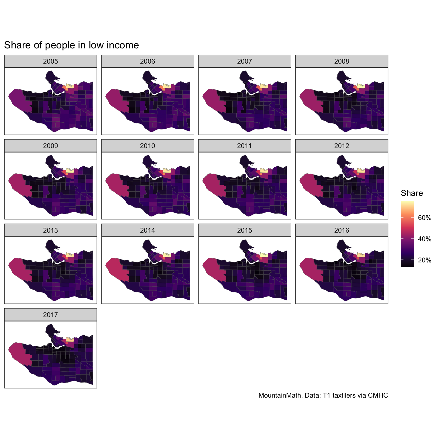
We can see some changes over time if we squint hard, simply plotting a series of maps is probably not the best way to show changes over time. Simple timeline graphs do a better job at that, focusing on tracts with high share of low-income people. This is where having the data on a uniform geometry becomes really important, the maps above we could have also drawn based on a changing geography.
vancouver_lico %>%
  pivot_longer(cols=starts_with("lico"), names_pattern = "lico_(\\d+)",
               names_to = "Year", values_to = "Share") %>%
  mutate(Year=factor(Year,levels=years),
         Share=Share/100) %>%
  mutate(highlight=GeoUID %in% filter(.,Share>=0.4)$GeoUID) %>%
  ggplot(aes(x=Year,y=Share,group=GeoUID)) +
  geom_line(data=~filter(.,!highlight),color="grey") +
  geom_line(data=~filter(.,highlight),aes(color=GeoUID)) +
  scale_y_continuous(labels=scales::percent) +
  tax_theme +
  labs(title="Share of people in low income by census tract",
       x="Tax year", y= "Share of people in low income")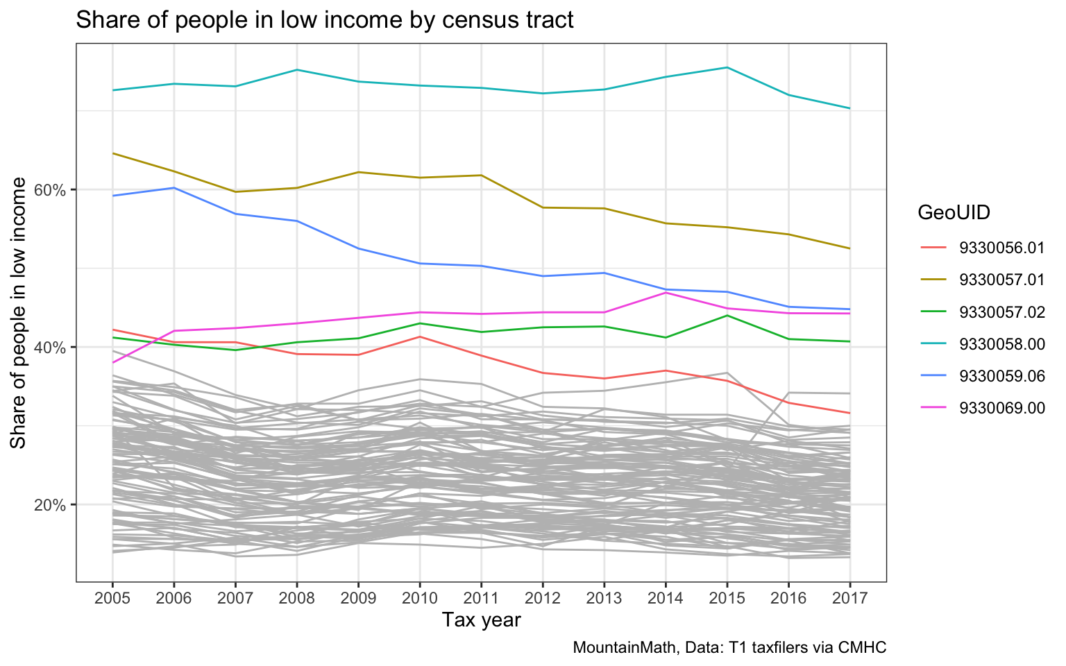
But this looses the intuitive geographic context that maps provide. Mapping the percentage point change between 2005 and 2017 in each region is a good way to round this up.
vancouver_lico %>%
  mutate(Change=(lico_2017-lico_2005)/100) %>%
  st_sf %>%
  ggplot(aes(fill=Change)) +
  geom_sf(size=0.1) +
  scale_fill_gradient2(labels=scales::percent) +
  tax_theme +
  coord_sf(datum=NA) +
  labs(title="Change in share of people in low income 2005-2017",
       fill="Percentage\npoint change")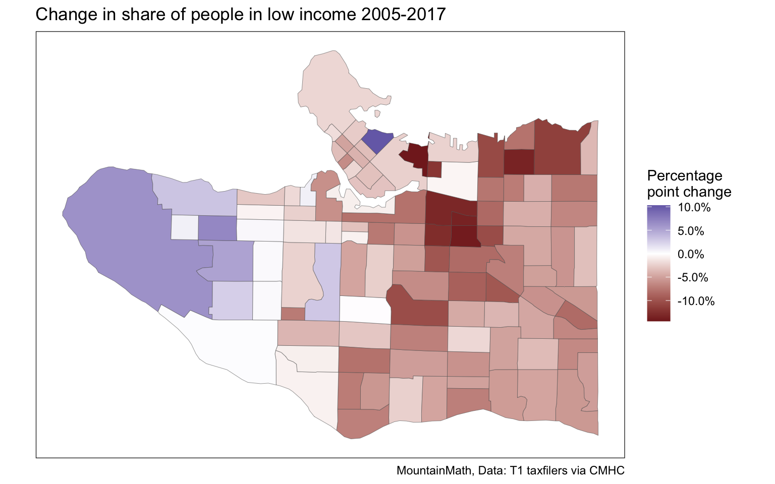
Other variables
Tax data has a wealth of variables reaching beyond just incomes. Beyond a variety of income metrics it provides information on economic family structure, children in economic families, taxfilers and dependents by detailed age group, share of taxfilers that are married, or that live in apartments, sources of income, child benefits and low income status.
elementary_age_vectors <-  lapply(seq(2001,2017),function(year){
    paste0("v_TX",year,"_",seq(253,259))
})  %>%
  unlist

vsb_children_data <- get_tongfen_census_ct(vsb_regions, na.rm=FALSE,
                                           vectors = elementary_age_vectors,geo_format = 'sf')
extract_year_count <- function(d) {
d %>%
select(GeoUID,starts_with("v_")) %>%
set_names(names(.) %>% gsub(":.+$","",.)) %>%
group_by(GeoUID) %>%
pivot_longer(cols=starts_with("v_"),
names_pattern = "^v_TX(\\d{4})_(\\d+)$",
names_to=c("Year","Age"),
values_to = "count") %>%
mutate(Age=as.integer(Age)-253+5) %>%
group_by(GeoUID,Year) %>%
summarize(count=sum(count))
}
left_join(vsb_children_data %>% select(GeoUID),
vsb_children_data %>%
st_set_geometry(NULL) %>%
extract_year_count(),
by="GeoUID") %>%
ggplot() +
geom_sf(aes(fill=count),size=0.1) +
facet_wrap("Year") +
scale_fill_viridis_c(labels=scales::comma) +
tax_theme +
coord_sf(datum=NA) +
labs(title="Children aged 5-11", fill="# 5-11yo")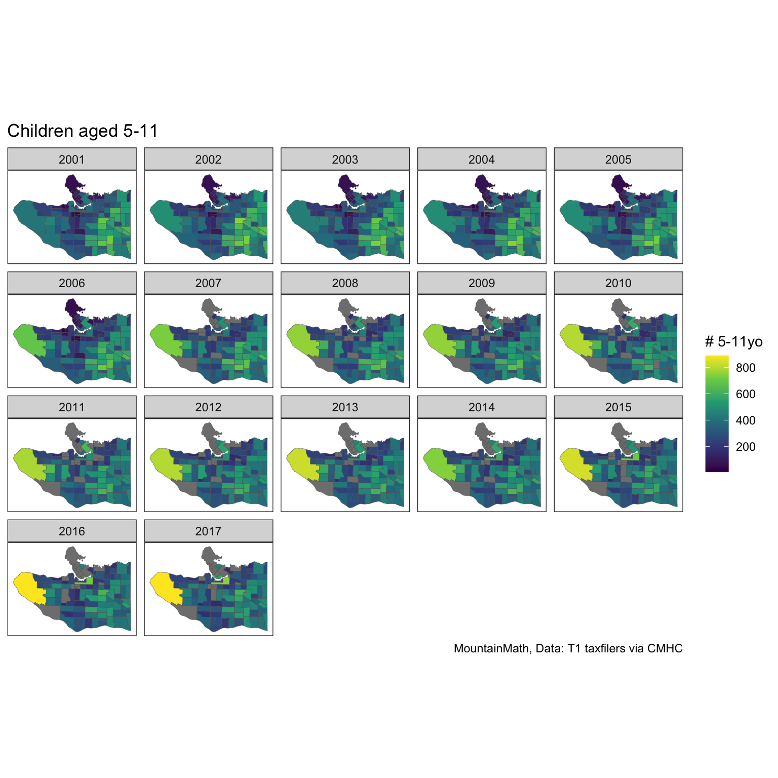
From this we again compute total change of number of children aged 5 to 11 in each region across the entire time frame.
left_join(vsb_children_data %>% select(GeoUID),
          vsb_children_data %>%
            st_set_geometry(NULL) %>%
            extract_year_count() %>%
            pivot_wider(id_cols = GeoUID, names_from = Year, values_from = count) %>%
            mutate(absChange=`2017`-`2001`,relChange=`2017`/`2001`-1),
          by="GeoUID") %>%
  ggplot() +
  geom_sf(aes(fill=absChange),size=0.5) +
  scale_fill_gradient2(labels=scales::comma) +
  coord_sf(datum=NA) +
  labs(title="Change in children aged 5-11 between 2001-2017", fill="Change in\n# 5-11yo",
       caption="MountainMath, StatCan T1 taxfilers, via CMHC")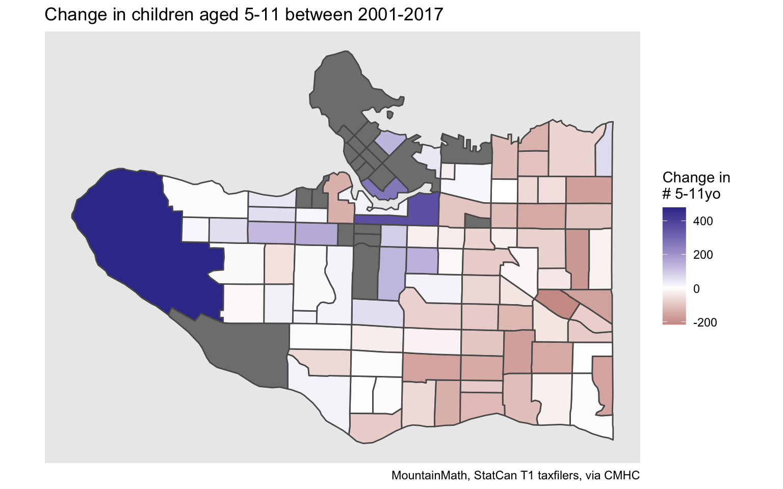
We note that some of the single year age data for some of the regions has been suppressed. This hints at some of the limits when using this data. To work around that we can repeat the analysis using the 5-year age group of 5 to 9 year olds, which has more robust data.
get_tongfen_census_ct(vsb_regions, na.rm=FALSE,geo_format = 'sf',
                      vectors = c("2001"="v_TX2001_743","2017"="v_TX2017_743")) %>%
  mutate(absChange=`2017`-`2001`) %>%
  ggplot() +
  geom_sf(aes(fill=absChange),size=0.5) +
  scale_fill_gradient2(labels=scales::comma) +
  coord_sf(datum=NA) +
  labs(title="Change in children aged 5-9 between 2001-2017", fill="Change in\n# 5-9yo",
       caption="MountainMath, StatCan T1 taxfilers, via CMHC")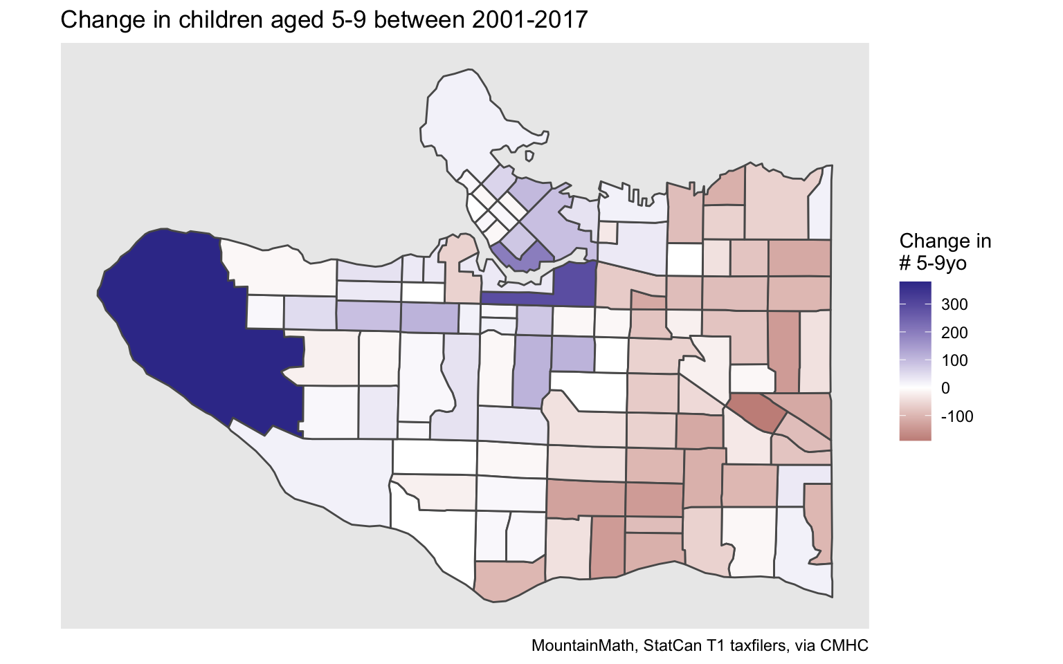
The result is of course similar to what census data has been telling us, and it provides the backdrop of the struggles VSB has had to match children to school capacity.
Median couple family incomes
For better or worse, median incomes are everyone’s favourite income metric. We give a quick example to show how median incomes of couple economic families evolved over time.
However, there is a slight wrinkle when using medians. We need to tongfen to make data comparable over time, and strictly speaking medians can’t be aggregated up from sub-geographies as required during tongfen. By default, tongfen will aggregate medians as if they were averages and emit a warning (which we suppress in the output here). But this is only an approximation.
yvr_inflation <- get_cansim_vector("v41695228",start_time="2001-01-01",end_time="2017-01-01") %>%
  mutate(Year=substr(REF_DATE,1,4),Index=VALUE/last(VALUE,order_by = Year)) %>%
  select(Year,Index)

median_income_vectors <- paste0("v_TX",seq(2001,2017),"_612")
income_data <- get_tongfen_census_ct(vsb_regions, vectors = median_income_vectors,
                      na.rm=FALSE,geo_format = 'sf')

income_data %>%
  pivot_longer(cols=starts_with("v_"),names_pattern = "v_TX(\\d{4})_612",
               names_to="Year",values_to = "income") %>%
  st_sf() %>%
  left_join(yvr_inflation,by="Year") %>%
  mutate(adjusted_income=income/Index) %>%
  ggplot() +
  geom_sf(aes(fill=adjusted_income),size=0.1) +
  facet_wrap("Year") +
  scale_fill_viridis_c(labels=scales::dollar) +
  tax_theme +
  coord_sf(datum=NA) +
  labs(title="Median couple family income", fill="2017 dollars")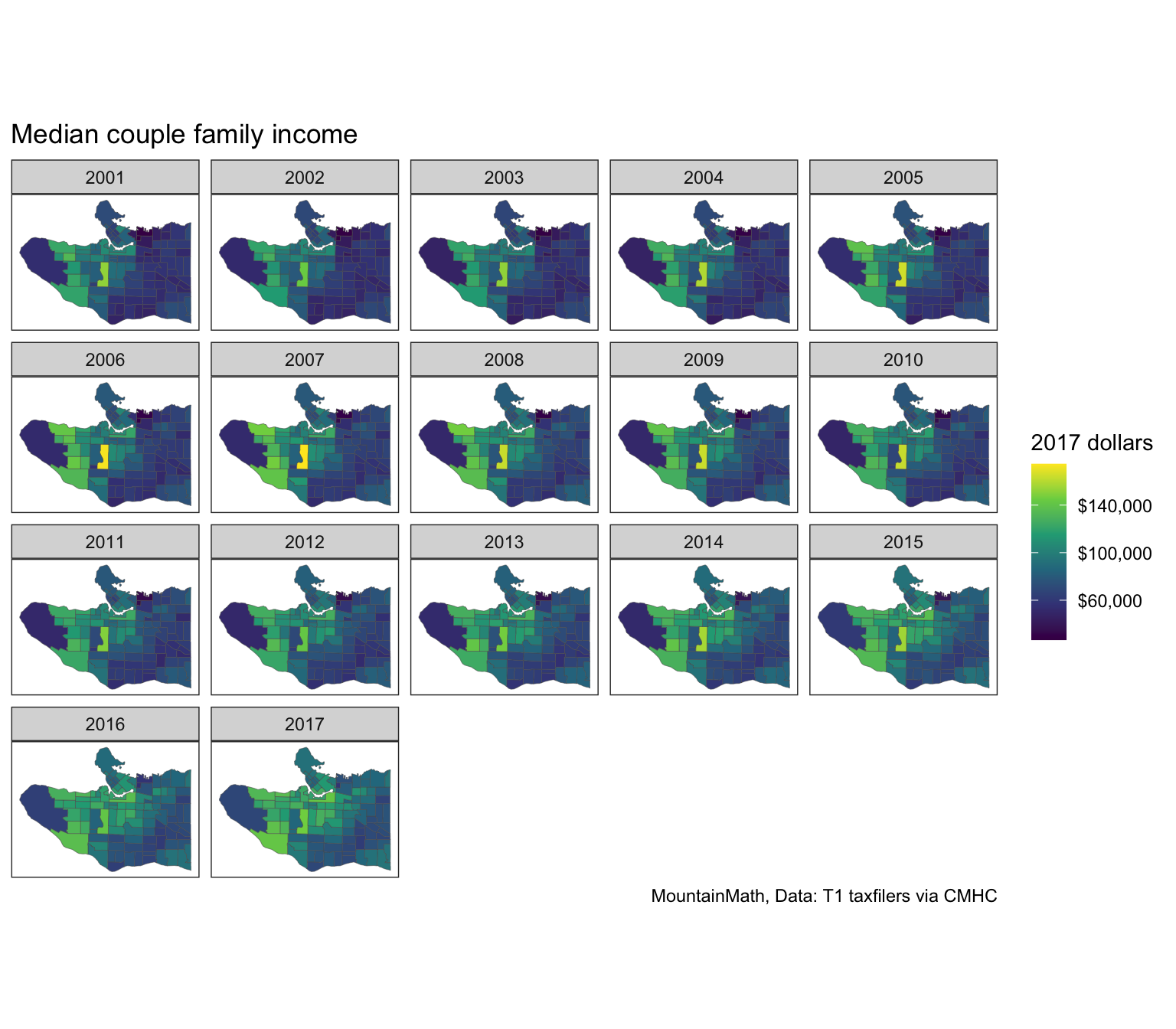
This paints the well-known east-west gradient, with Arbutus Ridge standing out as a particularly high-income area when using median couple family incomes as the metric. Here we used Metro Vancouver CPI to adjust for inflation.
income_data %>%
  mutate(change=v_TX2017_612/v_TX2001_612*filter(yvr_inflation,Year=="2001")$Index-1) %>%
  ggplot() +
  geom_sf(aes(fill=change),size=0.5) +
  scale_fill_viridis_c(labels=scales::percent,option="inferno") +
  coord_sf(datum=NA) +
  labs(title="Change in median couple income 2001-2017", fill="Relative change\n(inflation adjusted)",
       caption="MountainMath, StatCan T1 taxfilers, via CMHC")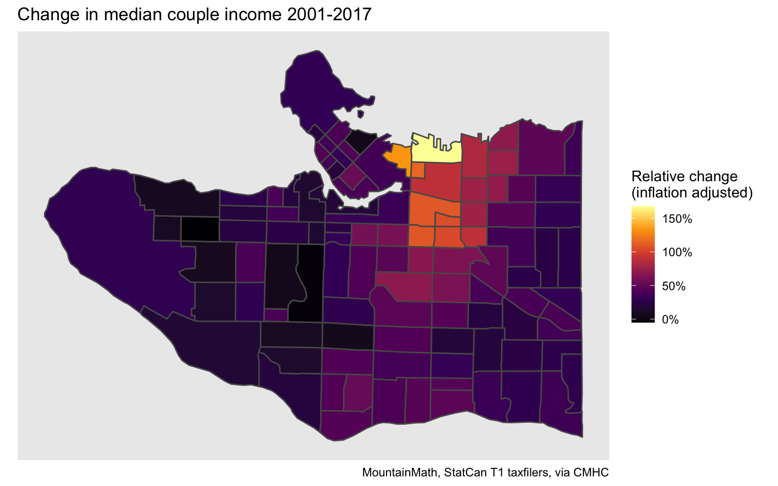
Looking at change between the start and end year of this time series highlights where median couple family incomes have been growing the fastest. And where they have been stagnant or even slightly declining.
Different regions
The CT level tax data covers all CMAs in Canada. It’s trivial to replicate any analysis for a different region by simply changing the region parameter. As an example, we can look at the City of Toronto.
toronto_city_region <- list(CSD=c("3520005"))
toronto_lico <- get_tongfen_census_ct(regions=toronto_city_region,
                                      vectors=lico_vectors, geo_format = "sf")
Copy and pasting the code for the percentage point change in the share low income population between 2005 and 2017 gives the graph for Toronto.
toronto_lico %>%
  mutate(Change=(lico_2017-lico_2005)/100) %>%
  st_sf %>%
  ggplot(aes(fill=Change)) +
  geom_sf(size=0.1) +
  scale_fill_gradient2(labels=scales::percent) +
  tax_theme +
  coord_sf(datum=NA) +
  labs(title="Change in share of people in low income 2005-2017",
       fill="Percentage\npoint change")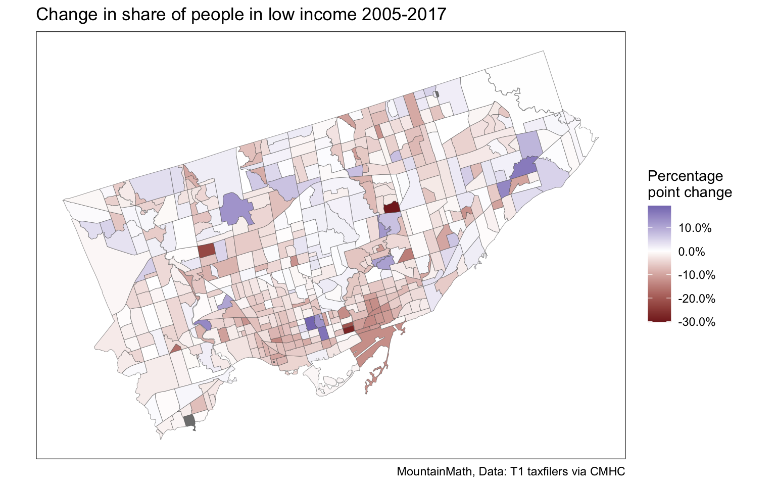
Upshot
T1FF taxfiler data is extremely useful for research purposes, having this available as open data will hopefully prove useful to others. We left the code visible in this blog post, but the whole document is also available on GitHub for convenience.
Reuse
Citation
@misc{census-tract-level-t1ff-tax-data.2020,
  author = {{von Bergmann}, Jens},
  title = {Census Tract Level {T1FF} Tax Data},
  date = {2020-04-23},
  url = {https://doodles.mountainmath.ca/posts/2020-04-23-census-tract-level-t1ff-tax-data/},
  langid = {en}
}