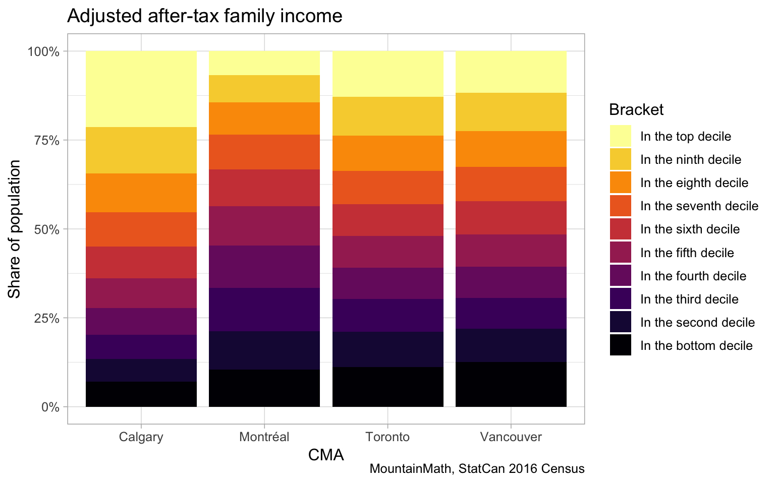
At the end of June StatCan released an interesting census tract level metric, dubbed the D-index, measuring how much the income distribution in each census tract differs from the metro-wide distribution, and we decided to take it for a test drive.
We are a bit of a sucker for this kind of fine-geography index. Condensing our wealth of information into a single number is an interesting exercise that involves lots of attention to detail. How best to do this depends on the question one is asking. And it’s extremely satisfying to arrive at a single number as a decent measure for a very complex question. But there are risks when developing such indices, once introduced they often develop a life on it’s own and get tortured to answer questions they were not designed for.
In this post we want to take a deep dive into the new D-index, as well as a host of related measures.
TD;LR
The D-index is a census tract level measure that is currently only available for 2017 and that measures income-based index of social mixing. It is particularly interesting in that it explicitly considers social mixing withing dwelling types and even individual large apartment buildings, as well as mixing within neighbourhoods compared to aggregate CMA level distributions of income and housing.
One of it’s main features is that it can be decomposed into an overall tract-level component, as well as components measuring how sub-distributions across dwelling types and large apartment buildings contribute to income mixing.
A motivation for including dwelling types and even large apartment buildings is to distinguish if income mixing in a particular area is e.g. driven by an apartment building with lower income residents in a sea of single detached homes with higher income residents. This should help alleviate some MAUP issues, these usually are alleviated by improving model specifications.
However, there are some components of the D-index we find unsatisfactory. * The D-index only considers census families and ignores people not in census families. * The D-index takes family size into consideration when computing the adjusted family income that it uses as a base, but the fundamental unit counted in the index is families, not individuals. When it measures the difference between the metropolitan and tact level distributions it treats a mismatch of a small family the same as the mismatch of a large family. * The D-index ignored that income brackets are ordered categorical data and treats it as if it was unordered categorical data. In particular, it treats a distribution that differs from the reference distribution in two adjacent middle categories the same as one that differs in the two extreme categories, which is contrary to how people or families experience differences in income.
Given these quibbles we propose yet another index designed to measure the level of income mixing. The D-index is essentially the HK-divergence based on adjusted family income deciles. It can be trivially extended to be based on persons not families and then extended to unattached individuals to cover the entire population (of taxfiler and dependants), alleviating my first two concerns. To alleviate the third we propose to refine it by considering optimal transport, which naturally leads to replacing the KL-divergence with the Wasserstein metric to define the new W-index.
However, paying attention to the order of the income deciles and moving to the W-index comes at the expense of loosing the additive decomposability that made the D-index easy to refine and interpret when e.g. conditioning on dwelling types and large individual apartment buildings. So unfortunately the W-index won’t be able to serve as universal replacement, but we believe it will be a useful additional tool.
What is the D-index
The D-index is modelled on the Kullback–Leibler (KL) divergence of the tract level income distribution relative to the whole CMA. It’s the expectation of the log difference in the tract-level distribution to the CMA level distribution. Additionally, it conditions on dwelling type (apartment vs other) and also conditions on distributions within large apartment buildings, exploiting that the KL-divergence is additively decomposible, so it can easily be refined to the sub-groups of dwelling types or within large apartments.
It builds on adjusted family incomes, which is an underused metric that lends itself for comparing income distributions and we have made extensive use of this metric before. It alleviates issues around Simpson’s paradox that e.g. household income can run into or other compositional issues that e.g. plague metrics relying on average individual income.
The basic unit in the metric is census families. To compute the census tract level D-index, each census tract is subdivided into * individual “large” apartment buildings, that is buildings with (roughly) 50 or more units and at least 10 census families, * everything else.
The census tract level D-index is then the weighted sum of the KL-divergence of the income distribution within each of these sub-categories (large apartment buildings and everything else) relative to the CMA-wide income distribution. The income distributions are quantized to quintiles based on the CMA level distribution, so the CMA-level reference distribution is by definition uniform.
More formally, the tract-level D-index \(D_c\) for census tract \(c\) is given by
\(D_c=\sum_{b\in B}\frac{n_b}{n_c} ~ D_{KL}(\pi_b~|~\pi_m)\)
where \(B\) is the set of large apartment buildings and the “everything else” category, \(n_b\) is number of census families in the building (category) \(b\), \(n_c\) is the number of families in census tract \(c\), \(\pi_b\) is the discretized income distribution in building (category) \(b\) and \(\pi_m\) denotes the metro-wide (by definition uniform) discretized income distribution.
As a reminder, the (discrete) KL-divergence is defined by
\(D_{KL}(\pi_1~|~\pi_2)=\sum_{q\in Q}\pi_1(q) ~ \log\left(\frac{\pi_1(q)}{\pi_2(q)}\right)\)
Where the sum runs over all income brackets \(Q\).
The authors point out that \(D_c\) can be (additively) decomposed into components separating out the contributions of variation across dwelling types and the contribution across large apartment buildings. In formulas
\(D_c=D_{KL}(\pi_c~|~\pi_m) + \sum_{d\in T}\frac{n_d}{n_c} ~ D_{KL}(\pi_d~|~\pi_c) + \sum_{b\in A}\frac{n_b}{n_A} ~ D_{KL}(\pi_b~|~\pi_A)\)
where \(T\) is the set of building types consisting of two elements (large apartments vs all others) and \(A\) is the set of large apartments. (So \(B\) is the union of \(A\) with the single element of all non-large apartment buildings.) While such a decomposition can generate useful insights, the individual components of \(D_c\) were unfortunately not made available in the dataset.
Let’s take the D-index for a drive and see what this looks like.
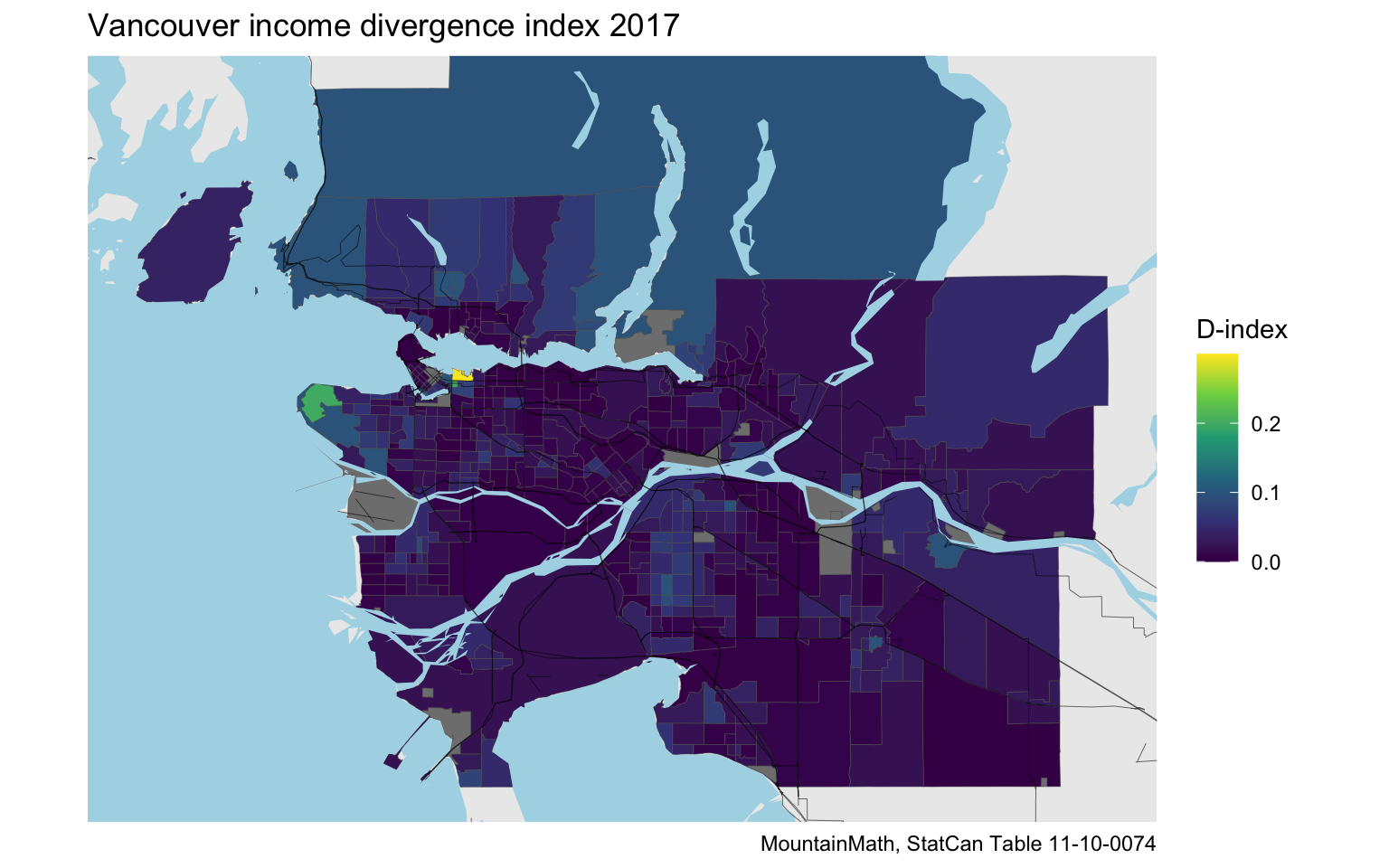
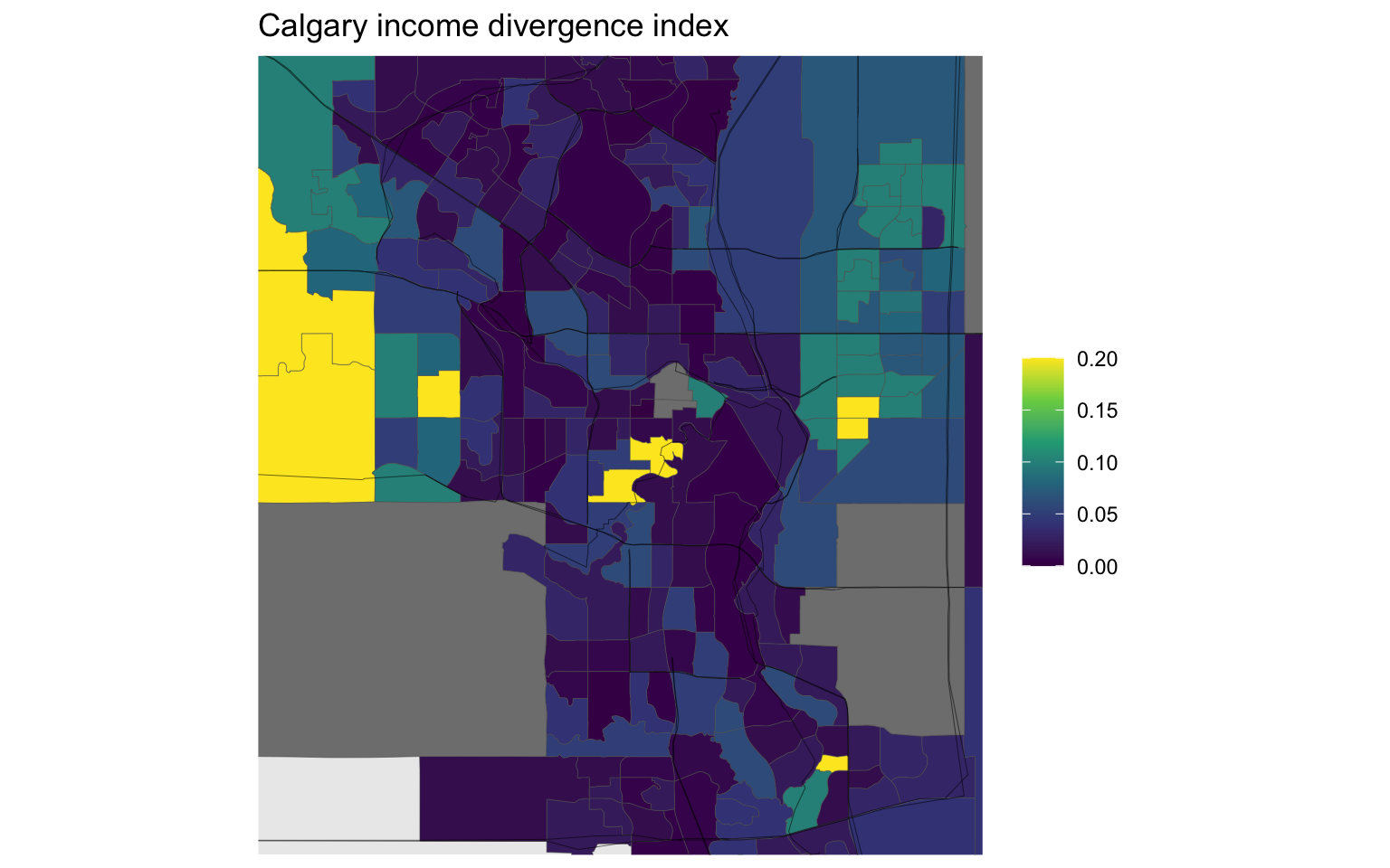
Vancouver looks (expectedly) quite homogeneous. Downtown Eastside lights up, but the other census tracts have income distributions, including within and across dwellings types and large apartments, match the Metro Vancouver distributions quite well. Some other tracts show up, North Campus and some of the North Shore for example.
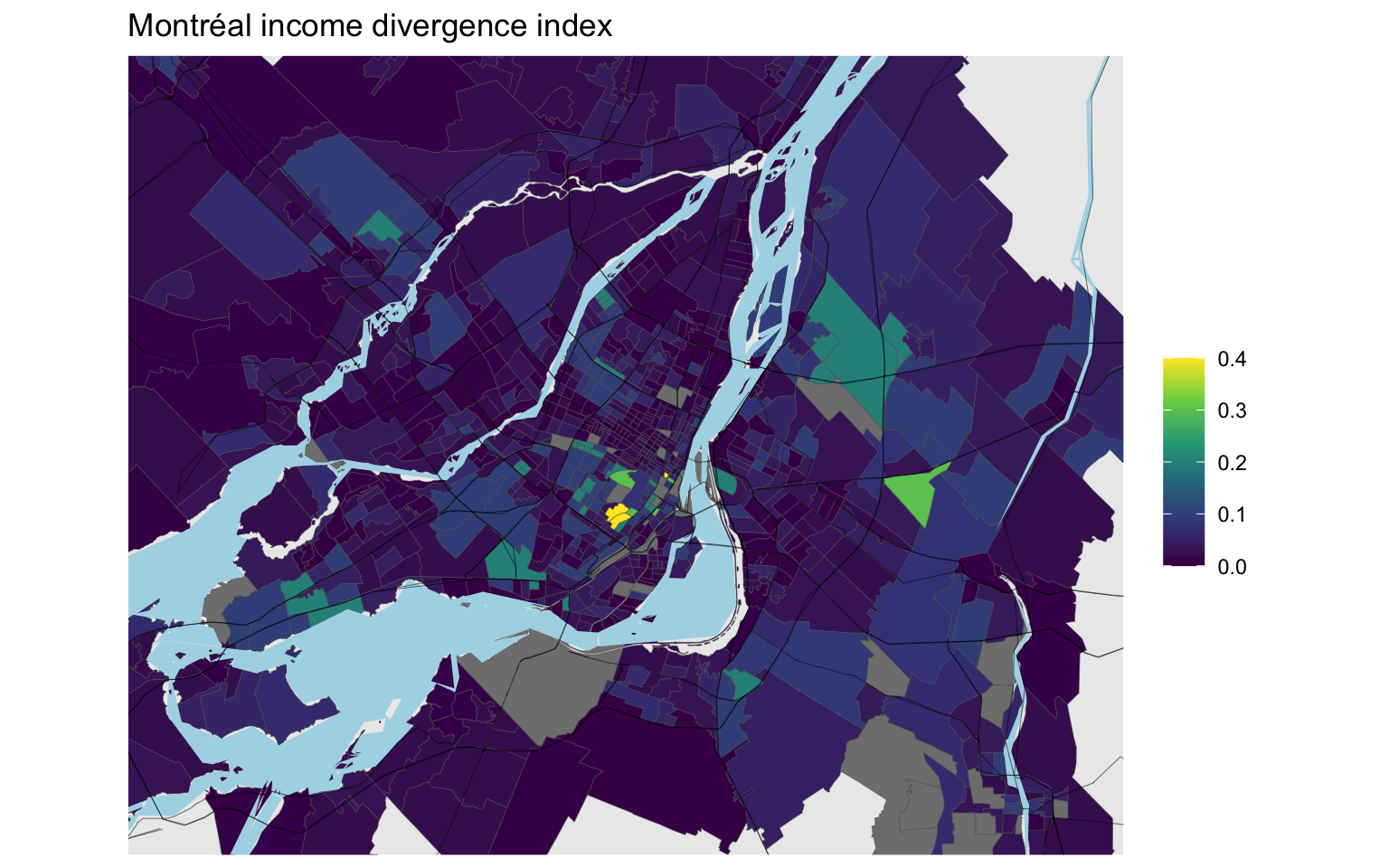
Montréal has a much larger overall variance, and shows some stark contrasts. Westmount stands out. Mount Royal is visible too, as is a part of East Montreal near the airport. These latter two stand out for very different reason, Mount Royal has a high share of high-income population whereas the area adjacent to the airport has a high share of lower income population.
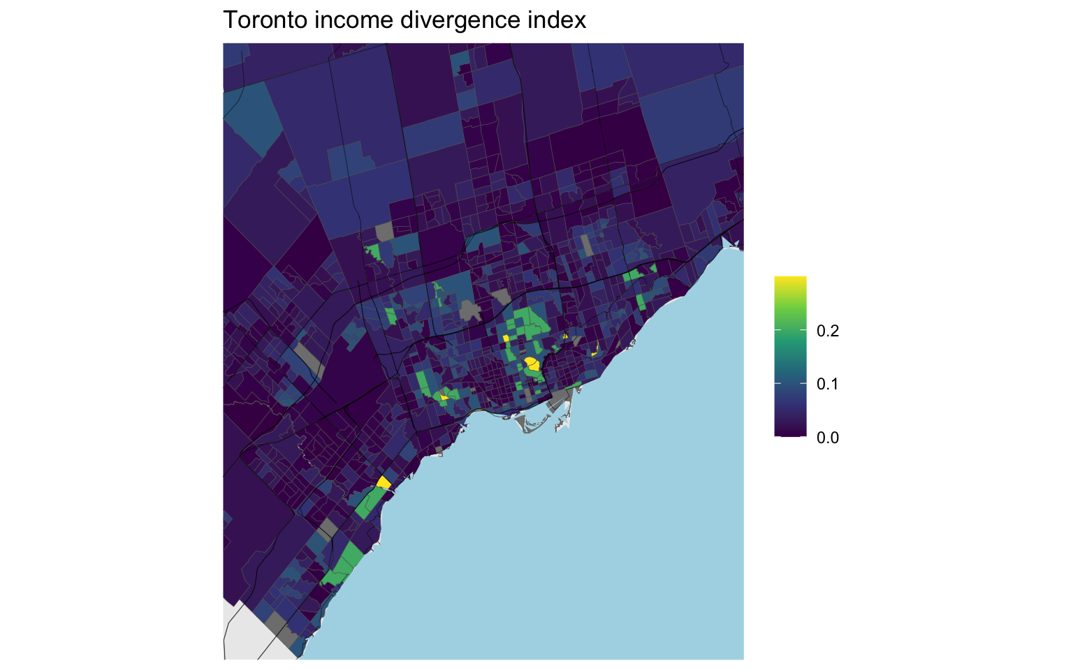
Toronto’s range is somewhere between Vancouver and Montreal, showing some interesting variation.
Adjusted family income decile KL-divergence
The interesting part about the StatCan D-index is that they conditioned on dwellings. Unfortunately we can’t separate out the dwelling component from the overall index that was released, but we can build a related metric. The census has tract-level adjusted family income decile data. However, this data differs from the data used in the D-index in two critical ways that preclude us from making direct comparisons:
- The universe of the census adjusted family income deciles is persons, whereas the D-index is built on census families. This means that an income divergence measures built on the census adjusted family income deciles will weight a large family more than a small family, even if members in both have the same adjusted family income.
- The universe of the census adjusted family income deciles includes non-census family persons, so an index based on this metric counts considerably more people.
Additional smaller differences are
- The census adjusted family income data is based on economic families whereas the D-index income is adjusted by the size of the census family.
- The D-index and the census data is that the census income data is based on the 2015 tax year, whereas the D-index was built from the 2017 taxfiler data.
Looking at these differences, the census adjusted family income seems overall (with the exception of it being based on older data) like a preferable metric to measure income mixing, but the D-index was developed with a focus on dwelling type and within large apartment building income mixing, where the focus on family units may have merit.
Despite these differences, it is interesting to compare the D-index to the tract-level KL-divergence based on adjusted family income.
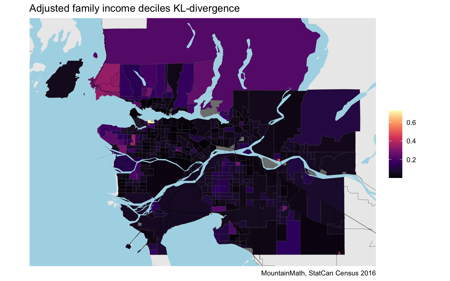
As expected, the result looks remarkably similar to the StatCan D-index. The overall scale is different, most likely due to the inclusion on non-family individuals.
In darker areas, the adjusted family income distribution matches the Metro-wide one, in lighter areas it is different. But from this map we don’t know how they differ. With some local knowledge we can deduce that the Downtown Eastside is different because of a high share of lower income people, whereas West Vancouver, or Arbutus Ridge, or Southlands differ because of a higher share of higher income people.
Another reason for the difference is that we were working with finer (decile) income data than the quintiles that were used in the D-index, and the additive decomposability outlined above implies that a coarser decomposition can’t be larger and will turn out to have smaller values in practice, as can easily be checked.

The effect of refining or condensing the income distribution categories is probably better highlighted in a scatter plot.
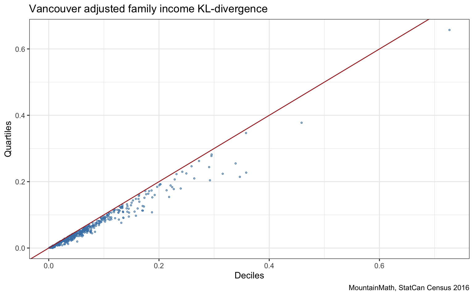
We clearly see how the KL-divergence based on deciles is never smaller than the quintile-based version, and sometimes is considerably larger.
Next we can compare the tract-level D-index to our quintile-based KL-divergence.
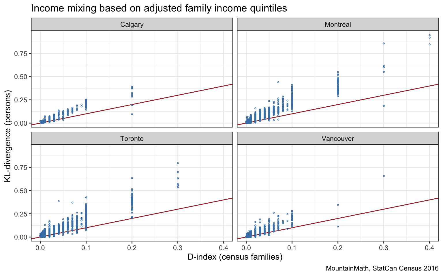
The quintile-based KL-divergence is predominantly larger than the D-index, as discussed before this is likely due to the D-index only considering census families. We also notice that the D-index has been rounded to two decimal places below 0.1 and one decimal place above that. The rounding below 0.1 is probably adequate given the measurement errors inherent in the data, the rounding above 0.1 seems excessive. It looks like the intent is for this to guarantee higher levels of privacy, I’d have to think longer about this to see how large the privacy risk actually is. (It’s high time to implement a more comprehensive privacy strategy like e.g. differential privacy instead of relying on ad-hoc rules for rounding to do the job.)
To get a better understanding let’s take a detailed look at the census tract in the Downtown Eastside.
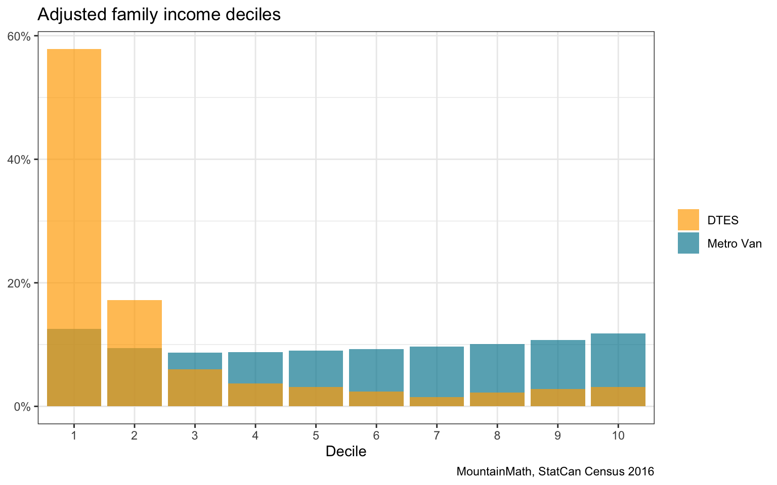
For more context, we consider a selection of census variables, as well as T1FF taxfiler data for the DTES tract. First let’s consider the time difference. The T1FF recorded median individual income in 2015 was $17,400 vs $18,580 in 2017, which is a modest increase. At the same time, the 2016 census recorded a 2015 median individual income of $15,381, which is quite a bit lower. This hints as some geographic mismatch or under/over coverage in the taxfiler data.
Further, median family income was $38,910 for 2017 census families from T1FF data, whereas the census reports $33,920 for economic families, with an average family size of 2.4. This gives us a (very rough) estimate of median adjusted economic family income, only considering persons in economic families and ignoring unattached individuals, of $21,895, compared to a considerably lower median income of unattached individuals of $13,414. This will cause our KL-divergence, that also considers unattached individuals, to be considerably higher than the D-index that only considers census families and likely accounts for much of the difference.
H-index
Another popular index to measure mixing is the Theil’s information theory index, also called H-index, that measures the relative entropy of the census tract distribution to the overall metro-wide distribution.
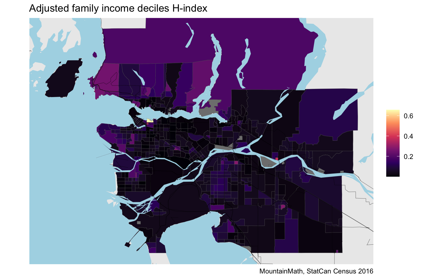
On the map the H-index appears similar to the other two metrics we considered, although the scale hides some of the detail. Let’s run a quick comparison to the KL-divergence.
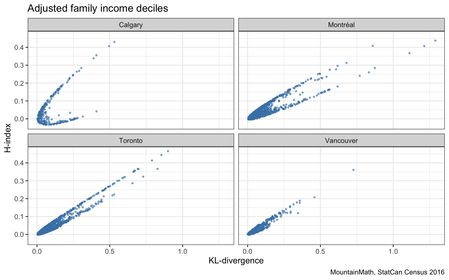
The two are generally highly correlated, but the shape of the pattern is interesting in that the data seems to cluster around a conic while avoiding the centre part. Calgary stands out with a broad shape, whereas Vancouver appears quite narrow. This bifurcated nature of the H-index is best understood by considering a simple example. If the reference metro-level distribution is uniform (so it has maximal entropy), then the KL-divergence becomes proportional to the H-index. Vancouver income deciles match the Canadian (by definition uniform) deciles quite well, resulting in a good fit. The Calgary income deciles however differ quite strongly, having much larger higher income brackets. Montreal on the other hand has much slimmer high-income brackets and fatter middle (and low) income brackets.
Having a non-uniform distribution as background gives opportunity for the H-index to differ from the KL-divergence. The DL-divergence compares the shares in each corresponding bucket (and does not detect if the order of the buckets are changed in a consistent way for both distributions), whereas the H-index only cares about the distributions separately, the results won’t change if the order of the buckets are changed independently for the two distributions. So in Montreal, the H-index has a hard time to distinguish a census tract with a fatter high-income distribution from one with a fatter low-income distribution, but the KL-divergence will see these differently because the background distribution distinguishes them.
We can visualize this by broadly colouring each region by whether the lower three deciles, the middle four deciles or the upper three deciles have the highest number of people in each region.
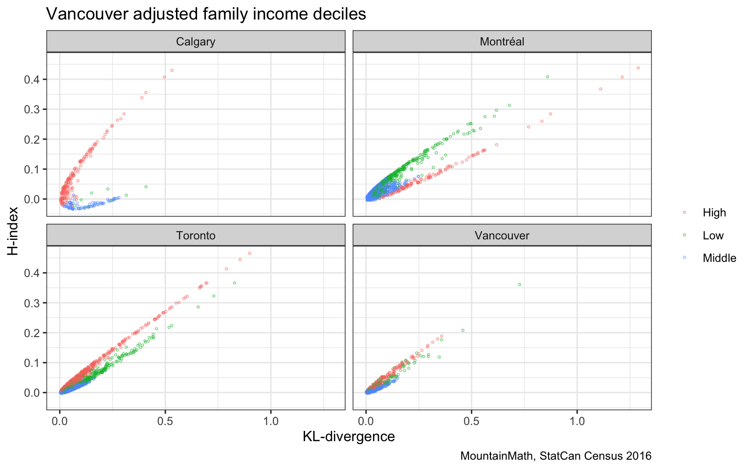
This offers some insight into how the entropy-based H-index differs from the KL-divergence. The KL-divergence benefits from distinguishing when different permutations are carried out on each of the income distributions, whereas the H-index does not.
W-index
Do we really need another index? We believe that we do. The previous example highlighted again that the order of the income brackets matter. The KL-divergence, and thus the D-index, don’t change if we consistently relabel the income brackets and e.g. exchange the bottom bracket with one of the middle income brackets.
To see how this might cause problems let’s look at a motivating example. We will use a uniform distribution as the background and consider the following two cases.
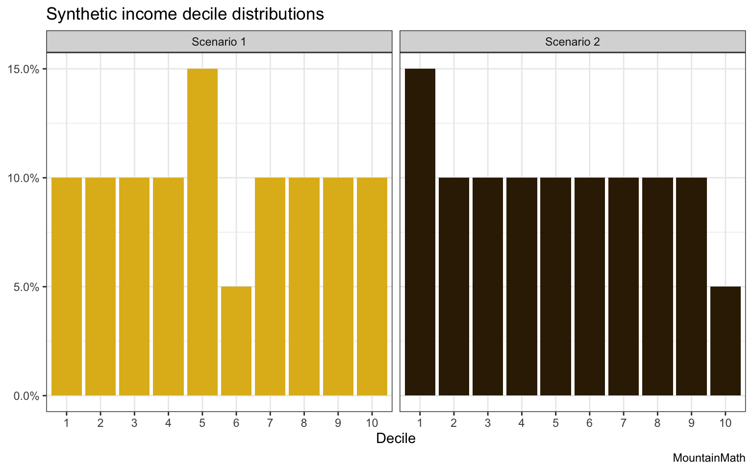
The two distributions differ only in exchanging some of the bins. Remembering that we take the background distribution to be uniform we can compute the D-index and H-index for these two scenarios.
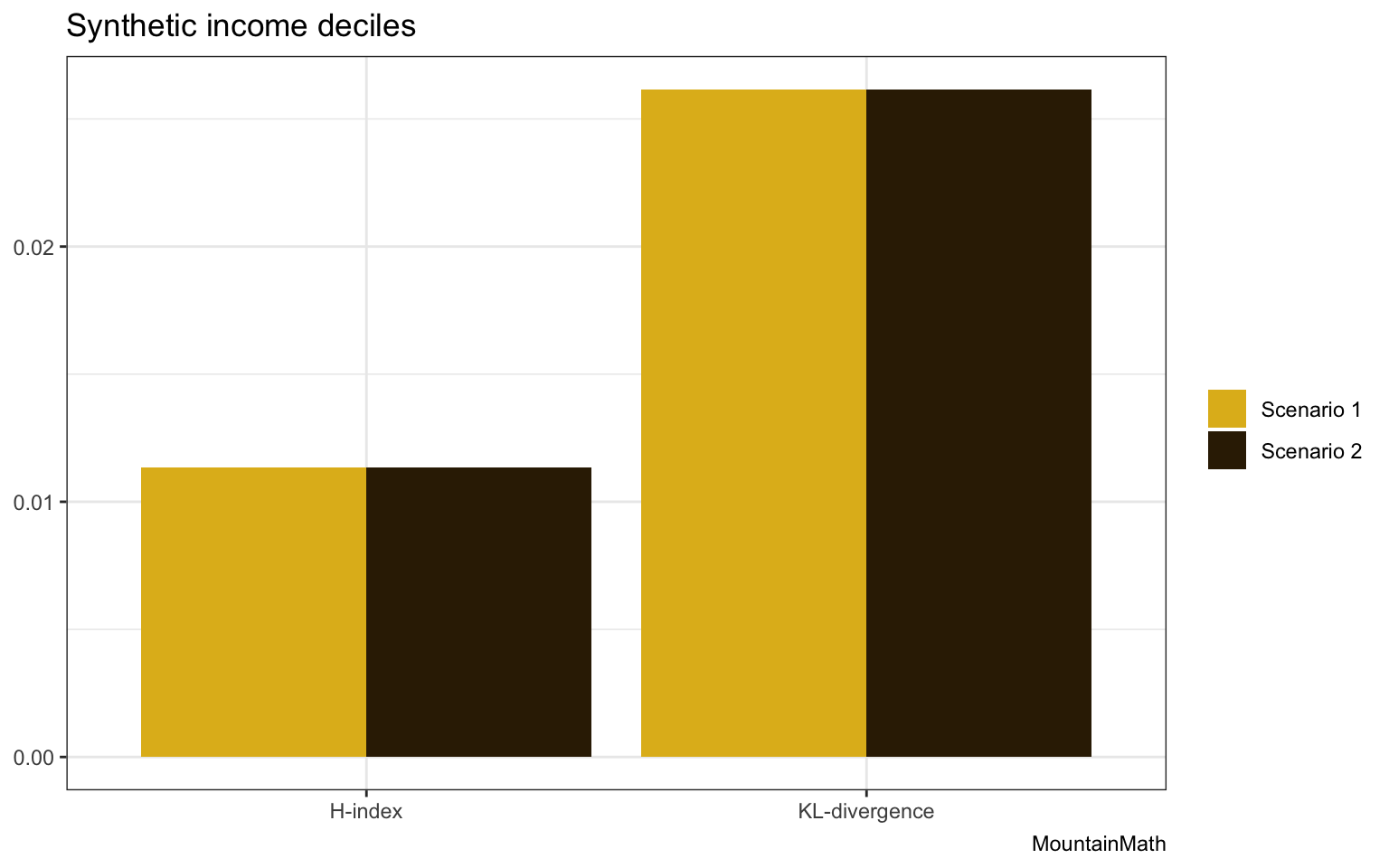
The math-minded people will have guessed this result, the two indices are identical across the two scenarios. They can’t distinguish them. Neither of them encode the order of the bins, form an information theory point of view those two scenarios are equivalent That’s why these indices are best suited for categorical data. But income deciles also come with an order. But that order matters to us.
Going back to the two distributions, most people would say that scenario 1 is closer to a uniform distribution than scenario 2. An intuitive way to understand that is to consider what would happen if we aggregated the data to income quintiles. In that case, scenario 1 turns into the uniform distribution, while scenario 2 does not. The order of the bins matters.
Math or stats folks will know where this is headed. An elegant way to consider order is to fold in optimal transport, which naturally extends the KL-divergence to the Wasserstein metric. Without going into detail, the Wasserstein metric encodes how much “work” it is to convert those two distributions into a uniform distribution. For scenario 1 it’s not that much work, all we need to do is shift some people over from the 5th to the 6th decile.
For scenario 2 it’s a lot more work, we need to shift people over from the bottom all the way to the top decile. In our particular application we can also re-interpret that as a measure of the level of taxation that’s required to re-distribute income to get the background income distribution, in this example the uniform distribution or in our census data driven case the metro-wide distribution.
More technically, we need to define a “work” or “cost” function, that is the cost that’s associated with moving a person from one bin into another. We won’t go into details and just count the number of deciles we traverse, so the cost to move a person from the 3rd decile to the 7th decile would be 4.
Let’s take a look how the Wasserstein metric (of order 1) performs on our scenarios.
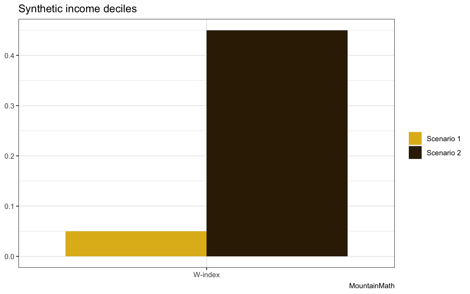
As expected, the W-index distinguishes the two scenarios, moving people from the bottom to the top bracket is a lot more expensive than moving people from the 5th to the 6th. Time to try this out on some real data!
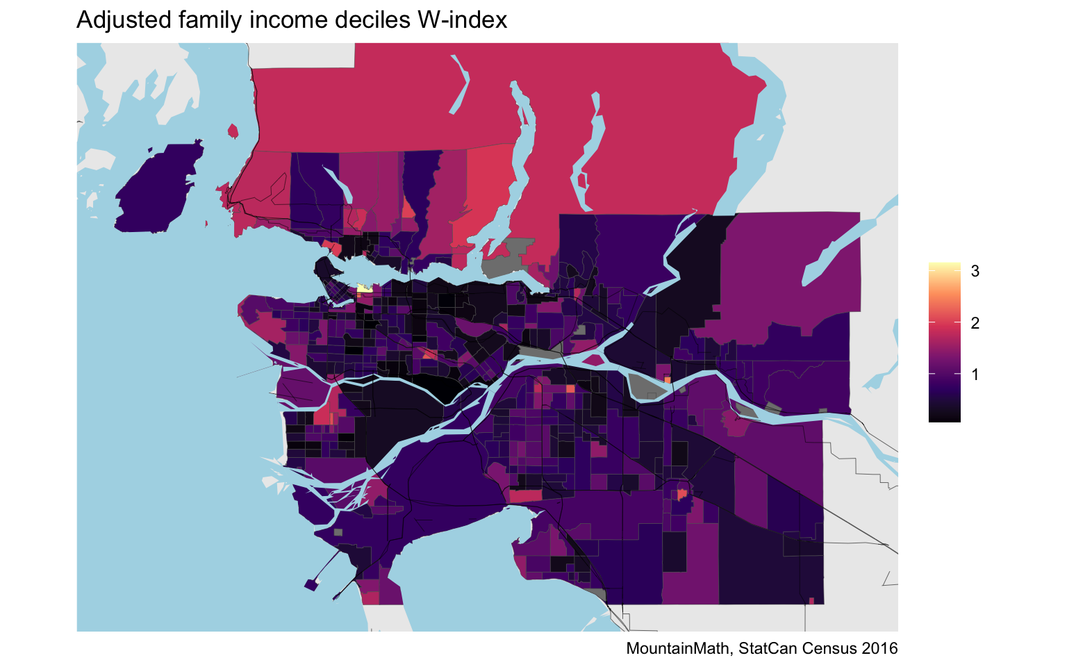
We see a lot of similarities to the KL-divergence (and the D-index) and the H-index, but there are also clear differences. let’s take a closer look.
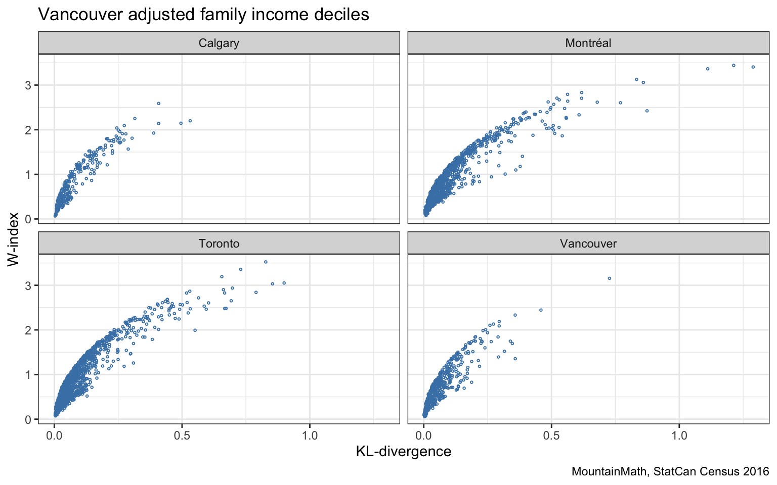
Generally the measures correlate well, but let’s take a look at some examples where they differ, so examples that have the same KL-divergence but different W-indices and vice versa.
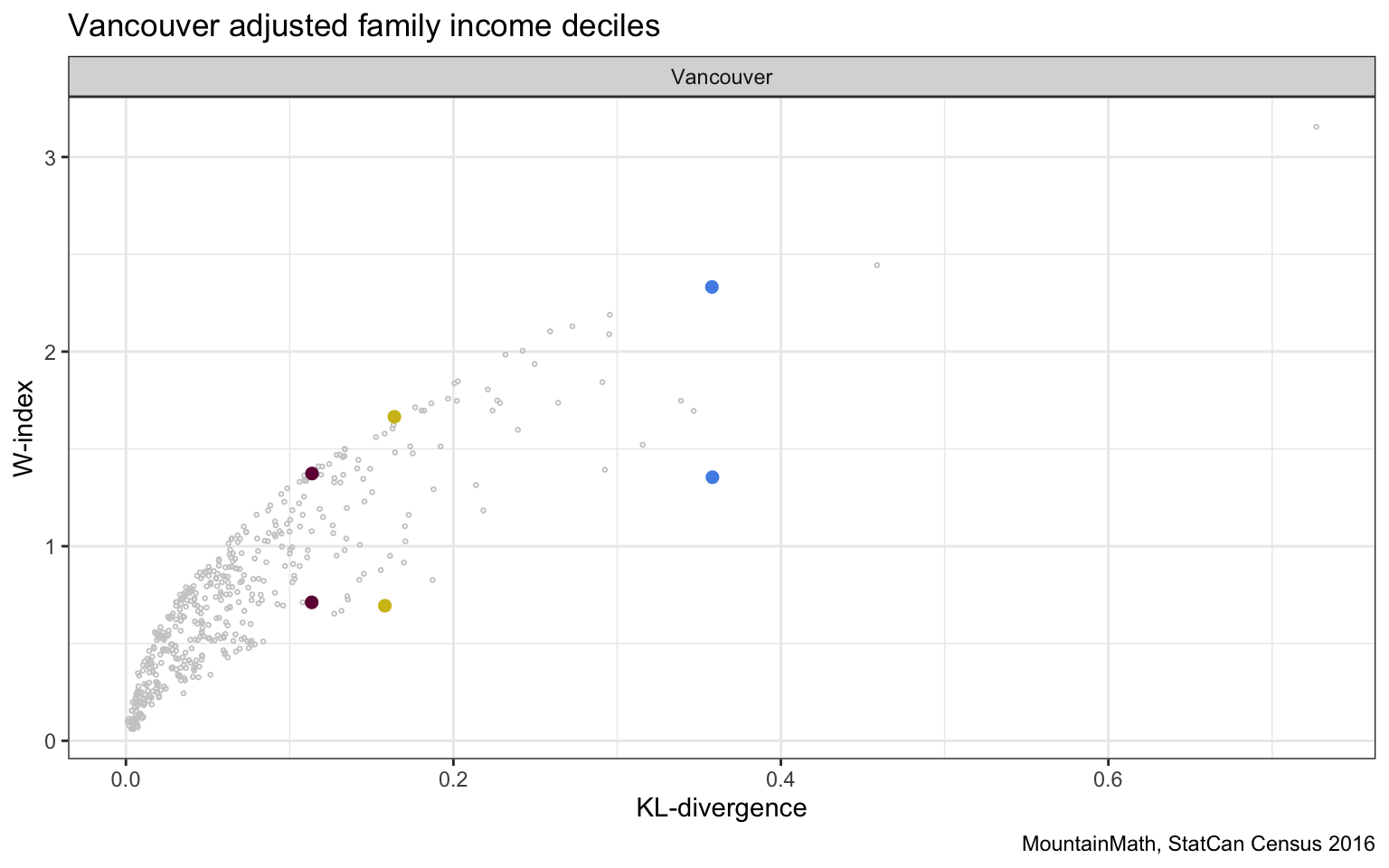
We highlighted a three pairs of regions with (almost) the same KL-divergence but different W-indices to take a closer look why the metrics differ.
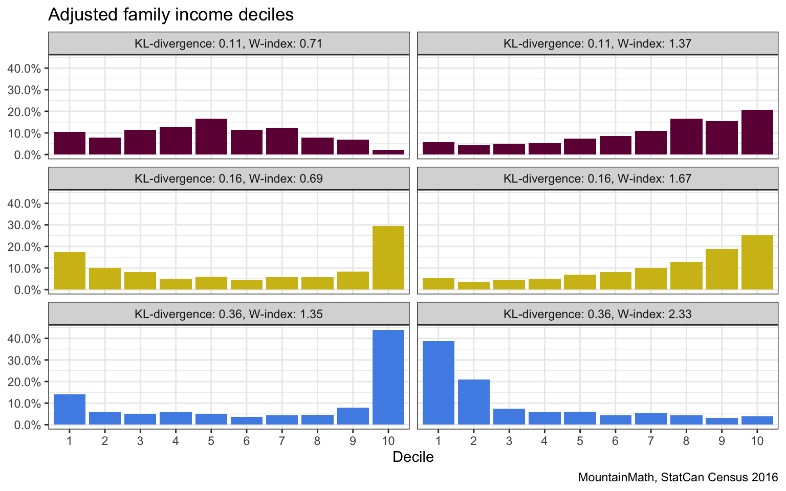
We picked 6 regions so that each row has the same D-index, the W-index in the left column is significantly lower than that in the right column. For the each row we have that from an information theory point of view where order of the brackets does not matter, these look quite similar. But when order matters, we see more mixing on the left than on the right. In the first row, shuffling people from the middle over to the sides is cheaper than moving people all the way from the top to the bottom. Similarly in the second and third row, moving people from the extremes toward the middle is cheaper than moving people from one extreme all the over to the other side.
Another way to think of this is that in left column, re-grouping the deciles in quintiles generally makes them more equal by evening things out a bit. Doing the same on the right does not really help much to make things more equal.
We can similar look at pairs of regions with (almost) identical W-index but different D-index.
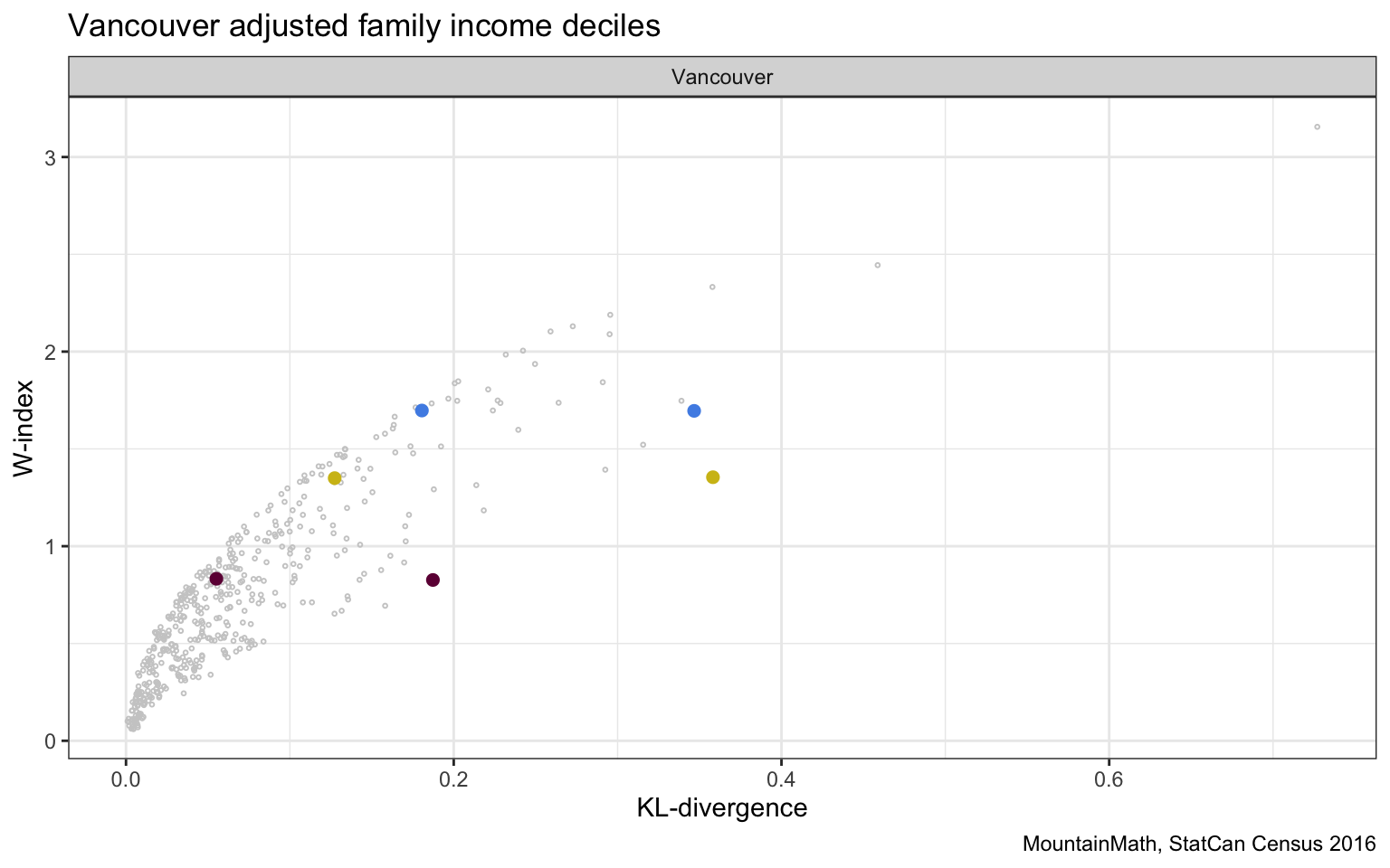
Again, we take a closer look to understand what accounts for the differences.
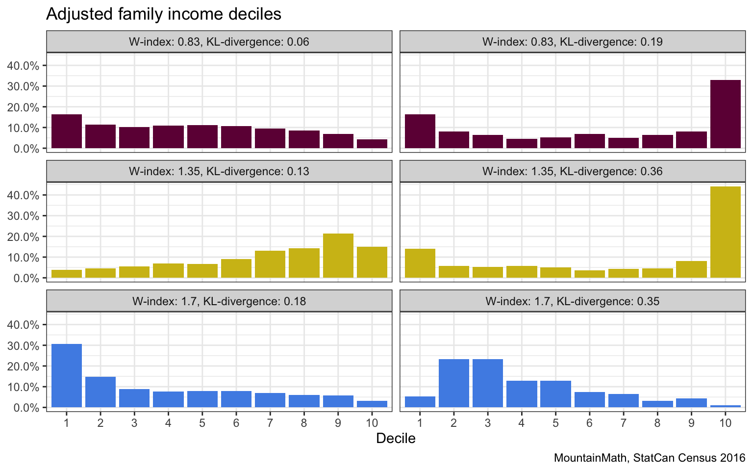
If we had to rank these based on which ones are more “mixed” we would probably pick the left one in each case. So the KL-divergence definitely has some redeeming qualities.
To round this off, let’s plot the StatCan D-index against the W-index.
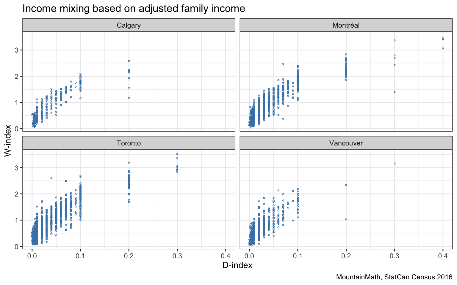
Overall, we feel that both the KL-divergence and the W-index both have their strength and weaknesses. We probably tend to favour the W-index, but also like the KL-divergence. It might also be interesting to use a mixture of the two.
The big disadvantage of this approach is that the W-index doesn’t allow for a straight-forward decomposition when we refine the regions like the D-index does. There may be a more abstract formulation involving Barycenters that allows for a decomposition, but it’s not immediately obvious to us. And may well not exist.
Other quantizations
Income mixing and segregation is an important metric to monitor across space and time. Since we mostly work with geography of residence, this has important implications on housing policy. (It would be interesting to contrast this to income mixing and segregation by geography of work!)
Noting if income mixing differs from the metro-wide background income distribution is useful, but it immediately raises the question how the distribution differs. We generally feel very differently if an area stands out because it has a lot more low-income persons vs a lot more high income (or middle-income) persons. And in as far as we view income segregation as a problem that may require policy intervention, the interventions will be quite different.
One way people have tried to address this is by categorizing neighbourhoods into e.g. “high”, “middle” and “low” income areas relative to their respective metropolitan areas. A prominent example is a location quotient of the average individual income popularized by the Neighbourhood Change Project. Unfortunately this metric mostly ignores income mixing altogether, and suffers from compositional issues, which makes it hard to properly interpret and compromizes its usefulness to informing policy.
We have introduced an alternative approach to broadly categorize neighbourhoods by income level that also explicitly models income mixing, we include an example using finer categories for convenience.
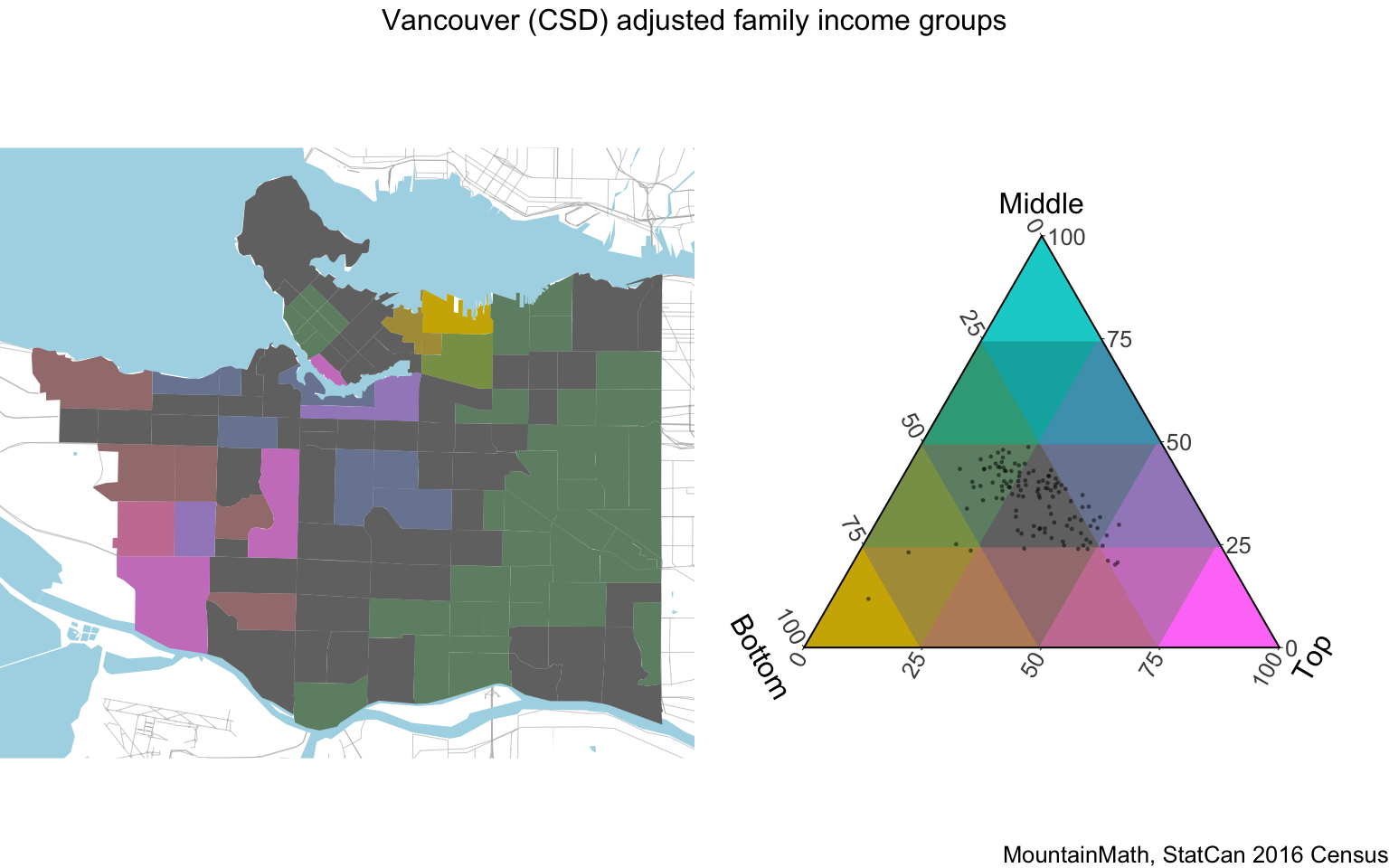
This metric also uses adjusted family income deciles (regrouped into three bins) to account for varying family size (as well as single person households), and in this example we expanded the categories for a finer view. Still, the City of Vancouver shows a high level of income mixing, as can be seen on the map on the left as well as on the scatterplot in the map legend to the right. Grey areas have an income distribution broadly similar to the metro wide average, yellow/brown areas differ by having a higher share of low-income persons, blueish areas differ by having a higher share of middle-income persons and pinkish areas differ by having a higher share of high-income persons. The visualization employs colour mixing to interpolate between the extreme states. The green-grey area on the east side is characterized by still being fairly close to the metropolitan distribution, but with fewer high-income persons made up for equally by lower and middle income persons.
We have previously spent time looking into more detail how this income mixing metric differs from e.g. average individual incomes and why explicitly modelling income mixing is important.
These kind of categorizations are useful to understand in more detail how neighbourhood income distributions differ from a reference distribution, but they are also harder to work with as they encode more information. The D-index (or the W-index) are easier to work with because they condense information into a single number instead of e.g. taking values in a (discretized) simplex like our income mixing metric shown above.
Upshot
There are lots of different ways to understand income mixing and segregation, and there is no single best metric. The choice of metric depends on the question one is asking, and in many applications it can be useful to consider several metrics.
One-dimensional indices can be extremely useful when analyzing income mixing, and the new D-index is an innovative and interesting addition. It is particularly useful in the context of housing policy as it explicitly models the known covariates of segregation across dwelling types and segregation across large apartment buildings within the same census tract, so it is designed to detect when e.g. an area shows good overall income mixing, but incomes fail to mix when conditioning on dwelling types with e.g. high incomes segregating into single detached houses and lower incomes into apartments within the same census tract.
While the decomposability of the D-index is a great features, it’s not really useful unless data on the decomposition is made available. Focusing on families and excluding unattached individuals can be useful for some applications, but if only one index is published we would rather have one that covers the entire population.
We are not convinced that the advantages of the decomposability of the D-index outweigh the downside that the D-index ignores the ordering of the income brackets. We believe the W-index is a better overall choice for an index to measure income mixing. Either way, we are looking forward to updates on the D-index, either adding data on the decomposition or adding data for other years to create timelines. And possibly by also adding the W-index.
Alternatively it would be extremely useful if StatCan were to publish adjusted family income deciles at the census tract level based on taxfiler data for all years, this would allow others to construct the W-index or the KL-divergence depending on their needs. Adjusted family income deciles is probably the most useful income variable to inform public policy, and making this widely available may also help marginalize largely uninformative yet ubiquitous metrics like ones based on average individual income.
As usual, the code for this post is available on GitHub for anyone to reproduce or adapt for their own purposes.
Reuse
Citation
@misc{income-mixing-and-segregation.2020,
  author = {{von Bergmann}, Jens},
  title = {Income Mixing and Segregation},
  date = {2020-09-21},
  url = {https://doodles.mountainmath.ca/posts/2020-09-21-income-mixing-and-segregation/},
  langid = {en}
}
