We are big fans of measuring different densities, and conceptualizing density in different ways. From tax density, tax density in 3D, plus an animated version, lot level density of single detached homes over time, estimating FSR from LIDAR data, density treemaps, dot-density maps, comparing Vancouver and Vieanna densities, building height profiles, renter density and net dwelling density, city density patterns and city density timelines.
When I saw the following tweet and linked blog post, I of course could not resist to reproduce some of the graphs and explore population-weighted densities.
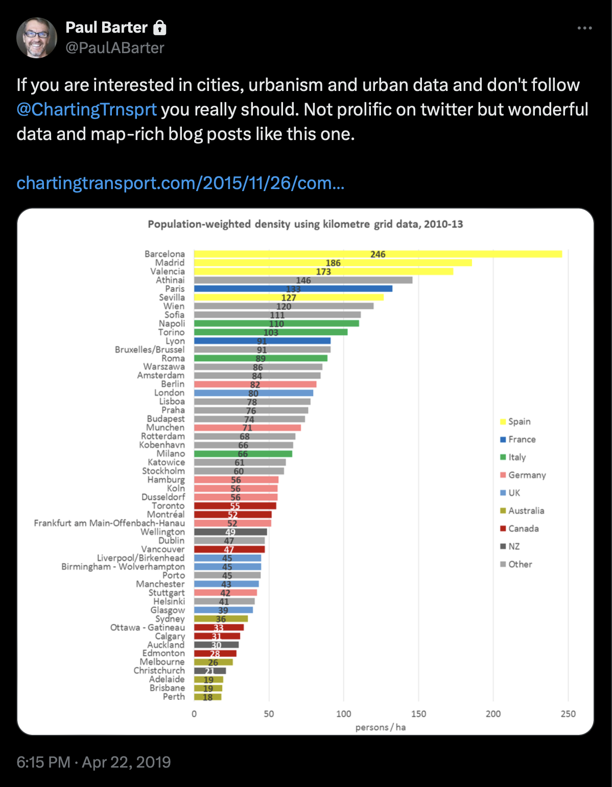
It links to a great post which you should definitely read. In this post we will take up the idea of population weighted densities and again employ the global GHS population grid to to compute these densities.
Population weighted densities
Having population density maps is great if one wants a lot of detail about a specific location. But it does not really speak to how people experience density. For that the treemaps we used before can be helpful in that we can use them to visualize what portion of the population lives in what kind of density. But that still makes it hard to compare density patterns across cities. If we want to condense this down into a single number, population-weighted density can be useful. Regular population density computes the average number of people per unit area. Population weighted density shows the density the average (in some sense) person lives in.
To keep things simple, we will ignore administrative boundaries and take 30km radii around regional centres to compute this. One advantage of population weighted densities is that sparsely population regions that get caught in the 30km radius barely factor into the total, since only few people live there.
We will again use the GHS data, and because we have been using it so much lately we refactored it into a (fairly messy) R package.
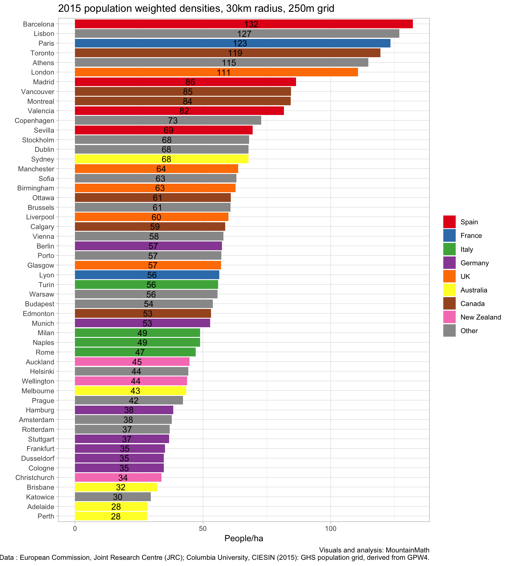
The numbers differ from the ones computed by Charting Transport, partially because we have chosen a different way to delineate cities, using 30km radii instead of administrative boundaries, and because data sources differ somewhat. Also, we used a 250m grid instead of the 1km grid used for some of the cities in the blog post. Population weighted densities do depend on the grid size, especially in cities with stark variations in population density as is the case for example in cities near the ocean where population density drops off from often high number along the shore to zero in the ocean.
The GHS data is available for 1975, 1990, 2000 and 2015. The dates are just approximate, with exact dates varying a bit between cities depending on the data sources used to construct the population grid. It should be interesting to see how densities evolved over time, and in particular how this change compares across cities.
No better way to do this than with one of these animated bar charts that made the rounds recently.
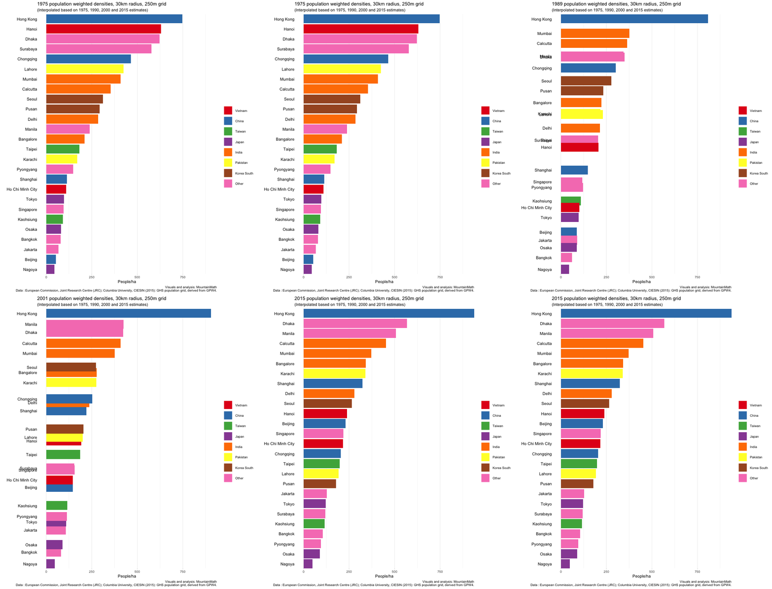
Hanoi really stands out in the graph with a huge population drop in the first period right at the end and after the war. Let’s take a look in more detail to understand what is going on, using the (unweighted) density timelines we built before.
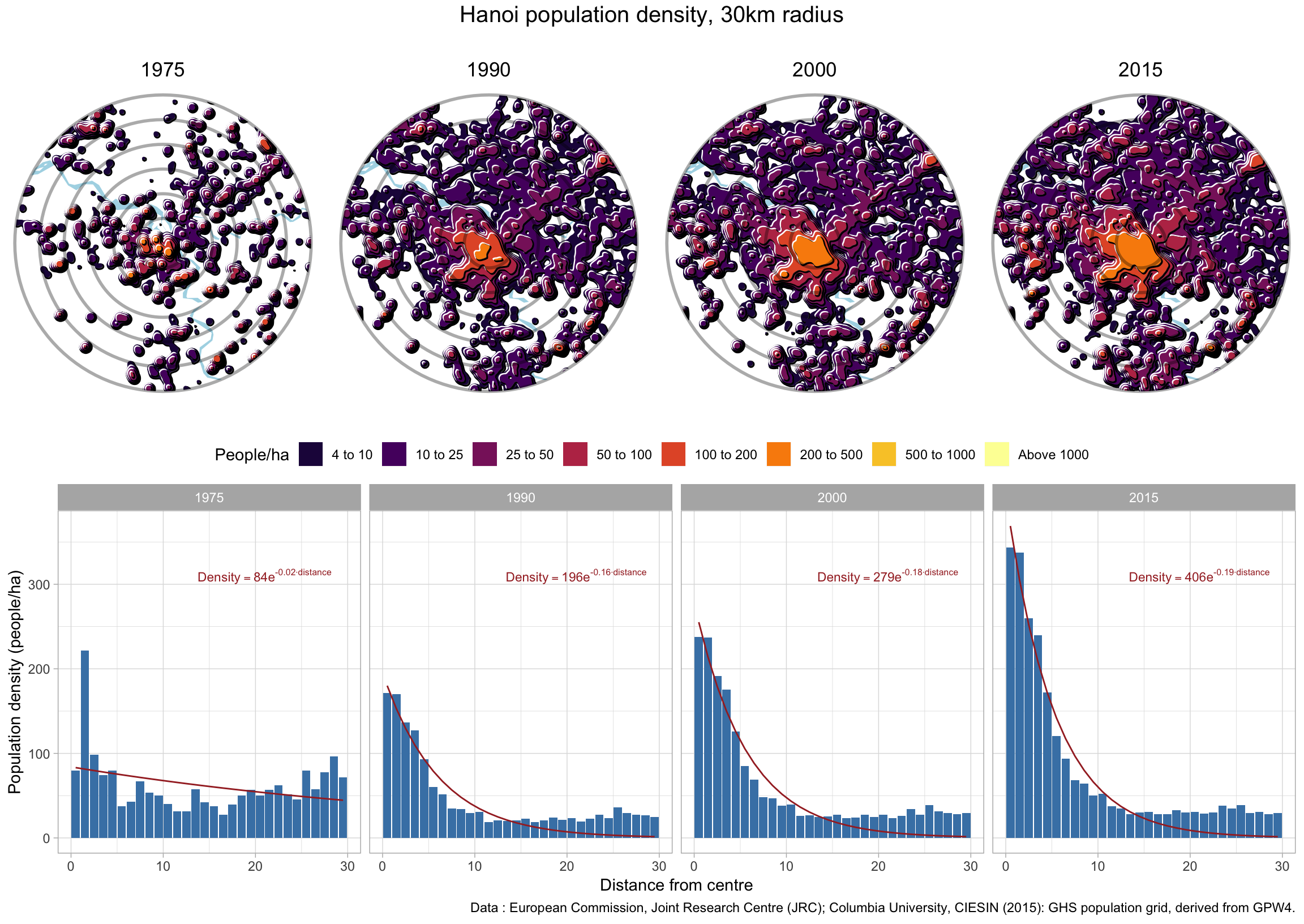
This shows that changes in density can have many reasons, and high-line numbers don’t capture all of them well. But even if we keep the built up area fixed, densities tend to decline. As people get richer, they tend to consume more housing. Both because household sizes fall and because the sizes of dwellings grow. People don’t bunk up as much and family sizes drop. In low density areas people add extensions or build larger houses, in high density ares people combine neighbouring apartments and new apartment buildings tend to have larger units. This can be counter-acted by increasing gross floor area, so the building intensity.
Grid size sensitivity
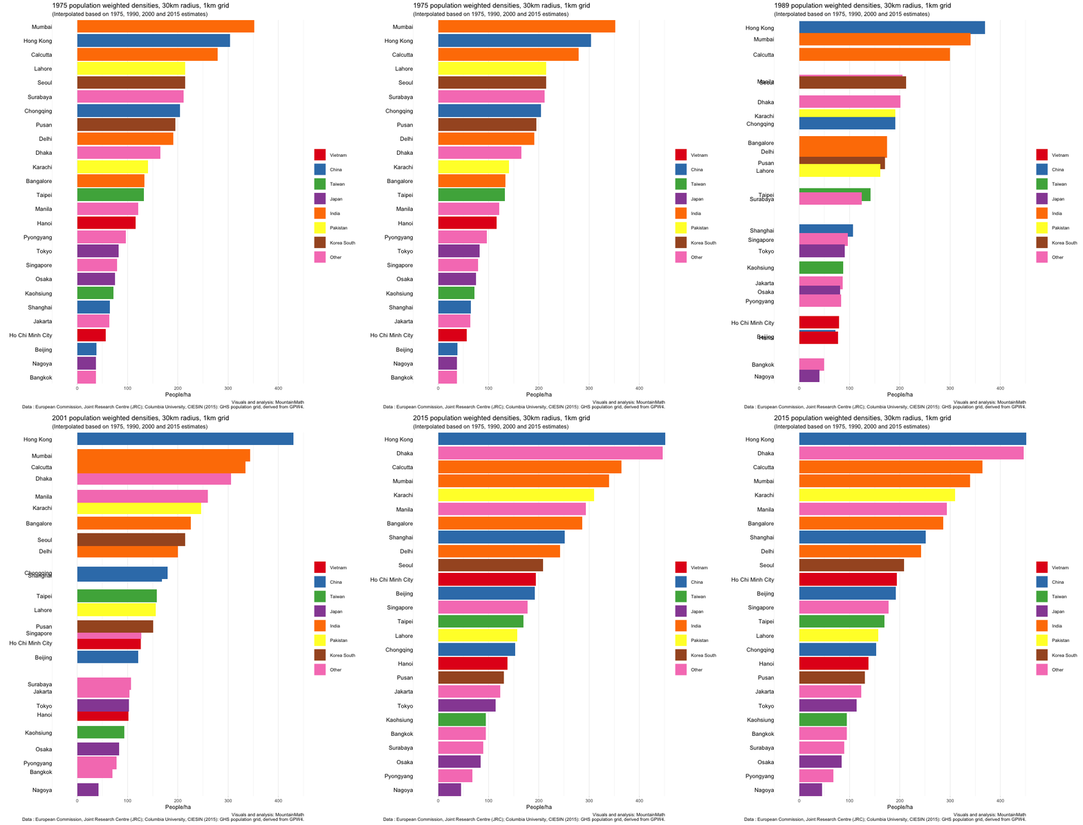
Another note is that population weighted densities can be quite sensitive to the grid size used. We have been using a 250m grid. That means if there is spiky high-density housing nestled in between water, mountains, and commercial areas, it will pick up those very high population densities. If we instead smooth things out a bit, for example by using a 1km grid, that density will wash out. This is particularly visible in the case of Hong Kong, for comparison here is the corresponding graph using a 1km grid.
US Cities
Let’s focus in one one country, the US for example, and see how population weighted density evolved over time. We simply take the 40 most populous cities and turn the crank.
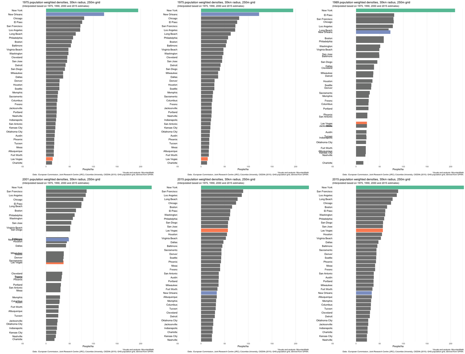
Three things immediately stand out. The absolute dominance of New York in terms of density, no other US city comes even close. Looking at the other cities, we see little overall movement, but some changing of ranks. New Orleans changes from number 2 right after New York down to almost the bottom quarter. And Las Vegas rises from second to the bottom almost into the top quarter.
Next steps
That’s it for now, as usual the code is available on GitHub in case anyone is interested in seeing the nuts and bolts or wants to adapt this for their own purposes. Fair warning, the first time the code runs it will download a couple of gigabytes of GHS data.
Reuse
Citation
@misc{population-weighted-densities.2019,
  author = {{von Bergmann}, Jens},
  title = {Population Weighted Densities},
  date = {2019-04-24},
  url = {https://doodles.mountainmath.ca/posts/2019-04-24-population-weighted-densities/},
  langid = {en}
}